A Minimal Tropical Retreat in Manila
Ivy Almario talks to us about how she kept the design scheme simple for this striking brutalist house, her first in the genre
How did you first meet the client?
Ivy Almario: Ruth Owen and I have a mutual friend, and I’ve been an admirer of Ruth's advocacy for women — she runs the social enterprise Connected Women. She had already commissioned an architect she liked for his methodology, and I did further work with him to improve the space planning. Because I’m such a fan of Ruth’s work, I decided to do the project pro bono.
Can you tell us about them and their lifestyle?
Ruth is married, and she and her husband have an adult son, so this is actually a home for the two of them. What I had in mind was for the couple to enjoy this house as their reward for their hard work. Ruth is a type A, loquacious woman, while Bob is more understated and worked as a ship’s engineer, so he read the plans for the project. I imagine that their hosting skills will bloom — I was anticipating that this has to be a very nice party house! So, when I was planning it, circulation was top of mind.
What was the brief to you for the project?
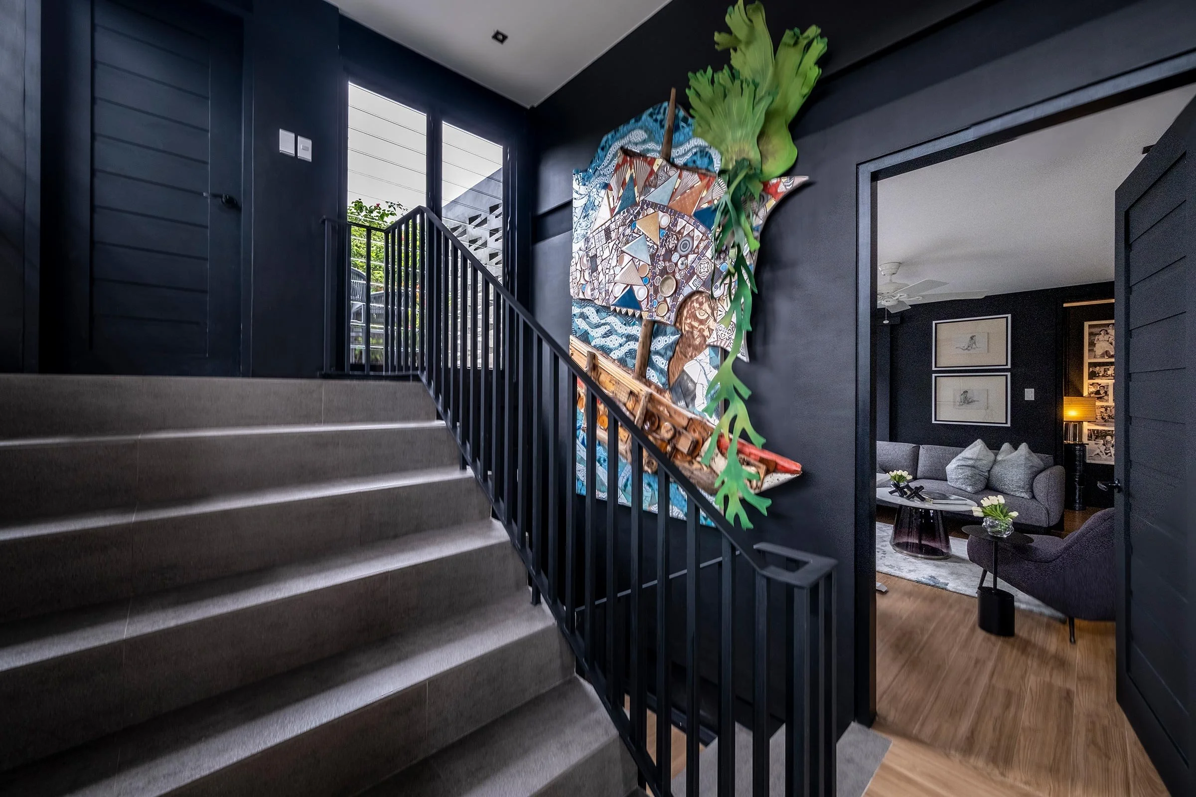
Ruth knew and admired my work, so she trusted me. And in fact, I don’t know if they understood the type of house they were getting! I made a change to move Ruth’s office to a prime space, what was originally going to be a guest bedroom. Now she has an office flooded with light. And when I painted it black, the joke was, okay, we have a black hole in the house. And it had become a design feature.
Originally, I’d agreed with the architect that this being a brutalist house we’d use a skim coat, but I realised I wasn't comfortable with the cement finish, so I asked if we could paint the interiors white instead. Then, after seeing the architect’s black eye beams and black mullions on the louvre windows, it became a bit too Mondrian — it wasn't cohesive for me. So we introduced more black and kept other elements white. This is my response to my first brutalist house, and I think it's dramatic. I feel that there's a certain casual elegance to it.
What’s the overall size of the house, and is there anything unique about the location?
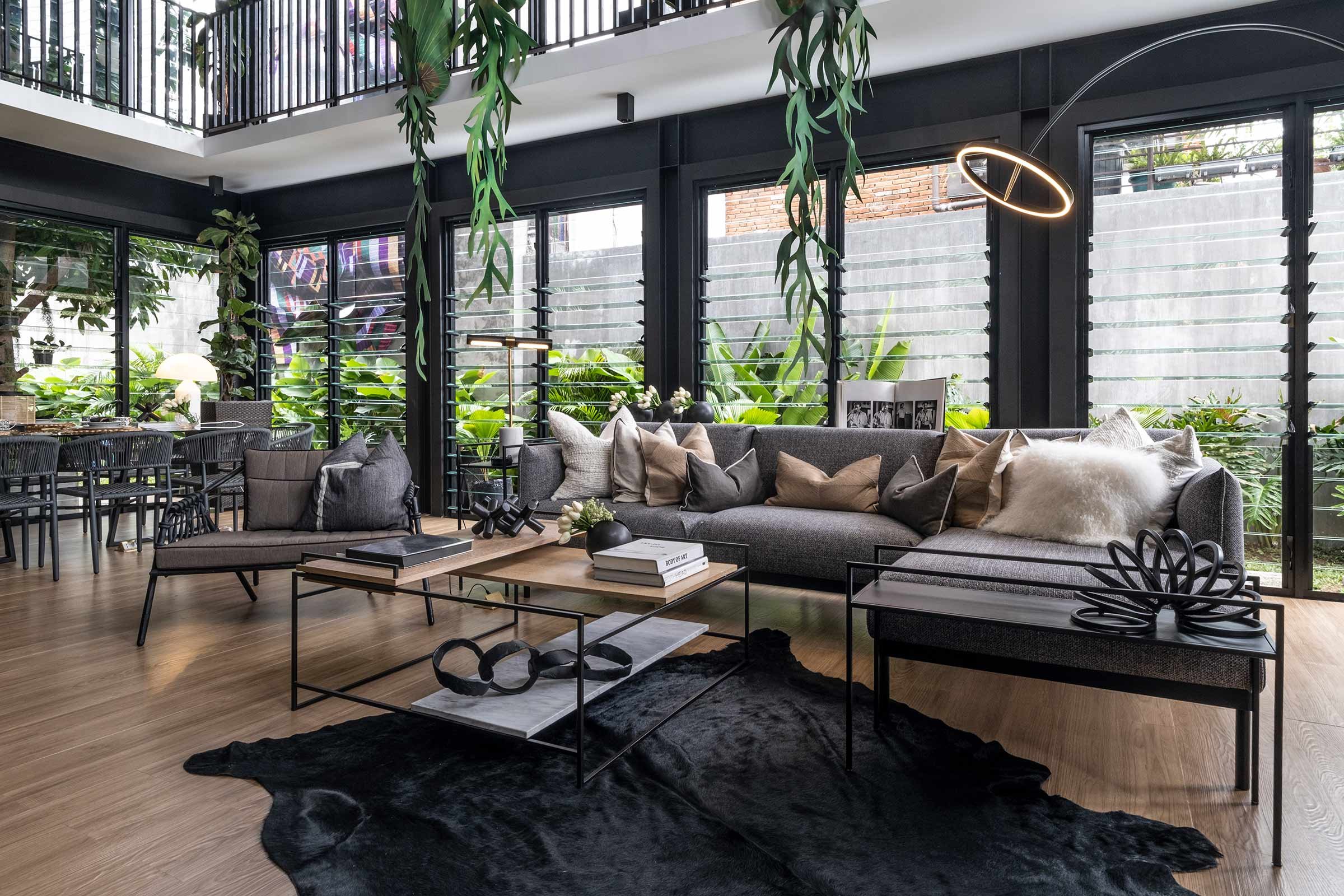
It’s just over 200 square metres, sitting on a 400-square-metre lot. But more critical than the size was the situation. The location is in Afpovai, an upcoming neighbourhood because it’s very close to Bonifacio Global City. And what’s unique about it is they purchased the land some years ago, and they were the last people to build in that street, which meant there were three parameter walls that were four or five metres high — if the architect and I didn’t ventilate the house, it'd be horribly hot. So when I was designing it, the first floor was always going to be a lanai. The clients’ preference was to have louvre windows, which totally upgraded the space. We also planted citronella to control mosquitoes. Basically, it was also already very evident what problems were embedded in the location, and the house is the solution to the challenge of the site.
Tell us a little bit about the material choices.
In terms of paint, we used skim coat on the outside, and regular house paint on the inside. I chose just two colours, with timber-look tiles on the floor to soften the louvres. Because I thought in terms of a lanai, I didn’t want them to be bothered by maintenance. That’s the materiality of the whole house — just simple and essential.
Tell us about the pieces you chose for the space.
We went for a high-low mix to keep things more economical. The kitchens and cabinets are from Ikea, as are the sofas. But I upgraded the L-shaped sofa, using an Italian-style trick of using extenders. I worked closely with my metalworker Louie Arrozal to create those, the table bases and all the metalwork in the bathroom. Some of the other pieces include an upholstered headboard from Jun Toribio, a Lalun lounge chair from Industria Edition and a beautiful coffee table from Mav. And mostly everything was either West Elm or Ikea. But these pieces all blended well and added a whole new level of refinement.
Then we splurged on the artwork outside. I said to the clients that we’d have to make the highest wall our art wall, and suggested something in metal. The company Brik-by-Brik manipulates metal to look like paper. And because Ruth is from Zamboanga, our collaborator Cherrie suggested basing the work on a particularly important or treasured fabric from Zamboanga. Ruth lent them a fabric used in headgear, which they graphically manipulated and recreated for the outdoors.
Do you have a favourite element or design detail in the architecture or interior?
Yes, two things. I love the louvres, and I love that the architect and I agreed immediately that we needed to use breezeway tiles, to create a brise soleil. We used that as fencing material too, so as not to negate the work we’d done ventilating. I think this is a very energy-efficient house. Ruth and Bob only use the air-conditioning at night. They don't have to turn on the lights because it's very bright. And it feels very tropical because with the little easement that we did, Cherrie and Ruth planted beautifully tropical foliage.


