An Architectural-Style Blue Bottle Café by Keiji Ashizawa Design
The New Blue Bottle Coffee venue in Nagoya was realised in local materials by Keiji Ashizawa Design, and aimed at a diverse crowd. Founder Keiji Ashizawa takes us behind the scenes
Design Anthology: What was the brief from the client?
Keiji Ashizawa: Blue Bottle Coffee’s philosophy is based on creating stores that respect the local culture, and for the Blue Bottle Coffee Nagoya Sakae cafe, the concept of ‘authentic and cute’ was also set to embody the atmosphere of the cafe. The café is in a prime location on the ground floor of the Chunichi Building, which opened in April 2024 as a new landmark in the Sakae area of central Nagoya. And being in front of Hisaya-odori park where many pedestrians come and go, it needed to be accessible for a diverse range of people.
How did you select the materials?
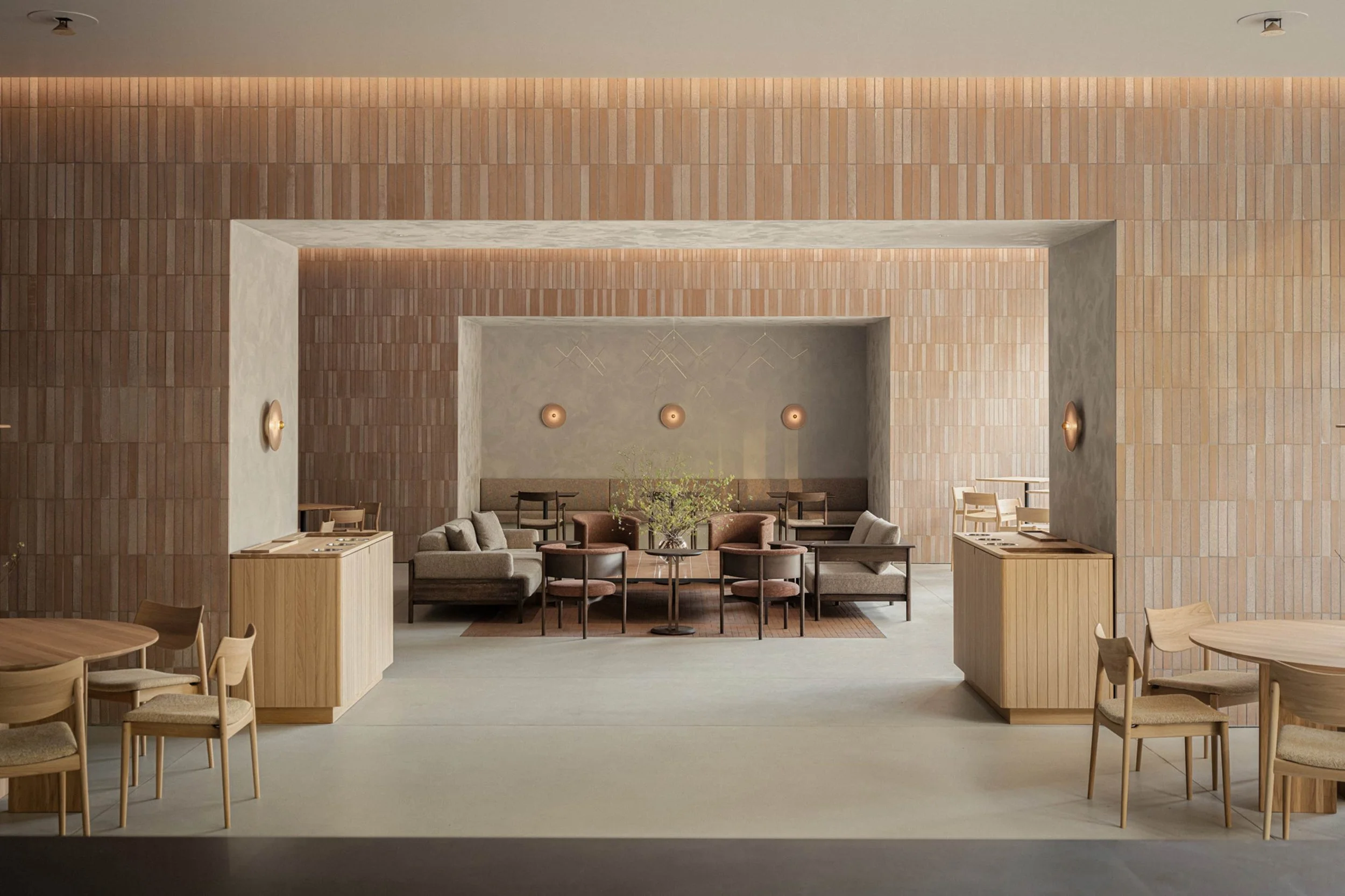
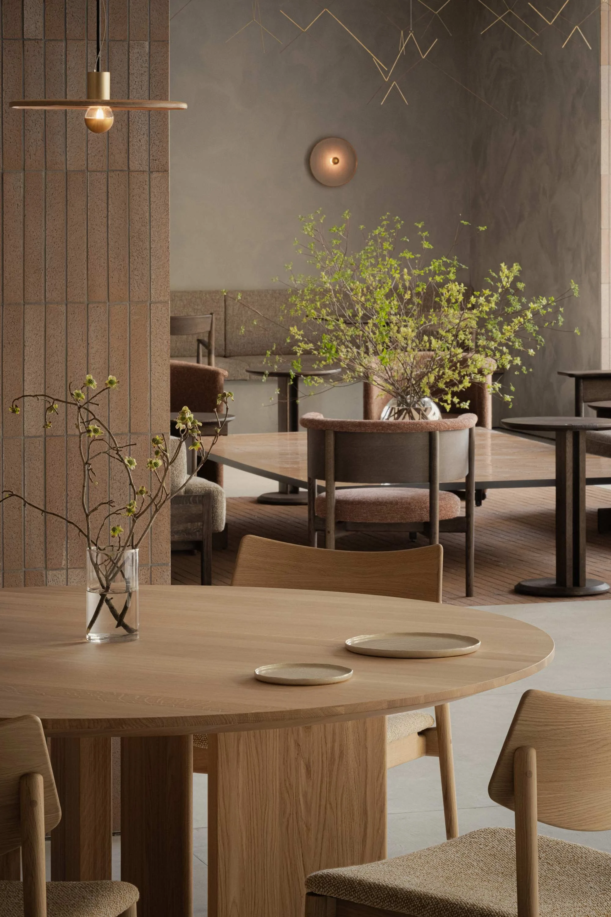
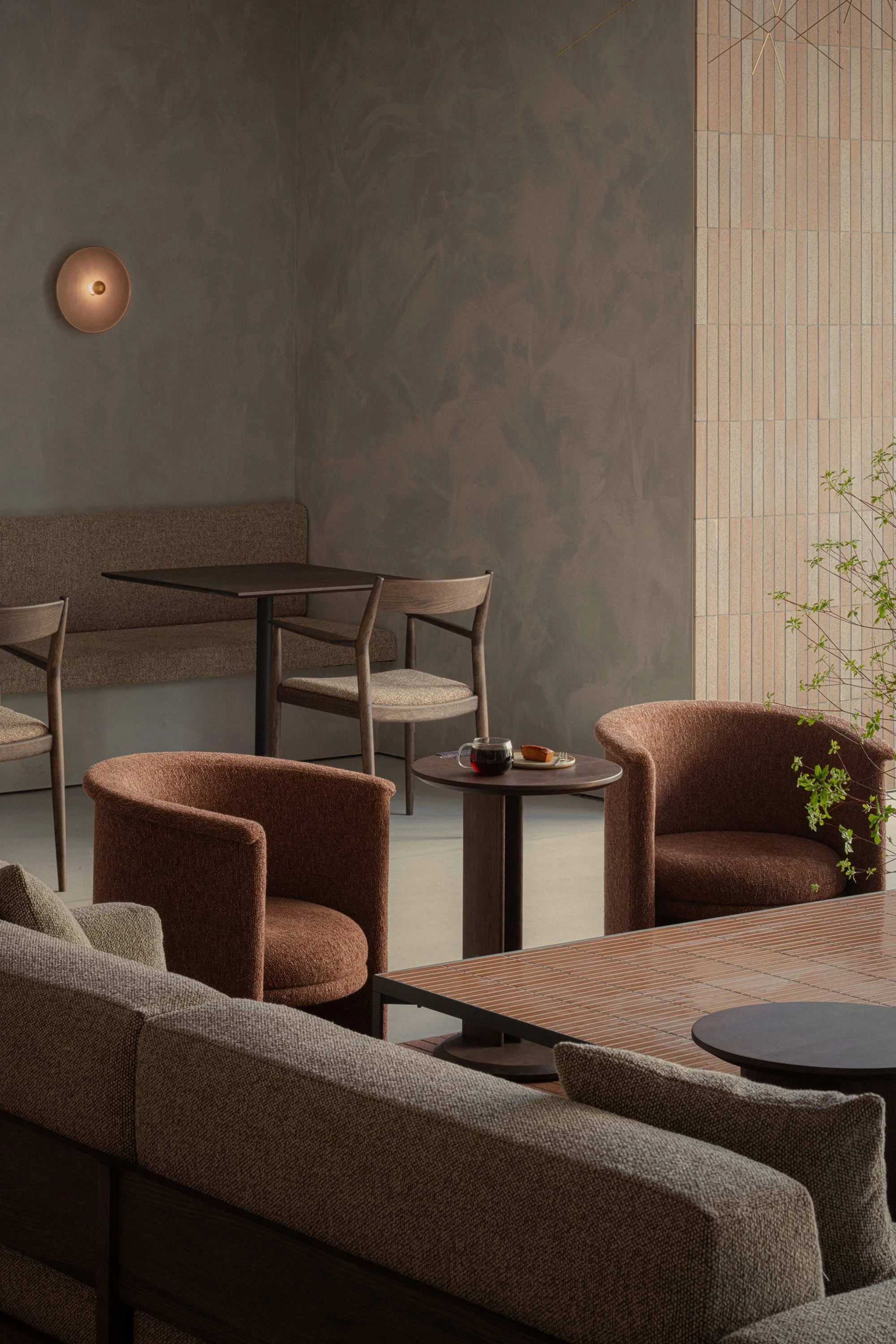
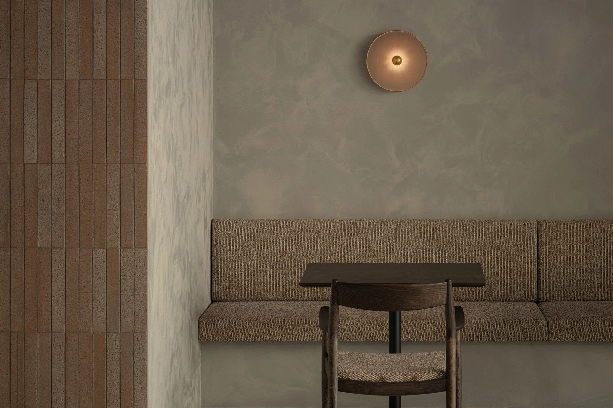
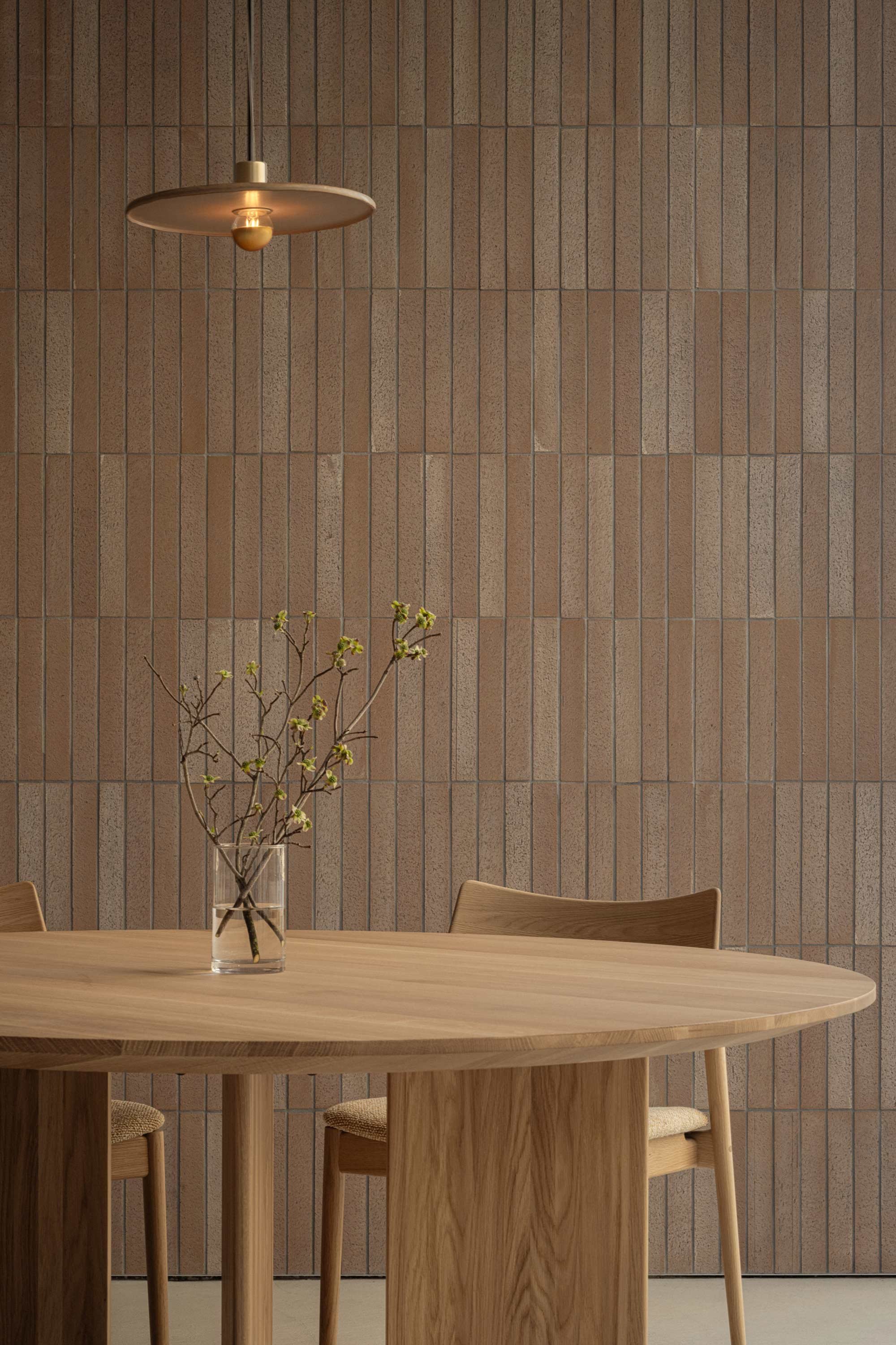
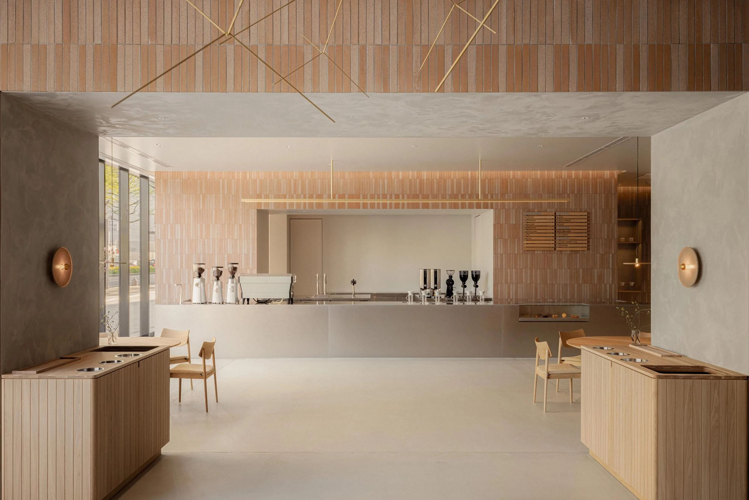
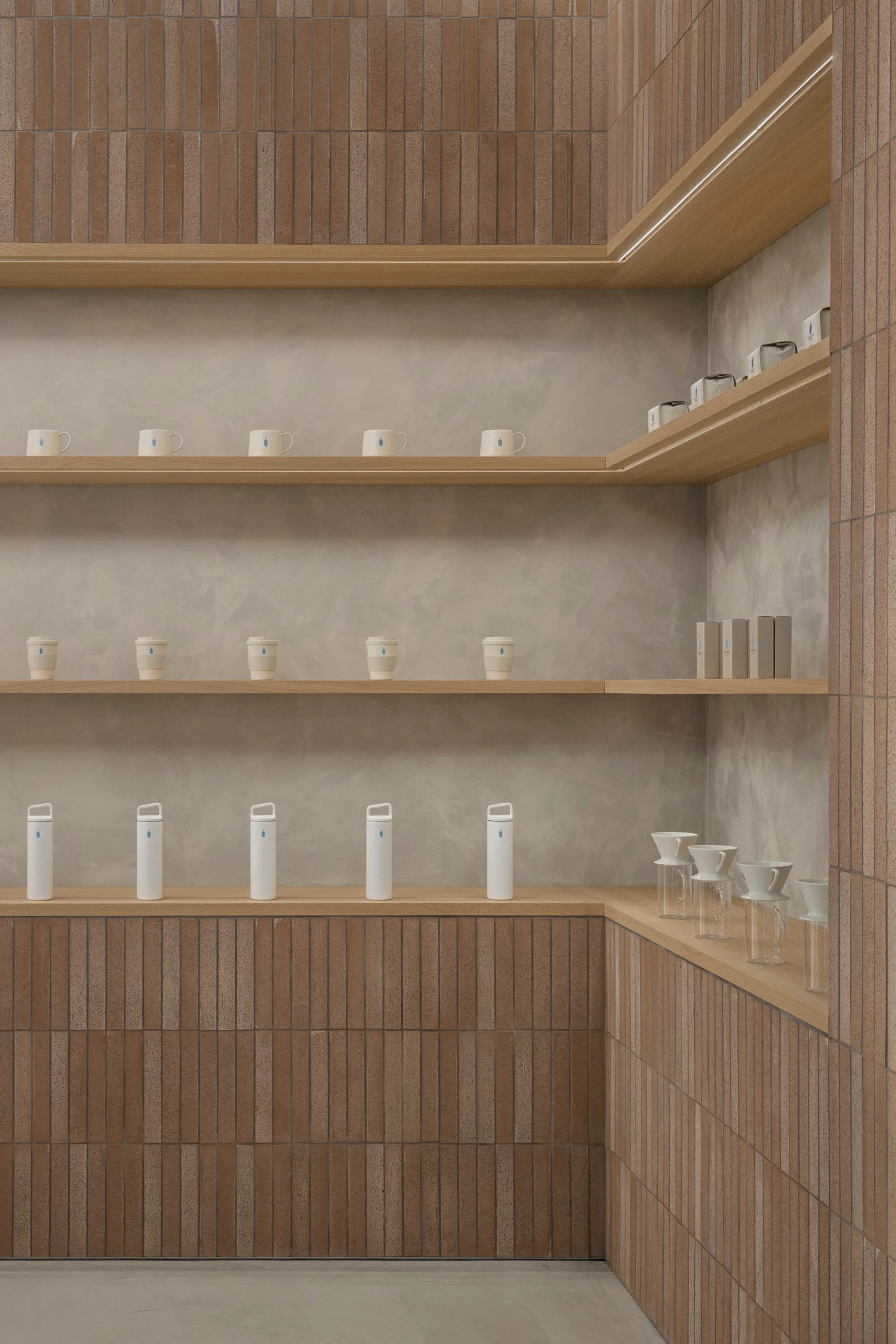
Based on the authentic and cute concept, we chose a warm and elegant pink tone for the wall tiles to create a charming and relaxed space. Olive Bricks, a tile manufacturer in Gifu Prefecture, produced the custom tiles in two shades. The bespoke pendant and wall lamps were also made from the ceramic plates served in the cafe. The wooden furniture was made by Karimoku Furniture, with which we also collaborate for Karimoku Case. Given the cafe’s location on a street-facing corner, it was designed as a lounge space that welcomes visitors, and we chose the materials to create an atmosphere that suits the intent.
Do you have a favourite feature in the space?
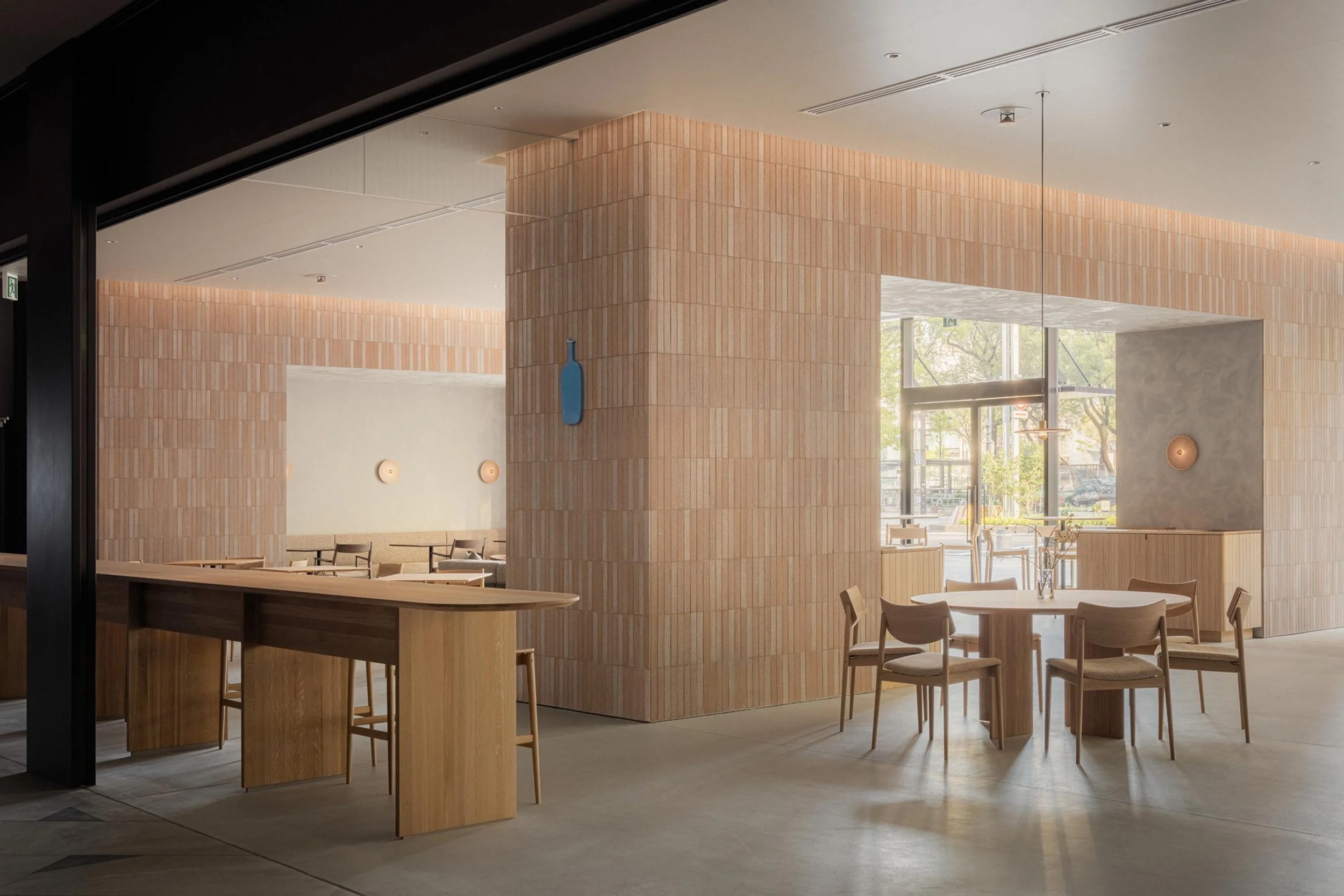
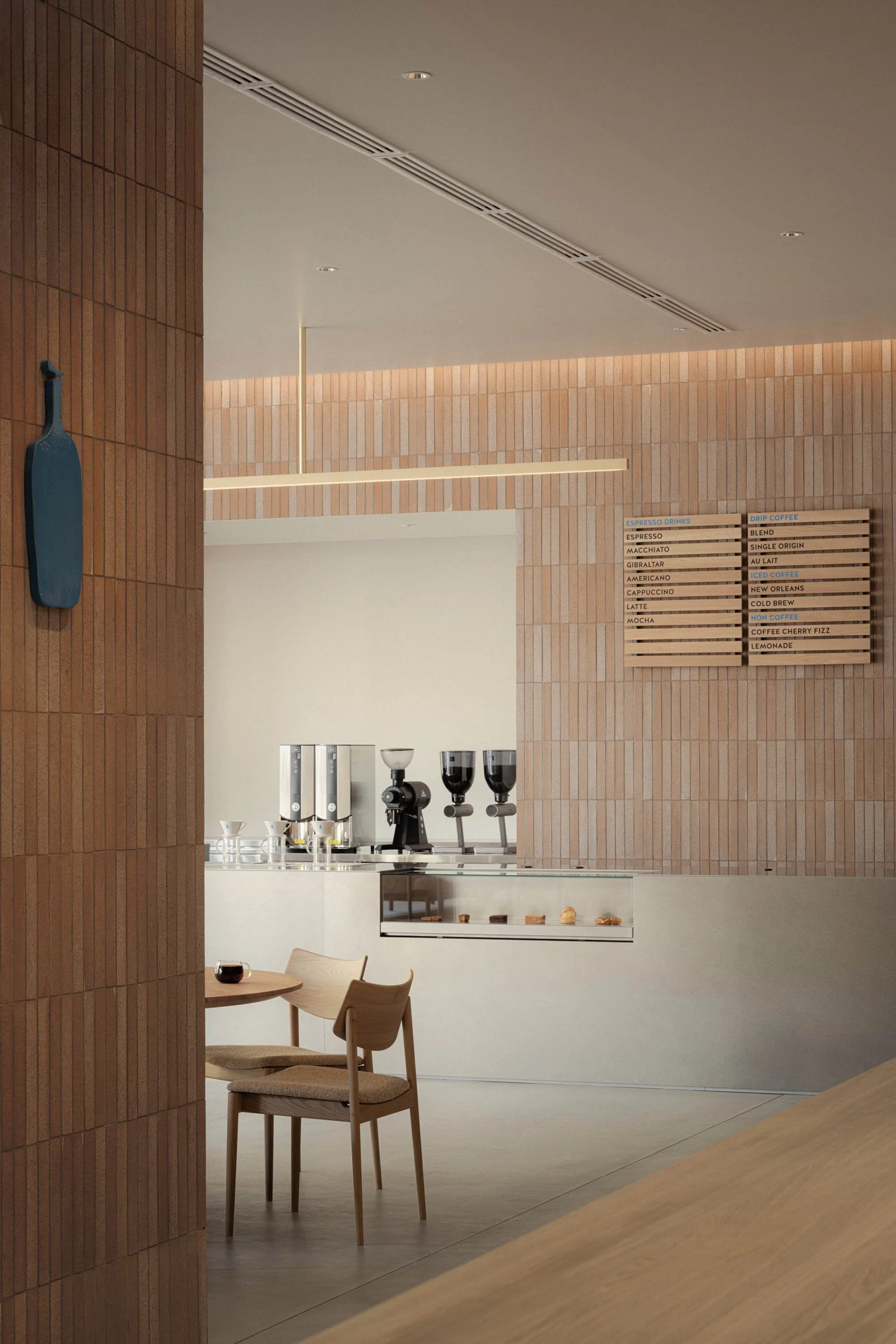
The space was largely occupied by existing columns and beam structures typical of a skyscraper. To optimise their presence, we decided to tile them with textured materials, transforming the interior into a strong yet graceful architectural space. By weaving soft materials, furniture, textiles and textured tiles into this authentic setting, we were able to achieve a sense of comfort while creating a subtle tension.
How did the building’s architecture influence the interior?
As well as texturing the pillars, we decided to create three gates to separate the space. Since diverse guests are expected, each space has seating for one person, a couple and a family of three or four. The central area is a space for couples to relax on sofas, enjoying the atmosphere of the park. Extended from the counter, the large gate acts as a picture frame, making each room look like a landscape, which not only is aesthetically pleasing but provides a divided space for guests to be seated at a comfortable distance.
What kind of feeling do you hope guests will have when they use the space?
Despite being an interior project, the space is very architectural. We encourage guests to feel at home in the harmonious space, richly made with local materials and furniture, and enjoying it at their own pace.
Images by Tomooki Kengaku

