Arpita Mehta’s First Flagship Opens in Mumbai
Blush tones, wood, concrete, brass and lush textiles combine in fashion designer Arpita Mehta’s first brick-and-mortar store, designed by Ravi Vazirani and outfitted entirely in custom-designed furniture
Design Anthology: How did you first meet the client?
Ravi Vazirani: Arpita Mehta is a celebrated Indian fashion designer. She was already familiar with our work, and when we finished the redesign of the iconic Pali Village Cafe in Bandra West in 2019, she — being a designer herself — responded very well to our aesthetic and reached out to work with us on her first brick-and-mortar store.
Can you tell us about her style?
Arpita’s minimalist yet fashion-forward designs combine traditional and contemporary elements, and her name has become synonymous with her signature aesthetic of hand-embroidered mirror work pieces in contemporary cuts and eclectic colour palettes.
What’s unique about the building and the location?
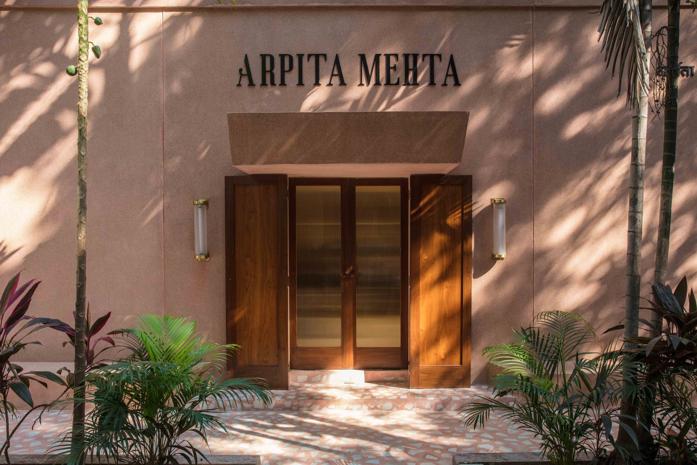
The space, which is 100 square metres big, is in the lower level of an older building in a leafy bylane in Khar, Mumbai. The building doesn’t have any of the strong architectural elements typical of most buildings in the area, and the fact that the store is set in an unusual location within an apartment complex lends character to the space and makes it an unexpected surprise.
How did you approach the project — what design references did you try to incorporate into the space?
Our design approach was to synchronise the meeting of our practice and Arpita’s over two mediums, all focused on the celebration of craft. We wanted to create a space that would allow the clothes to the focal point, with several understated architectural details. I firmly believe that when designing for retail, it’s important to create a concept that allows for the product to be the final star.
Please tell us a little about the material choices for the space
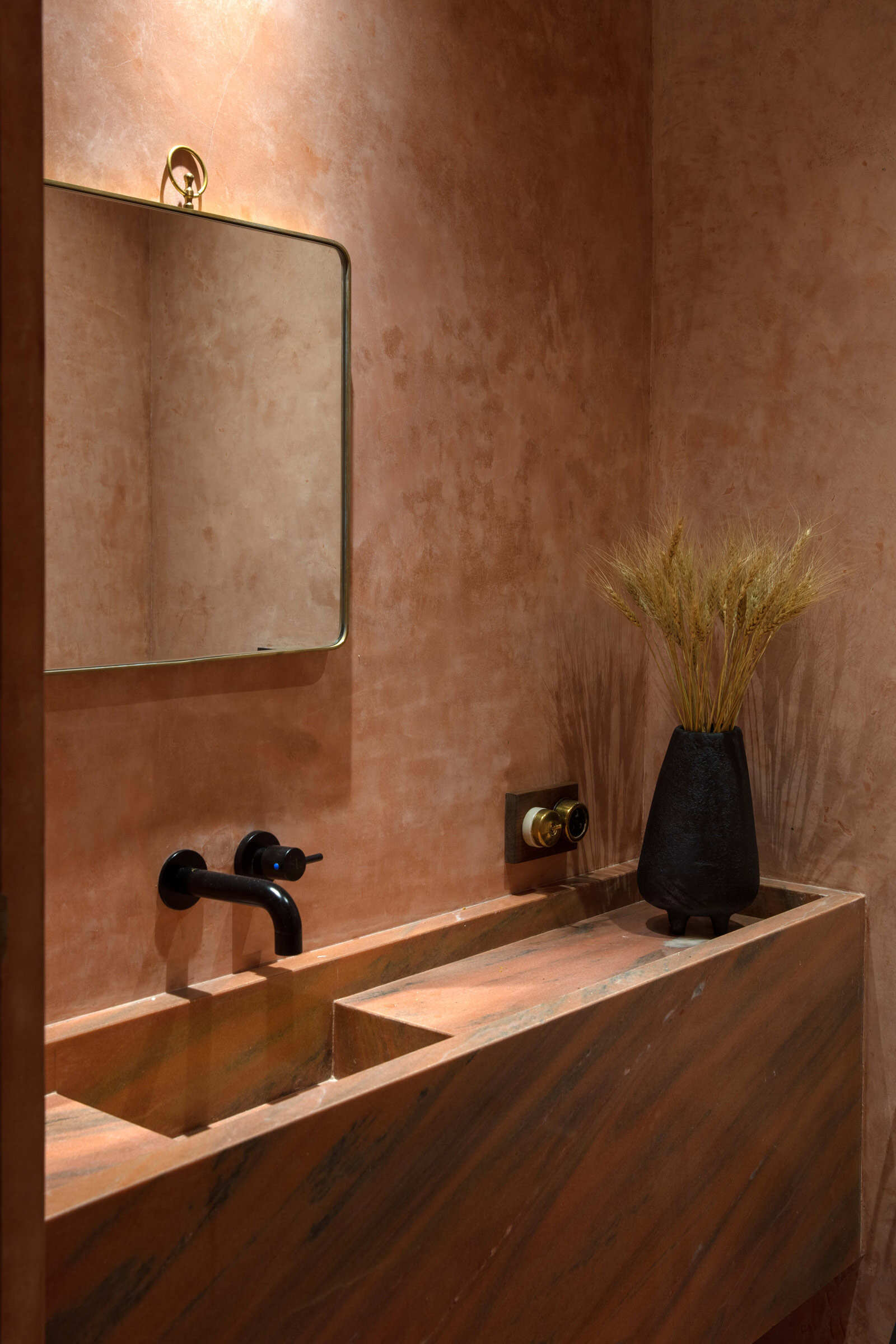
We wanted our material choices to invoke a sense of nostalgia, starting with the facade, which is finished in custom pink terrazzo that’s reminiscent of the 80s. The walls are textural in muted nude tones, while the rest of the space features elements of wood and wax- and sand-cast brass and aluminium pieces. The powder room is all pink concrete, with a custom wash basin in pink Indian marble — again, this is an ode to the craft that’s accessible when designing in India.
To contrast the rough textures of the metal and concrete, the upholstery and drapery is in lush pink and terracotta velvet. Brass mirrors provide a pop of luxury to compliment the embroidery and mirror work on the garments.
The black artwork on the wall is made of recycled waste from construction sites and mimics the textures of the customised sand-blasted furniture pieces. We found many of the accessories in various vintage markets, where we hunted for pieces that would match the overall narrative of the store.
Please tell us about some of the custom pieces for the space.
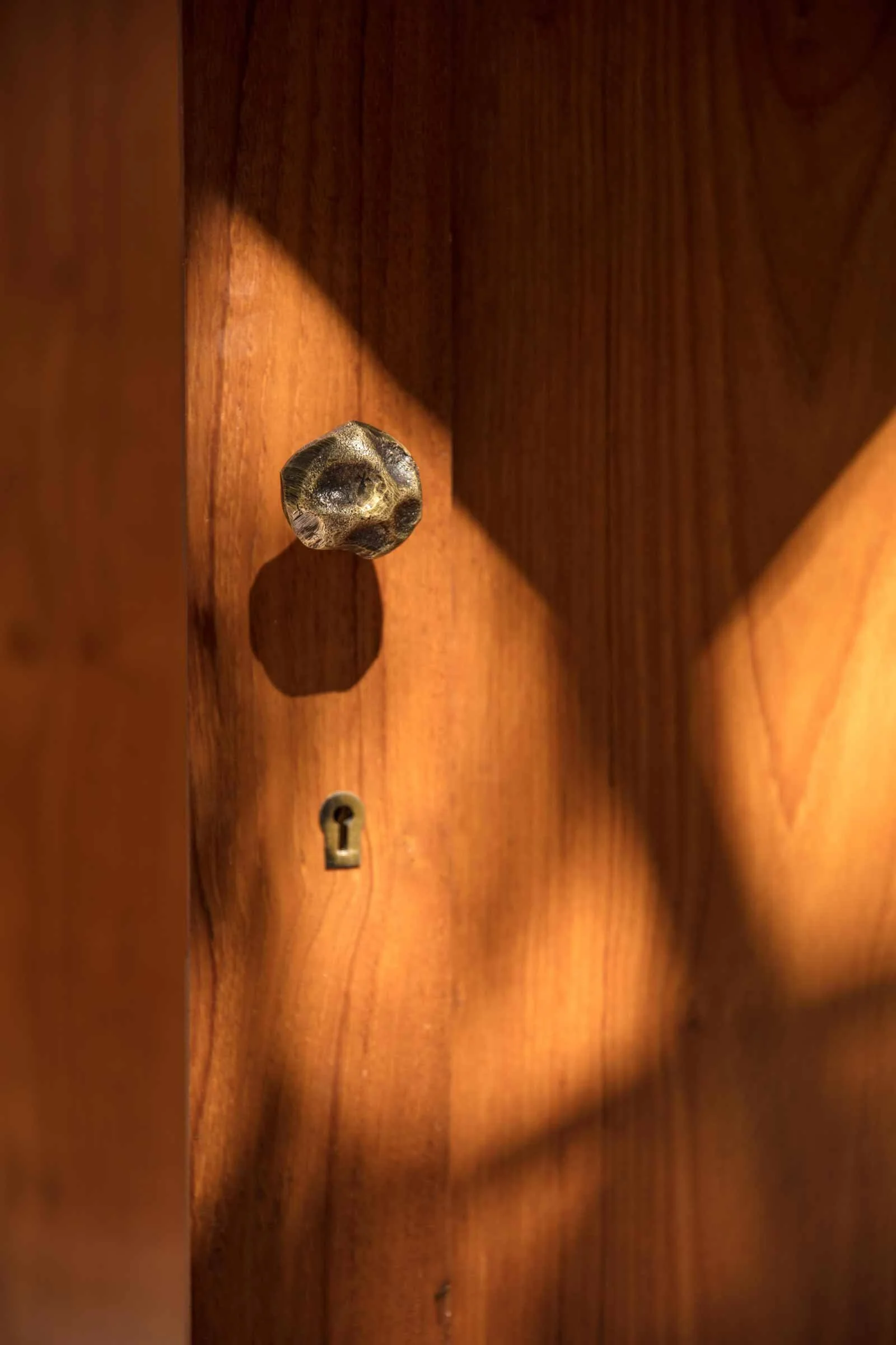
Each and every piece is custom designed as part of our studio’s latest furniture collection, Flow. The coffee and cocktail tables are made of cast aluminium with special black matte finishes, while the lamps were made of fibre and plaster, and the hardware is all cast in brass. The marble pedestals are hand carved by artisans in Jaipur, and the console tables and armoire were handmade by local wood workers.
Images / Pankaj Anand


