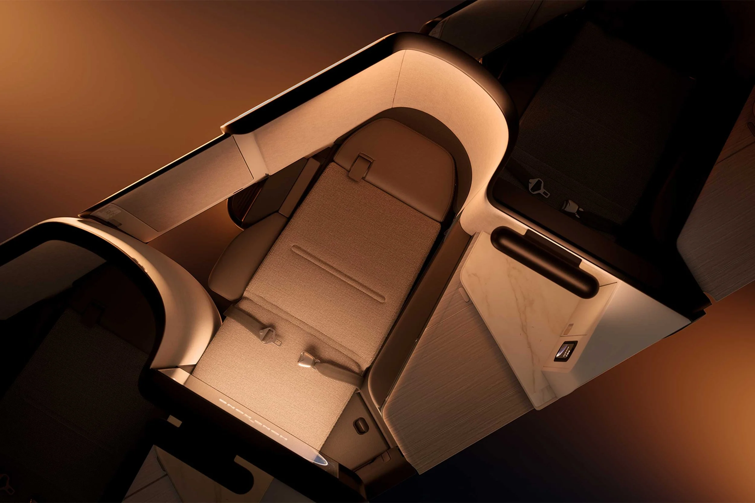
Behind the Design of Cathay Pacific’s New Aria Seat
Cathay Pacific’s long-haul business-class seats get their first upgrade since 2016 and prove that an aircraft can, in fact, make you feel right at home
For an airline, the opportunity to fully rethink the passenger experience comes along only once or twice a decade, and with it, the rare opportunity to reinvent the seat that millions of passengers will sleep, read, dine, watch and work in for years to come. But when Hong Kong’s flag carrier Cathay Pacific revealed its new business-class seats in a reconfigured Boeing 777 last month, the result didn’t seem to be too far off from the current product in its Airbus A350 aircraft, at least to the casual observer. And that’s for good reason.
‘When people look at our new seat, some say “It’s nice, but it’s not revolutionary”. But I wouldn’t reform for the sake of it,’ says Vivian Lo, the airline’s general manager of customer experience and design. Cathay Pacific already operates some of the world’s best airline lounges and has a long history of elevating design within the brand. Previous creative collaborators have included Foster + Partners, John Pawson and most notably in recent years, Ilse Crawford’s Studioilse, with which the airline has partnered on the development of its current lounge programme.
For this next generation of cabin products, the airline sought to bring that same residential atmosphere to the seats of its long-haul aircraft. ‘You can increasingly see that, between lounges and cabin products, there’s more and more of a coherent language,’ explains Lo. ‘We apply human-centric design, which to me is the thread that links everything together, but I’m also very mindful that they’re never a copy-and-paste. You are designing for what the customer wants to do in that environment.’
The existing business-class seat has been improved upon in key areas while retaining the elements that still work well. The technology stack has received a significant upgrade with the addition of high-definition screens, wireless charging and preset lighting schemes. But more importantly, the seat’s finishes finally start to resemble the interiors found in more familiar environments, utilising textiles such as suede and wool. The space is illuminated by warm cove lighting integrated into the shell, along with a sconce above the countertop, making for a cosier, more intimate setting. ‘We really challenged the designers to look for materials that can build that serenity. Even within an inflight environment, you can create that tactile, soft feeling that makes you feel like you are in a very well-designed home,’ says Lo.
But despite these bigger changes, it’s the small details that prevail. ‘One thing I’m very proud of is how the team empathises with the customer, for example, in the bed-mode buttons. If you’re lying down or if you’re asleep, the last thing you want is to have to turn on the lights and put on your glasses before you can press the buttons, right?’ Lo says. She’s referring to the small panel of three physical buttons that are only exposed once the seat is fully reclined, bringing the most common functions to a waking passenger’s side. On its own, it’s a simple experience informed by residential design and brought to the skies above, but it’s exactly these thoughtful gestures that make a frequent flyer’s late-night departure or early-morning arrival that little bit more humane.
Text by Jeremy Smart


