An Eclectic Duplex in the Heart of Mumbai
Local firm Hiral Jobalia Studio paired sleek fixtures and plush materials with vibrant art and designer pieces to meet this family’s brief for ‘a modern space with a touch of luxury’. Here architect Hiral Jobalia shares more about the project
Design Anthology: Can you tell us about the clients and their lifestyle?
Hiral Jobalia: The clients are a family of four — two parents, an 11-year-old daughter and an eight-year-old son — and they love to entertain friends and family. We first met when we designed the couple’s office space about four years ago.
The 465-square-metre apartment is in a residential condominium with a clubhouse and state-of-art amenities in Mumbai.
What was their brief to you for the project?
The clients had a clear vision of the home they wanted: a modern space with a dash of luxury.
The objective was to maximise the space while minimising any wastage. The apartment is spread over two levels: the lower level houses the common areas including formal and informal living areas, an entertainment area, a kitchen and a powder room. The upper level is for the private areas, including the master bedroom and both children’s bedrooms.
Please tell us a little about the material choices for the space.
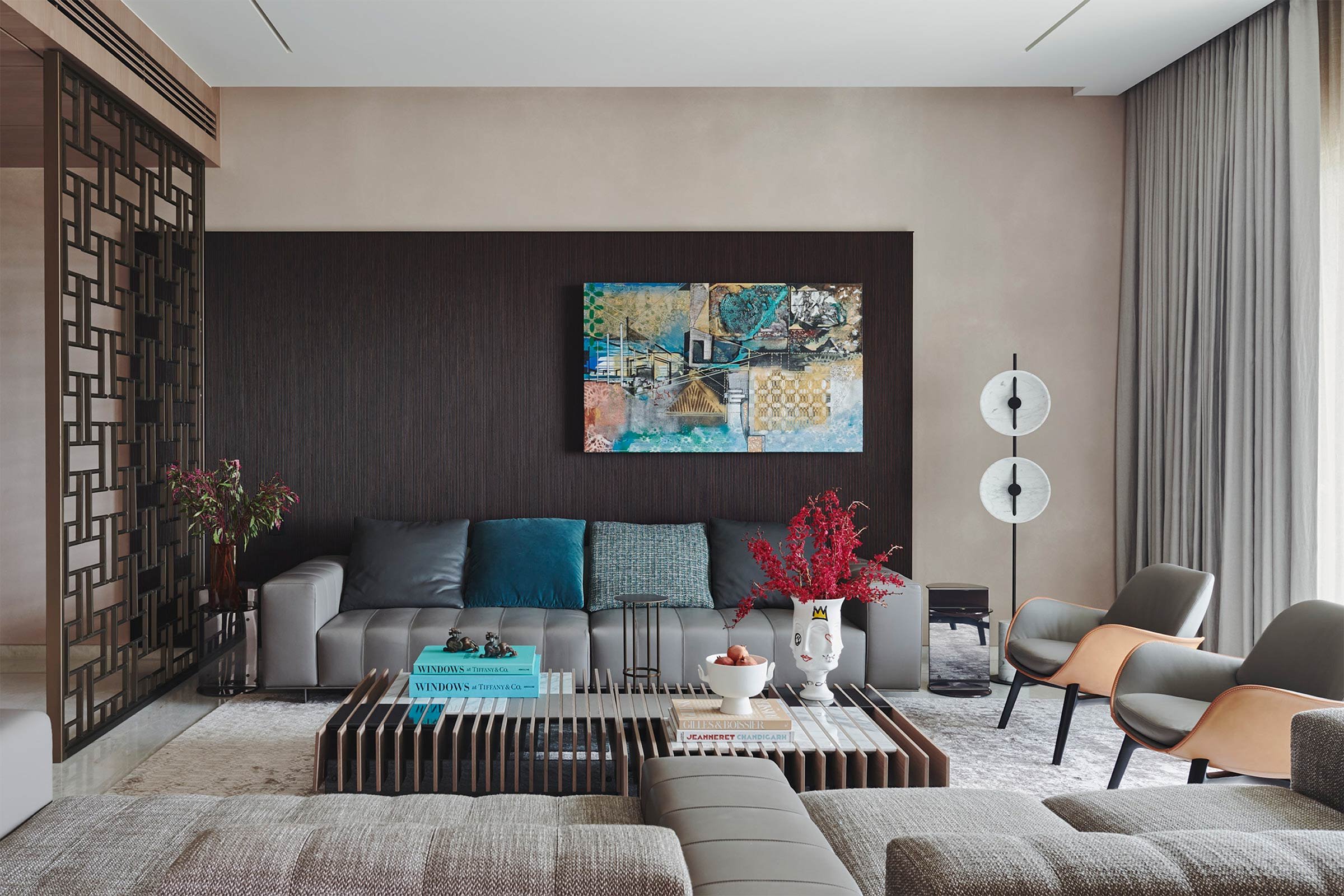
The materials palette consists of dyed veneer, fluted timber, marble, satin and metal panels.
Which of the furniture pieces were custom design for the project?
The screen in the main entrance is inspired by the work of visionary architect Carlo Scarpa, and we custom designed the screen in steel and finished it with a satin metallic paint. Other custom pieces include the metal console with wooden drawers near the main entrance, the bookshelf adjacent to the dining space and the media unit in the entertainment area.
Do you have a favourite element or design detail in the architecture or interiors?
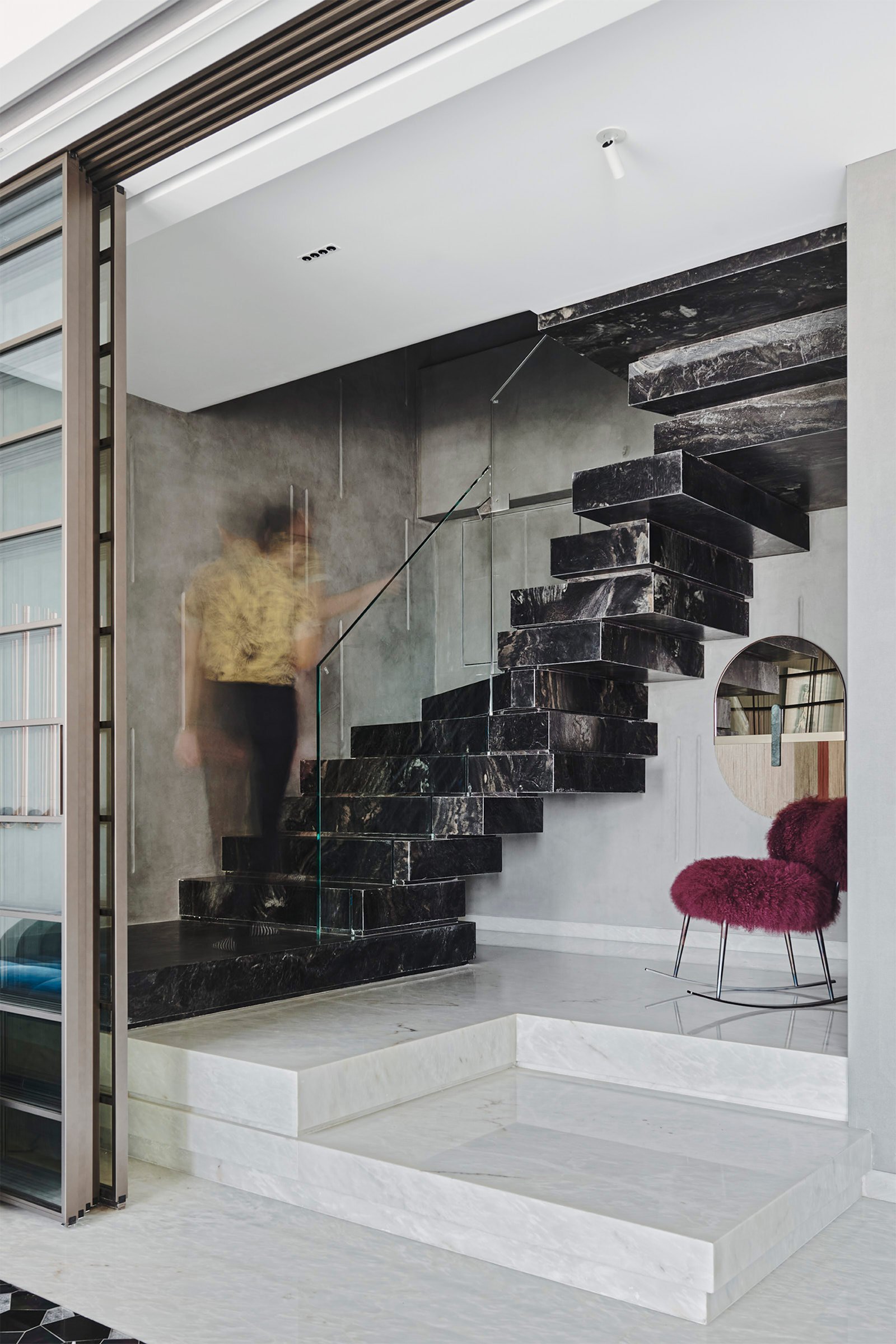
We really enjoyed designing the staircase, which is well articulated and very functional despite the tight space. We also loved creating all the custom furniture, vanity counters and the screen in the main entrance, as they allowed us a lot of creative freedom.
Images / Suleiman Merchant


