Serenity at Home
Located near a river in the heart of Taipei, this minimalist apartment by 317studio is inspired by the natural landscape and the idea of spiritual awakening. Here studio co-founder Kenny Yang tells us more about the project
Design Anthology: Who is the client and how did you first meet them?
Kenny Yang: The clients are an elderly couple. We were introduced to them by another client who has known them for decades. After building a successful business from scratch, they’re now enjoying retirement and keeping a low profile.
What was their brief to you for the project?
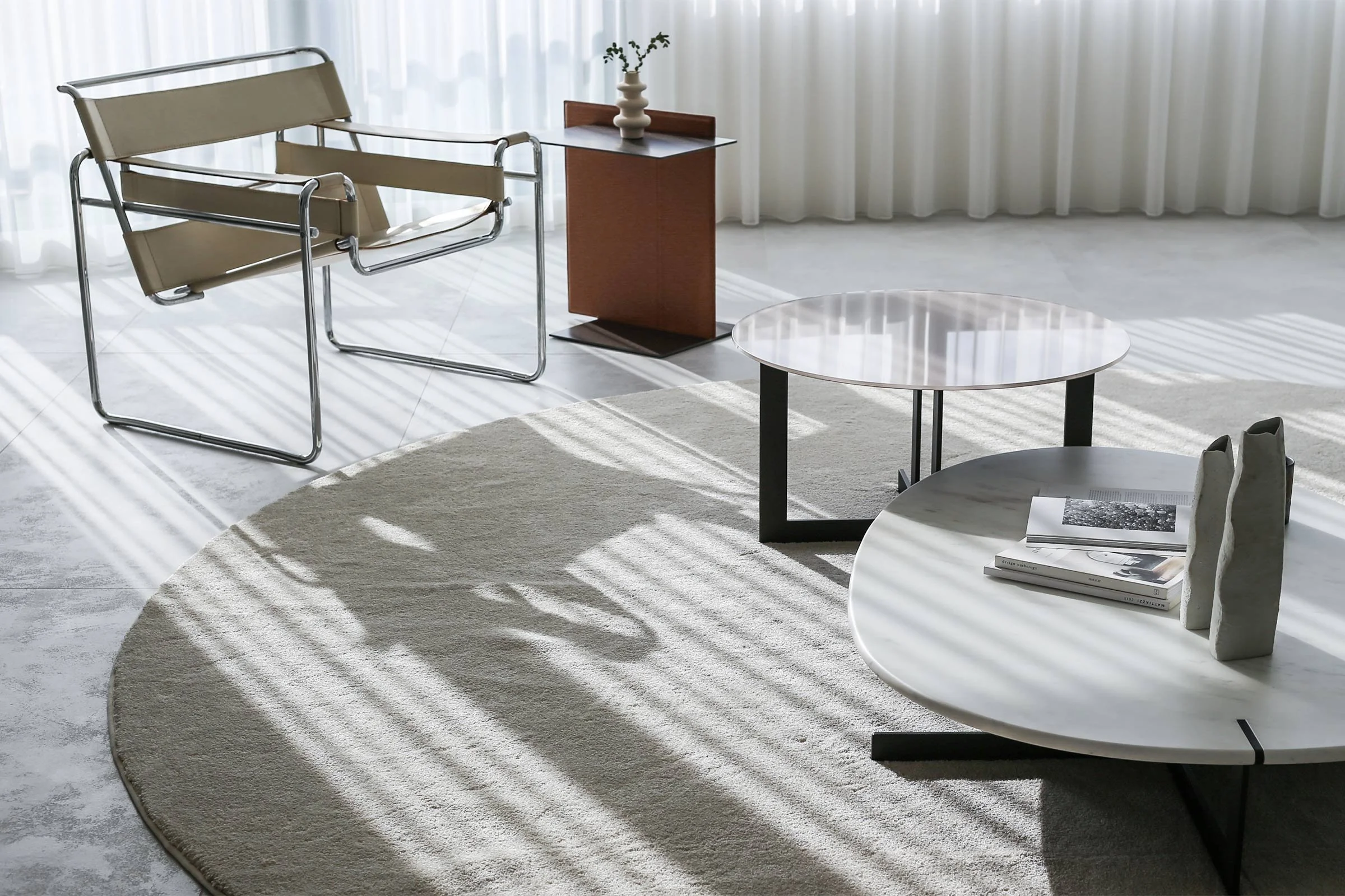
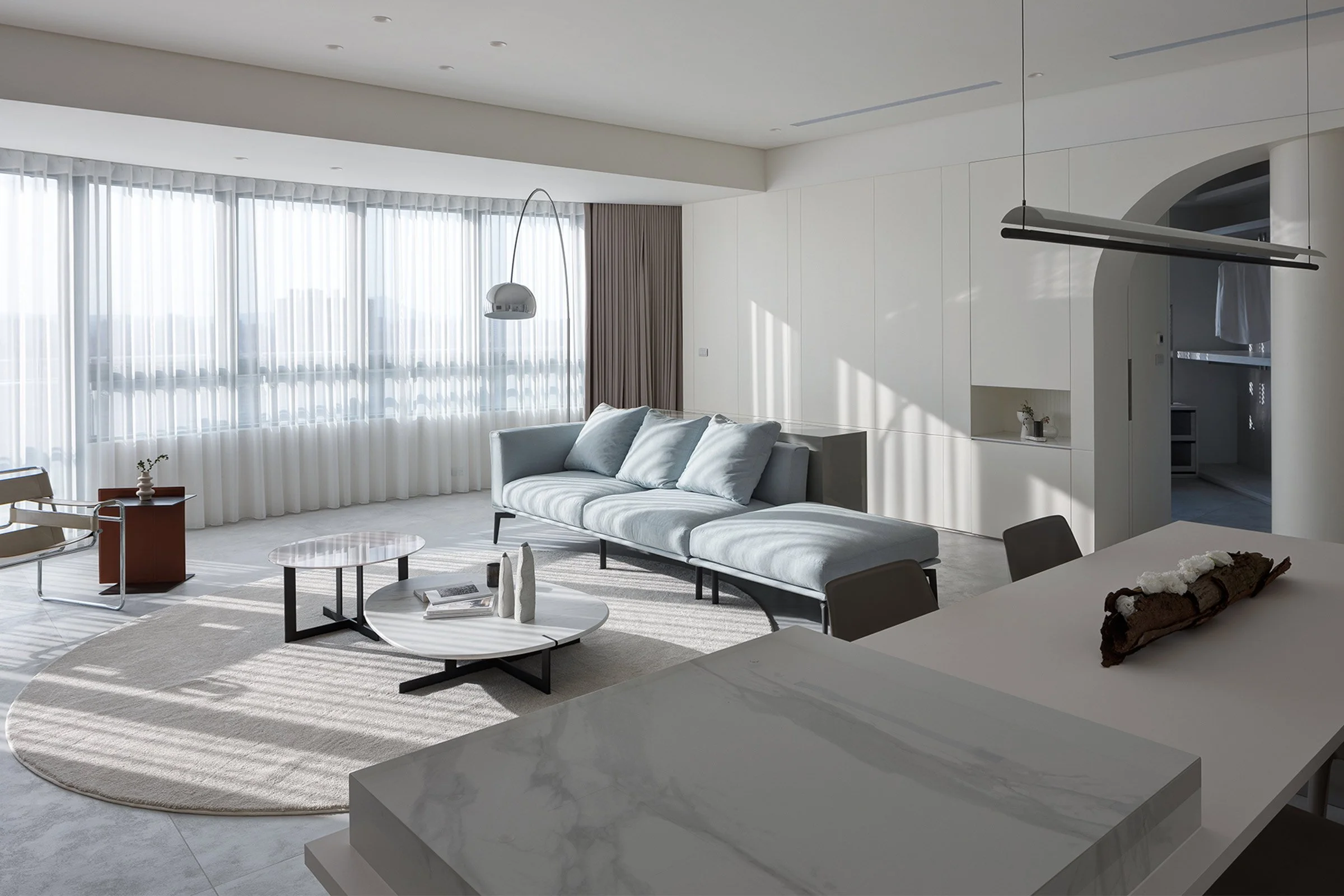
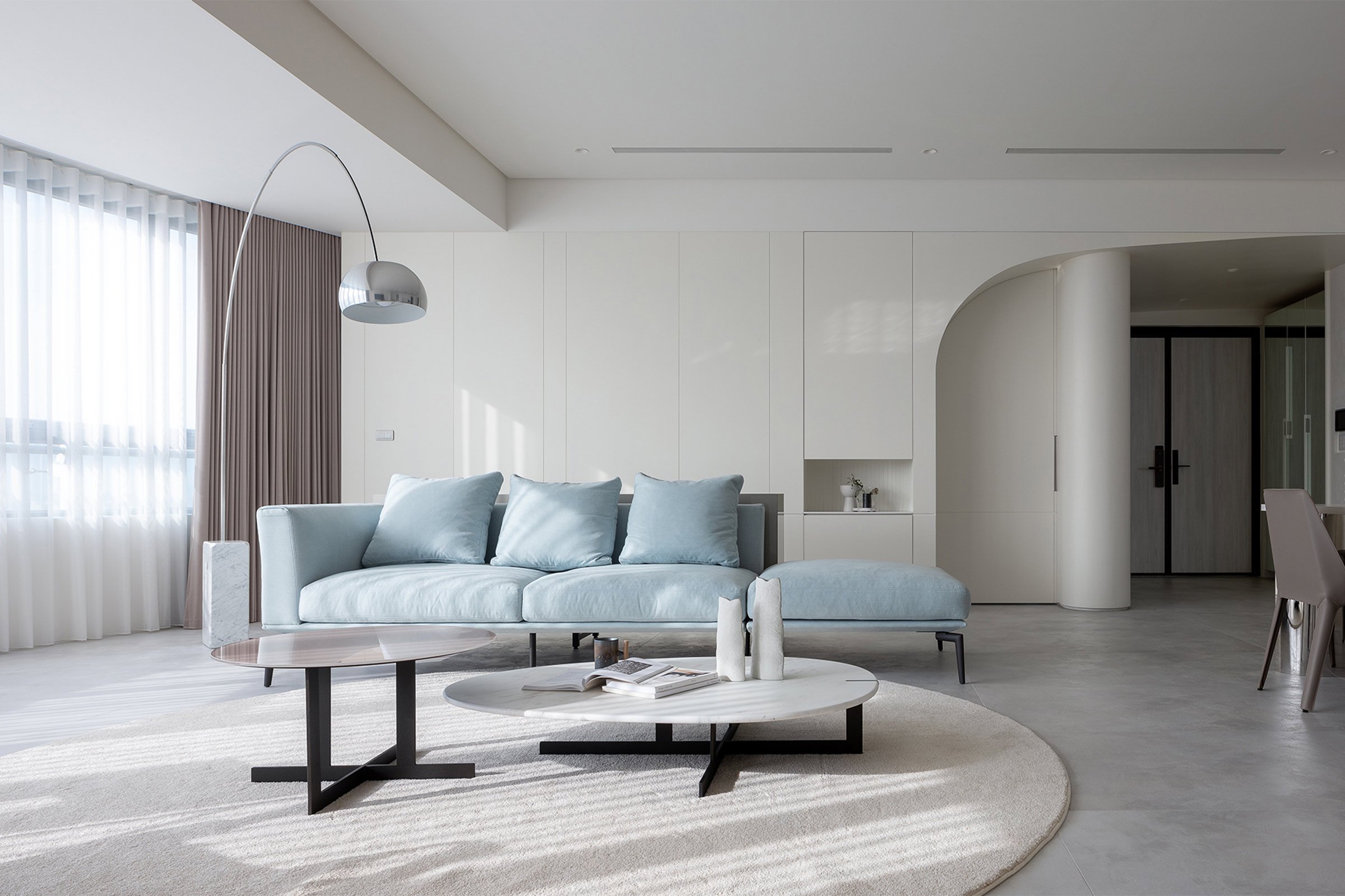
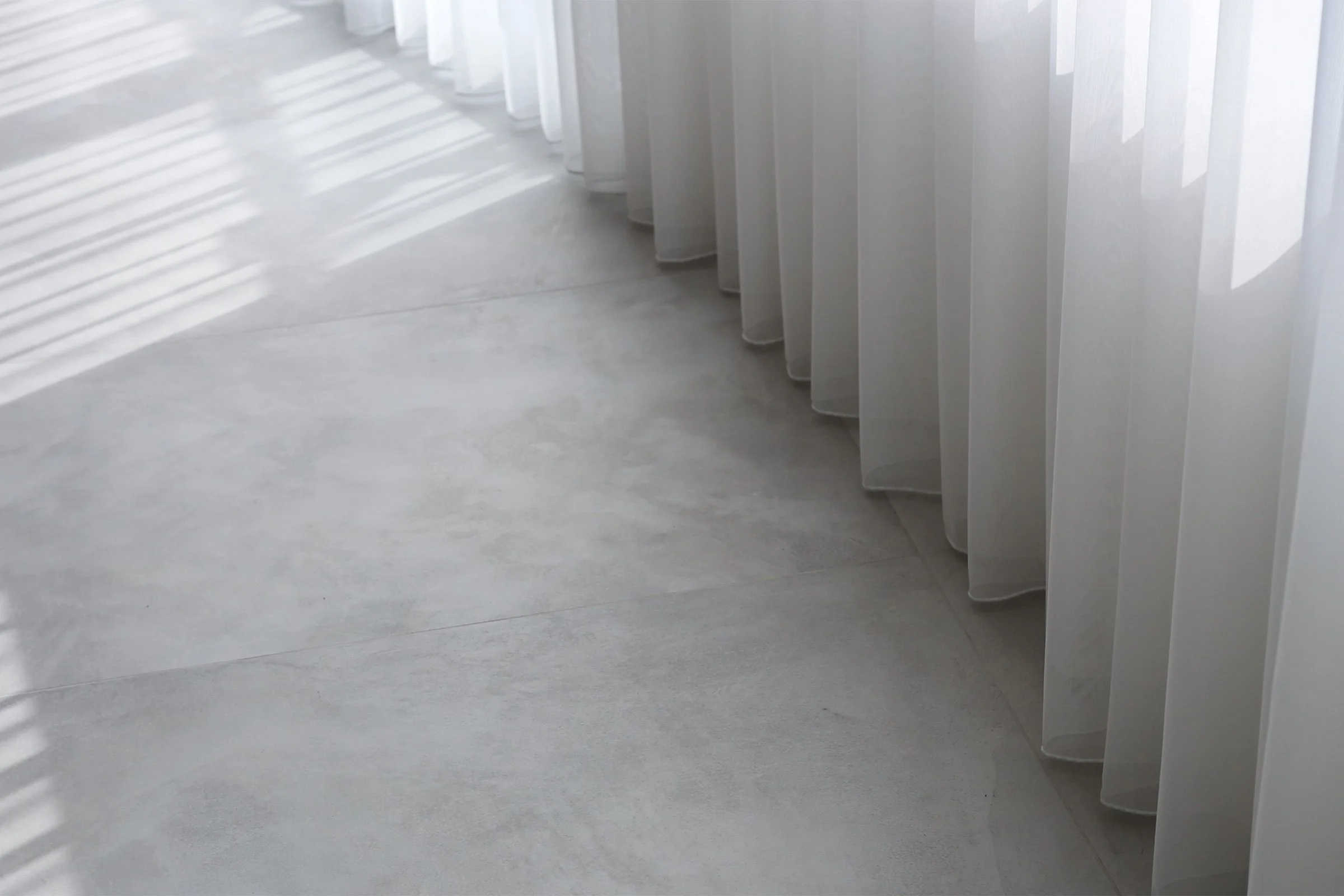
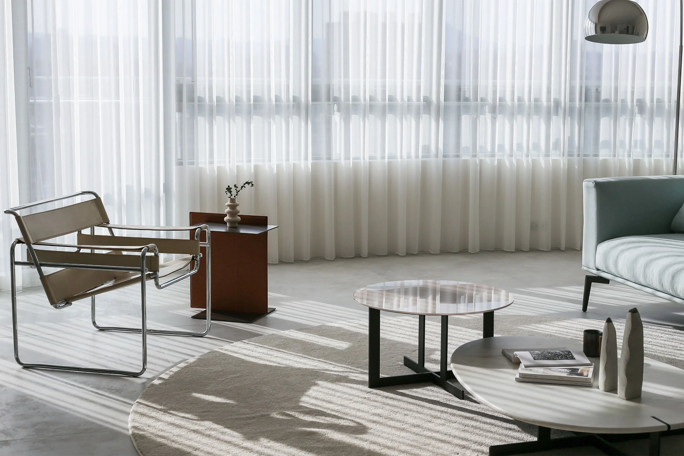
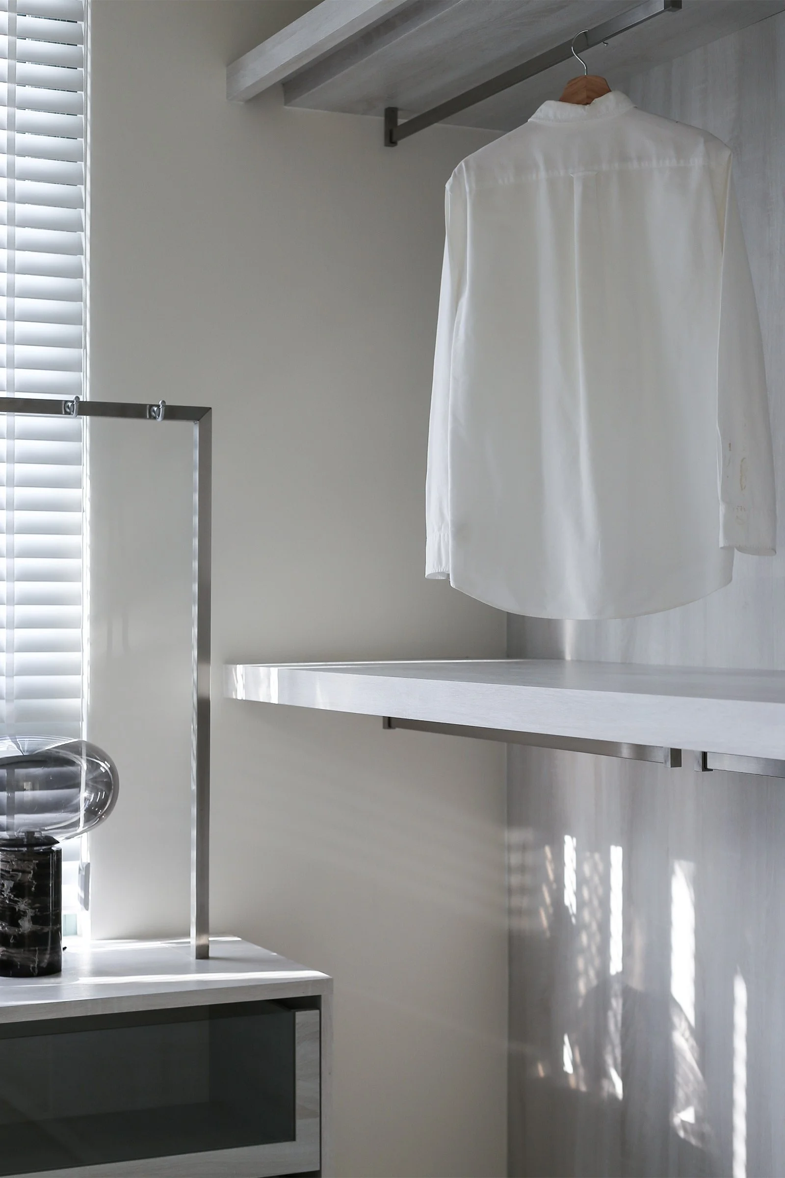
The couple wanted the home to be all white with natural light and a simple, minimalist aesthetic that reflected their personality. Our aim was to achieve this look by adapting our design methods and materials to suit the local characteristics, hoping that that process would help us capture the essence of the area.
What’s unique about the building and the location?
The 200-square-metre apartment is in a block that borders Taipei’s Xindian district. When looking at the site, we explored the connection between the clients’ background and the neighbourhood and its history. We were particularly inspired by features of the area’s geography, like the watercourses around the building.
How did you approach the project — what design references did you try to incorporate into the space?
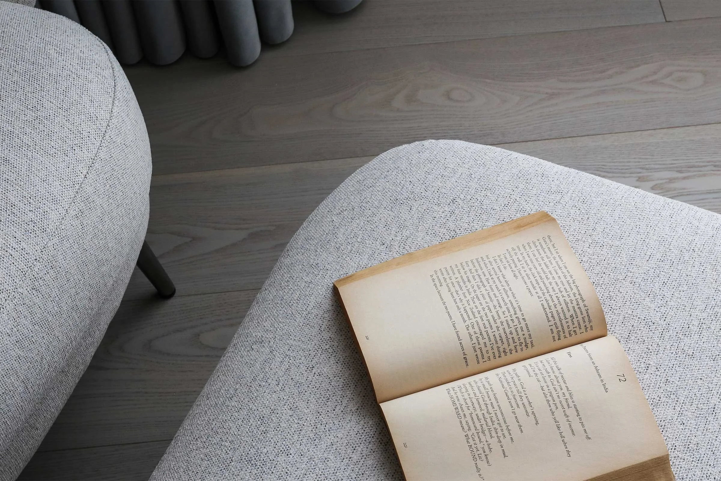
The clients’ background and story reminded us of the novel Siddhartha by Hermann Hesse — from the main character’s spiritual journey of self-discovery to the minimalist design language depicted in the narrative. The most striking parallel we drew is that the character in the book experienced his spiritual journey through the river.
Please tell us about some of the custom pieces for the space.
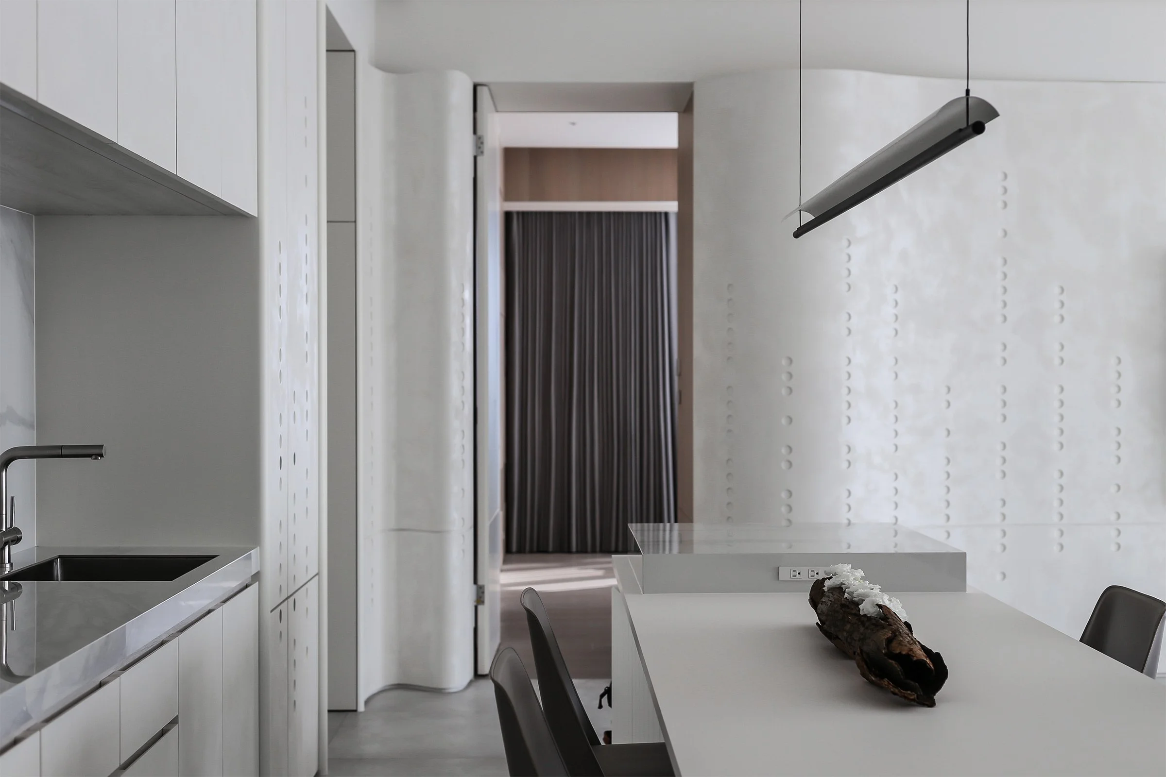
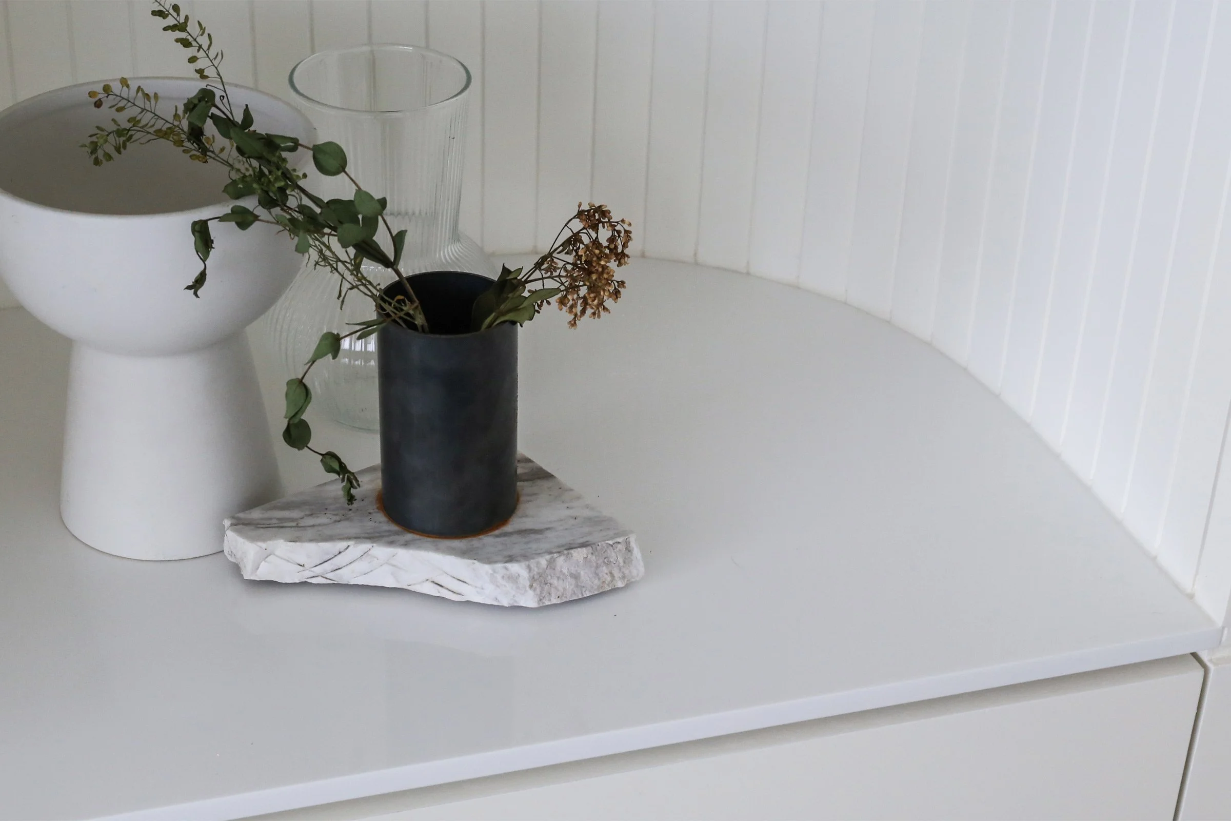
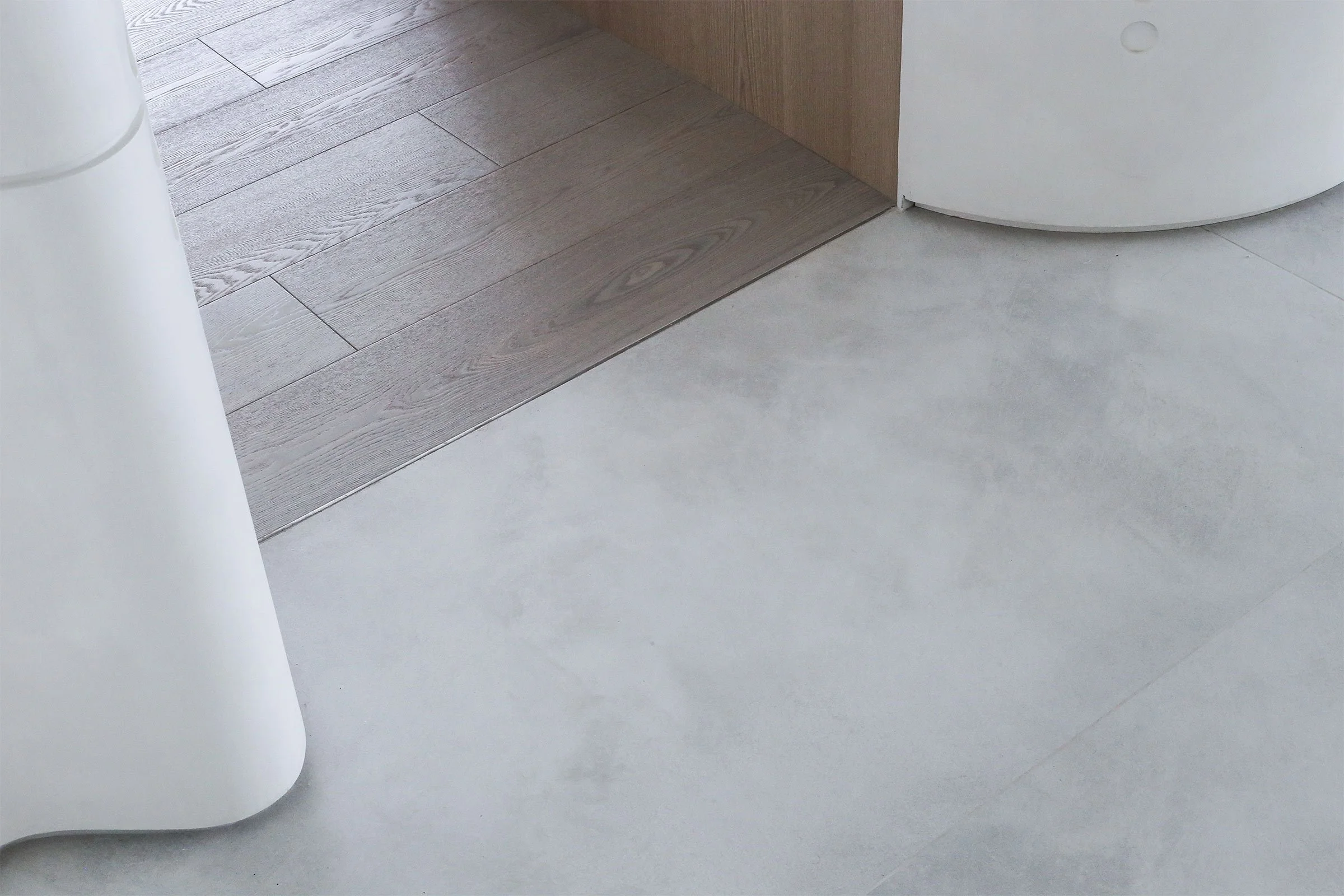
Anchoring the centre of space is a bespoke dining counter crafted from marble and plastic and inlaid with a curved mirror leg that reflects natural light and shadows. With these tactile materials, we tried to give the spaces a clean and bright quality.
Do you have a favourite element or design detail in the architecture or interiors?
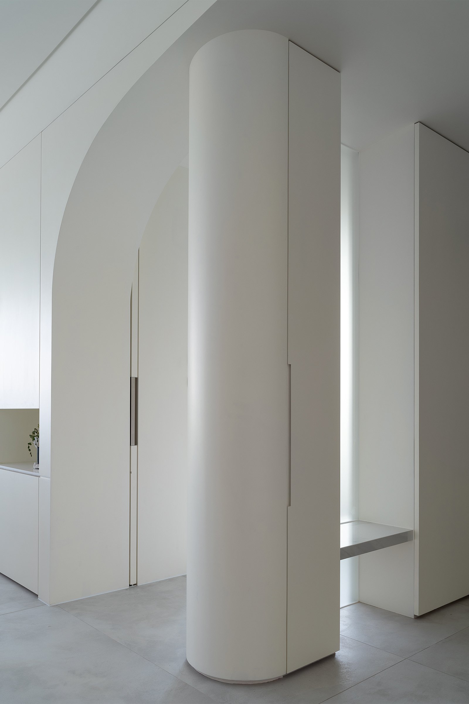
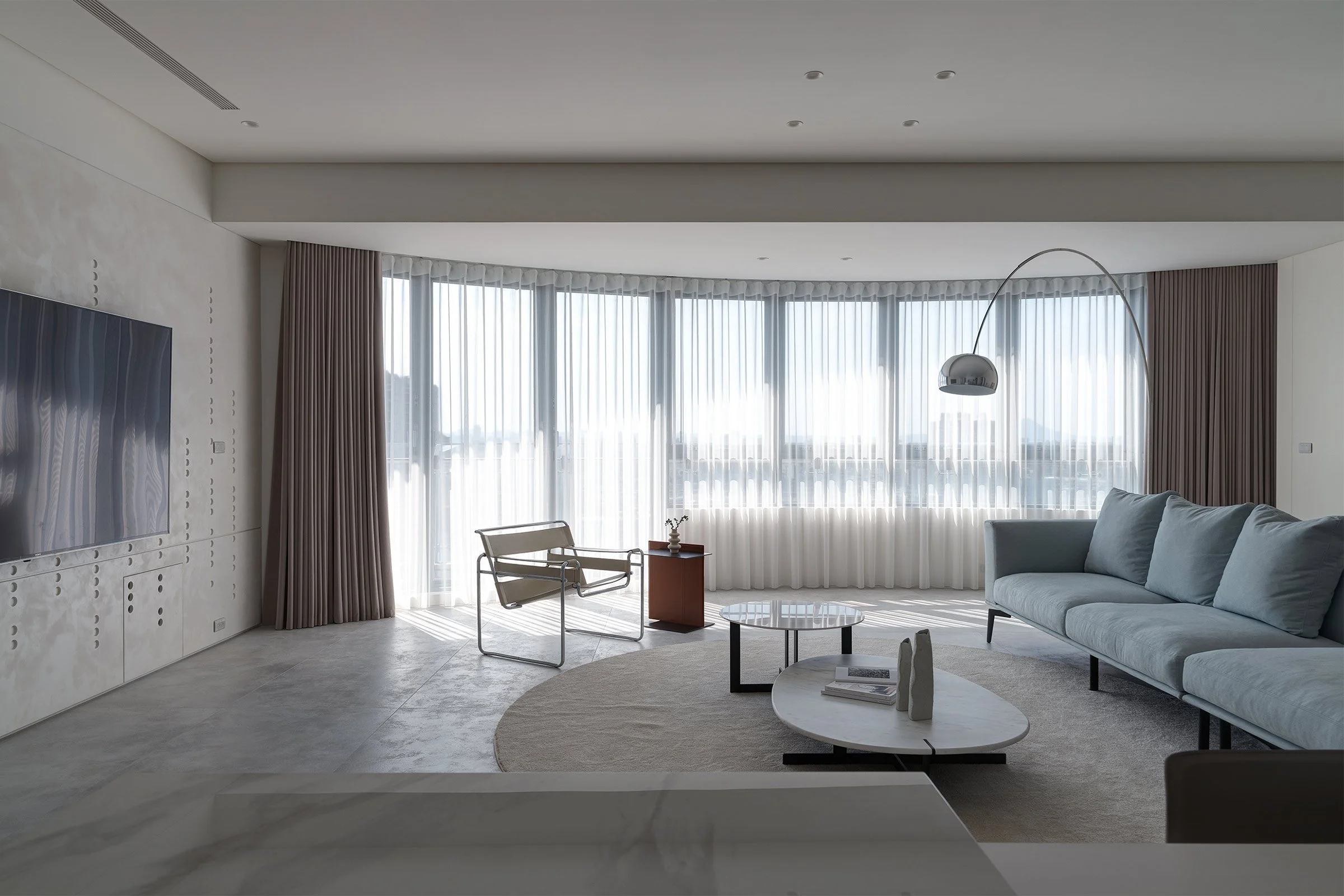
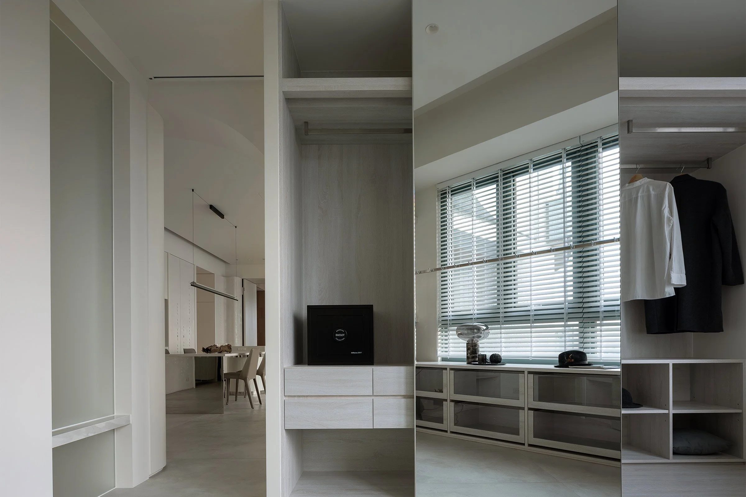
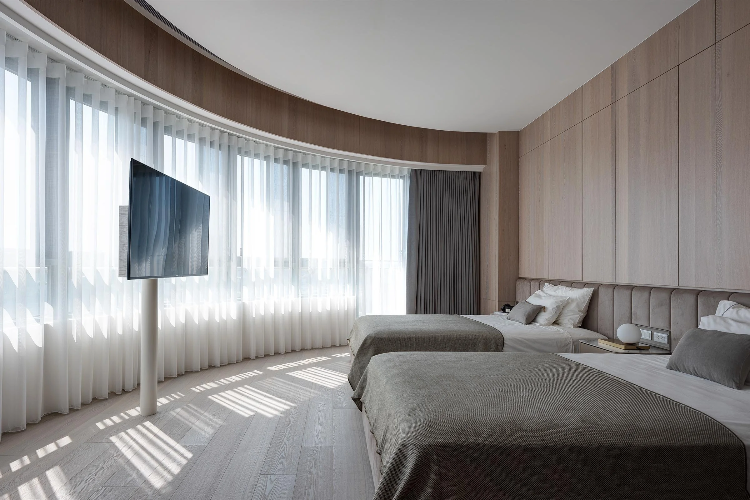
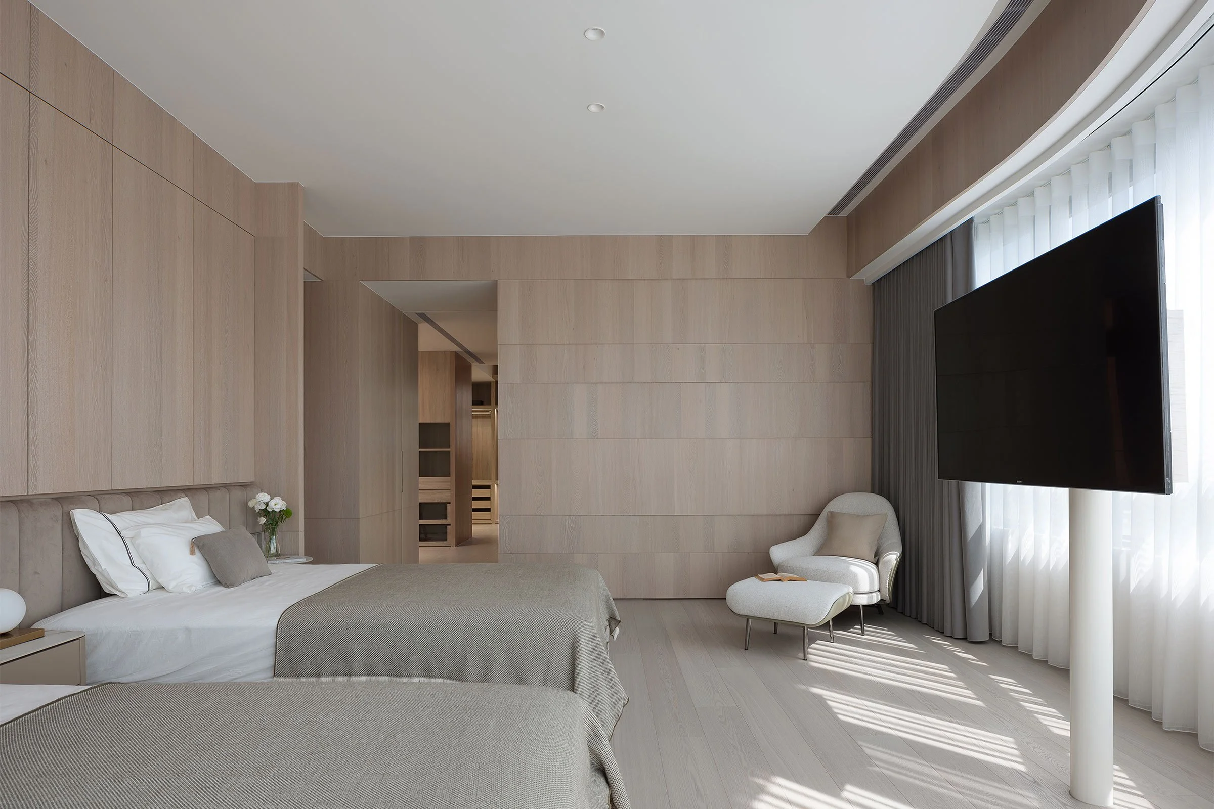
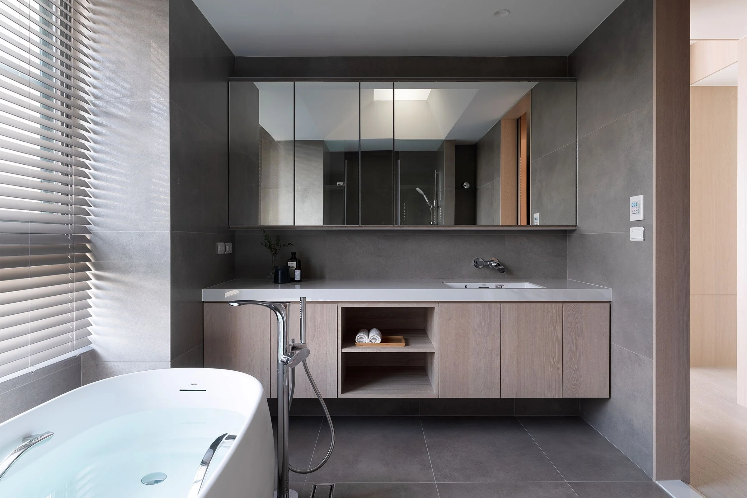
Upon entering the apartment, it’s the living room’s refined textures that first impress. The ceiling in the entrance was remodelled to create a sleek curved line. On the living room’s partition walls, we designed shallow flat-bottomed holes whose patterns resemble tree shadows, a subtle nod to the landscape of the river. We also love the timber private space which, when the light comes in, evokes the boundary between the river and its caves.
Images / Kyle Yu

