Material Harmony: Aesop Shanghai Jing'An Kerry Centre
Lanterns and circles are two central motifs in Aesop’s Jing An Kerry Centre store, for which the designers looked to the nearby Jing'an Temple for inspiration
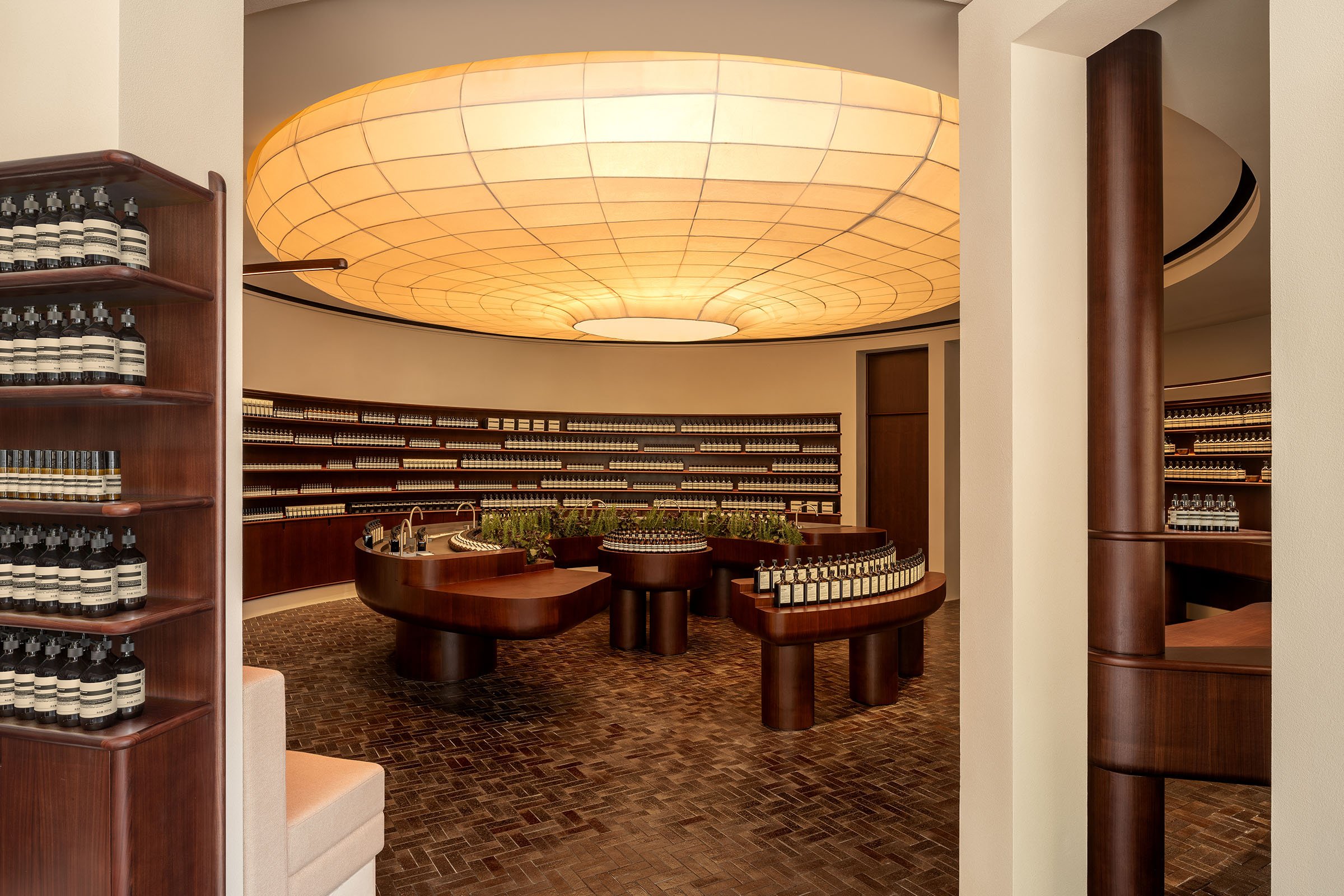
Located in the centre of Shanghai, Aesop’s fourth store in the city is on the ground floor of the Kohn Pedersen Fox-designed Jing An Kerry Centre. Designed by Aesop’s in-house team, the store draws references from Chinese culture and, looking to the nearby Jing'an Temple, was imagined as a retreat from the bustling shopping district of Nanjing Road West.
For the most part, the store is designed around two key motifs: the circle and the lantern. The circle is one of the most significant symbols in Chinese culture, and represents harmony and the balance of yin and yang. Here, the main room is a circular, chamber-like space — a cocoon within the store where customers can interact with assistants and products. The shape recurs elsewhere in the space — in the rounded counters, the timber plinth — establishing a sense of rhythm and pacing.
An oversized paper lantern hangs overhead, mirroring the circles below. Conceived as the focal point of the store, the piece is striking yet modest. Another reference to Chinese customs, the lantern was produced by local makers who used the traditional production method of tying the structure together with paper ribbons instead of welding or gluing. ‘The paper lanterns are a counterpoint to the sturdier elements of the store,’ says Marianne Lardilleux, Aesop’s head of store design. ‘They’re light and delicate, clearly linked to traditional culture but in unusual dimensions.’
The material palette of paper, stainless steel, ceramic and wood balances the local and traditional materials with the contemporary. And as with Aesop stores around the world, the material is often the message. Here, the recycled ceramic flooring was created in collaboration with Yi Design, a local company that collects ceramic waste material from factories in the ‘porcelain capital’ of Jingdezhen to create recycled ceramic bricks and tiles. The result is a surface that echoes the alleys of Shanghai’s Old City, but is made with an innovative material produced by crushing and compressing the waste.
And though perhaps unintentional, there’s a pleasing link between the concept of the circle, which defines the space, and the concept of circularity, which informs the material selection.
The tactility of the paper and ceramic is enhanced by the warmth of walnut timber furniture pieces, each invitingly round and soft. ‘The timber furniture was custom designed with the intention of exaggerating domestic qualities and proportions,’ says Lardilleux. ‘The rounded forms are linked to the idea of the circle and of conviviality, but they also look as if they might have been softened and eroded over time, like the cobblestones of a busy old street.’
More in this series
Aesop Hollywood Road
Traditions Upheld
Aesop Kichijoji
Building Community
Aesop Seochon
Open to All
Aesop Fashion Walk


