An Apartment with a Simple and Sophisticated Approach
Using monochrome tones and uncluttered surfaces, Indian firm ns*a Architecture and Interiors has transformed this Mumbai apartment into a comfortable space for easy living. Here Neesha Alwani and Shruti Jalan share more about how they used balance and harmony as a key driver
Design Anthology: How did you first meet the client?
Neesha Alwani (NA): They had visited another apartment we designed. Those clients spoke highly of our work and recommended they get in touch.
Can you tell us about them and their lifestyle?
Shruti Jalan (SJ): The clients are working professionals in their 50s. After a busy day at work in the city they wanted a retreat of sorts, where they could unwind and enjoy a quiet evening in each other’s company. The wife enjoys reading so we created a den as her hideaway, while the husband, who likes to entertain friends, requested a living and dining area that was comfortable and understated with a concealed bar. Overall, they were looking for a homely space where they could carry out both their individual and shared activities in comfort.
What was their brief to you for the project?
NA: They wanted a simple apartment that was cosy and exuded warmth; a space where they can find a sense of calm and retreat from the buzz and stress of city life. They wanted to convert the two-bedroom apartment into one, making provisions for a spacious secondary lounge cum den area that extends out onto the balcony.
What’s unique about the building and the location?
SJ: The apartment is tucked away in one of the lanes off Pedder Road, the main arterial road of South Mumbai.
How did you approach the project — what design references did you try to incorporate into the space?
NA: We approach every project with a fresh outlook, a process that involves composing new thoughts, concepts, functional requirements and aesthetic sensibilities. We always strive to create a unique language that meets the needs of the client.
These clients were clear about the kind of space they wanted, giving us direction while conceptualising the design for their home. The process was straightforward and we instantly knew that the house would be in monochromatic tones with clean surfaces as they wanted a sober palette that expressed harmonious and calm living.
What design references did you try to incorporate into the space?
SJ: The apartment is simplistic in nature and allows its inhabitants the freedom of relaxed and comfortable living. Keeping that in mind, we created spaces that are bright and airy with materials that are easy on the eye. The clients wanted a carefree and low maintenance lifestyle so we designed the spaces to be clutter free.
Can you tell us about the colour palette and materiality?
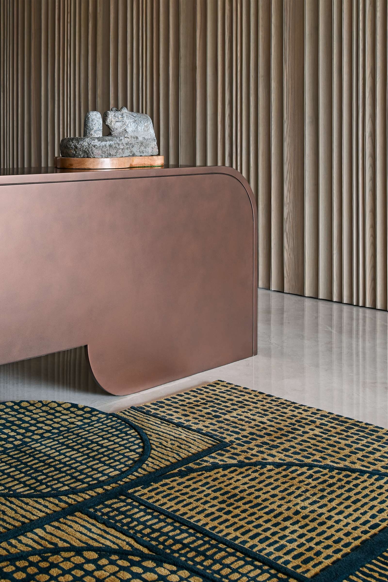
NA: The monochromatic interiors of the apartment feature shades of ivory, beige, smoked ash and burnished copper in varied textures. The uniformity of the colour scheme helps make it feel cosy and clean, and the neutral canvas allows the architectural details and organic elements to stand out. The apartment is minimalist and harmonious in nature. Every object in the space carries a purpose.
Do you have a favourite element or design detail in the architecture or interiors?
SJ: At the entry there’s a long wall made from ribbed smoked ash-wood in an irregular texture. The surface extends onto a panel that conceals a hidden bar. The panels and console are finished in a burnished copper matt PU that gives the dining area a unique character and acts as a dramatic backdrop for the chaise longue.
Images / Suleiman Merchant


