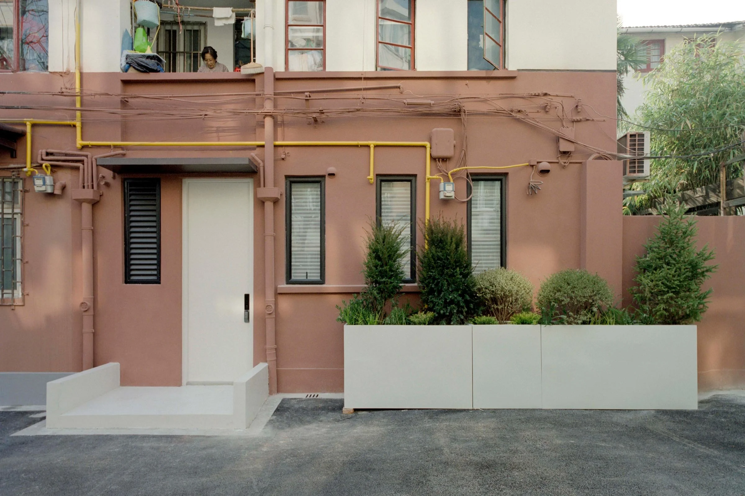
A Narrow and Neat Family Home in Shanghai
In Shanghai’s former French Concession, local studio Offhand Practice turned this narrow apartment into a bright and cleverly designed family home. Here studio co-founders Yuan Yuan and Nie Xuan explain their approach
Design Anthology: Who are the clients and how did you first meet them?
Nie Xuan (NX): The clients reached out to us online after visiting a few of our projects in Shanghai. They’re a couple with a young child, and they wanted a cosy, modern and functional home, within a reasonable budget. They cook often and like to entertain friends at home.
What was their brief to you for the project?
Yuan Yuan (YY): They wanted the 65-square-metre space to include two comfortable bedrooms, two bathrooms, a living room, a dining room and a kitchen, and suggested some ideas to us. Meeting the family’s storage space requirements was also a must.
What’s unique about the building and the location?
NX: The building is located on Taian Road in the heart of Shanghai’s former French Concession. From the early 1980s to the mid-1990s, the government built a lot of public housing in the city centre, including the building in which this apartment is located.
The unit is on the first floor, so almost all of the interior walls are load-bearing. Fortunately though, there are a few windows on the south and north sides, and the building is surrounded by trees.
How did you approach the project — what design references did you try to incorporate into the space?
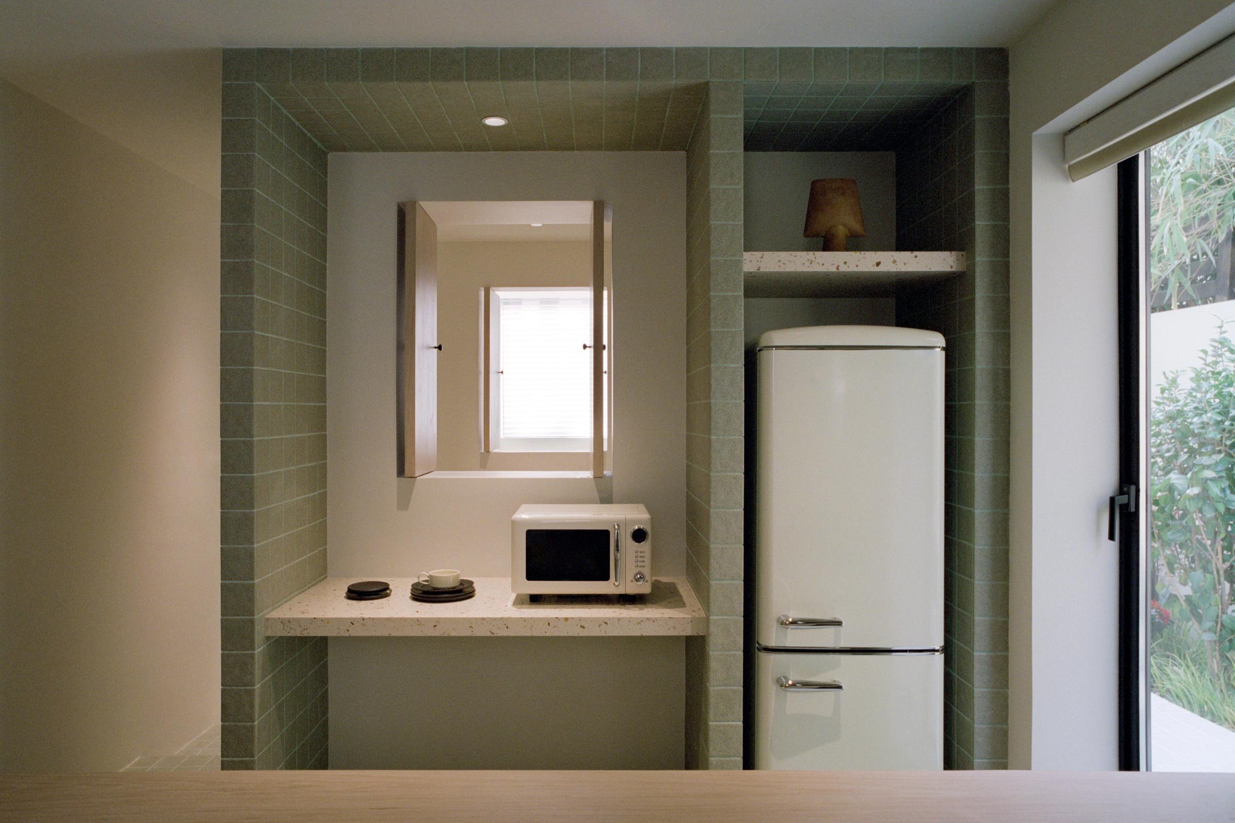
YY: The design concept grew from the site’s original condition. We were able to extend two windows along the southern wall to bring more natural light into the interior, and we then used this as the starting point for the design, carving windows into the internal walls of each space to create natural air flow throughout. The layering of windows creates the illusion that the interior extends infinitely, visually enlarging the narrow space.
Please tell us a little about the material choices for the space.
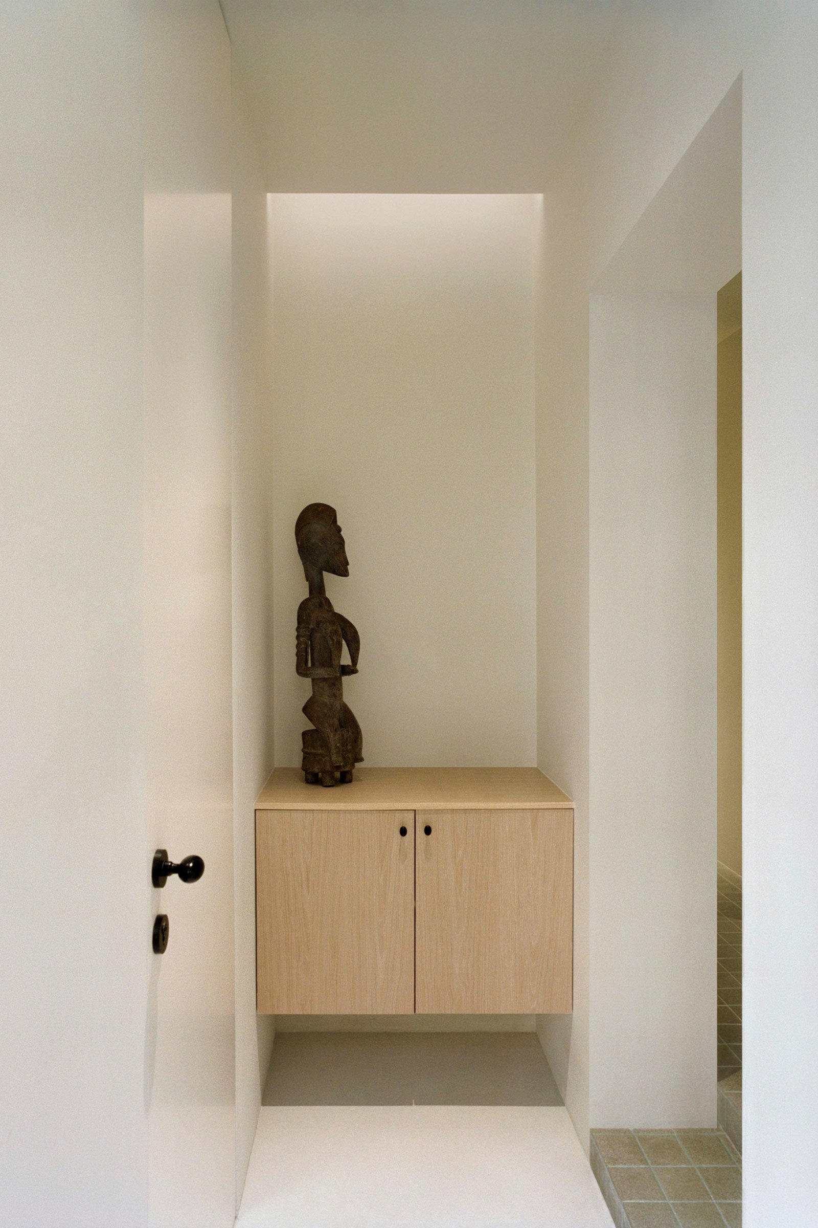
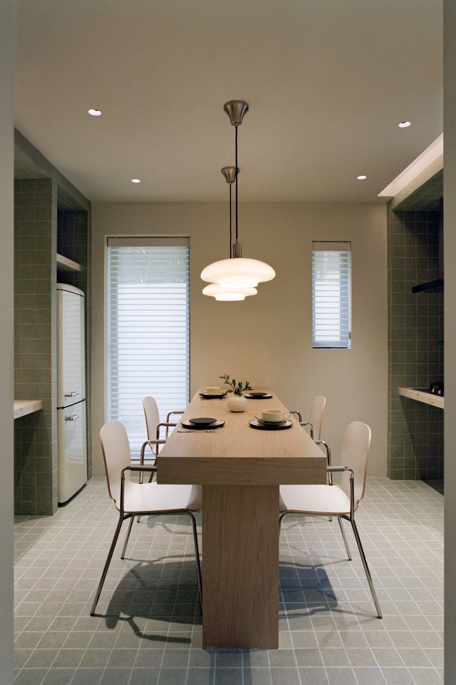
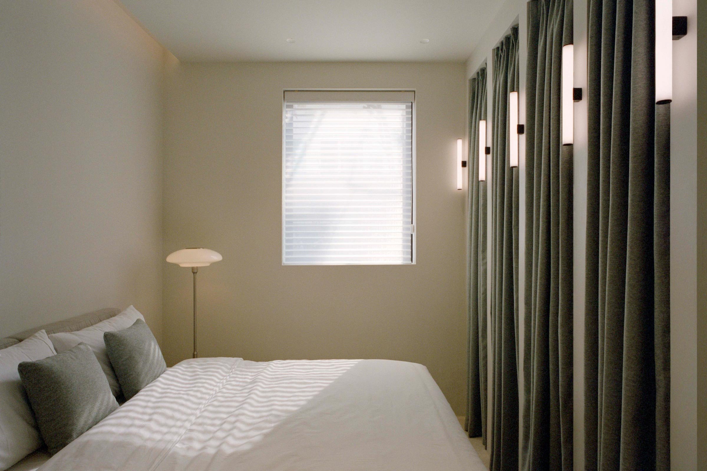
NX: We chose green ceramic tiles, like the ones commonly used to pave local public squares, as one of the main materials, since they’re reasonably priced and easy to install. For the bathrooms, we designed small mosaics that make the space light and bright. All of the built-in furniture is custom designed, including the dining table, the bed frames, the sofa, the wardrobe and the cabinets. The custom wooden pieces are made of warm oak, which brings a sense of balance to the space.
Do you have a favourite element or design detail in the interiors?
NX: We really like the solid green platform, which we designed to give the space a sense of rhythm. This platform runs across the whole space and into tables, shelves, counters and seating, making the home look and feel continuous and integrated.
Images / Yanyun Hu


