Serene Dining at Chao Restaurant
Chao Restaurant in Shanghai was designed by Atelier xy to be an elegant reprieve from the city, offering guests a calm, quiet dining experience. Studio co-founder Yuyang Wang tells us more about the project
Design Anthology: How did you first meet the client?
Yuyang Wang: We’ve worked with this client on a couple of projects before. Two years ago, he came to us after seeing a project we had completed. He showed us their other projects and we spent some time getting to know each other, and after that we began working on our first project together. Since then, we have worked together on several more projects.
What was the client’s brief to you for the project?
They wanted a restaurant that’s light in colour yet elegant and rich in Chinese aesthetics. Furthermore, the restaurant had to be very functional and usable. The three-floor restaurant has a ground-floor entrance on the ground floor and two dining rooms on the second and third floors.
Where is the restaurant and what makes the location unique?
The restaurant is in Shanghai’s Minhang District. The site is quite ordinary, but the good thing is that there are a few tall sycamore trees, which provide nice greenery for the restaurant. They also help to block out the hustle and bustle of the city.
How did you approach the project — what design references or narrative did you try to incorporate into the space?
Instead of the bustling, dense city routine, Chao Restaurant delivers a quiet, everyday experience. Away from the city, we’re created a quiet and comfortable experience for the modern city dweller.
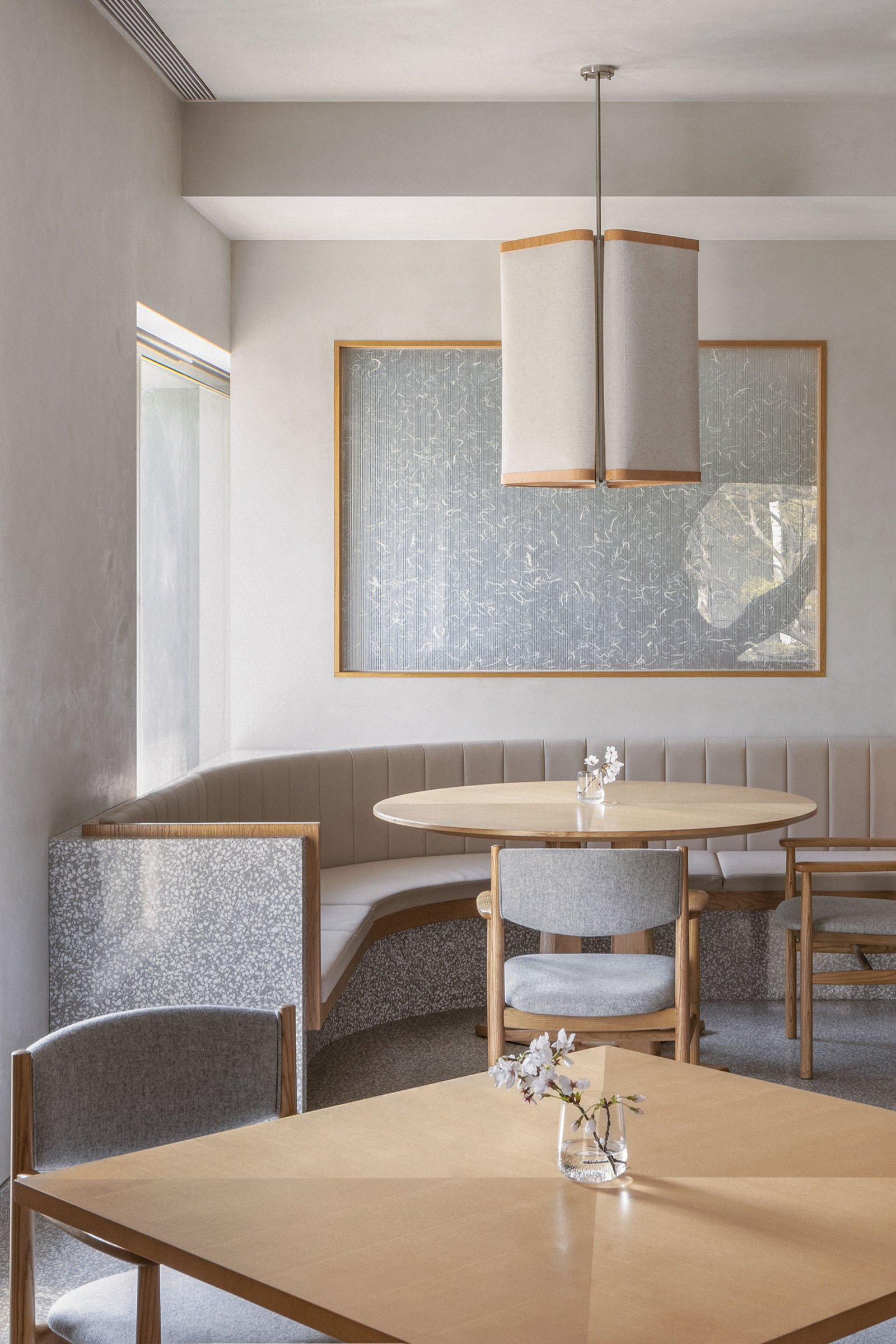
The design of the restaurant doesn’t stick to traditional Chinese details, but it carries the beauty of Chinese design, with a new balance and beauty brought forth with different spatial layers. The use of neutral colours helps reduce noise, both visually and literally, helping to maintain an elegant dining atmosphere.
We designed furniture and lamps with symbolic motifs such as flower petals and butterfly wings, which, with the help of the pieces’ lines and curved surfaces, are arranged and combined to create shapes like flowers and butterflies.
We used both hard and soft materials in light, warm colours. Opaque materials such as light oak, beige textured paint and light grey terrazzo are combined with translucent materials like embossed glass, transparent fabrics and Chinese rice paper.
Images by half.half.photography


