ST. ALi & The Queen Embraces a Communal European Feel
Fiona Lynch Office’s latest collaboration with coffee icon ST. ALi affectionately highlights the history and community of Melbourne’s Queen Victoria Market. Director Fiona Lynch tells us more
Design Anthology: How did you first meet the client?
Fiona Lynch: We’ve worked with Salvatore Malatesta, the founder of the famed St. ALi coffee brand, previously on ST. ALi’s other venues, where we’ve enjoyed interpreting his artisanal coffee brand into the opportunities afforded by the various sites. While each project is unique, creating diverse experiences for the brand’s devotees, the restrained but inspiring design, where the natural materials shine, has been a consistent thread.
What was the brief to you for the project?
This project was particularly exciting because it brings together two hospitality powerhouses with ST. ALi and Orlando Marzo, the award-winning mixologist, collaborating on the coffee-meets-cocktails concept. So the brief was to design a space that caters to the day-to-night experience and effortlessly transitions from casual dining to a sophisticated aperitivo and cocktail venue.
What’s great about the neighbourhood and what makes the location unique?
The venue is part of the Munro site community hub, a major part of the rejuvenation of the iconic Queen Victoria Market, and overlooks the market’s Food Hall. Given the location in this eclectic part of Melbourne’s CBD, where you have students, tourists, market goers, city residents and local office workers, we aimed to create an inclusive and flexible venue. The rejuvenation of the market is set to bring a new chapter and energy to this part of the city, and the Munro site is a significant mixed-use development that contributes to this vision, which we’re thrilled to be a part of.
How did you approach the project? What design references or narrative did you try to incorporate?
We took inspiration from the original market’s sleek aluminium and stone Food Hall. That has inspired the rational and bold design language. The vibrant community of the market and the client’s Italian roots were also an inspiration in the warm and welcoming feel that we set to create, which, in turn, informed our choice of materials.
Tell us about the material choices.
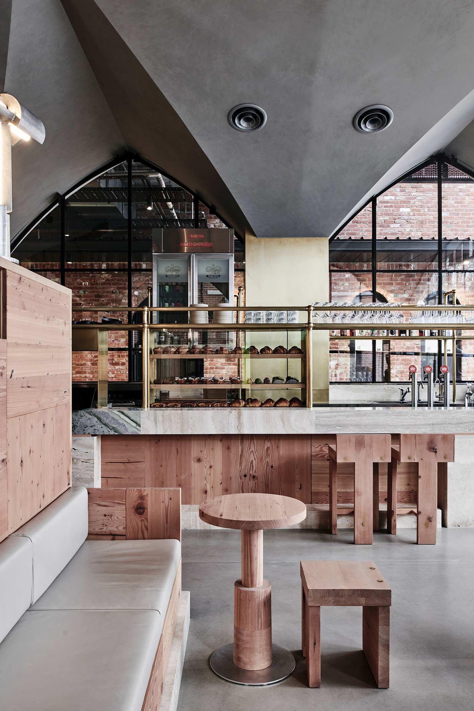
We narrowed it to three primary materials of raw wood, stone and brass. The reclaimed Oregon throughout is a sustainable choice that exudes warmth and tactility and makes you want to linger in the space. Blocks of cream and grey travertine and green-hued Afrodite stone on the counter inject colour and pattern, with brass joinery adding highlight textures.
Tell us about some of the custom pieces.
All furniture and shelving was custom-designed for the space. We’ve been collaborating with Ross Thompson, the accomplished Geelong furniture maker, on other projects and were really excited to develop this range that was so raw and honest in both its design and the materiality of reclaimed Oregon. Our custom counter light is another result of an ongoing collaboration with Melbourne’s Volker Haug lighting design studio.
Do you have a favourite element or design detail?
The bar was inspired by my travel experiences and one particular memory of a stallholder at a Parisian market, serving out her specialty soup to the local regulars. It’s that spirit of warm hospitality that we wanted to evoke in the design of the bar. Defined openings for the bar stools are designed for the customers to chat with the staff while they move between the cafe’s counter and the takeaway window. We selected Aphrodite marble for this highlight bar for its dramatic effect and elevated European feel.
What other features are you most excited about?
The site provided us with an opportunity and inspiration to be creative with the seating design. Having the iconic market right opposite inspired the design of the bench seats that are outwardly facing and embrace the atmosphere of the market in a true European style. The movable stools, on the other hand, are flexible and can be grouped together for a more social feel.
Images by Tom Blachford


