Sweet Escape
Taiwanese chocolate brand Yu Chocolatier’s new Taipei store, designed by studio VVHH’s design director Chun Wei Tsai and chief designer Hsieh Hsin Hui, is an ode to the artisanal process of chocolate making. Here Chun Wei Tsai tells us more about their creative process for the project
Design Anthology: How did you first meet the client?
Chun Wei Tsai: We first collaborated with Yu Chocolatier five years ago. After winning several international chocolate competitions, the brand expanded and sought to re-establish itself at its original location, hence this new collaboration.
Where is the store and what makes the location unique?
The 50-square-metre store is located in a quiet alley close to a boulevard in downtown Taipei, Taiwan.
The design blends harmoniously with the neighbourhood. In the daytime, the reflection of the trees on the windows becomes part of the store’s scenery, and in the evening, the counter glows against the dark background.
How did you approach the project — what design references or narrative did you try to incorporate into the space?
Inspired by the chocolate-making process, we tried to emulate the products’ geometric shapes for the design elements. Using deconstructed and reconstructed elements, the space has a layered geometry meant to be experienced from different angles.
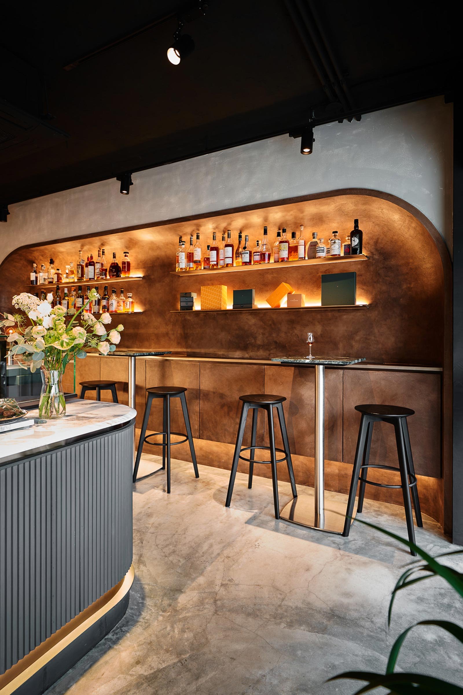
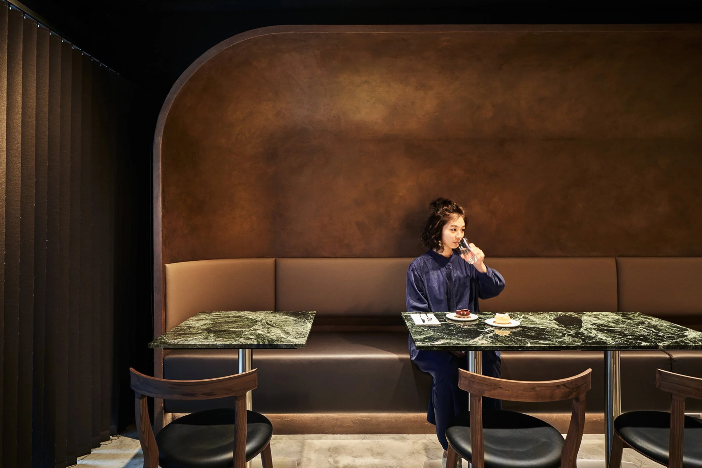
The colour palette and materials used for the concave walls on each side were chosen to represent chocolate. The three-sided counter in the centre of the space was designed with an open layout to ensure that each corner of the shop is served.
The store’s design also blends subtly with the brand’s logo: the black and grey background and the partially retained green-tiled walls from the original store highlight the brand’s colours.
Please tell us a little about the material choices for the space.
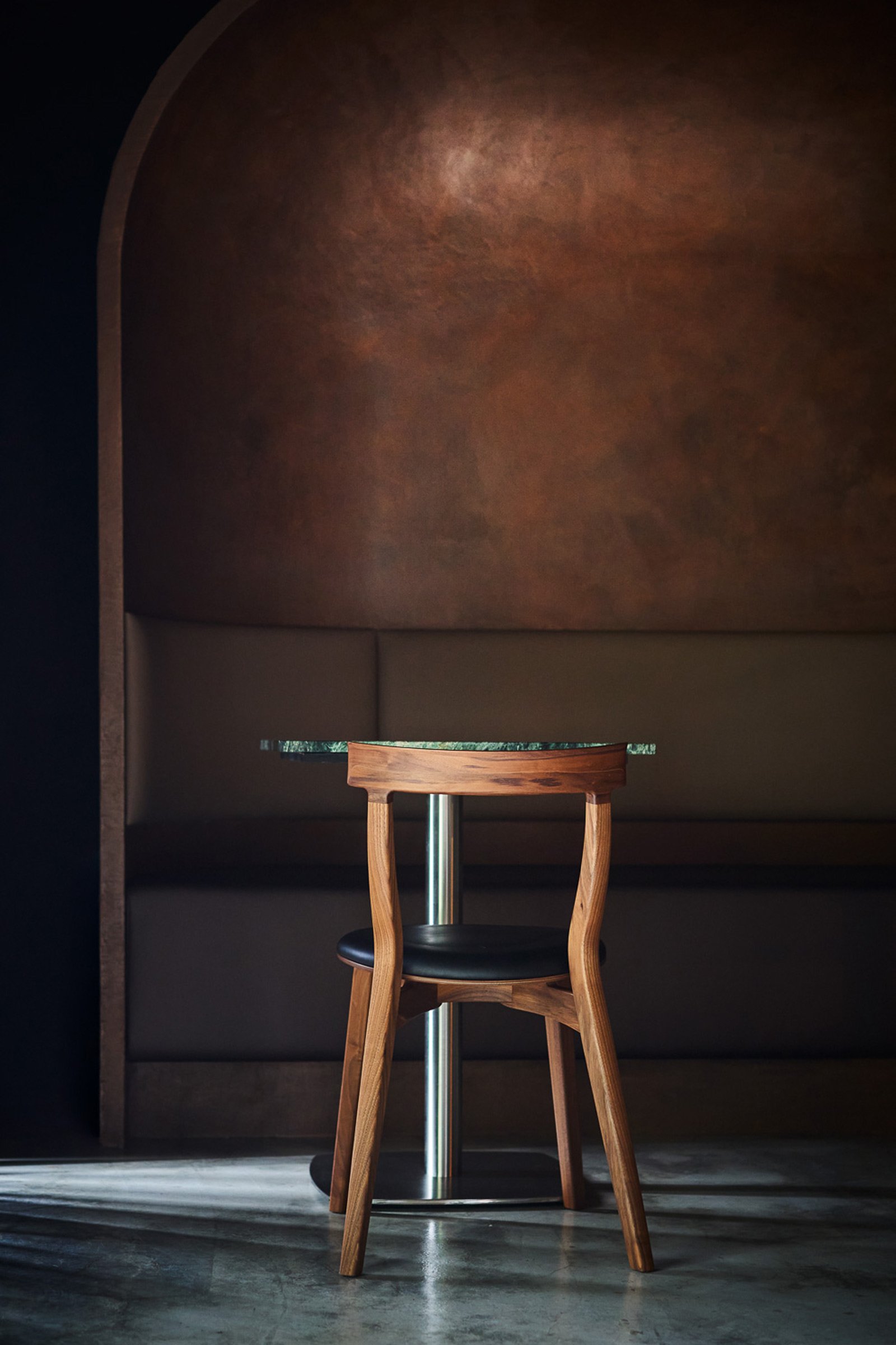
We used local materials to echo the brand’s efforts in incorporating Taiwanese ingredients in their products. We sourced green serpentine marble from eastern Taiwan to make the dining tables, while the dining chairs are from a Taiwanese brand and made of local wood.
Do you have a favourite element or design detail in the interiors?
We designed the space to be like cutting through chocolate, and the counter is the inner centre, with a deep brown-black background reminiscent of smooth liquid chocolate. The natural materials accentuate the artisanal products while geometric lines echo the shapes of the chocolates.
By strengthening the connection between the space and the products, our design creates a complete experience for visitors.
Images / Hey!Cheese


