A Glass House that Embraces Nature
Just outside of Bangkok, this modern home by architecture and interiors studio ANONYM is nestled within a lush shared property that inspired its outward-focused design. Studio co-founder and design director Phongphat Ueasangkhomset tells us more about the design process
Design Anthology: How did you first meet the client?
Phongphat Ueasangkhomset: The clients own a real estate development company. After we met with them for a new development project, they asked us if we’d like to help them with their new home as well. They had already developed seven designs for the house before we got involved, but none of them fit with their lifestyle and they couldn’t make up their mind in order to start construction.
Can you tell us about them and their lifestyle?
They’re a very active couple in their late thirties and early forties, with a hardworking yet fun and cheerful nature. The wife used to be a DJ and MC for an international music channel. They both love fashion, art and music.
What was their brief to you for the project?
The house is part of an existing family property that already included a main house and a kindergarten owned by the family. They wanted some privacy, but the house still had to be connected to the main house and the shared garden. It also had to represent the face of their business.
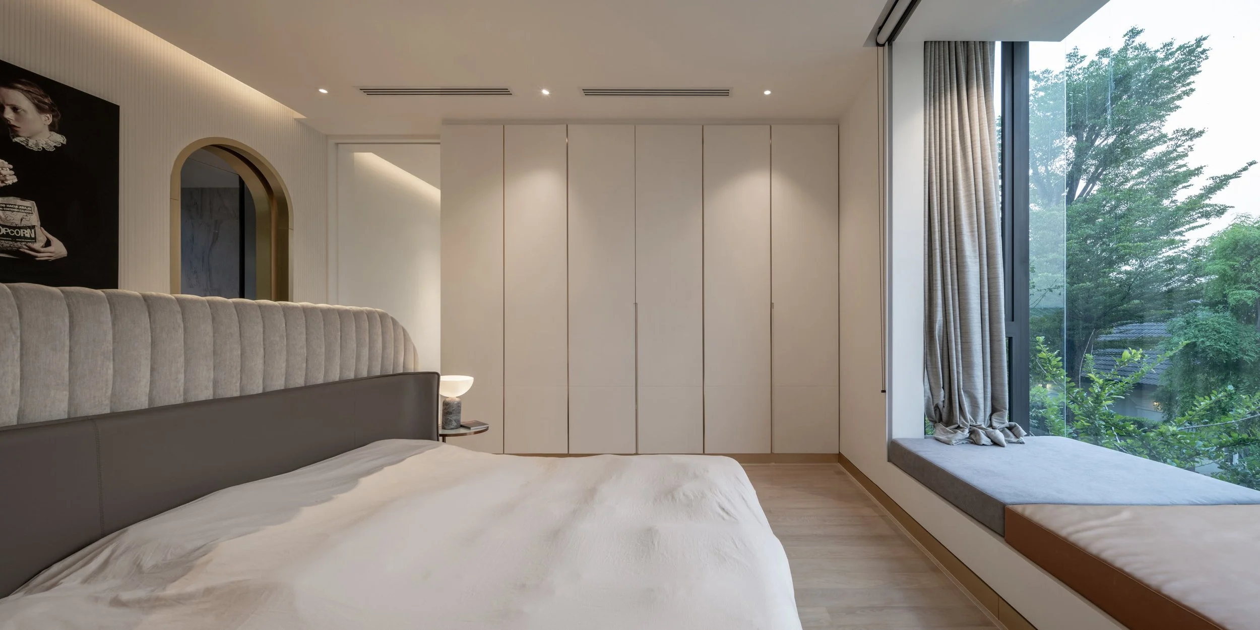
Special requests included a big kitchen with a breakfast corner, two very large separate closets, a bay window seat (where the wife can read while watching her husband playing with their dogs on the terrace), a fully equipped gym, an outdoor shower, a large wall to hang art and fun furniture.
What’s unique about the building and the location?
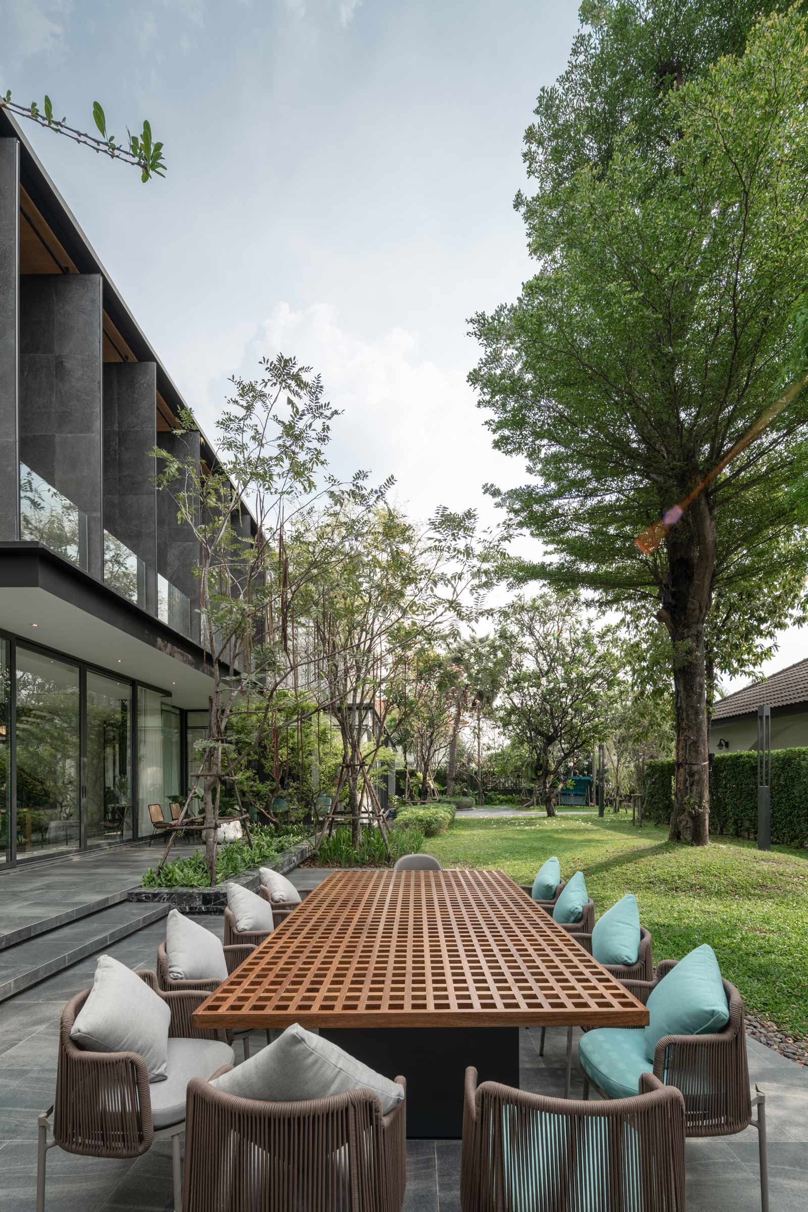
The 1,000-square-metre house is built in a narrow line running from north to south, and connects to the main house via an existing courtyard and garden, which are shared between the two houses. The building’s western facade has double-height glazing and is exposed to direct sunlight. The trees and the fins on the courtyard help to screen the heat, while windows on the east and west sides let the breeze in.
How did you approach the project — what design references did you try to incorporate into the space?
Our starting point for the design focused on the context and the orientation of the house, and the relationships between the buildings and the users — the members of the two families, and the children and staff from the kindergarten.
Please tell us a little about the material choices for the space.
The clients had stocks of tiles and stones that we could use. We also reused steel structures from their previous sales offices to build the house. This helped with the budget and allowed us to reduced waste.
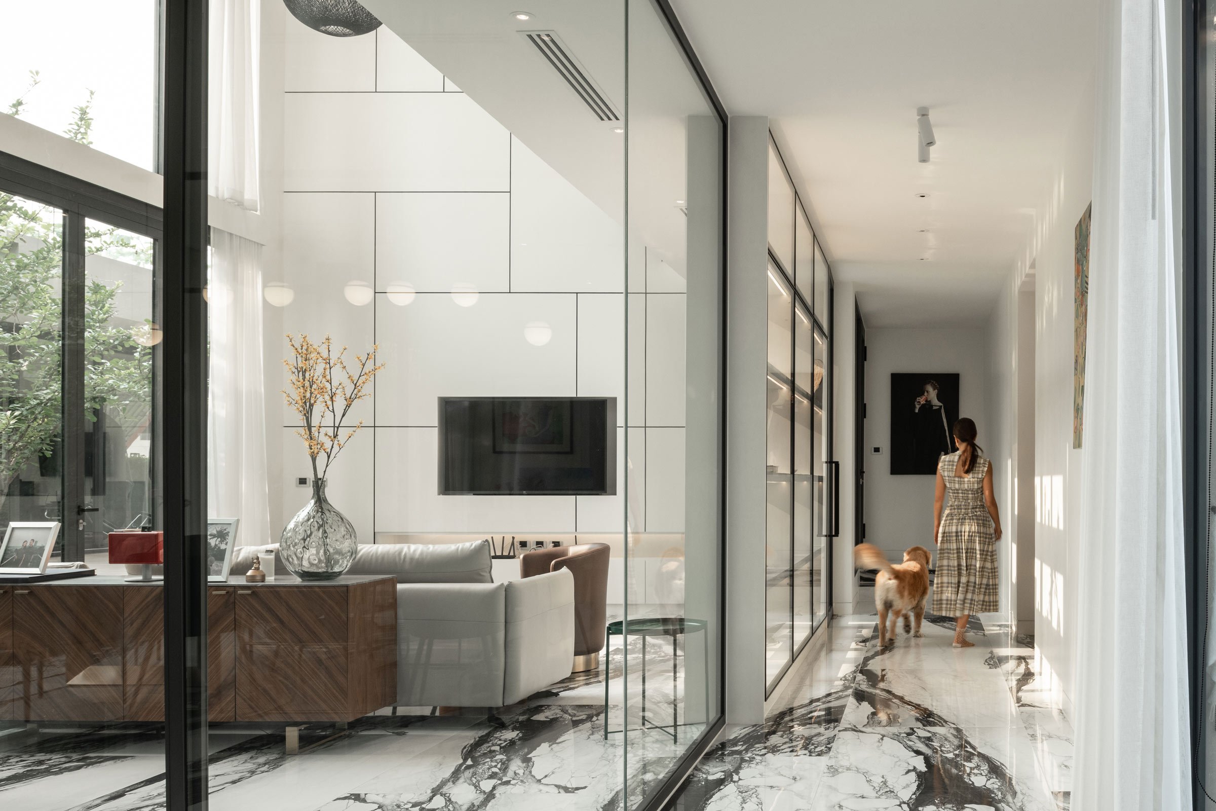
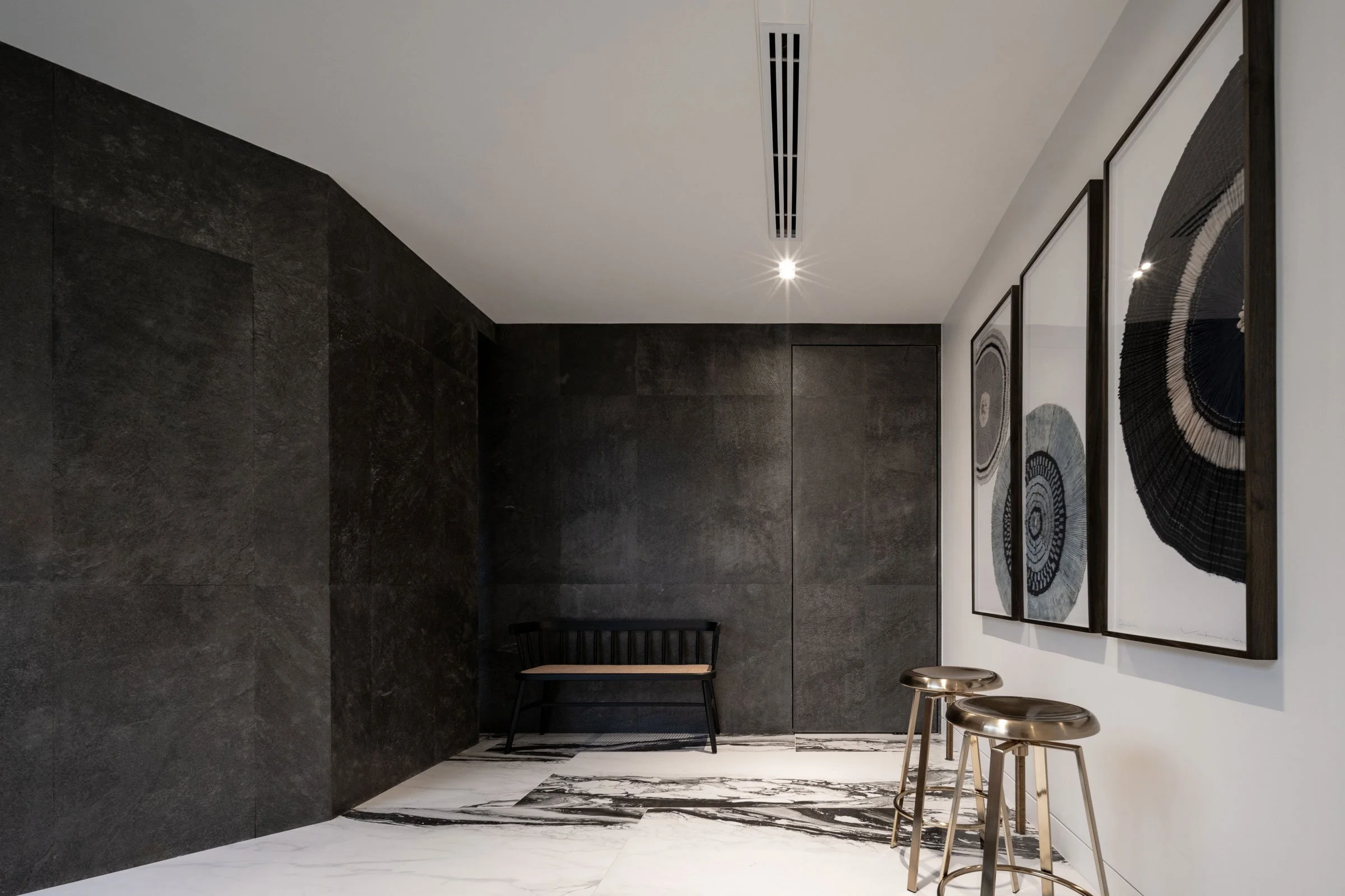
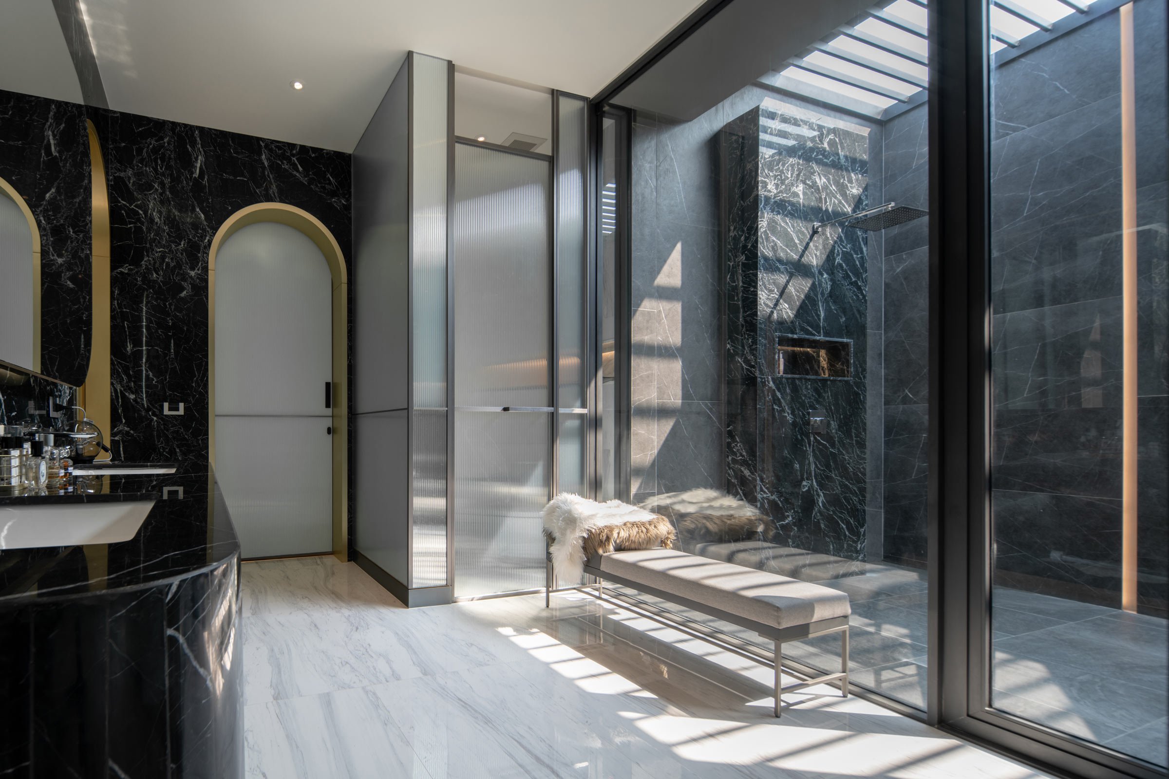
The main colours are black, white and grey, which we combined with different textures like stainless steel, high-gloss paint, marble, slate veneer and glass. We added some timber elements and chose playful colours for the furniture to bring some warmth.
Which of the pieces are custom designed?
We designed the perforated pattern and folded shape of the aluminium envelope that wraps the second-floor terrace on the south-west wing; this facade acts as a protective layer for security and privacy. We developed several timber designs for this structure but the clients ended up choosing aluminium for maintenance purposes. We wanted the terrace’s fins to be very thin and still have a stone-like texture, so we ended up using stone-veneer cladding on a steel structure to achieve the sleek effect that we wanted.
Do you have a favourite element or design detail in the architecture or interiors?
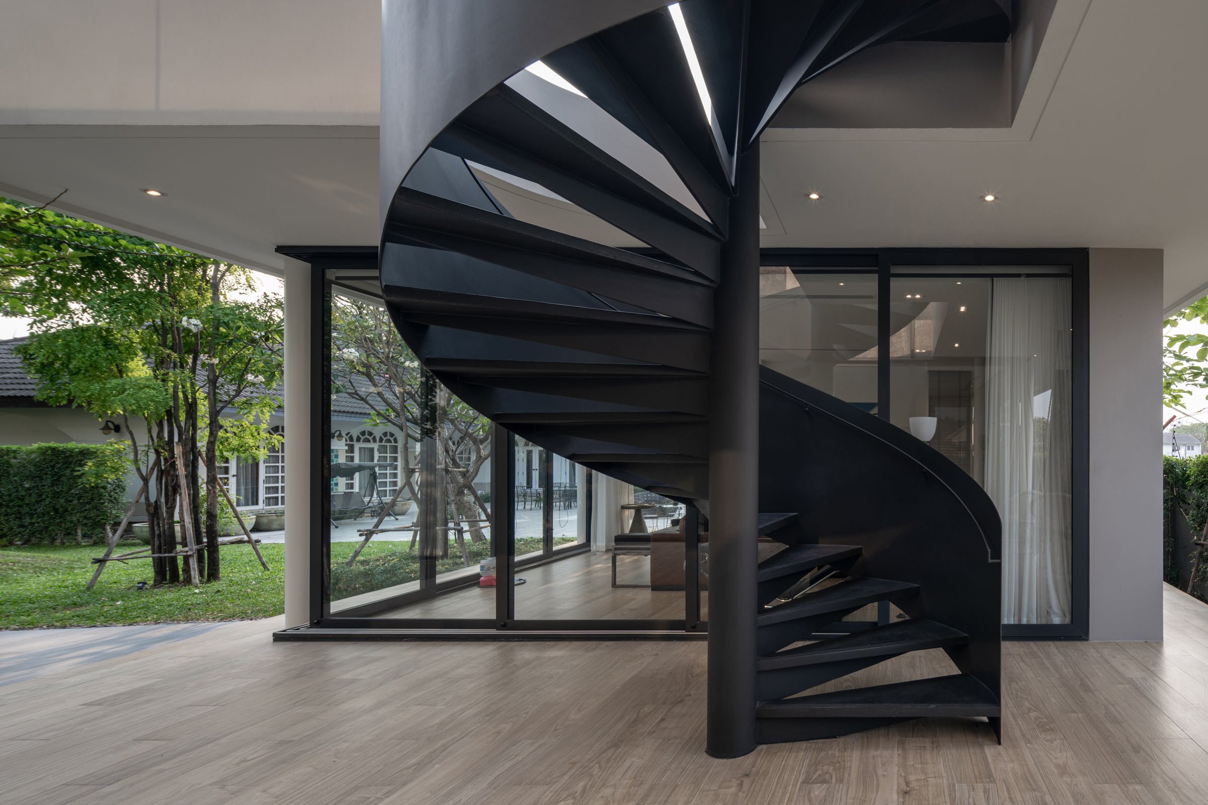
Our favourite interior pieces are the staircase details and the television wall in the master suite, which both showcase refined carpentry skills. These details have to be seen up close as they reveal themselves in the sunlight.
Images / DOF Sky|Ground
