A Look Inside Maroon Optique
In Kuala Lumpur, Maroon Optique’s Taman Tun Dr. Ismail store privileges material and craft, with swathes of stone, plywood and steel and intriguing details. Here Wuuu Studio director Dom Tee tells us more about the project
Design Anthology: How did you first meet the client?
Dom Tee: We first met the client through their branding consultant. We hit it off immediately and quickly became part of their retail branding and design consulting team, working in tandem with the lead branding designer.
What was their brief to you for the project?
The client has a bold ambition to challenge the status quo of optical stores in the local market, so our design direction revolved around ways to elevate the brand image. We decided very early on to emphasise craft as a reflection of Maroon Optique’s bespoke glasses offering, and to create a space where this craft meets innovation and artistry.
What’s great about the store’s neighbourhood and what makes the location unique?
Compared to other upscale neighbourhoods in Kuala Lumpur, such as Mont Kiara and Bangsar, Taman Tun Dr. Ismail (TTDI) is one of the best-kept real estate secrets for those who want some quiet from the cacophony of the city. TTDI sits on the western side of Kiara Hill and its residents tend to have an affinity for urban history and modern architecture.
How did you approach the project — what design references or narrative did you try to incorporate into the space?
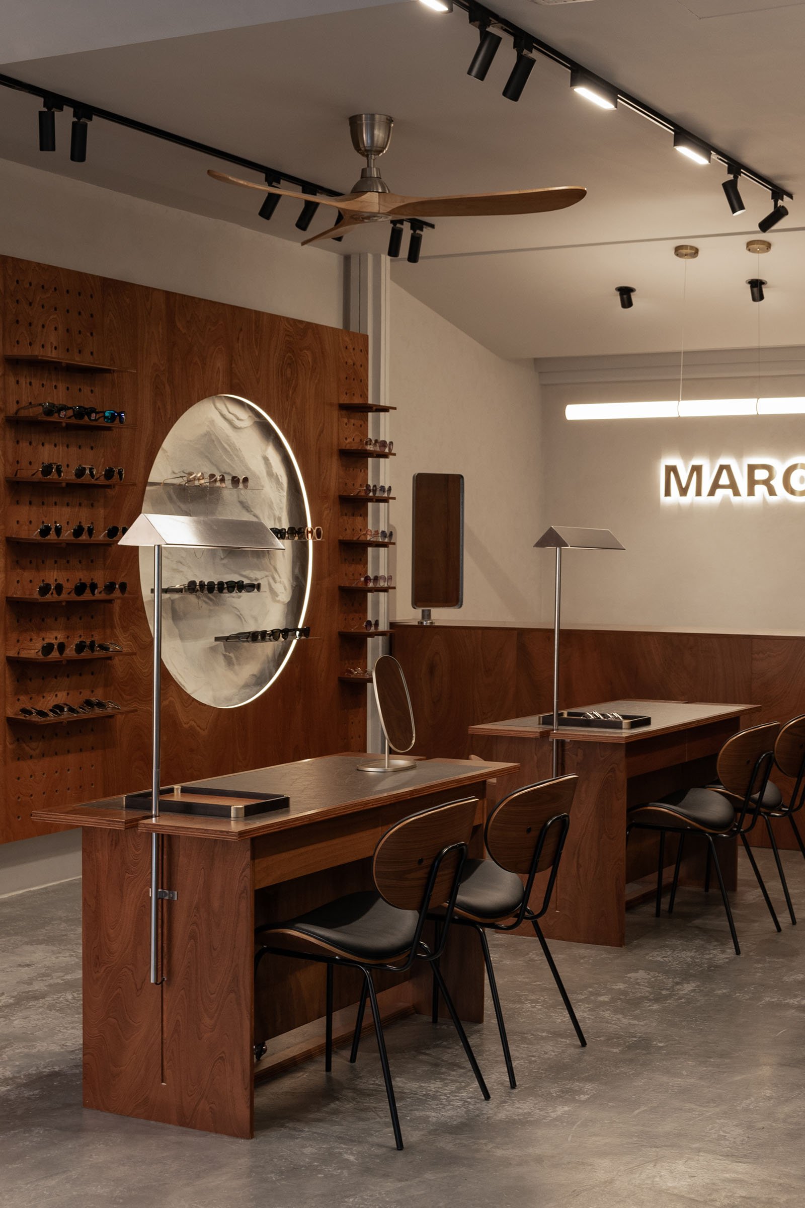
The underlying principle that guides all our works has always been minimalism, but we enjoy putting playful twists into all our projects. Other than celebrating the artistry of craft, another important narrative was exploring the tension between nature and order, which is represented by the different materials we used throughout the space: stone, processed wood and stainless steel. In the store you will also find formal references to the works of Scarpa and Kahn, who we feel are important pioneers of such designs.
Which of the pieces are custom designed?
We designed a couple of discussion tables as practical centrepieces in the store. These tables were assembled and interlocked together from plywood pieces. At the side of each table, we customised a stainless-steel table lamp that is attached to the table legs with a simple brace. This detail is exposed and further accentuated with a deep niche on the tabletop and a groove line along the table legs.
Do you have a favourite element or design detail in the architecture or interiors?
My favourite design detail has to be the main display wall, with two circular voids in which we designed a series of floating metal shelves suspended against a stone backdrop. I think the feature wall encapsulates our primary design idea for the project, which is exploring those interesting contrasts between nature and order.
What other features are you most excited about?
Another notable feature that comes to mind is how we drew attention from the street by inserting a break in the shopfront. We angled the entrance and created two different planes. On the left side sits a massive stone with floating metal display shelves; on the right side, a bench cum planter box protrudes through the glass wall and extends into the interior space. The angular intervention gives the otherwise sterile shopfront typology an intimate foyer, which we felt was a great touch to the visiting experience.
Images by TWJPTO


