A Quiet Place
Realised by Intrinsic Designs, this Ahmedabad apartment is characterised by earthy materials and colours, with pared-back spaces as calming as they are timeless. Chief architect Shivraj Patel shares more about his team’s approach
Design Anthology: How did you first meet the client?
Shivraj Patel: The client saw our work on our Instagram page, and they dropped us an inquiry to see if we could help them design their new apartment.
Can you tell us about them and their lifestyle?
The clients are a young couple in their mid-30s. They both own their own businesses, and outside of work they lead a simple lifestyle and enjoy staying home on weekends.
What was their brief to you for the project?
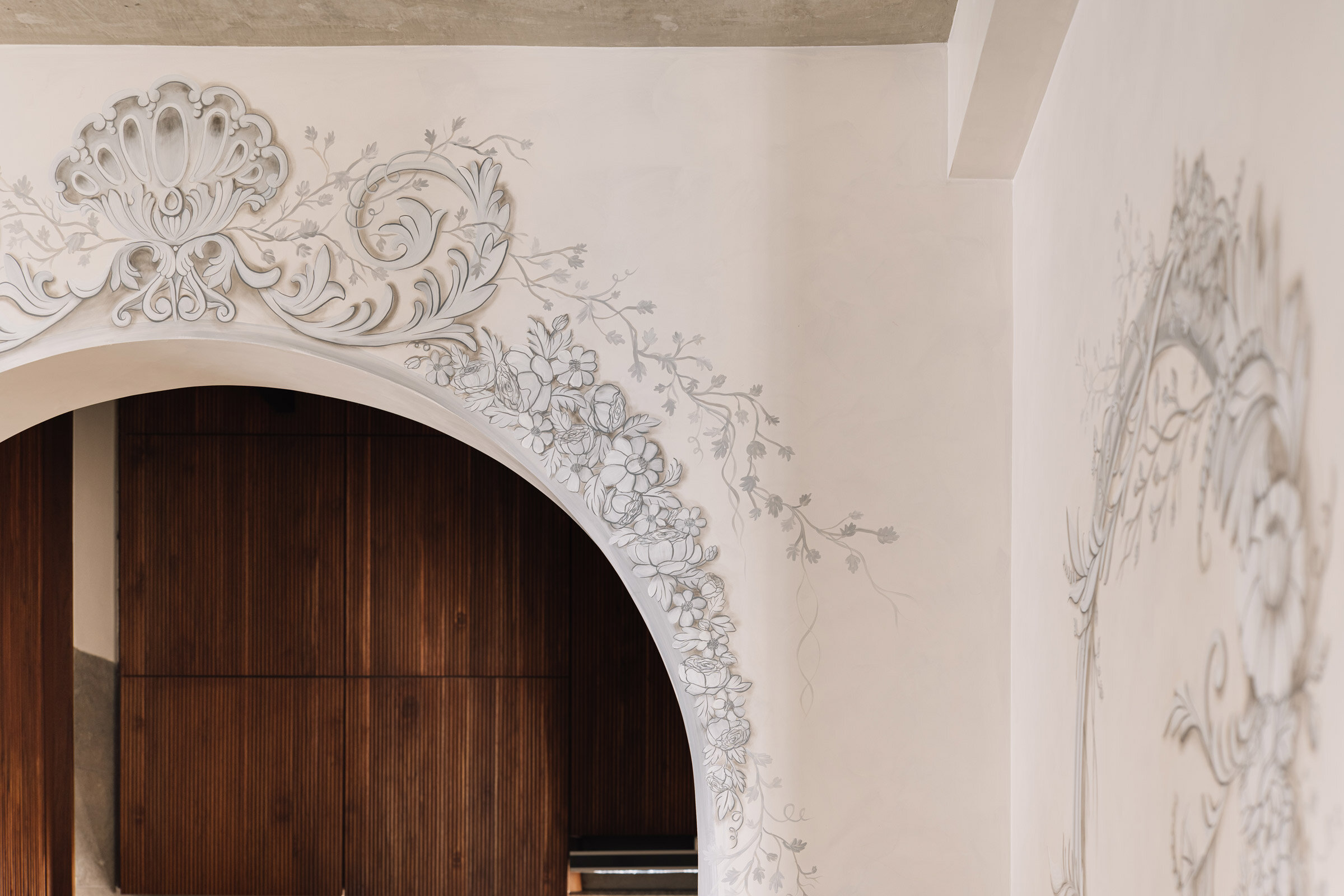
The couple wanted a simple and minimalist home, a clutter-free space that allows them to move easily within the apartment. They wanted to convert the 170-square-metre apartment’s four-bedroom layout into three bedrooms by turning the master bedroom a master suite. They wanted simple yet creative bespoke furniture, which is thoughtfully designed according to their needs. Extremely influenced by European art, the clients love trompe l'oeil art and wanted to incorporate it in their home. We were asked to avoid using too many colours and to use an earthy pallet instead. Their love for classical elements can be seen throughout the house.
How did you approach the project — what design references did you try to incorporate into the space?
We started with a neutral palette and an emphasis on natural light. In the living room, we selected a burgundy sofa to anchor the otherwise ethereal space, where diffused natural light comes through sheer curtains. There’s a custom-designed coffee table, and other handpicked and customised elements include a sculptural black pot and a textured beige hemp rug — a nice contrast again the rich Dyna marble floor.
Extending from the living room, the five-metre-long TV unit is a sleek wooden element capped with a terrazzo-style marble top. This creates a sense of linearity while providing additional surface area. The dining area echoes the stark palette, apart from the wall art, with the woven cane of the Cesca chairs adding another a hint of the rustic. Similarly, the kitchen’s minimal and neutral palette is softened by an arched entrance.
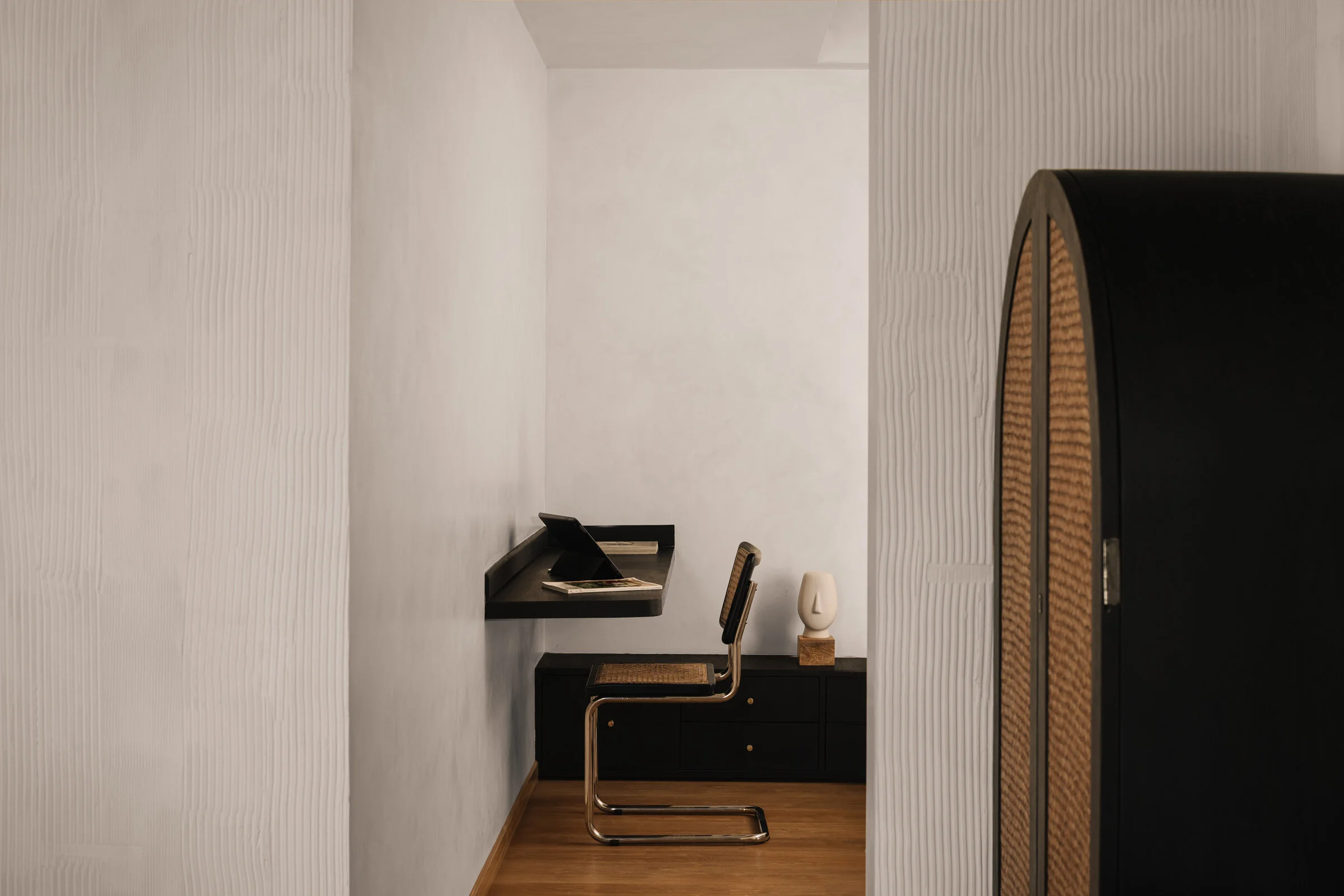
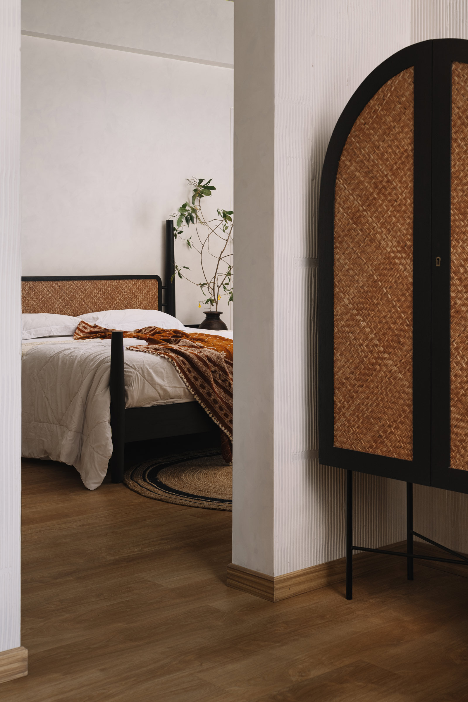
Like the living areas, the bedrooms are havens of simplicity and contentment. The master bedroom unravels through layers of textures, with natural and polished wood, plaster and woven cane. A simple wooden workspace becomes a minimal and utilitarian design statement. Here too, arches and niches add depth to these personal spaces.
Please tell us more about the material choices for the space.
The entire design revolves a natural materials and colour pallet. The furniture is mainly stained teak wood, while rattan figures in many of the wardrobes and chairs. Natural marble and laminated wood are used for the flooring, with exposed concrete above for the ceiling. All of the rugs are custom made in natural hemp.
Please tell us about some of the custom pieces for the space.
Apart from the chairs, all of the furniture is custom made per our own designs and the clients’ requirements. The furniture has been kept minimal and to specific proportions, and where possible, one piece of furniture can perform multiple functions to avoid the need for additional furniture.
Images / Ishita Sitwala


