A Highly Functional, Flexible Penthouse
Craftsmen Studio used a series of intelligent insertions and multipurpose features to amplify the usability of this penthouse in Singapore
While this two-storey penthouse apartment in Singapore isn’t small, the rooms in the original layout weren’t spacious and there were several awkward areas. The owners, a couple with a dog, called on interior and spatial designers Craftsmen Studio to turn it into a liveable and inviting home
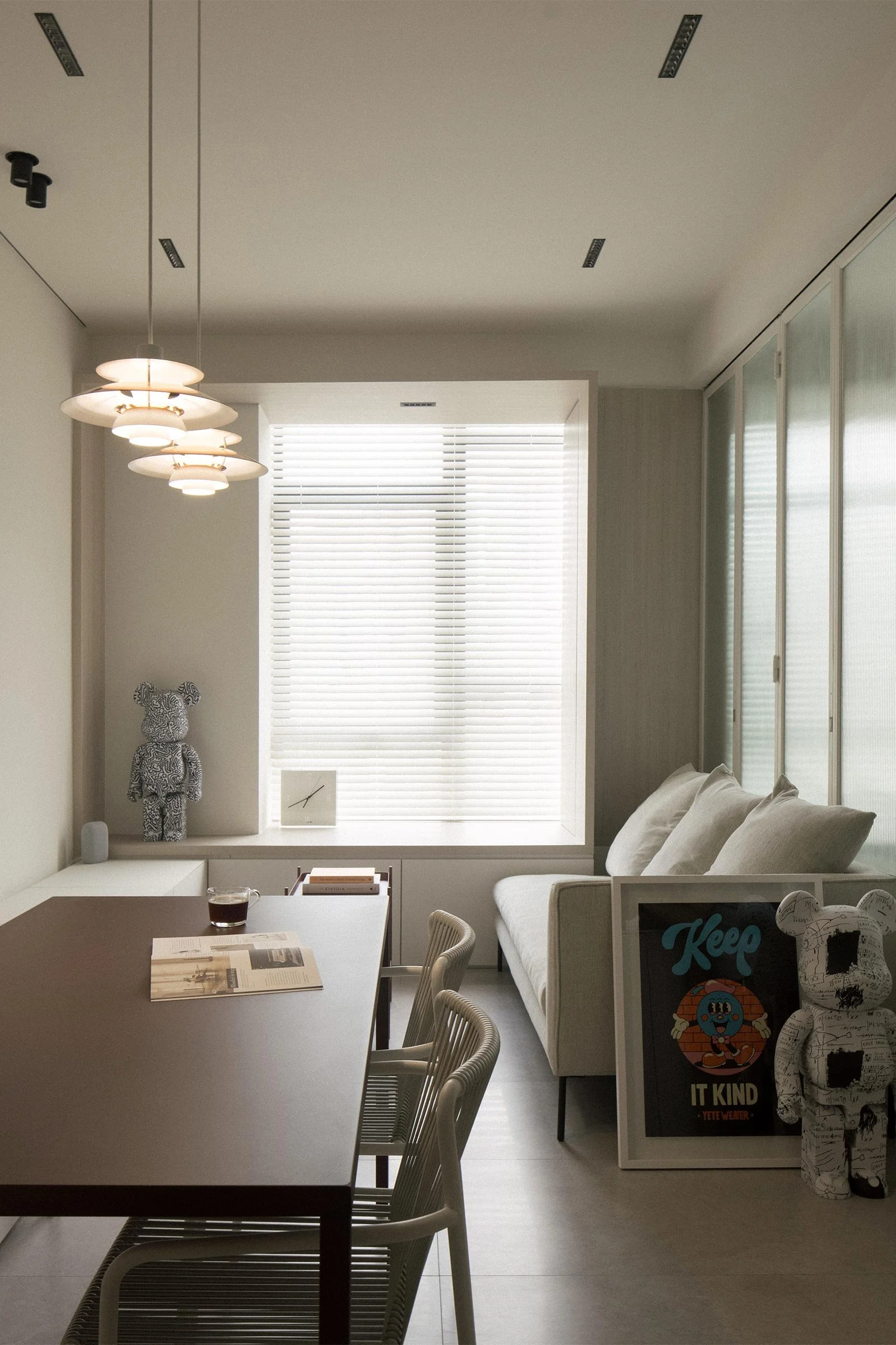
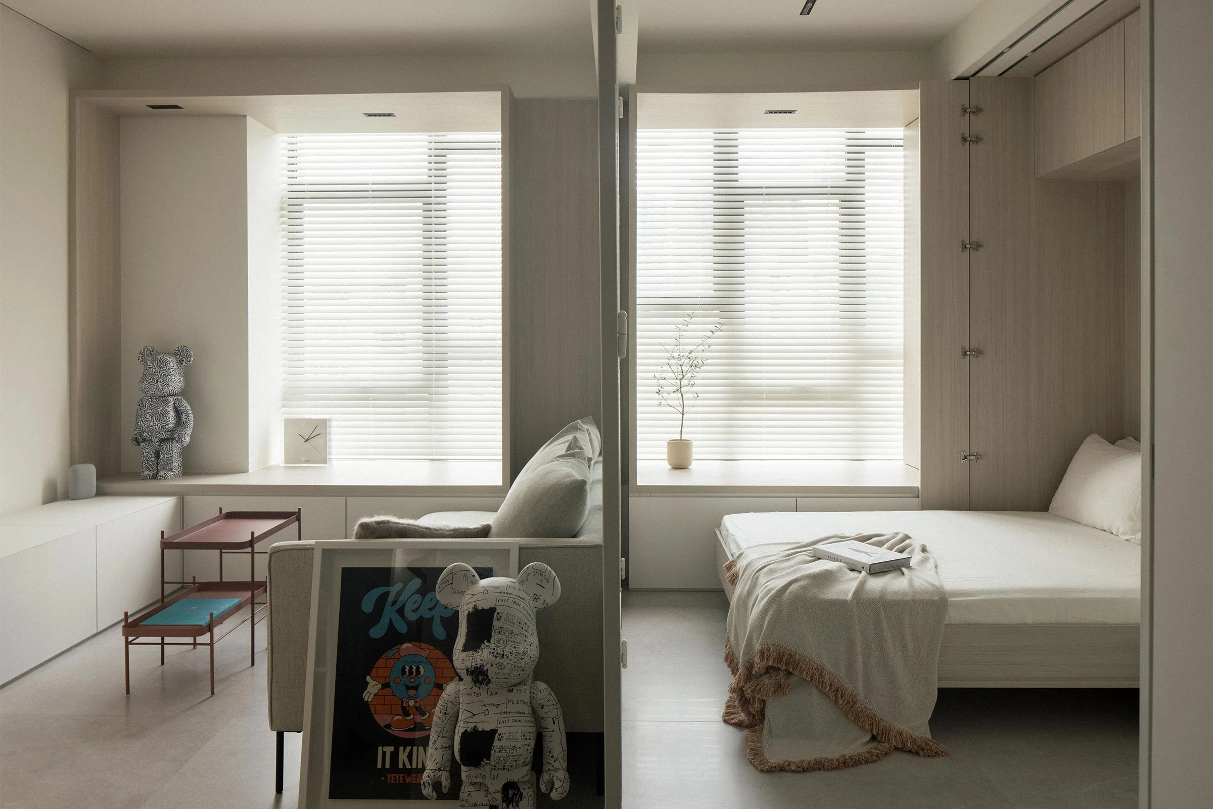
‘The brief was to create a home with calming earthy tones, to maximise natural lighting and to design it so it feels spacious and can be configured to adapt to the couple’s changing lifestyle needs,’ says Tristan Wu, principal of the Singapore-based design studio. The first step was to rework the compartmentalised layout. On the first floor, Wu demolished a wall separating the guestroom and the diminutive living room, turning it into one big space, with new sliding and bi-fold doors that can close up the guestroom when needed. Reeded glass infill provides privacy, diffused light and tactility.
Aside from an increased sense of openness, this living area now enjoys more natural light. Wu also created an arched ceiling in the corridor that leads from the foyer to the living room, concealing an unsightly staircase protrusion while softening sharp edges that help create a sense of fluidity through the space. These arches become a motif, appearing again in the doorway to the kitchen and laundry, and on the ceiling in the second-floor corridor.
In the living room, Wu extended the depth of the original bay windows to make the feature more usable as a daybed or as additional seating. The cabinets under the windows extend into the living room, becoming a media console and banquette seating on one side of the dining table. This method of designing carpentry for maximum usage, adaptability and storage is key to the home’s calm demeanour.
‘As most of the carpentry is floor-to-ceiling height, extended and flushed edge to edge, the elements had to be built systematically from one adjacent piece to the next. This required a lot of patience and quality workmanship from the carpenters,’ Wu explains. ‘It took a lot of pre-planning to ensure precision and tolerances so that all the pieces come together harmoniously.’
Earthy and light tones create a serene atmosphere — aside from the white walls, only three colours were used for all carpentry finishes. The intelligent insertions also accommodate the couple’s growing collection of art, with tracks incorporated into the joinery doors and walls to hang artwork. ‘As one moves along the double-volume corridor to the second storey, the walls and staircase landings continue to form part of the art corridor experience,’ Wu notes.
Other design details throughout the rest of the home include the storage platform that functions as the base of the master bed, the concealed wardrobe and bathroom door in the study that are behind a wall of mirrored doors (which are also helpful during yoga sessions), and the cut-out window in the kitchen wall that increases transparency and light flow between rooms. The home’s simple appearance belies a multitude of clever design tricks thoughtfully conceived for efficacious and enhanced living.
Text / Luo Jingmei
Images / Finbarr Fallon


