YAGEO Foundation Opens a New Art Centre in Taipei
Paris-based Studio Liaigre designed the new YAGEO Foundation centre in Taipei, an art and hospitality space to house the collection of Taiwanese entrepreneur and art collector Pierre Chen. Here studio creative director Frauke Meyer tells us more about the landmark project
Design Anthology: When did Pierre Chen first approach you about this project?
Frauke Meyer: Our studio has had a long relationship with Pierre, but he initiated this project in 2018. He established the YAGEO Foundation itself in 1999. The main objective was to combine his art collection with his lifestyle. He began collecting art in 1976 and his collection now ranges from modernist works to contemporary Chinese art, reflecting a wide variety of artistic styles and movements.
What was his brief to you for the project?
Pierre is an avid wine collector and a passionate businessman, and he is also an outstanding host who enjoys bringing friends together from different cultural and intellectual backgrounds. He wanted the YAGEO Foundation to combine exhibition and work spaces with generous seating areas, a teppanyaki kitchen and a wine tasting bar.
What’s unique about the building and the location?
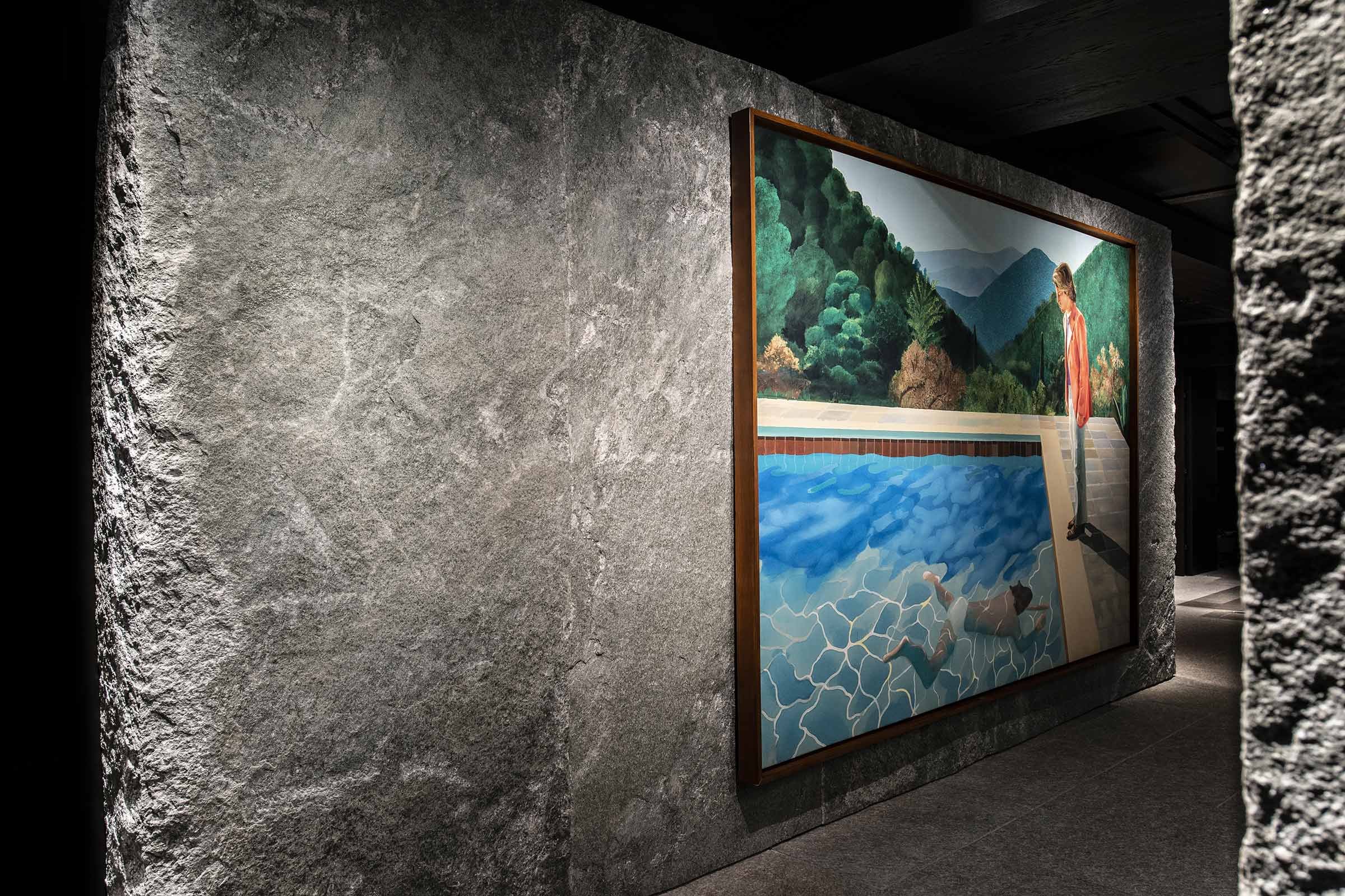
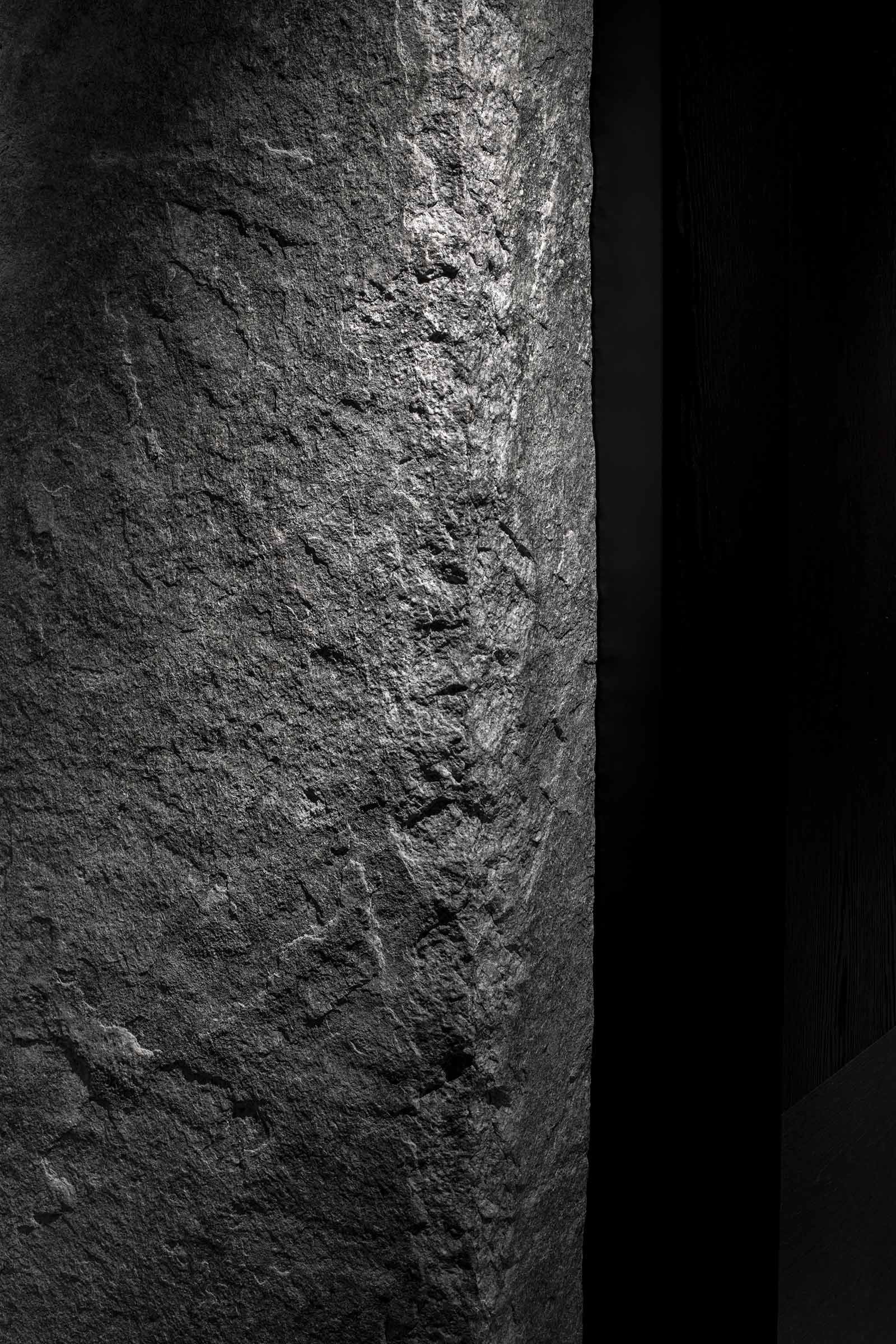
With its timber and stone walls and ceilings, the art foundation is a hidden gem and a totally unexpected place in the established environment of Taipei.
How did you approach the project — what design references did you try to incorporate into the space?
The foundation is on the second floor of the fifteen-storey building in Taipei. The windows frame views of the treetops in the garden outside. The interiors, with the timber wall cladding and great stone pieces on the walls, benefits from these green views — there’s a moody, almost cinematographic atmosphere inside.
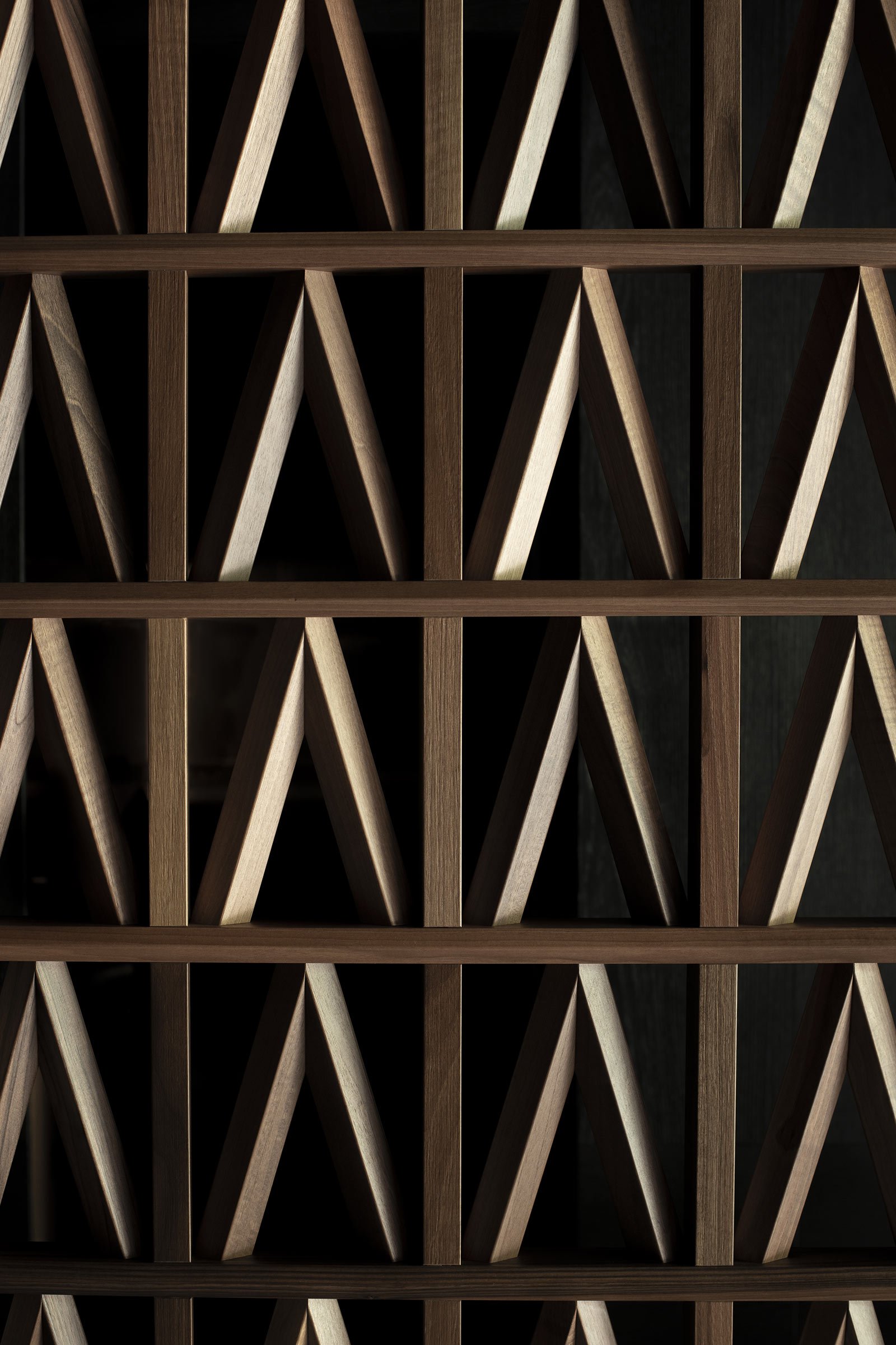
The space is intended to be a calm, harmonious environment for art, taking care to avoid a superfluous, loud design language. Nevertheless, in order to bring in as much natural light possible, semi-transparent partition doors were created between the great reception room and the entrance. They take their strong pattern from the influence of architect Auguste Perret's Palais d'Iéna in Paris.
How did you work with the collection and create space for that?
As the collection is in constant movement and is meant to grow and change in various ways, it didn’t influence the creation of the space as such. However, the main goal with regards to the collection was to create as much as exhibition space as possible.
Images by Benoît Auguste


