A Hong Kong Apartment Becomes a Compact, Stylish Retreat
In Hong Kong’s Tai Hang enclave, Adrian Chan Design and Research Office has created an apartment with a minimal look and thoughtful functionality. Principal Adrian Chan tells us more
Design Anthology: How did you first meet the client?
Adrian Chan: A mutual friend had seen some of our work. She knew the young couple who had recently bought the apartment, and had a hunch that my aesthetic would appeal to them based on the way they dressed — clean, minimal, structured. The first meeting proved her right, and we were immediately commissioned.
Can you tell us about them and their lifestyle?
They’re first-time homeowners who lead very busy lives and have a strong interest in fashion and the arts. They’re also seasoned travellers with an affinity for Japan, Italy and the Nordic countries.
What was the brief?
They needed a home that provided relaxation as well as a backdrop for hosting and entertaining. Since the apartment is small, at roughly 70 square meters, it had to look spacious without sacrificing functionality, particularly storage. Very importantly, the design had to reflect their tastes and highlight the art objects they collect.
What’s unique about the building and the location?
The property is in a 1980s building located in a leafy part of Tai Hang, minutes from the bustle of Causeway Bay. We performed a gut-out renovation.
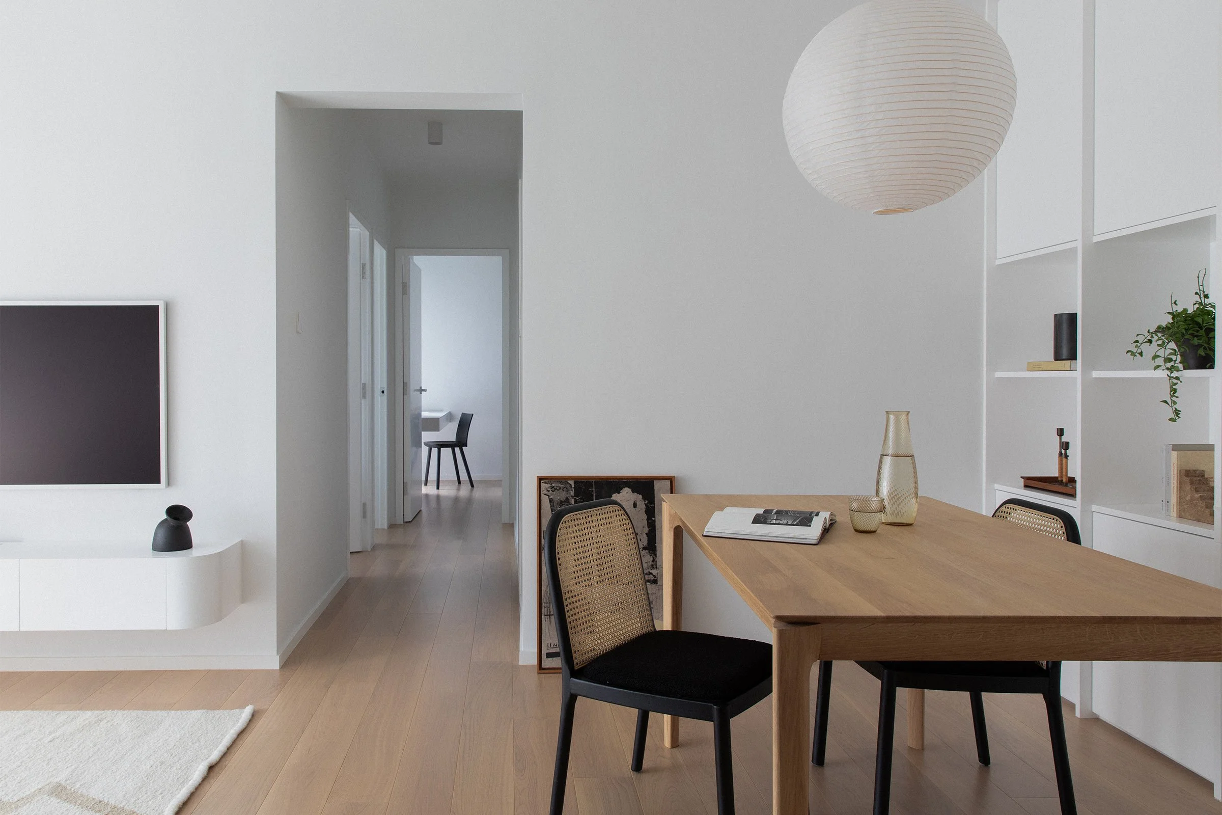
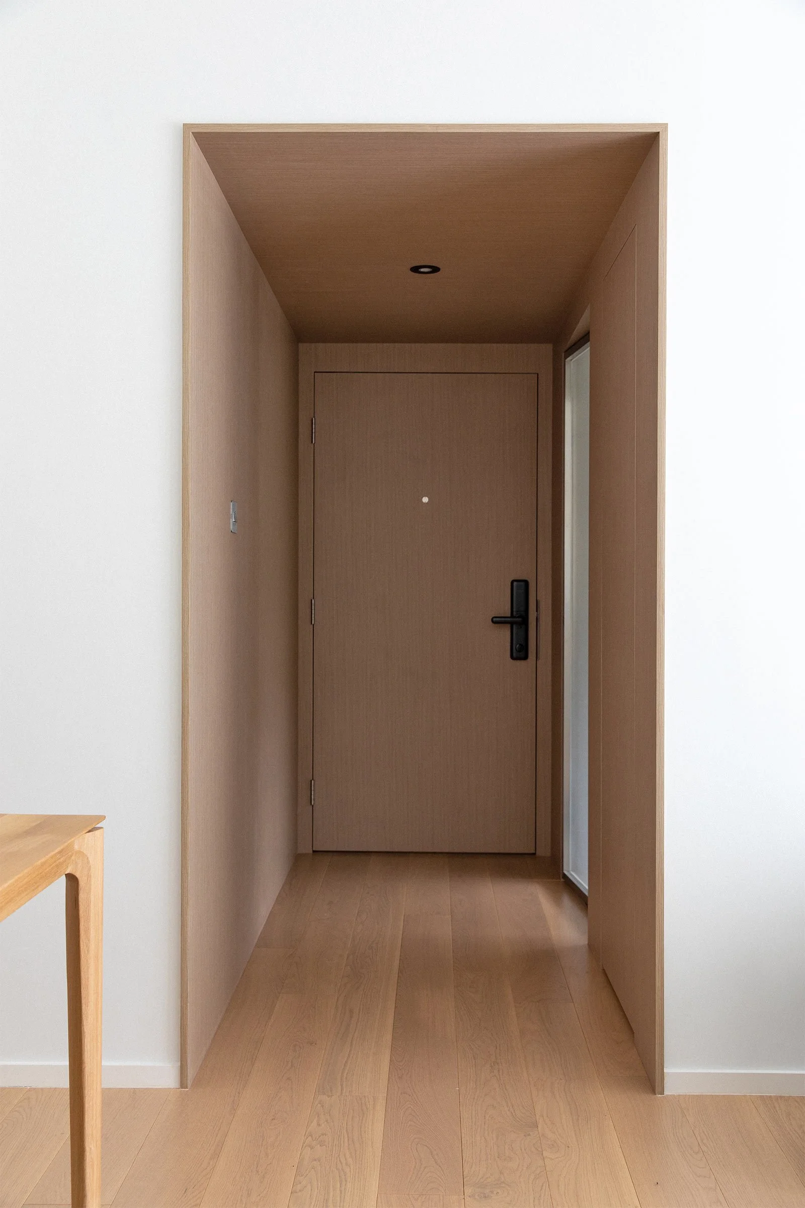
The layout is notable for its relatively long hallways given the small size. We took advantage of this feature to convey grandeur, creating the illusion of a bigger space: the corridor leading to the rooms is in a stark, monotone white, including the door hardware, while the vestibule is clad completely in one dark-toned wood texture.
Tell us about some of the material, art and furnishing choices.
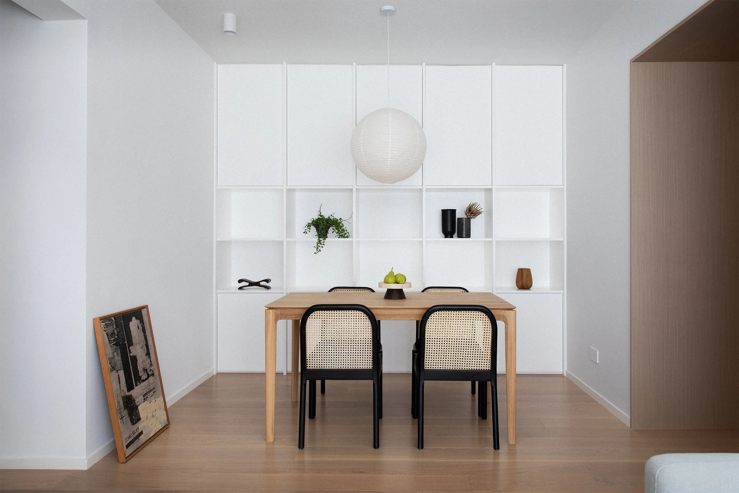
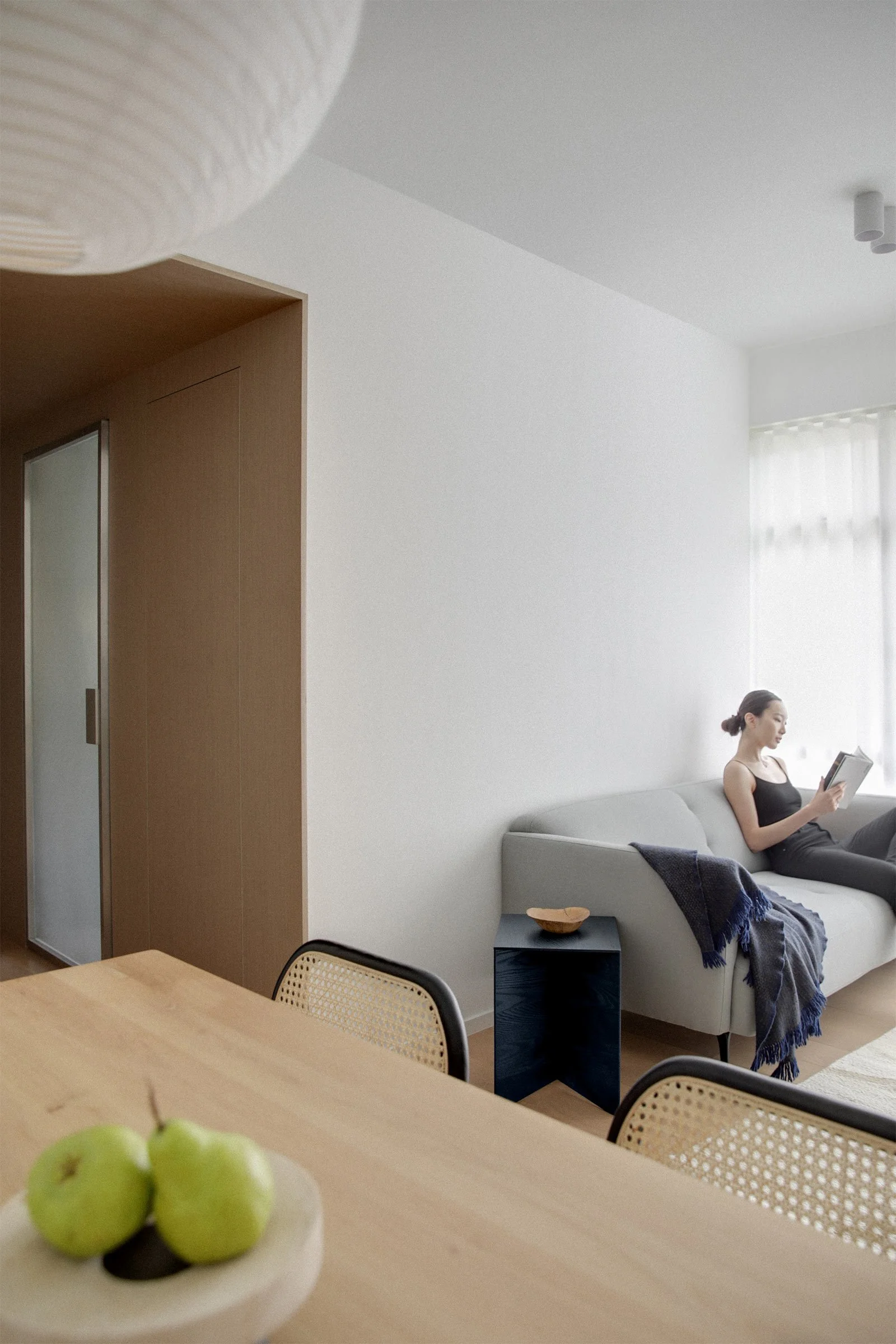
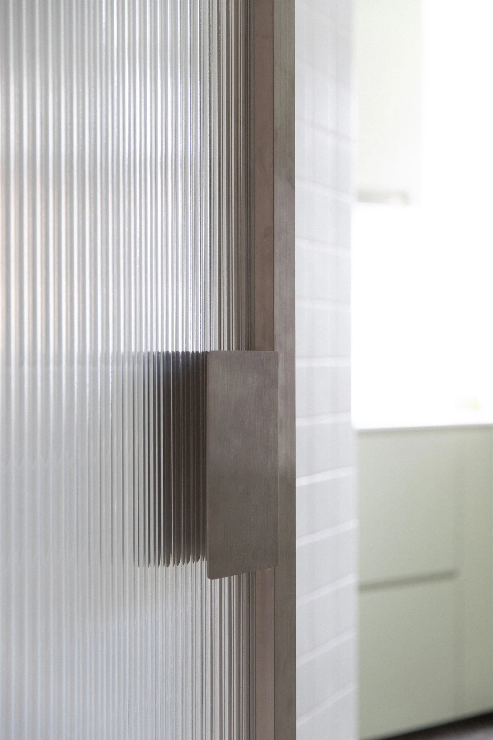
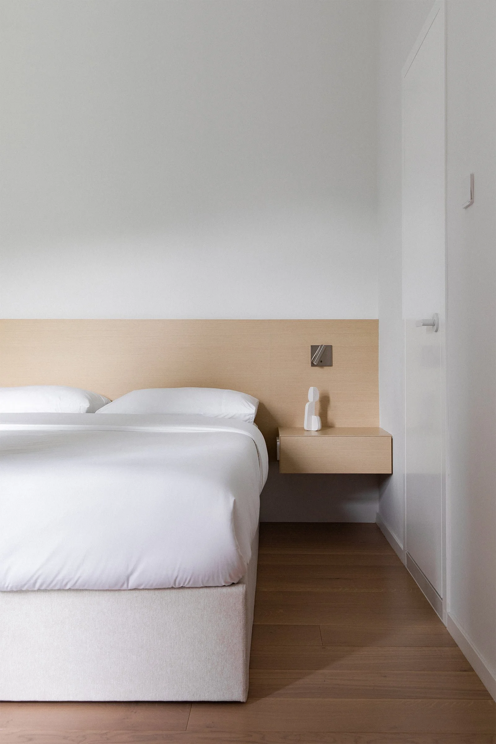
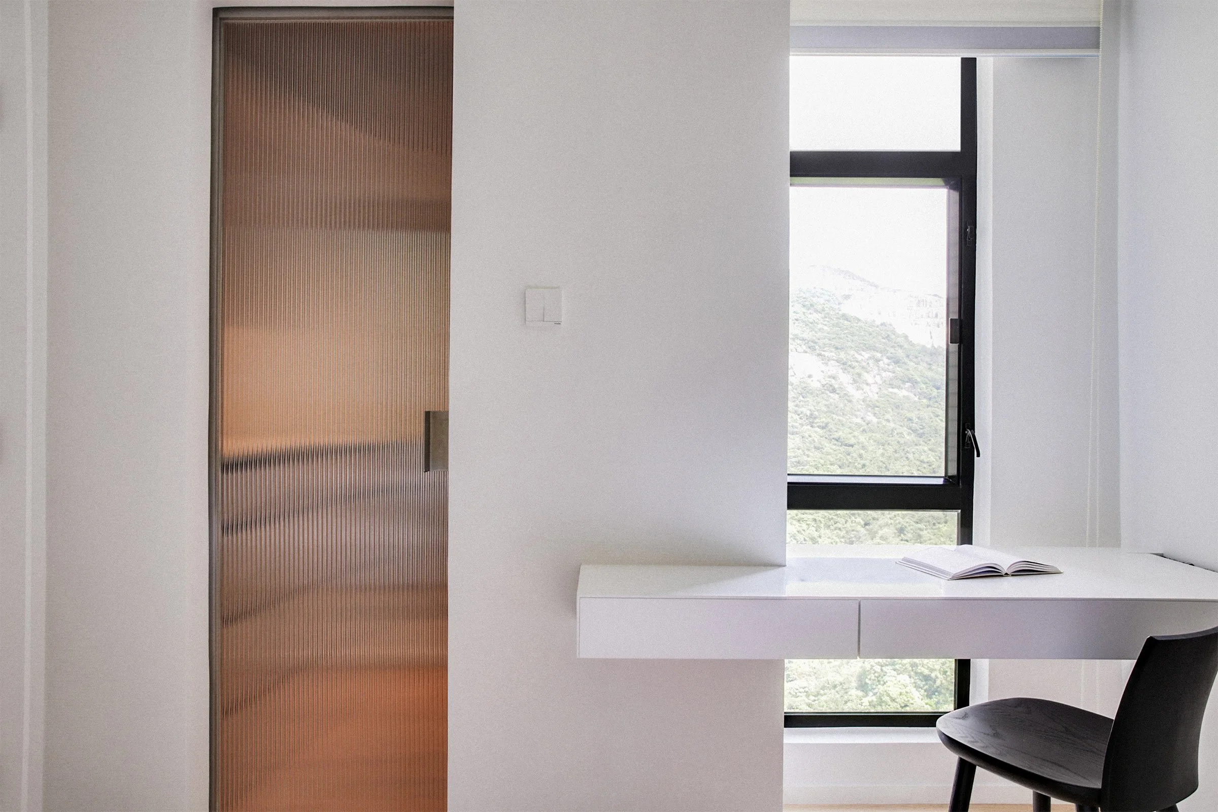
The apartment faces east, so we harnessed light colours and natural materials to maximise the appearance of daylighting throughout the day. The material choices are kept minimal and tonal: the floor features warm oak that stands in contrast to the pearl-white joinery, while the bedroom joinery is made of a light-toned ash. A pop of tea green in the kitchen adds zest and conveys the idea of cooking as a fun pastime. Stainless steel-framed fluted-glass doors allow light to flow freely between spaces.
In the living area, an origami-inspired Paperwood table from Ariake, notable for its iridescent-blue oil finish, sits by the Nordic-style sofa. Original artworks include an orange carrot-like clay vase by Ladies & Gentlemen Studio of Brooklyn, and a painting by Japan-based French artist Charles Munka.
Tell us about some of the custom pieces.
Working with tight spaces required a high degree of customisation. We wanted the clients to inject their own personality through art objects, so we created a white ceiling-height cabinet with clearly defined rectangular compartments showcasing their collections, almost like a canvas for their creativity.
Storage was designed as its own architectural feature, or made unobtrusive. Architectural storage includes a floating desk with dual compartments for make-up and jewellery that hovers in front of a full-height window, conveying the idea of serene concentration. In terms of unobtrusive storage, a sizeable shoe and umbrella closet is hidden within the walls of the vestibule and made easily accessible. A walk-in closet is carved out from one of the rooms.
Do you have a favourite element or design detail?
The vestibule, referencing Frank Lloyd Wright’s method of compression and expansion, acts as a filter that facilitates a transition from the busy outside world to a bright, tranquil respite. It’s clad in dark ash, and is designed to be low and enclosed to accentuate the transition into serenity.
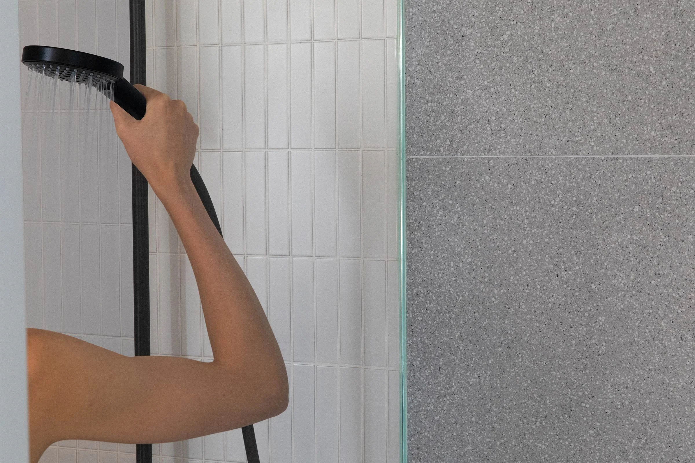
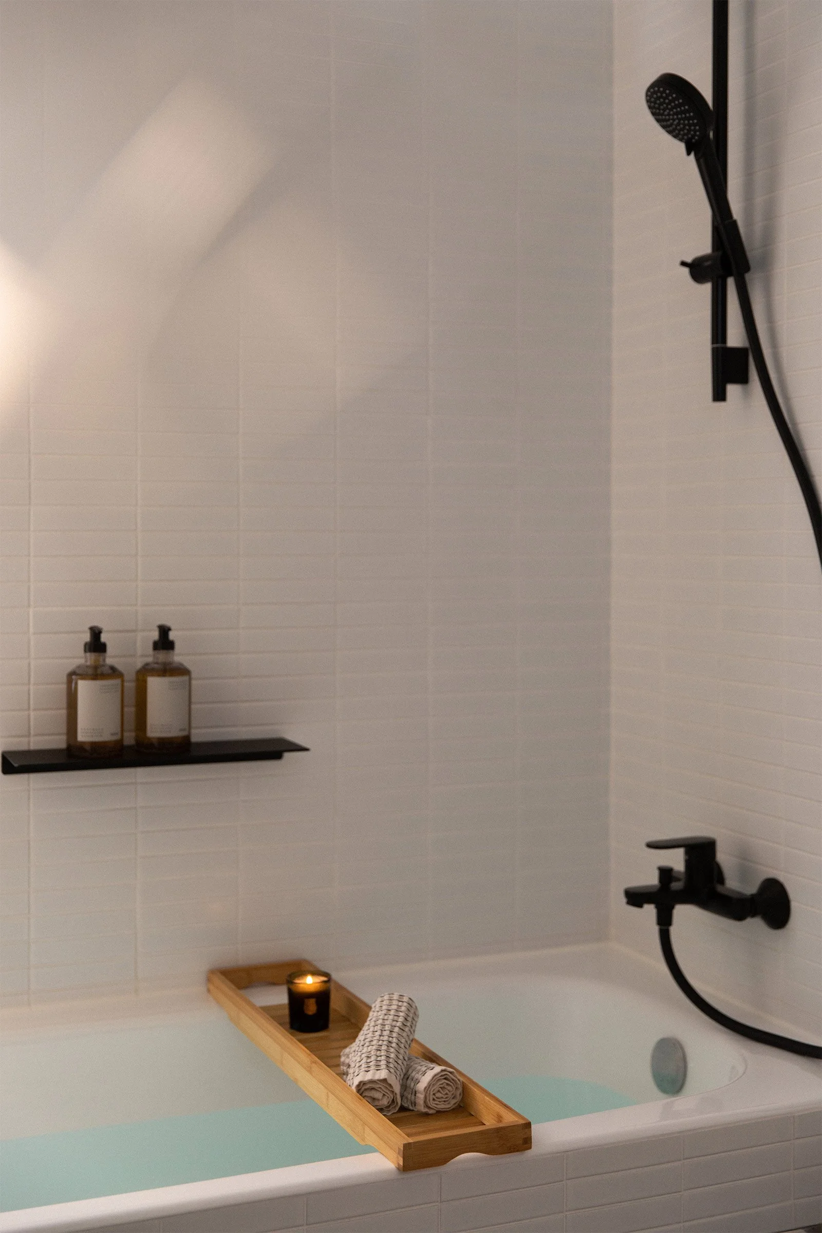
Overall, contrast is a key theme. As one takes a peek into the apartment from the vestibule and vice versa, one senses a clear delineation between positive and negative spaces, the yin and the yang. Such alternation is also present in the master bathroom, which is a space meant to restore the body and the soul: one half of the bathroom uses dark terrazzo, whereas the other half, containing a shower box, features glistening white tiles. So stepping into the shower resembles a purification and ablution ritual for the clients every evening as they return home.
Images by HDP Photography
Styling by At Liberty Studio


