A Responsive Family Home
In Victoria’s Brown Hill, local architecture firm Eldridge Anderson created a durable family home that embraces its natural terrain while responding to its owners’ lifestyle. Co-founders Jeremy Anderson and Scott Eldridge share more about the project
Design Anthology: How did you first meet the client?
Jeremy Anderson: The clients approached us after seeing our work on social media, in particular a project we completed in Ballarat years ago.
Can you tell us about them and their lifestyle?
Scott Eldridge: The clients are a young family with three boys. They’ve lived in the Ballarat area for a few years, and were drawn to the idea of living on a larger site where their children could explore the surrounding bushland. They’re a social family with an active lifestyle and often entertain friends and family, so the house had to be suitable for hosting larger gatherings while retaining a sense of intimacy. They also requested a layout that would allow them to keep a passive watch over the children while still including spaces for retreat.
What was the brief to you for the project?
Jeremy Anderson: The brief focused on the idea of a reasonably robust and cost-efficient family house that would age gracefully and sit comfortably on the sloping site. It was important to provide a clear and well-connected overall space that incorporated breakout spaces for different activities, entertaining and kids’ play.
What’s unique about the building and the location?
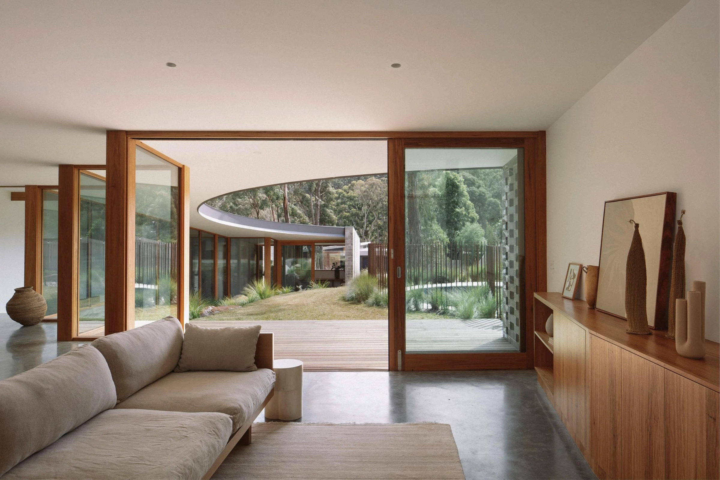
Scott Eldridge: The natural slope of the site falls in two directions, which prompted a series of levels and a sloping roofline that reflects the gentle slant of the site. The footprint and arched roof edge provide sun protection while creating a visual connection between different spaces. The arch was also offset from an existing tree that was too unstable to be retained, and eventually provided a nice central space for the pool and lawn terrace.
How did you approach the project, and what design references did you try to incorporate into the space?
Jeremy Anderson: Our approach was driven by an efficient response to the brief and site, in particular the existing trees, the slope of the site and its orientation. The courtyard developed as the key design driver and orienting device that connects the house and provides a central sheltered focal point.
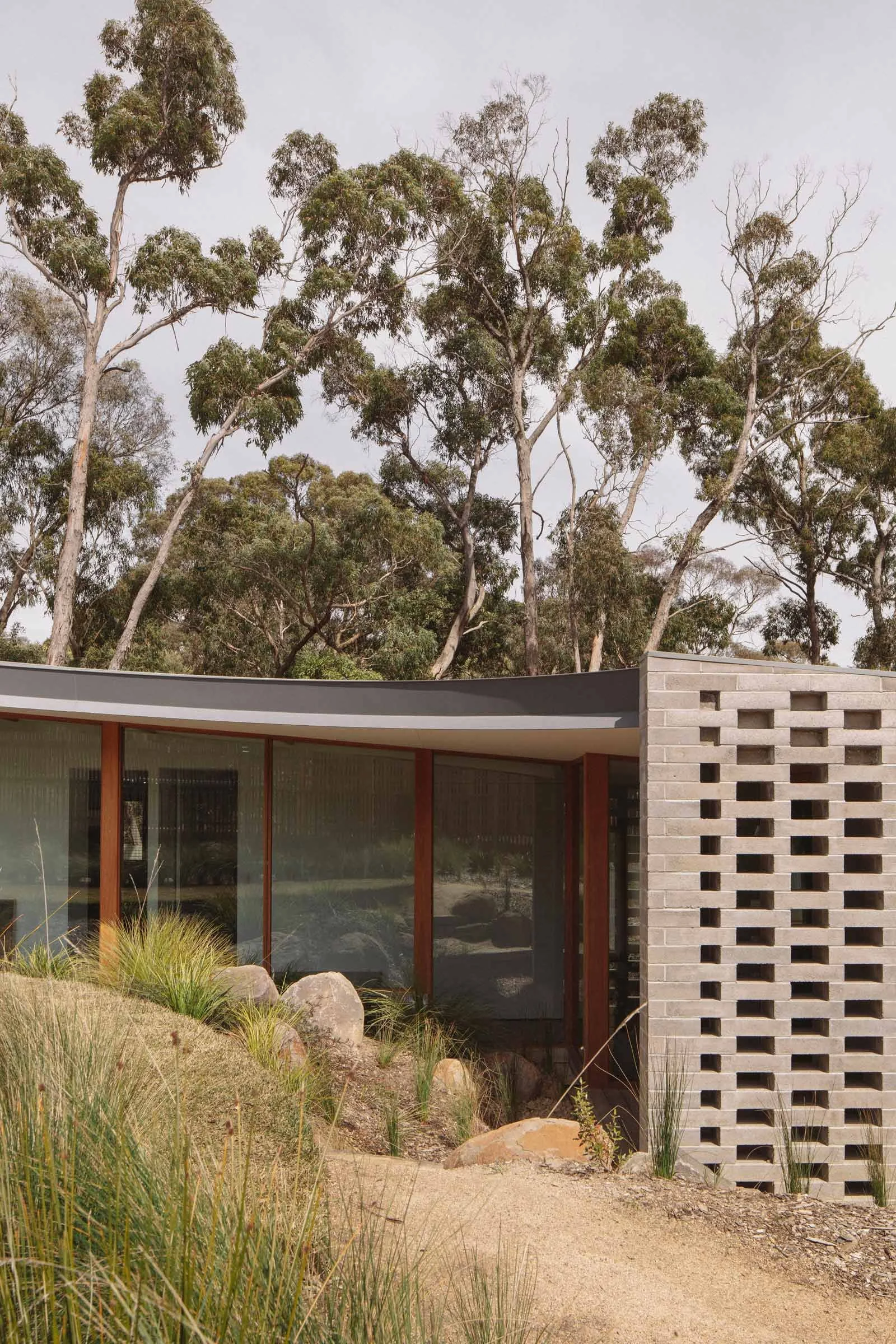
When we first visited the 1600-square-metre site, there was a series of very tall trees with minimal foliage on the lower levels. Following an arborist assessment, we felt that the most suitable approach was a building that would maintain a singular presence and that shifted around the existing features. So we maintained these existing trees where possible and worked with the natural contour of the land.
Tell us a little about the material choices for the space.
Scott Eldridge: We used masonry walls for the perimeter of the house and concrete for the brick screen at the courtyard wing walls. The grey external palette sits well with the bushland, and its gentle patina makes the house look as though it’s been on the site for many years.
The courtyard is predominantly glazed with hardwood timber frames that are carried over into the exposed timber roof structure through the hallway space. We limited the interior palette to reflect the light, emphasising the focus on external space as a dynamic and evolving experience. The bathrooms are slightly darker, providing a subtle sense of privacy.
Tell us about some of the custom pieces.
Jeremy Anderson: The most significant custom item in the house is the curved steel eave designed in collaboration with a local maker. It forms the perimeter of the courtyard and rotates in multiple planes to frame the edge of the courtyard roof.
Do you have a favourite element or design detail in the architecture or interiors?
Scott Eldridge: The courtyard and the quality of space it provides.
Jeremy Anderson: The way the building engages with the site and nestles into the landscape while maintaining a modest profile from the street.
Images by Ben Hosking
Styling by Jess Kneebone


