An Urban Showroom Inspired by Nature
In the heart of Chengdu, this airy showroom designed by Chengdu-based firm ATMOSPHERE Architects for local fashion label hug is infused with references to both nature and the city. Here studio founder Tommy Yu tells us more about the project
What was the brief to you for the project?
The idea was to create a pure and gentle atmosphere inspired by nature in the city. Through careful colour combinations, the selection of materials such as concrete and the use of curved points in the layout, we wanted to convey a natural feeling connected to the city's atmosphere. The client hoped the space could evoke a sense of ease and healing.
Where is the store located, and what’s great about the neighbourhood?
hug 3.0 is located in the core commercial area of Chengdu. It’s a 265-square-metre space in the first phase of the Jingronghui shopping mall. Next door is the famous Sino-Ocean Taikoo Li Chengdu, which attracts a huge flow of people.
How did you approach the project — what design references and narrative did you try to incorporate into the space?
In the face of rapid change, all kinds of content fill our lives through social media channels. As someone with a vanguard view, the client hoped that the store could create a real impact through its identity by allowing people to regain mental peace and rationality, while also strengthening the mutual trust between the brand and its customers.
Tell us a little about the material choices for the space.
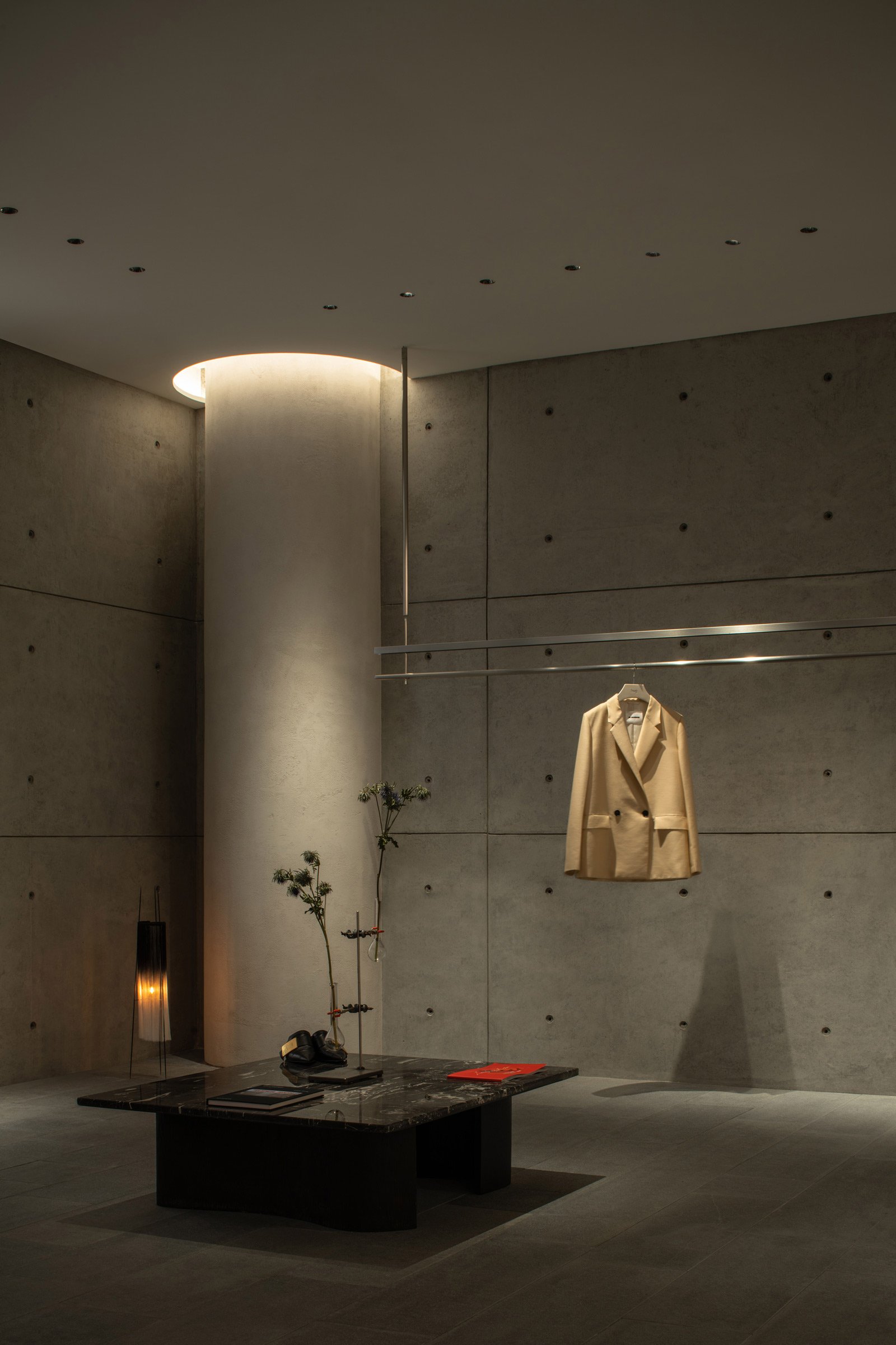
The starting point for the material selection was to combine the original architectural language with a natural look and feel. Therefore, we used concrete as the main base for the space, with natural textured birch boards and green flocking carpets to create a natural atmosphere.
Tell us about some of the custom pieces.
Designer Louis Shengtao Chen and principal of Zenus Art Studio Zipeng Li collaborated on an art installation simulating various forms of hummingbirds in the space.
Do you have a favourite element or design detail in the architecture or interiors?
We used a three-dimensional curved wall as the main space division in the interior, which is my favourite design detail. This method expresses the spatial theme of hug 3.0 — an urban valley — through a combination of materials and shapes.
What other features are you most excited about?
Our team is redesigning the Aranya hug store, which is expected to be completed in 2023, so stay tuned.
Images / Chuan He, Here Space


