Sun, Sea and Spectacles at Cubitts, Brighton
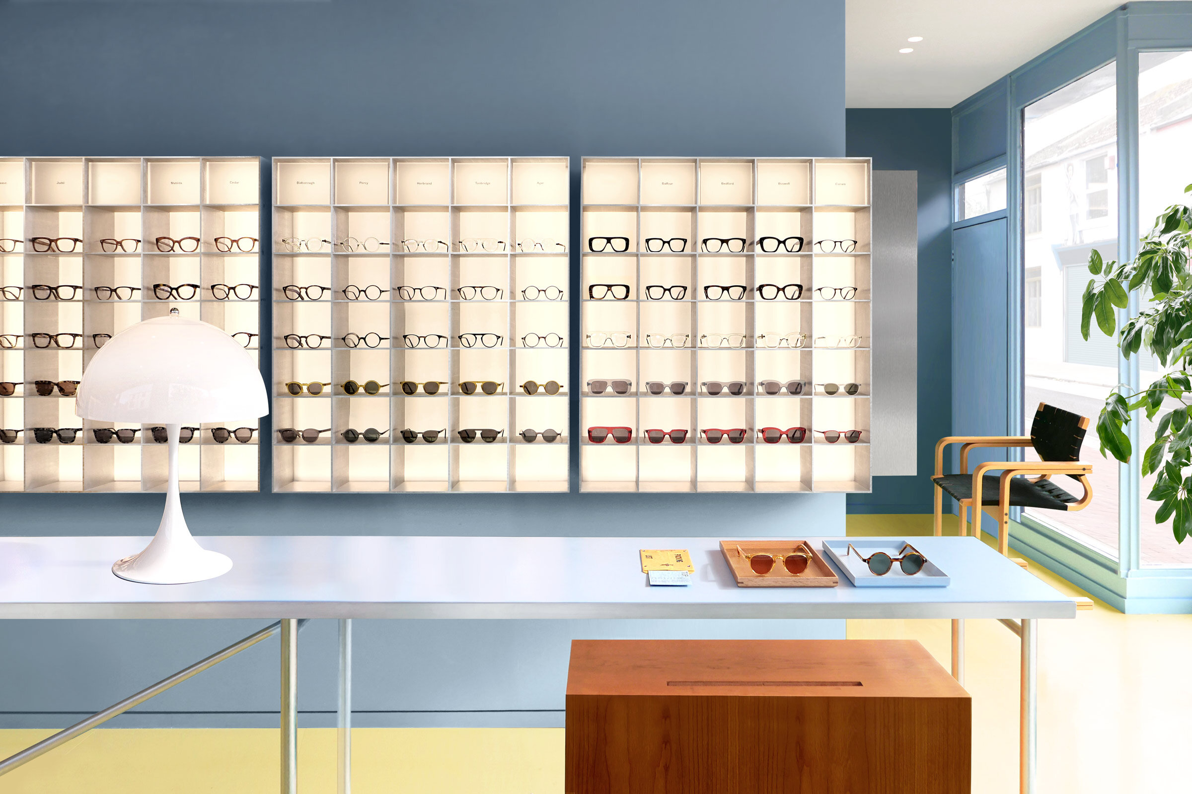
Designed by London-based Child Studio, bespoke spectacle makers Cubitts’ new Brighton store — its first outside London — is inspired by the town’s modernist heritage and the nostalgic charm of English resort towns. We speak with the studio’s founders Alexy Kos and Che Huang to find out more about the project
Image by ©Child Studio
Design Anthology: Can you tell us about Cubitts and how you came to work with the brand?
Alexy Kos (AK): Cubitts is a modern spectacle maker, founded by Tom Broughton in London back in 2013. Each frame is made by hand at their amazing workshop in King’s Cross in Central London, and they’re made to be worn for life, repaired when necessary rather than replaced.
Che Huang (CH): We’ve been working with Tom and the Cubitts team for a year on various concepts and ideas for their physical retail spaces. The Brighton store is the first project that has been realised, and it’s also the brand’s first store outside of London.
What was the brief to you for the project?
AK: The brief was to create an environment that would feel embedded in local history and become part of the neighbourhood. Cubitts combines cutting-edge technology with traditional craft, and the space needed to feel tactile and immersive, while showcasing the bespoke services offered at the store.
What’s unique about the building and the location?
AK: This project feels like something of a spiritual homecoming for the brand, which is named after the Cubitt brothers, three Victorian master builders, engineers, and architects. One of the three brothers, Thomas Cubitt, was actually involved in the building of Brighton’s Kemptown area, and lived there for a while, too.
CH: The store sits on a corner of the North Laine district, a vibrant neighbourhood where narrow alleyways bustle with a mix of independent fashion boutiques, vintage shops and local restaurants all occupying small two-storey houses built in the 19th century.
How did you approach the project — what design references did you try to incorporate into the space?
CH: We wanted to capture the nostalgic charm of English seaside resort towns in the 70s and 80s, with their pastel tones and bold simplicity that bring back childhood holiday memories.
AK: We were also inspired by the photographer Martin Parr’s iconic series The Last Resort, featuring images of a beachside ice cream parlour and its patrons. Those photographs offer an intimate portrait of everyday life in 1980s Britain, and a beautiful mix of social commentary, humour and nostalgia.
Please tell us a little about the material choices for the space.
CH: The material palette pays homage to the quintessential 70s aesthetic of Parr’s photographs: muted blue walls, geometric aluminium shelving and cherry wood cabinets. The concrete floor was painted a vivid shade of yellow that creates a contrasting backdrop for the sunlit interior. The large windows are lined with terrazzo-like Blue Dapple, a material made entirely out of recycled plastic that is produced by Smile Plastics, a young company based in South Wales.
What about the furniture?
AK: The furniture and light fixtures were carefully curated to celebrate the modernist aesthetic of Cubitts. We sourced original Joe Colombo pieces, a Panthella lamp by Verner Panton and classic tubular steel sling chairs by Rodney Kinsman for OMK.
Do you have a favourite element or design detail in the architecture or interiors?
CH: We really enjoyed working with aluminium to create the custom display stands and cabinets. It’s such a diverse material with a unique sculptural quality to it. The centre of the shop is occupied by a long, narrow trestle-style table with an aluminium frame, which serves as the perfect backdrop for Cubitts’ Brighton Collection, a series of frames inspired by the geometry of two local modernist landmarks: the Embassy Court building and Saltdean Lido.
Image by ©Child Studio
Image by ©Child Studio
Image by ©Felix Speller
Image by ©Child Studio
Image by ©Child Studio
Image by ©Child Studio
Image by ©Child Studio
Image by ©Felix Speller
Image by ©Child Studio
Image by ©Felix Speller
Image by ©Felix Speller
Image by ©Child Studio
Image by ©Child Studio


