A Meditative Oasis
In designing this home in a remote rural area near Ahmedabad, local studio Design ni Dukaan attempted a study in ‘non-architecture’, focusing on the quality of spaces in the inward-looking structure. Here principal and founder Veeram Shah tells us more about his approach
Design Anthology: How did you first meet the client?
Veeram Shah: It was a chance encounter. We were learning carpentry in my home town when my mother called and told me that someone we knew through my uncle wanted to have their house done. My first question was why would someone give us the project, since we had no background or portfolio. During my first meeting with the client, I remember none of us spoke the entire time, since we’re both introverts. It took a while but we eventually we managed to do a decent job!
Can you tell us about them and their lifestyle?
The client is from the same village as me and moved to Mumbai for work many years ago. He wanted to come back to his roots when he retired. He’s humble and has a very simple lifestyle. He appreciates classical music, art and literature, and is involved in a lot of charity work.
What was his brief to you for the project?
After my first design attempt failed, the client gave me a proper brief for the project. He said something that struck me: ‘Veeram, I don’t care if my house doesn’t have an elevation.’ And that illustrated exactly who he was. I immediately understood him and started to envision courtyards, nature, imperfections, silence and humility.
He wanted the house to be divided in two parts, one as a public area to hold gatherings and with a separate artist lounge, and another for the kitchen, dining space, living room and the private areas. The brief evolved as we were building the project.
What’s unique about the building and the location?
There wasn’t a single tree on the site when I first visited, so we had to create a context for the project with an inward-looking plan. The building has no elevations — it unfolds sequentially, with courtyards of various scales punctuating the space.
There are two main suites for the clients and two rooms for their sons, all opening onto the pool, gym and lounge. There are also three guest suites with their own glass box lounges.
How did you approach the project — what design references did you try to incorporate into the space?
Roger Anger would often talk about creating a sense of ‘implied tension’ in his work through large sculptures that wouldn’t touch the ground and columns that wouldn’t touch the ceiling. We’ve tried to create similar elements with large cantilevers for the water tank and a column that doesn’t touch the ground.
We also studied Le Corbusier’s paintings and made a lot of sketches to understand the imperfect curves. The building plan is marked by two continuous, imperfect curves and two static lines that don’t touch each other.
Please tell us a little about the material choices for the space.
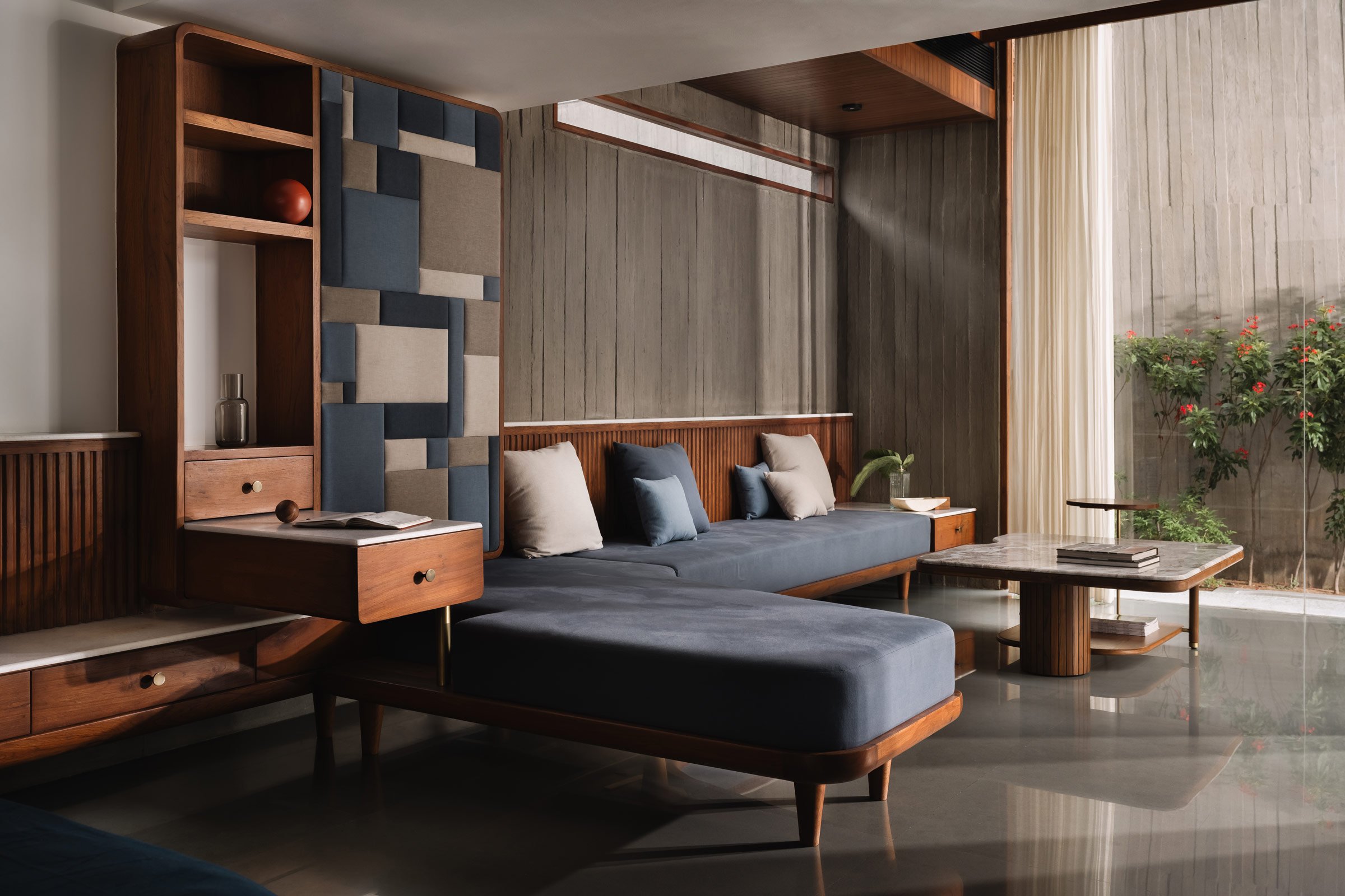
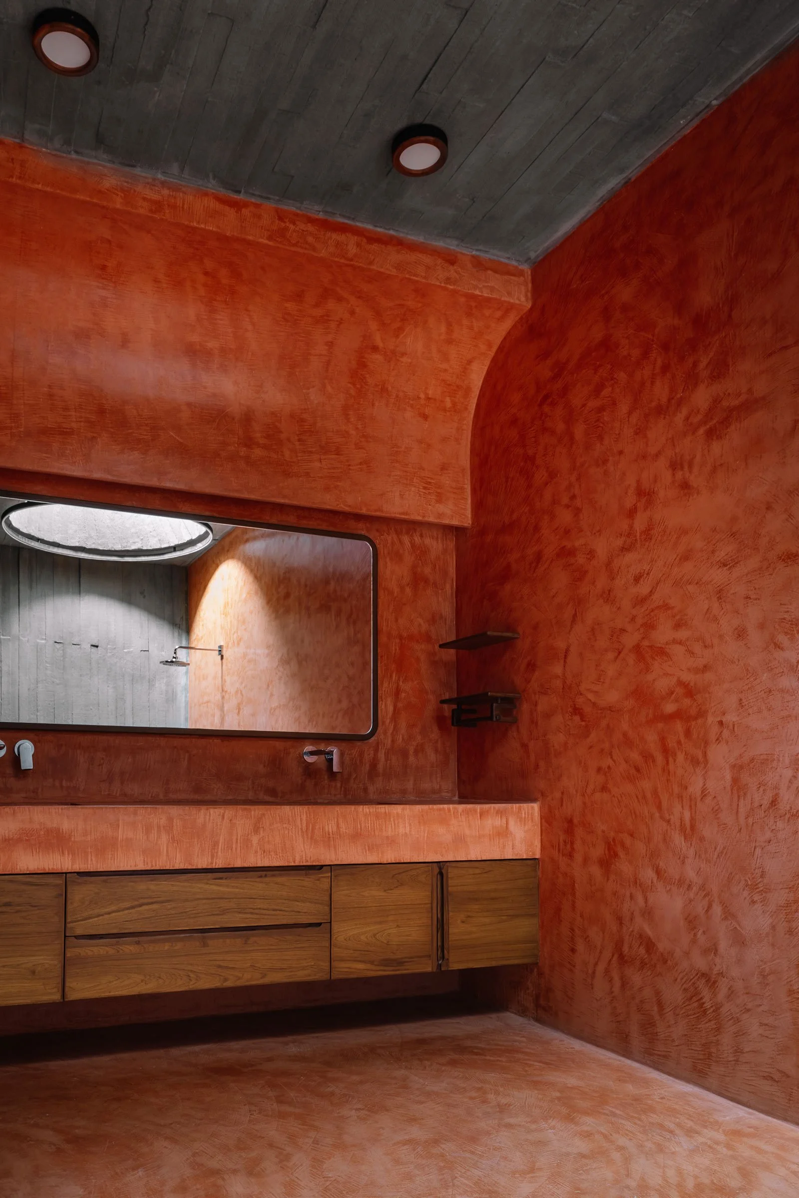
We wanted to keep the palette extremely simple to maintain a certain meditative silence in the spaces. The walls are in a shuttered concrete and soft plaster. Terracotta is the only one colour, which we’ve used to mark ‘pauses’.
The imperfections in the project manifested further when we realised that we could achieve a texture that can’t be recreated or controlled. For example, the local contractor couldn’t bolt the wooden shuttering and a few of the slats started warping. We started calling these ‘anticipated imperfections’. This gave the building a character unlike anything that could be planned.
The floors are Kota, the simplest and the cheapest limestone, and we used all of the waste stone on the colonnades. All of the furniture is made from teak — it’s a very local, Indian material palette.
Which of the elements are custom designed?
We custom designed all the furniture pieces in our workshop, including the casing for the lights, the table lamps and the door handles. With this project, we wanted to focus on creating instead of curating. The four-poster bed in the elder son’s bedroom is my favourite.
Do you have a favourite design detail in the architecture or interiors?
The altar in the entrance, which we added much later into the project. We designed it so that its cylinder structure floats without touching any of the walls. My instructions to the artist were to not carve the idol out of the stone but rather within the stone. The reverence should be for the outline of the form and also for the material that it has been carved out of. Overall this exercise was one of my most memorable narratives from this project.
Images by Ishita Sitwala


