A Workshop and Exhibition Space for the Soul
In designing the Shenzhen Qizhushe Workshop and Exhibition Space, Beijing-based YI+MU DESIGN OFFICE reimagined the former factory as a vessel for creativity that verges on the spiritual. Here co-founders Yi Chen tell us more
Design Anthology : How did you first meet the client?
Yi Chen (YC): The client is a furniture maker and supplier who we’ve been friends with for many years.
What was their brief to you for the project?
YC: The workshop and exhibition space is in the Shenzhen Art Exhibition Center , which is a transformed 1980s industrial factory. The new space needed to provide furniture designers with a work space that can inspire creativity, as well as a display and retail space for original furniture and home accessories.
How did you approach the project — what design references/narrative did you try to incorporate into the space?
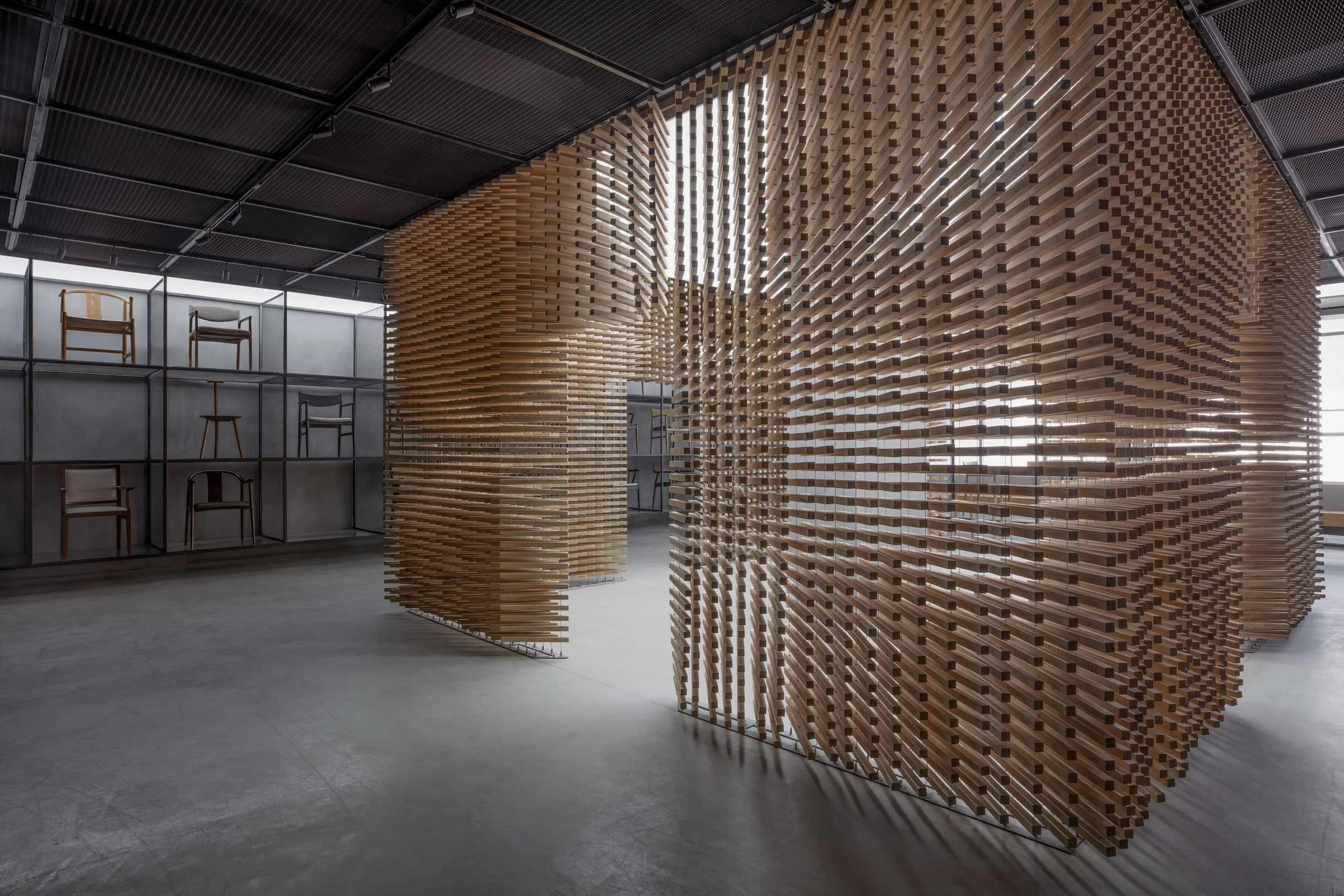
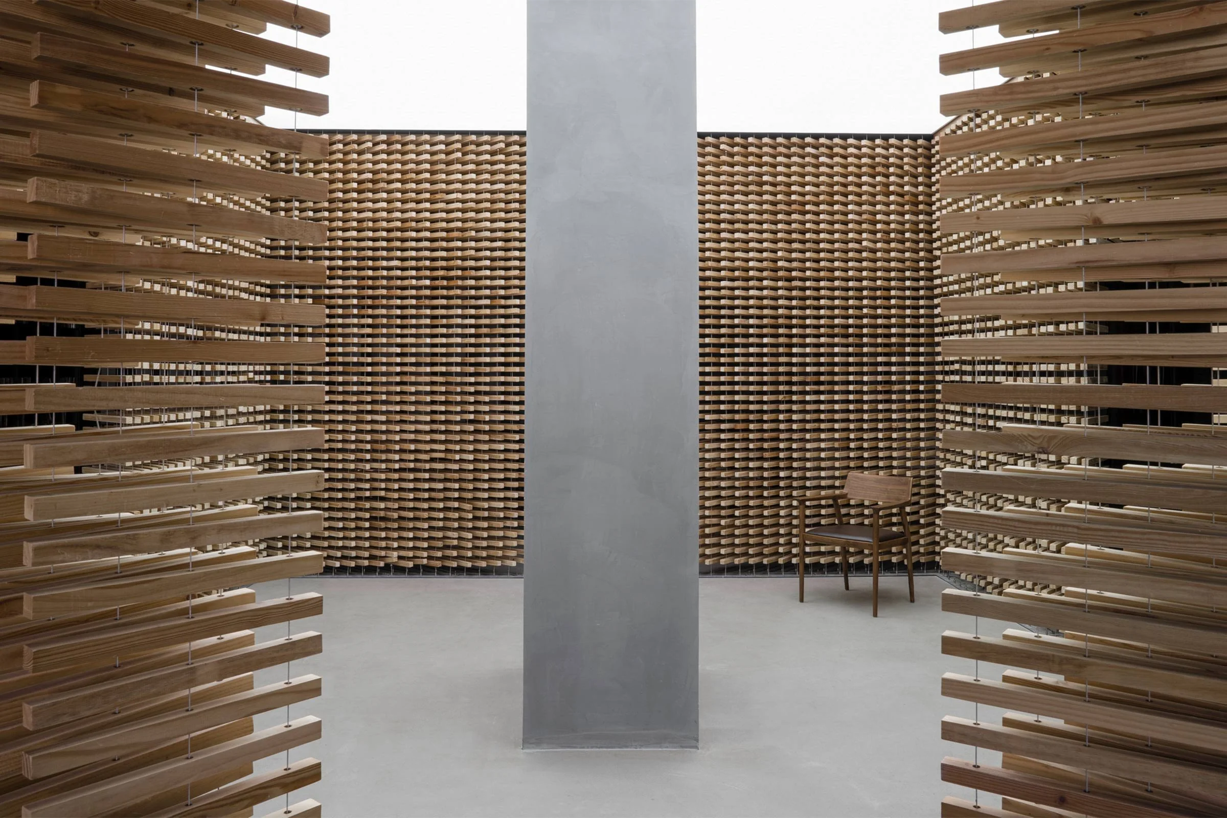
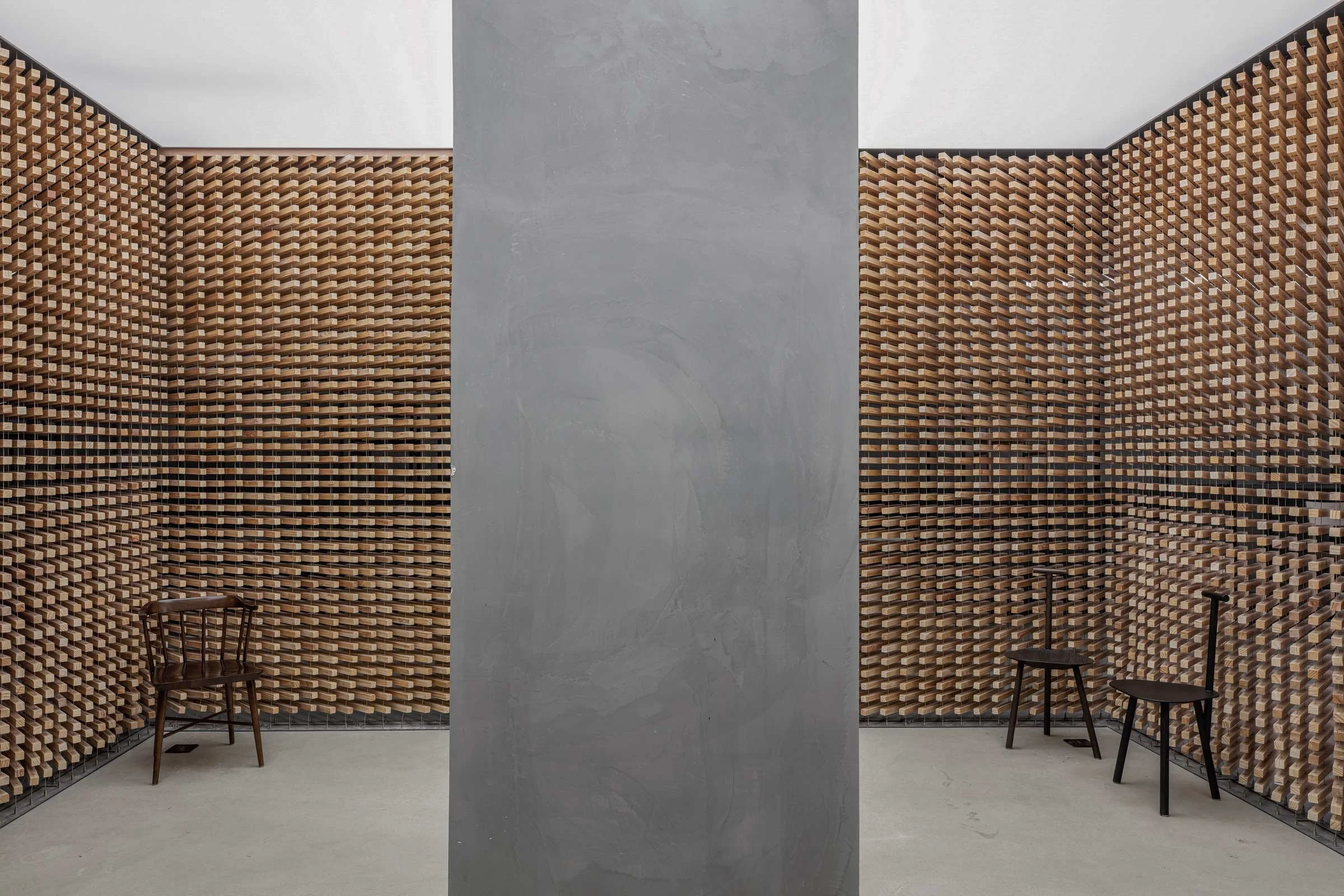
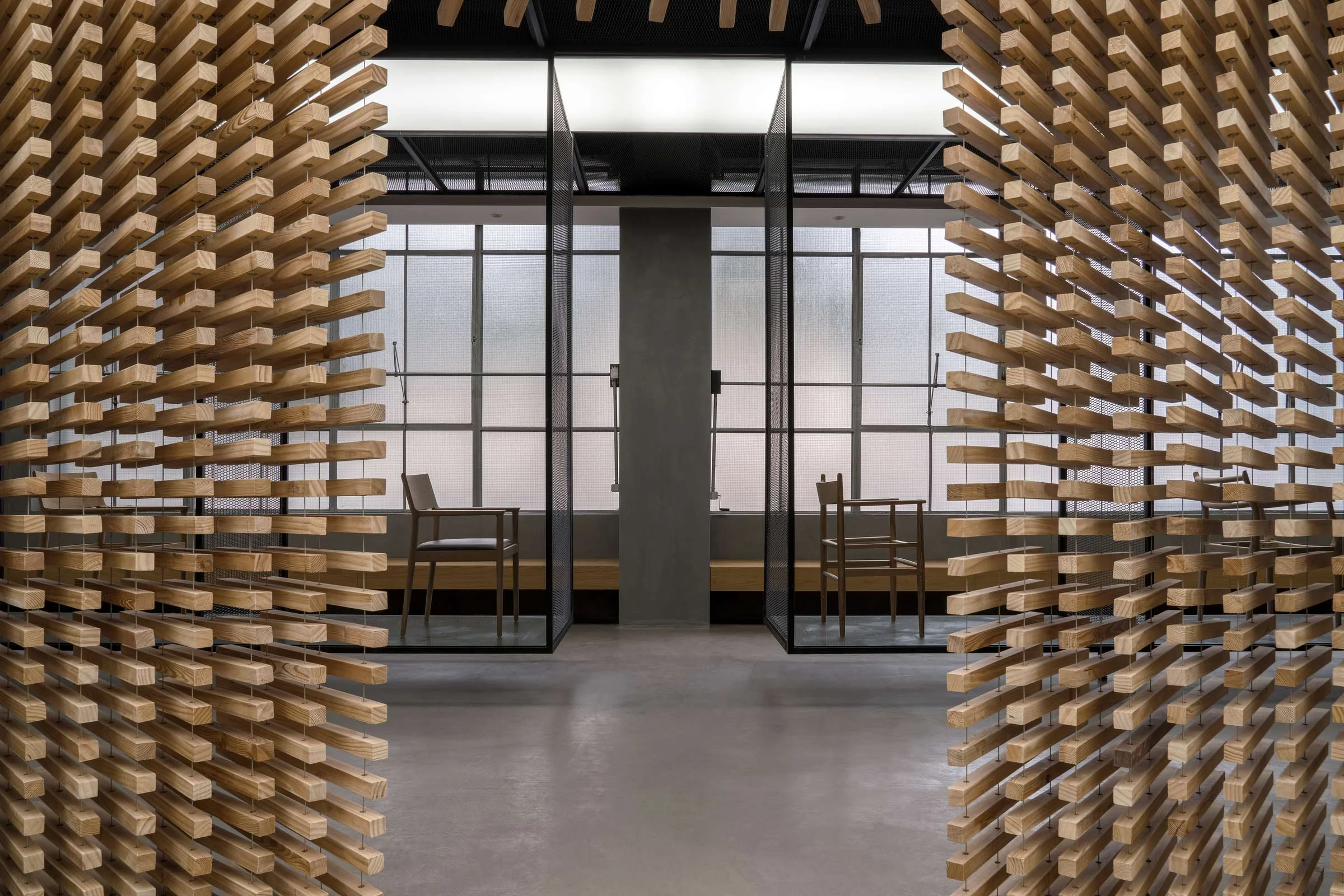
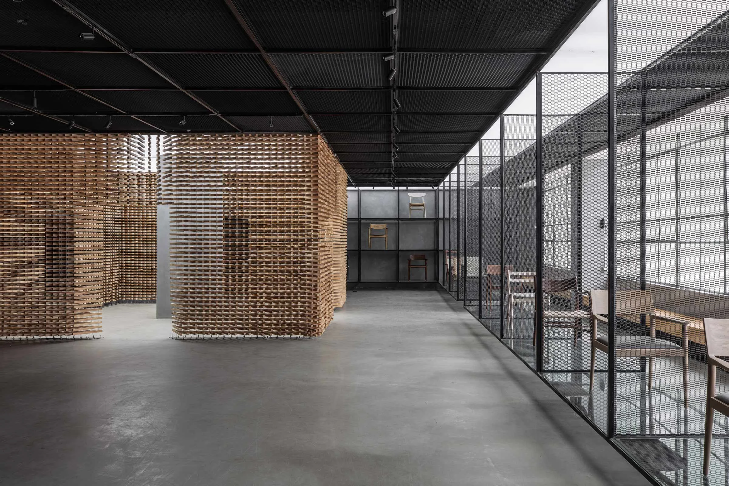
YC: We approached the project by devising an abstract concept where the whole space is understood as a home-like container and a kind of ‘nest’ made out of suspended pieces of timber.
Please tell us a little about the material choices for the space.
YC: For the ‘nest’ element, we used wood that that has been reprocessed from scraps discarded during furniture production. The rest of the space is made of dark grey steel, which creates a strong contrast with the natural warmth of wood.
Please tell us about some of the custom pieces for the space.
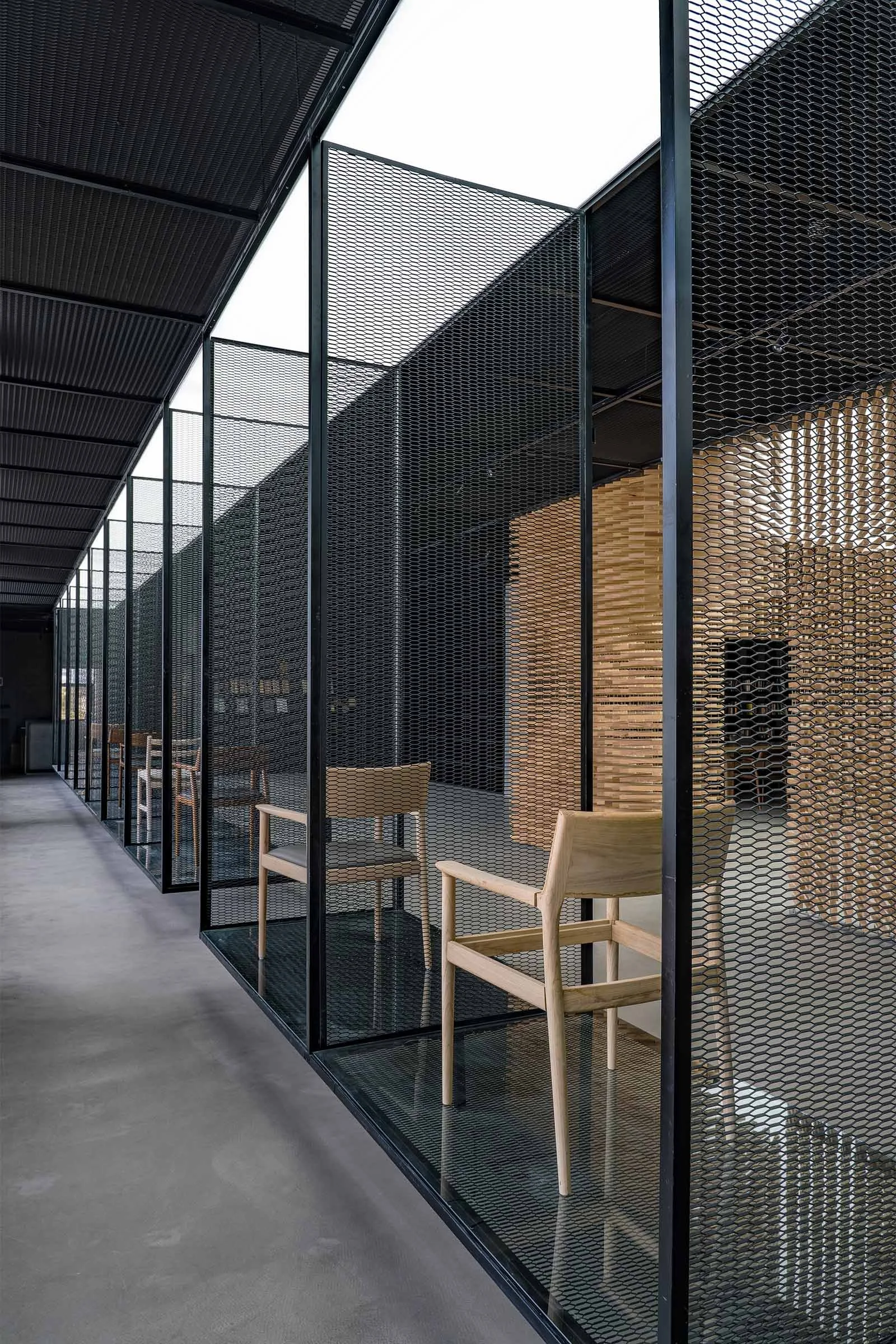
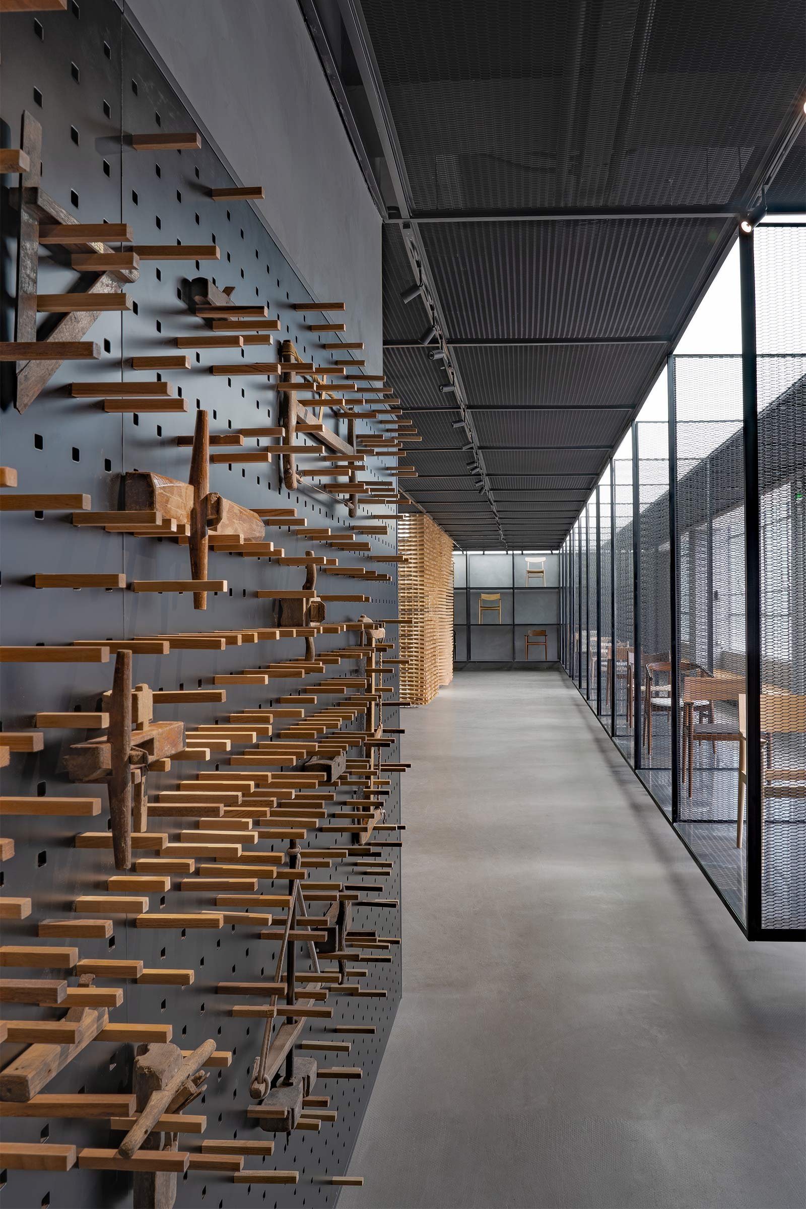
YC: Aside from the nest, we custom made the 19-metre-long suspended mesh display rack. The rack evokes a sword piercing through the entire space, its simple block shape creating a harmonious yet sharp contrast with the timber installation.
Do you have a favourite element or design detail in the architecture or interior?
YC: Our favourite element is definitely the nest, which is the visual centre of the space. We incorporated strong illumination inside its structure to form a ‘light house’, creating a strong sense of order and a tension that spreads to all sides of the room. The light diffuses from the centre through the wooden components, evoking the rhythms of breathing similar to a human body.
What other features are you most excited about?
YC: What excites us the most is that we’re trying to dissolve the boundary between the real world and the spiritual world through the concept and expression of abstract space. We used spatial form as a visual language to convey our understandings life and the spiritual world, while hopefully expanding people's understanding and experience of the space.
Images / Courtesy of YI+MU DESIGN OFFICE


