A Celebration of the Humble White Loaf
Designed by local multidisciplinary practice Studio Eccentric, South Korean bakery Whitelier’s outpost in Hanam embodies the bright, airy aesthetic of its signature product: soft white bread. Here studio founder Seuk Hoon Kim tells us more about the project
Design Anthology: How did you get involved in the project?
Seuk Hoon Kim: Whitelier opened its first flagship store in 2019 and quickly expanded to open four more stores around the country. While the first four outlets were designed by a Japanese studio, Whitelier wanted to have its fifth flagship store designed by a local studio. That’s when we joined the project.
What was their brief to you for the project?
The brief for this project was to design a bakery that included both a sales space and a fully equipped baking kitchen to produce the white bread that is Whitelier’s signature product. Whitelier is a portmanteau of the words ‘white’ and ‘atelier’; and the overall design had to represent this identity.
Where is the bakery located and what’s great about the neighbourhood?
The new Whitelier is located in Hanam, a fairly new residential city in South Korea’s Gyeongi province, east of Seoul. Because of its proximity to the capital, a younger population has settled there. The store is located right in the middle of high-rise residential buildings, which allows local residents to pop in and get their fresh bread every day.
How did you approach the project?
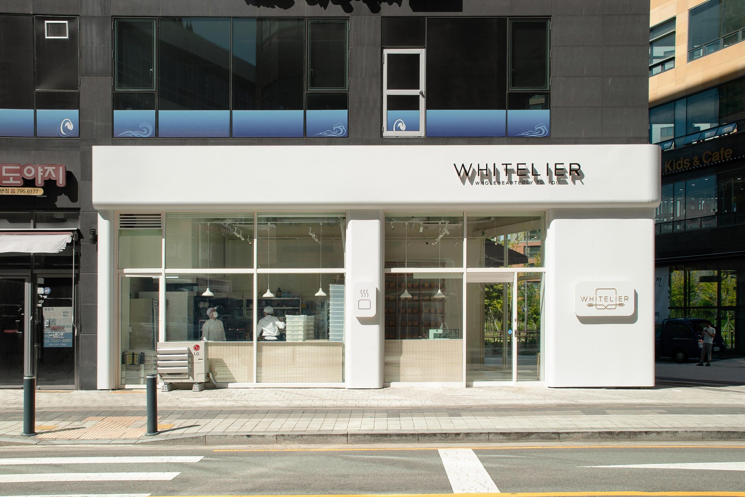
Our biggest challenge was to divide the 54-square-metre space into two zones with distinct functions — the shop and the kitchen — but also to make sure each space didn’t feel too cramped. We kept the ceiling fully exposed and divided the two zones with a three-metre wall, but designed the external facade so that the shop and the kitchen look like a single entity when seen from the outside.
Please tell us a little about the material choices for the space.
To make the space feel larger than it actually is, it was critical to use as few materials and design elements as possible. We selected bright materials like white paint, white engineered stone, light-coloured wood and veneer and white powder-coated metal panels, which we also used for the exterior facade.
We used beige clay tiles to wrap both the shop and the kitchen — they create the visual impression of a continuous workshop counter.
Which of the pieces are custom designed?
The main custom piece for the store is the external facade. Each laser-cut powder-coated metal panel was fabricated and installed on site. We wanted to express the freshness and softness of bread, which we translated into the curved white form of the facade.
Do you have a favourite element in the architecture or interiors?
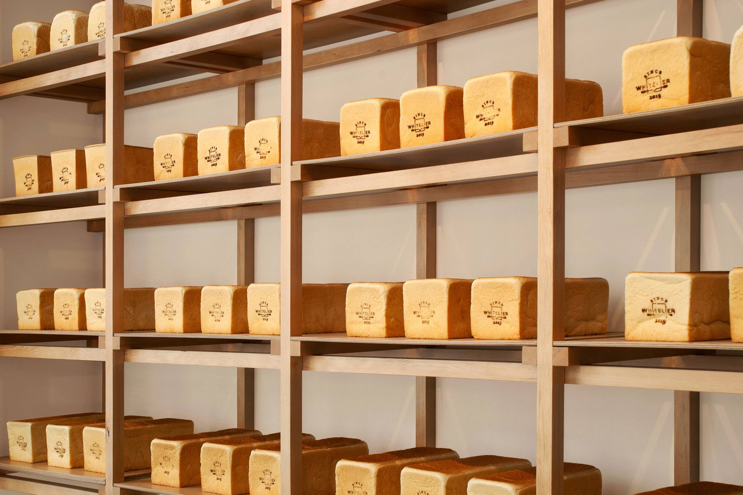
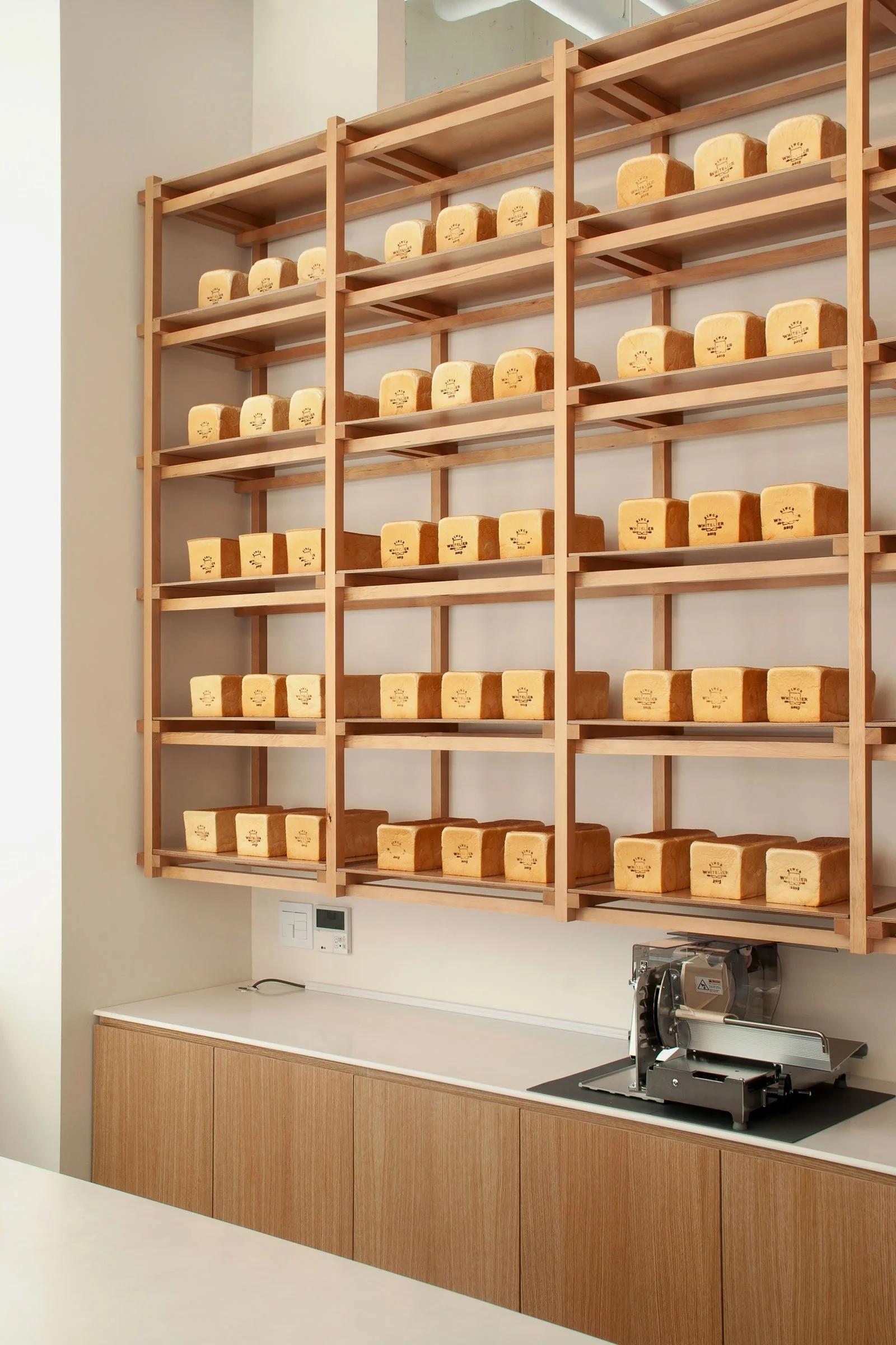
One of my favourite elements in the space is the bread display shelves. It’s a wooden structure on a white wall, built to display Whitelier’s golden loaves of white bread.
Images / Studio Eccentric


