A Beach Home Designed to Last
This beach house by Casey Brown Architecture was designed to respond to the site’s unique environmental conditions, with a rugged exterior and raw but refined interiors. Founding partner and architect Rob Brown tells us more about the project
Design Anthology: How did you first meet the client?
Rob Brown: The clients had already been living in a house on the site for 20 years. They’re very involved in environmental issues and aware of the site’s unique beauty and extreme weather conditions. Prior to our engagement, they had explored ideas with two other architects but weren’t convinced that their design proposals matched the site’s significance: a site exposed to the great Southern Ocean, surrounded by a headland reserve and seen from every position on Avalon Beach.
Can you tell us about them and their lifestyle?
The couple are empty-nester journalists with a passion for the natural environment and a wonderful appreciation of good place-based design. Their experience living on the site for decades gave them an acute awareness of both the conditions the home needed to withstand and the dramatic vistas available from every part of the site.
What was their brief to you for the project?
The clients envisioned a building they could live in for the rest of their days, and one that would blend in with the rocky, boulder-strewn headland. They requested a private top floor, a lower basement for guest bedrooms, a living room on the middle floor that opens out to a sun-drenched northern entry courtyard, and cantilevered terraces to the ocean and beach on the south and west.
What is the overall size of the house?
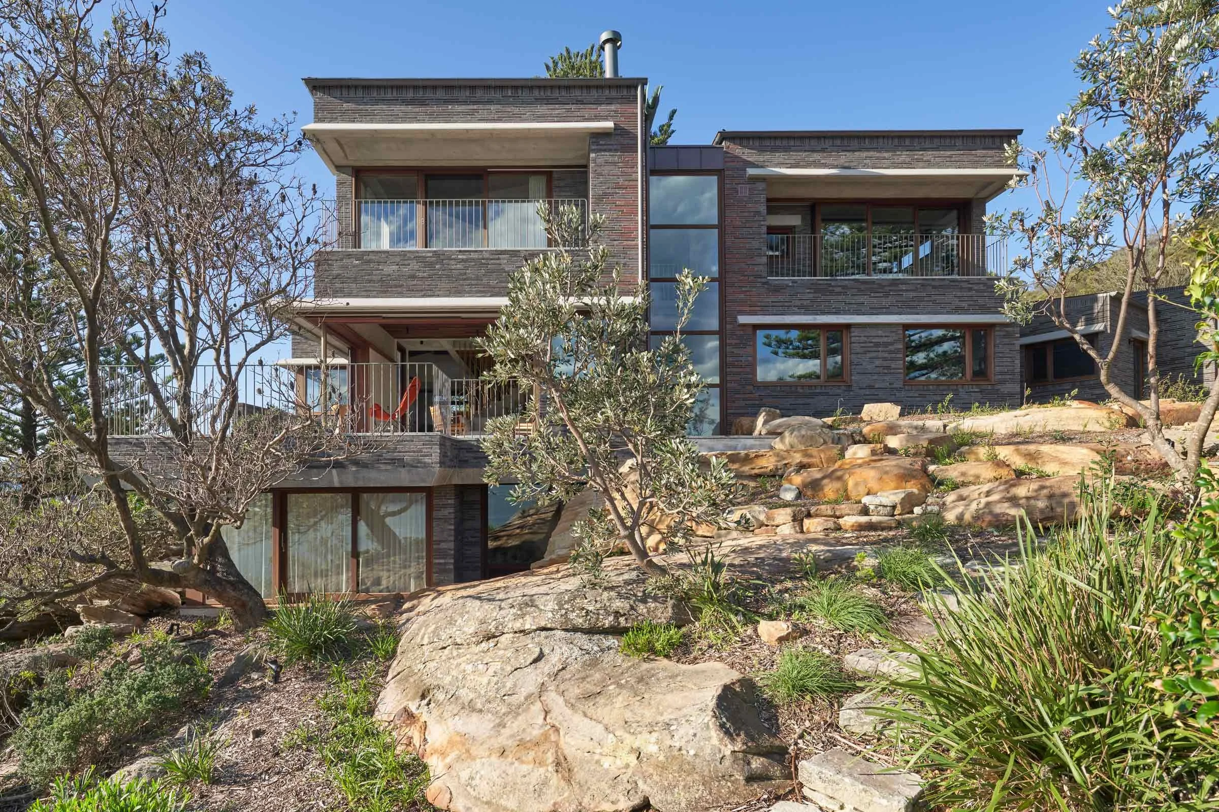
The house is 350 square metres, spread over four attached pavilions that go up three storeys.
What’s unique about the building and the location?
The location is an extremely rare battle-axe block in a heathland reserve, high up on the northern headland of Avalon Beach. The building is designed to step down the slope and nestle among the sandstone boulders, without dominating the site. The colours of the materials we chose and the four-pavilion layout help to maintain a relatively small-scale architectural response to the brief.
How did you approach the project — what design references did you try to incorporate into the space?
We really admire the hill villages of the Mediterranean and how they respond to the terrain and seem to grow out of hills in both scale and materials, so that was our approach — but in a contemporary way, accounting for the site’s microclimate and modern lifestyle requirements.
Please tell us a little about the material choices for the space.
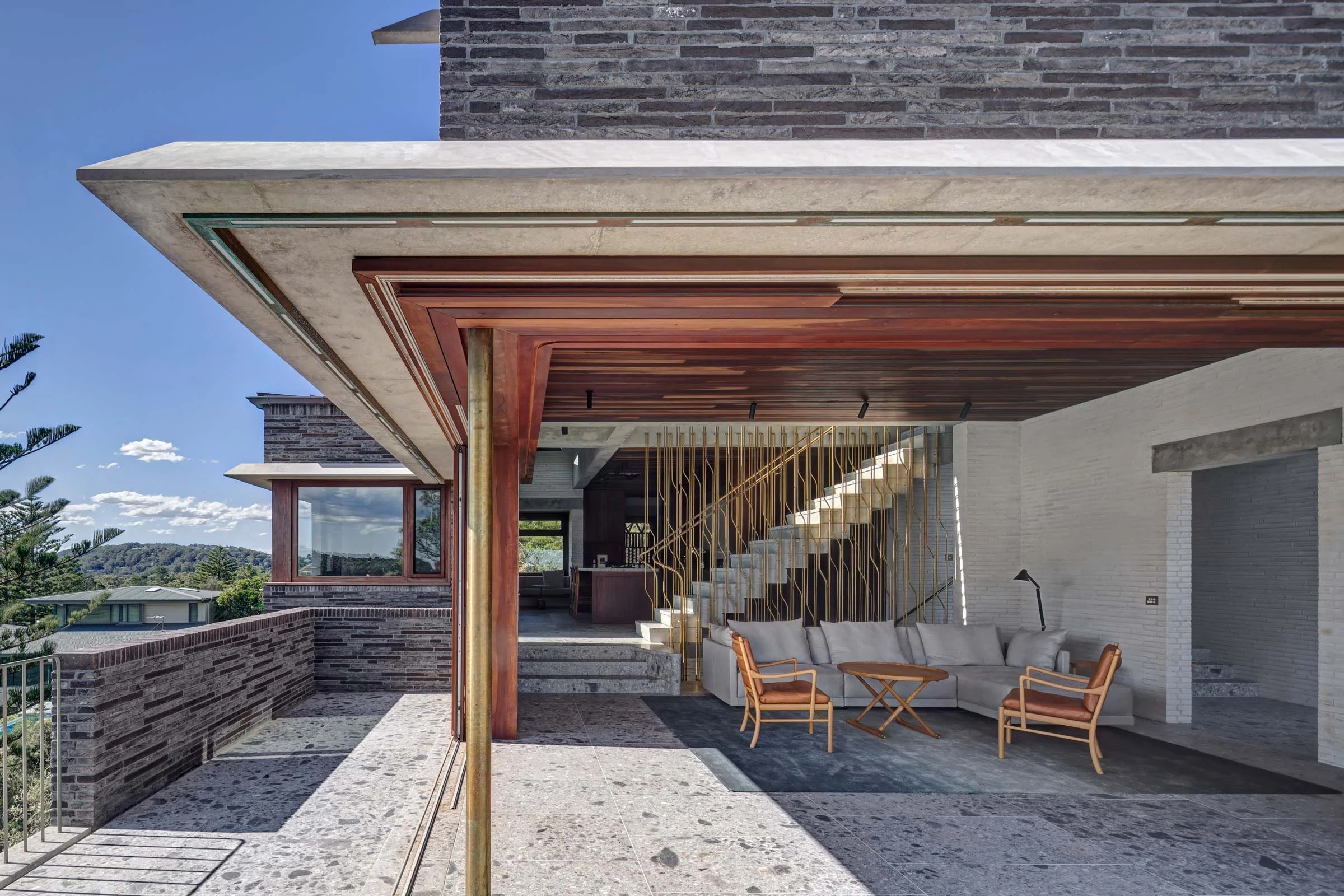
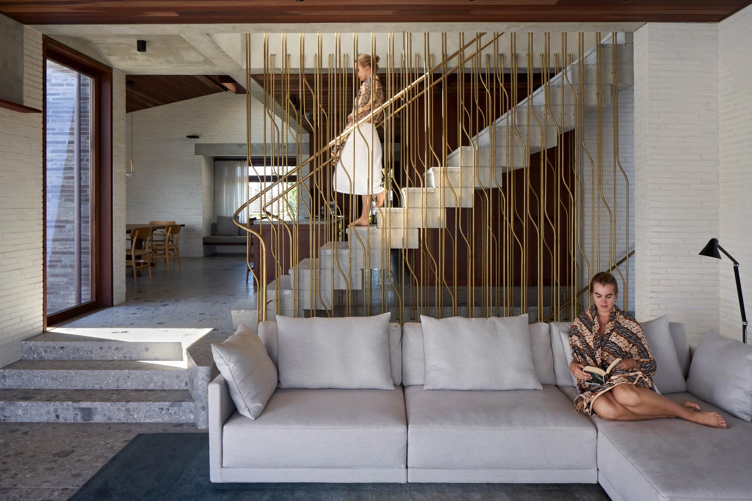
A rustic, robust exterior of copper roof and dark burnt bricks contrasts with the refined, white brick interior, stone floors, fine joinery, timber ceilings and delicate brass detailing. All materials are able to resist the salt and age graciously.
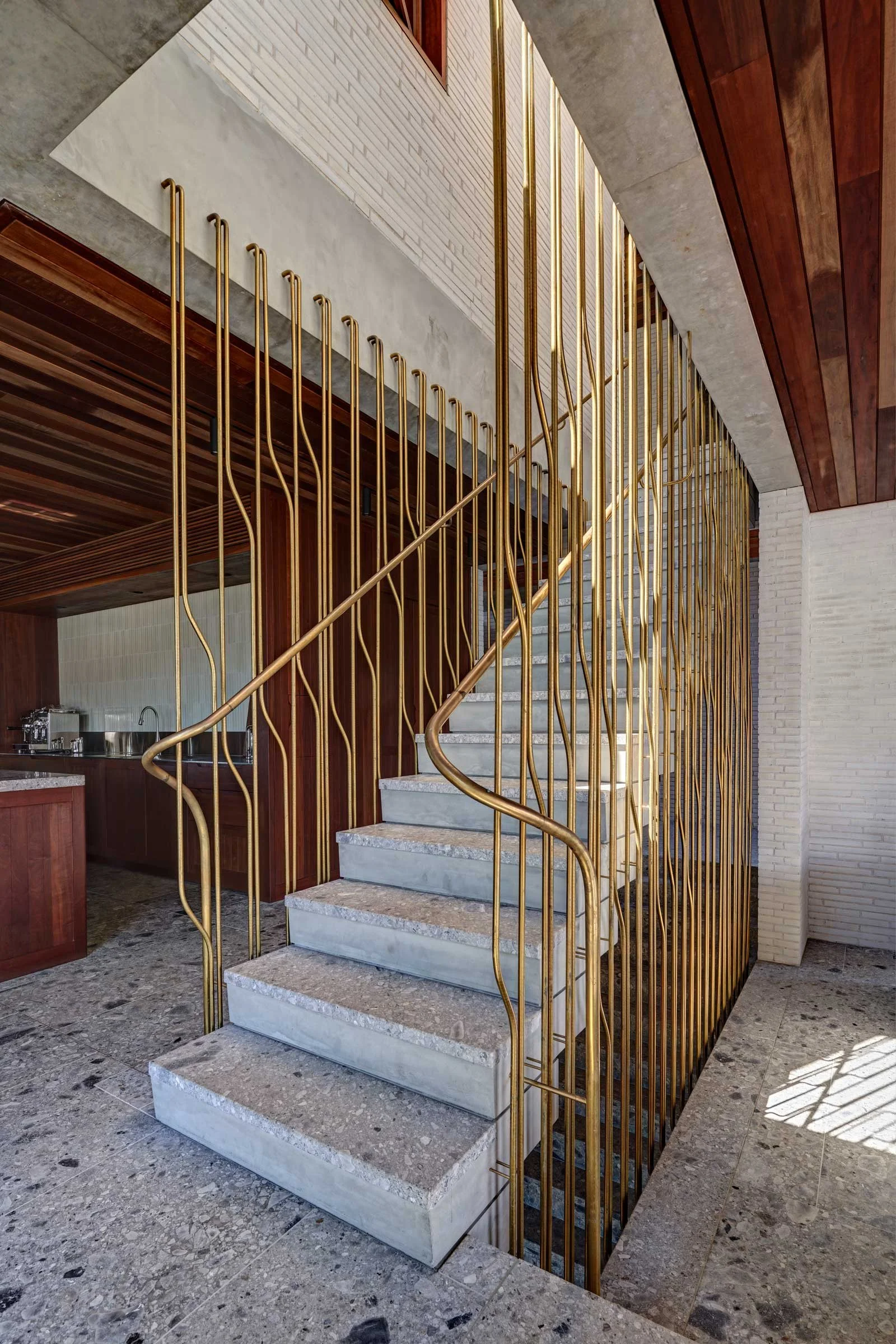
Our firm’s co-founder Caroline Casey designed the brass screen that encloses the floating concrete stairs and selected the furniture and fittings throughout.
Do you have a favourite element or design detail in the architecture or interiors?
The entry canopy is a cantilevered, arched concrete structure supported by a massive 16-ton natural stone column dug up from the site and erected as one of the first built elements. As the building’s main views are to the south, we kept the plan one-room wide so we could draw the northern sun into every room. This is enhanced by skylights shooting light down over the stairs and into the rooms not facing north.
Images / Michael Nicholson


