A Perfect Cube
In Canggu, Studio Jencquel designed this home as a perfect cube, its geometric elements tempered with softer details befitting its tropical location. Here studio founder Maximilian Jencquel tells us more
Design Anthology: How did you first meet the client?
Maximilian Jencquel: The client first contacted us via email. They wanted us to design a rental home, not so much for them but for foreigners seeking to stay in Canggu, on the south coast of Bali.
What was their brief to you for the project?
When they reached out, they told us they didn’t have an idea of what kind of house they wanted, but they liked simple and elegant.
What is the overall size of the house?
The plot is 250 square metres, and the house is 175 square metres spread over three levels. There was a height restriction of ten metres, and we ended up designing a perfect cube that measures seven and a half metres on all sides.
What’s unique about the building and the location?
I believe that it was a bold move for the client to purchase this land and then approach us. It makes me really happy because I think it’s a beautiful story. The simplicity of the building is what makes it unique. We literally created a perfect cube and fitted our programme into it, while being playful with the layout, light, airflow and so on.
How did you approach the project and what design references did you try to incorporate into the space?
It is unlike any project we’ve done before. The site was challenging for me — it’s not urban, but it’s not in the middle of nature either. The area is hot, humid and dusty, and there’s a lot of development happening in the neighbourhood, so there’s not much of a view onto anything. That meant we had to turn inwards, which is not an easy thing to do when you have a small plot of land, a lot to fit into it and a restrained budget!
Please tell us a little about the material choices for the space.
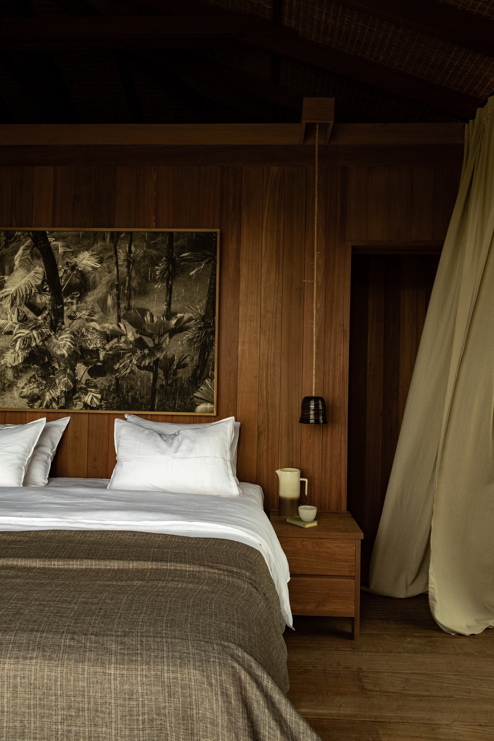
The material palette is basically composed of two materials: timber (bengkirai) and coloured cement. We wanted something that could fit into the context of the site, that’s not too modern, yet not too rustic. The blend of the two materials works well to create that balance.
Please tell us about some of the custom pieces for the space.
The Angostura chair and the bistro table are our favourite pieces in the space. I designed both for a restaurant project ten years ago, but when the client turned them down I went on to develop them for myself. They are the best sellers in our collection now.
Do you have a favourite element or design detail in the architecture or interiors?
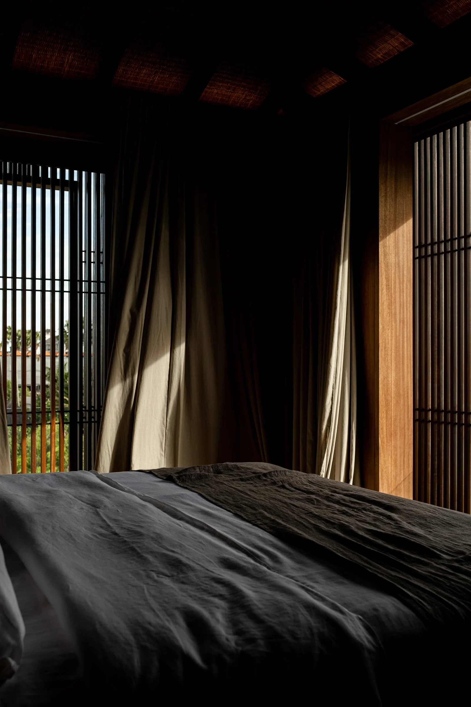
The screen works really well. It filters out the sun beautifully and creates a play of light and shadow, and it also provides privacy while allowing a feeling of open, infinite space.
Images by Ruben Beeris