A Sculptural Journey
In Singapore, Open Studio took a sensory, storytelling approach to designing Seroja, a new restaurant celebrating the flavours and culture of the Malay Archipelago. Here studio lead Jun Nan Lam tells us more about the project
Design Anthology: How did you first meet the client and what was his brief to you?
Jun Nan Lam: We met chef Kevin Wong through a mutual friend. He was looking for a space that would be the setting for his debut restaurant serving cuisine from the Malay Archipelago, food that’s true to his heritage. We wanted the design to communicate the authenticity, humility and ambition of the project, which seeks to communicate regional flavours with finesse.
Where is the restaurant and what makes the location unique?
The 250-square-metre restaurant is on the ground floor of DUO Galleria, a boutique retail mall in Singapore’s Bugis neighbourhood. The entrance is through an open courtyard garden in front of the restaurant, which makes a perfect tropical garden setting to experience the cuisine.
How did you approach the project — what design references did you try to incorporate into the space?
We were inspired by American artist Richard Serra’s large-scale sculpture The Matter of Time and the effect of growing suspense it creates through its different inclines — this is what we hoped to create for Seroja.
We also crafted the spatial scenography to address the challenge of the restaurant’s original linear layout. Such a path would have been entirely functional and unsurprising, and so the challenge was in how we could accentuate guests’ sense of anticipation, from their first encounter through to the moment they sit down.
Please tell us a little about the material choices for the space.
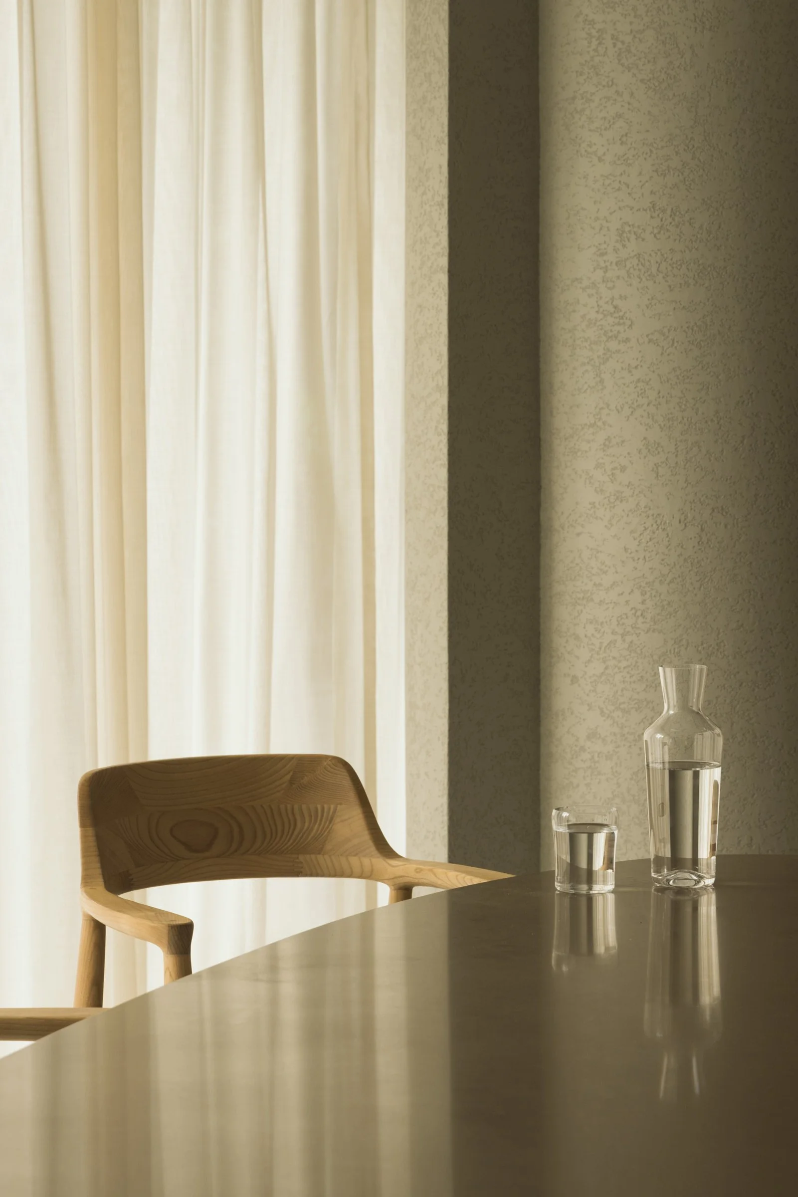
We employed hardy materials, such as textured paint, timber-look laminates and stone-look tiles, with an emphasis on textures and subdued shades to create a warm, comfortable palette akin to a refined home. These were layered with translucent sheers, loose pebbles and a botanical feature, which is a collaboration with a local botanical designer.
Please tell us about some of the custom pieces for the space.
We designed the ceiling moulding to create the sculptural, dramatic form of a funnel, and the expressive coves of the show kitchen to evoke the shape of an archipelago.
Do you have a favourite element or design detail in the interiors?
We included many curved details in the design. We’re especially proud of the curved cabinet doors that appear concealed but are entirely functional. We also love how the volumes were detailed to sit lightly in the space, balancing the heavy textures and creating an unexpected sculptural experience.
We had fun designing the signage, which we thought was an important first introduction to the restaurant and its cultural context. We were inspired by wayang kulit, a traditional form of shadow puppet theatre from Java and Bali, in our decision to use light and shadow to communicate a story.
Images / Finbarr Fallon


