A 19th-century Townhouse Becomes an Eyewear Shop
In a classic townhouse in Belgravia, this new outpost of British eyewear brand Cubitts was designed by Child Studio to balance traditional Georgian architecture with modernist design features. Here co-founders Che Huang and Alexy Kos tell us more about the project
Design Anthology: How did you first meet the client?
Che Huang (CH): We met Cubitts founder Tom Broughton three years ago and that's when we started discussing ideas for the brand's physical spaces. Tom's vision has always been that the stores need to be authentic and meaningful spaces embedded in the local community. Since then we’ve collaborated on eight stores for the brand, and each interior was designed to reflect the heritage and spirit of its neighbourhood.
What was his brief to you for the project?
Alexy Kos (AK): Our brief was to design a space that celebrates the rich history of Belgravia while weaving in a modernist narrative connecting it to the brand. It was important to communicate the attention to detail and commitment to craft, while also making the space feel inviting and unpretentious.
Where is the store?
AK: The two-floor store is located on Elizabeth Street in the heart of London's Belgravia neighbourhood. The charming tree-lined street is famed for its small independent boutiques, cafes and elegant facades decorated with flowers.
The entire area was designed in the mid-19th century according to a master plan by master builder Thomas Cubitt, who was the inspiration behind the brand's name.
How did you approach the project — what design references or narrative did you try to incorporate into the space?
AK: Our aim was to celebrate the architectural legacy of the building while also finding a narrative connecting the neoclassical interior with the modernist ethos of the brand.
When we started researching the history of the neighbourhood, we found that Eileen Gray, one of the pioneers of the modernist movement, lived in this part of London at the beginning of her career. So our concept evolved around the idea of Eileen Gray's drawing room, which we imagined with a classic townhouse interior furnished with sculptural pieces inspired by her designs.
Please tell us about some of the custom pieces for the space.
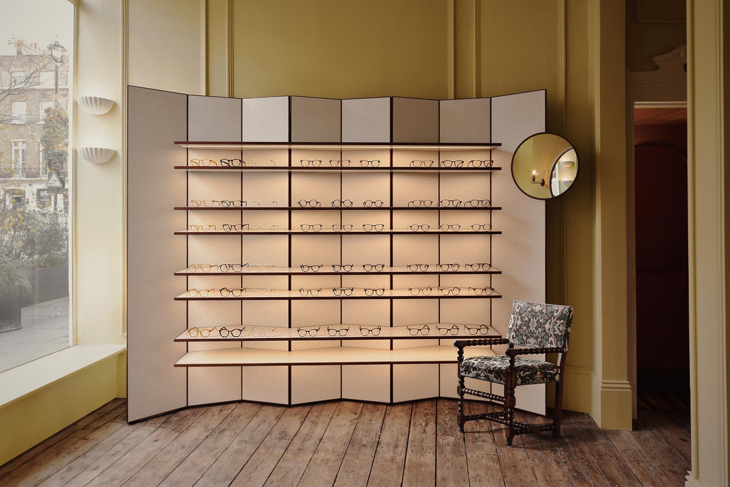
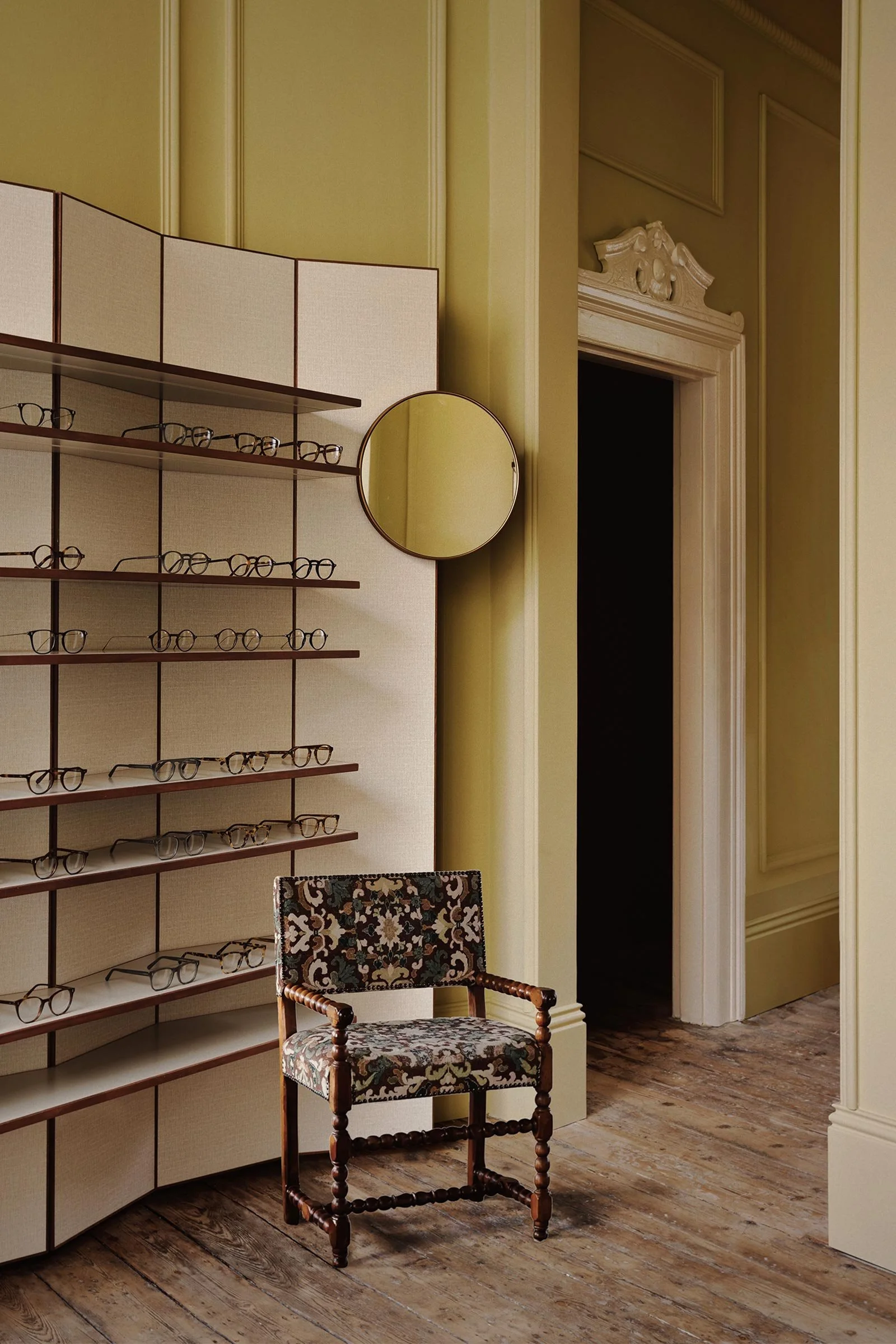
AK: We designed a series of custom furniture pieces responding to the intimate and domestic scale of the space. The display units reference the room’s dividing screens, and the counter is a homage to Gray's Rivoli table designed in 1928.
Do you have a favourite element or design detail in the architecture or interiors?
CH: It was an exciting task for us to reinstate the architectural details that were lost during previous renovations, such as the plaster cornices, mouldings and skirtings. These details give a subtle rhythm to the space, highlighting the high ceilings and doorways. We also sourced some peculiar carved wooden pediment details that were installed at the top of the doorways.
What other features are you most excited about?
AK: We always enjoy finding unique vintage pieces for our projects as they add a lot of warmth and personality to the space. One of our favourite items is the late-Victorian cast iron fireplace that was sourced from an antique dealer in Cambridge. The beautiful wall lights installed above the fireplace are antique Liberty-style Murano glass produced by Barovier&Toso.
Images / Felix Speller


