Concrete Vision
In Perth’s beachside community of Scarborough, this robust family home is epic yet modest thanks to the thoughtful design by Carrier and Postmus Architects (CAPA). We spoke to practice director Steven Postmus to find out more
Design Anthology: How did you first meet the client?
Steven Postmus: The clients spoke with several architects recommended to them by word of mouth, and we were on their list. Our initial meeting was informal but focused. I think it was an audition to see whether we could be trusted with listening and interpreting the project context, brief and budget.
Can you tell us about them and their lifestyle?
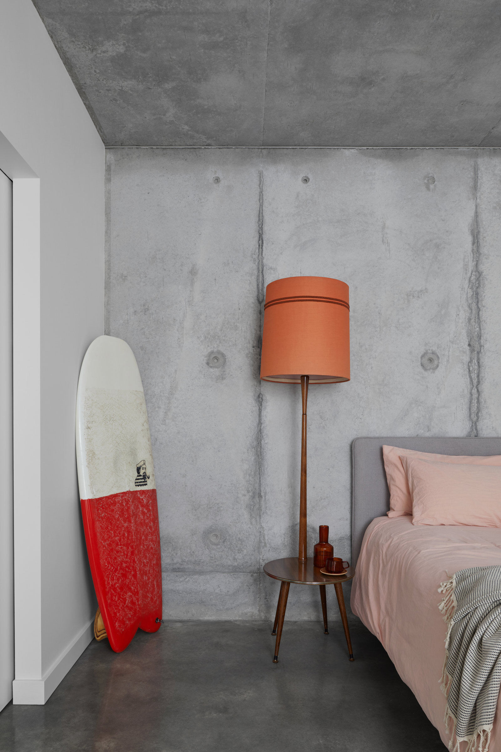
They are a young couple full of spark and enthusiasm, and are very community minded and people orientated. The coastal location suits their surfing, skating and outdoor lifestyle. Following the completion of this project, there was an Open House Perth event and a group of young kids dropped by looking for our clients and talking about how cool the pool was. It was very sweet and reflects the couple’s hospitality.
What was their brief to you for the project?
In essence, the home needed to be epic but modest, crafted but not delicate, and somewhere for their family and friends to gather.
What is the overall size of the house?
The house spans six levels, with 330 square metres of enclosed space. Additional amenities include a covered al fresco area and rooftop.
What’s unique about the building and the location?
Its uniqueness lies in the fact that it’s full of contradictions inside and out. We love how people respond to it intuitively; they like it but don’t know why. This is foreshadowed at the street elevation, with the singular epic expression that’s also articulated at a modest suburban scale. The house is hidden at the end of a cul-de-sac but has an open facade with sculptural forms. We’ve used concrete, which has a cool, raw quality, and paired it with a light and warm cream brick. The interior is a real surprise.
How did you approach the project — what design references did you try to incorporate into the space?
Our approach was to design the architecture, landscape and interior together at the start. This allowed us to make decisions about protection, integration, contrast and surprise to create a welcoming sanctuary.
The project’s spatial intrigue was influenced by Le Corbusier’s Mill Owners' Association Building in India and the considered modesty of our friends and fellow Western Australian designers vittinoAshe, Simon Pendal and Stephen Neille.
The interior is a protected space, buffered by the solid facade and discrete windows centred around a double-height living space. The private rooms are arranged across multiple levels; all different, but still connected.
Please tell us a little about the material choices for the space.
The materials palette needed to be resilient and robust as our coast is pretty fierce, with intense winds, heat and glare. Fortunately for us, the clients already had a builder with a preference for concrete, which is rare for Perth. Overall, the palette is comprised of concrete (boarded and face) and masonry brickwork (ribbed concrete and face clay), with concrete ceilings and stained timber linings.
Do you have a favourite element or design detail in the architecture or interiors?
The folding tiled wall of the en suite with its hidden skylight is a highlight. We also love the central void.
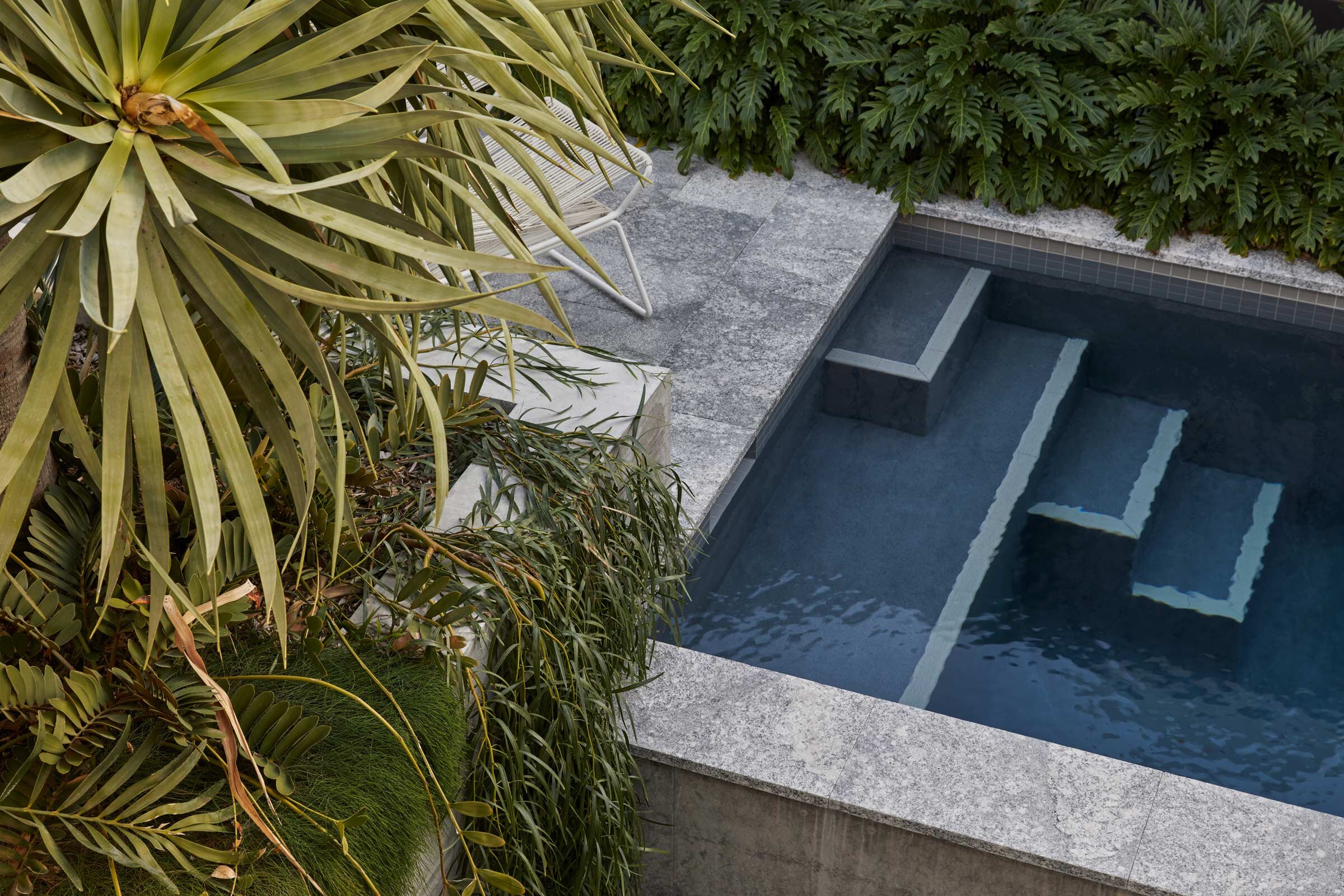
Structurally, the concrete pool has been raised as a retaining wall to the site, but it also doubles as pool fence security for the children, and allows people to come to the edge and interact. Other favourite details include the timber outdoor chair that’s hanging inside, and the Virgil Abloh x IKEA “KEEP OFF” rug that their pet dog Kanye sleeps on.
Images / Douglas Mark Black
Styling / Amy Collins-Walker


