A Cosy Coastal Cafe
Located within East Coast Park’s Marine Cove, East Coast Commune is a new cafe intended to be a gathering spot for all ages, with its inviting interiors designed by cafe owner Shermien Koh and Jerry Goh of Studio Grain to reflect the lush coastal location
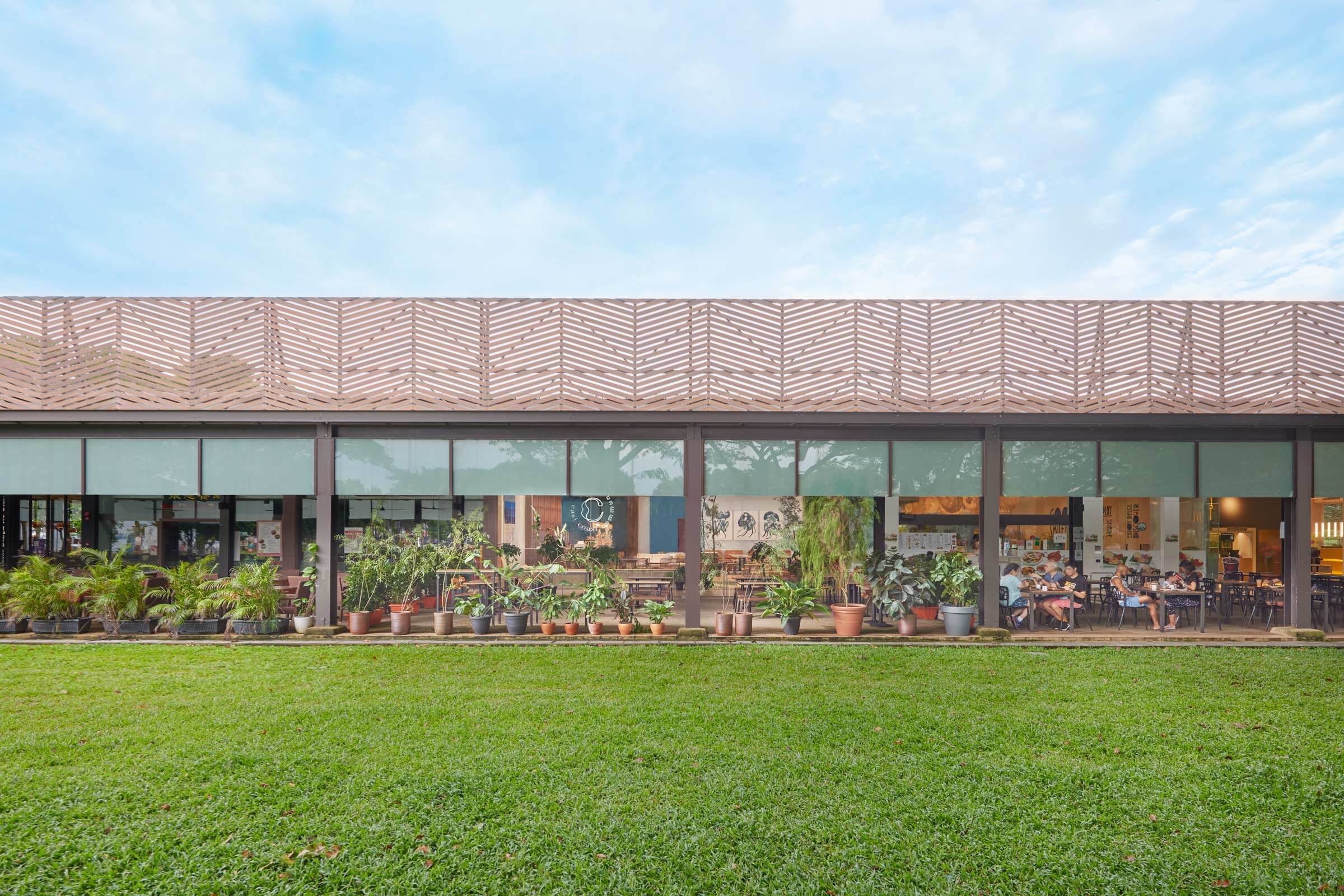
Singapore’s East Coast Park is 15 kilometres of coast, aged rainforest trees, views across the water of distant ships en route to port, and ample bike routes and pathways that link from Changi almost to the city. Along this stretch is Marine Cove — a row of eateries accompanied by a large playground, where new cafe East Coast Commune makes its home.
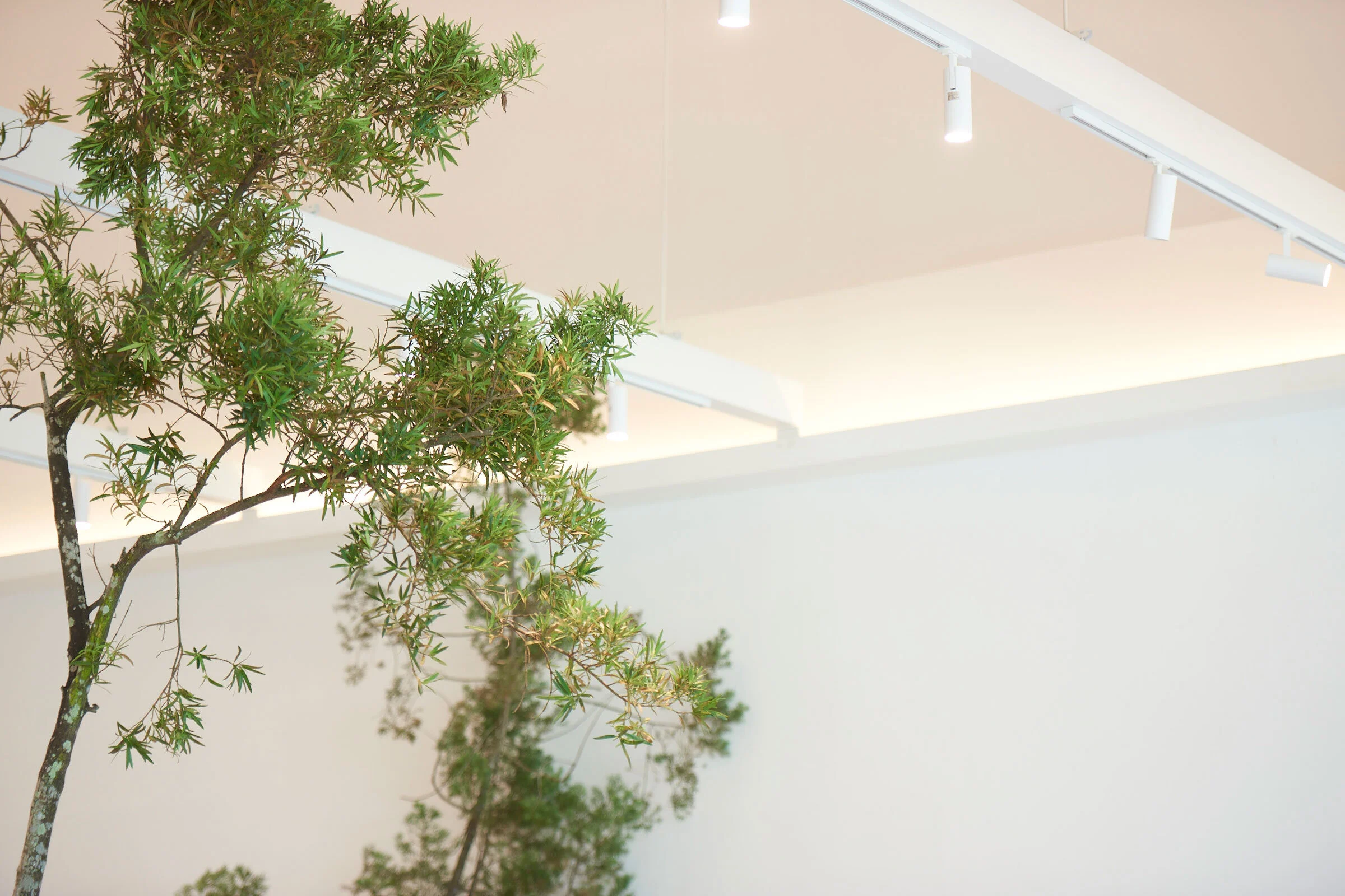
East Coast Commune’s name reflects its intention to be a gathering spot for all ages. There’s pasta, waffles and cold-pressed juices, a children’s menu of additive- and preservative-free meals, and a selection of natural wines and craft beers. The high ceiling, casual cement flooring and ample potted plants make the space inviting, while vintage and new furniture in wood and rattan, as well as details like a hanging tapestry by Marrakesh-based lifestyle brand LRNCE, adds to the homely feel.
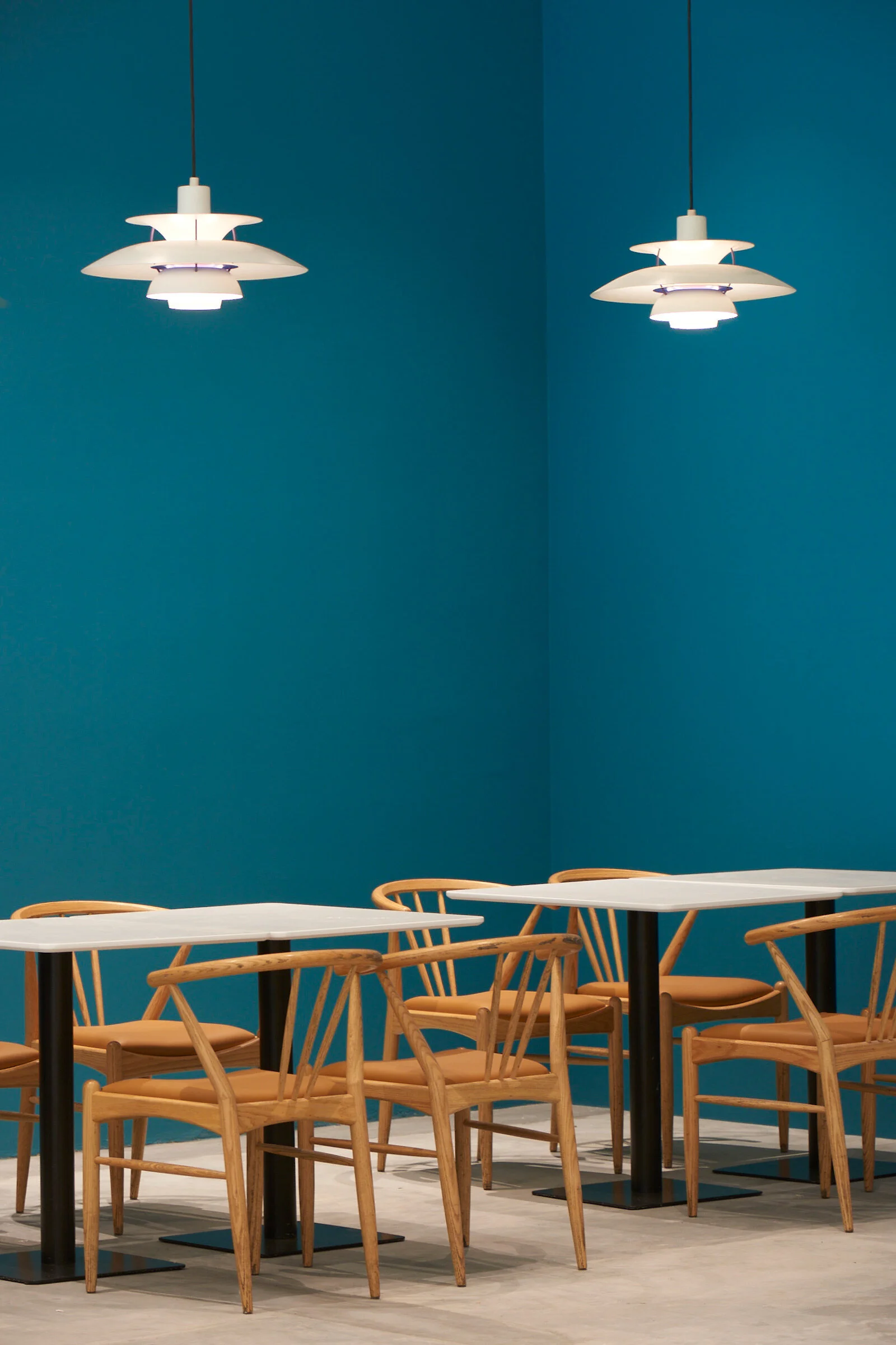
The design pays homage to its natural context. According to cafe owner Shermien Koh, who is also behind the interior design, this shows up in many aspects, including the ocean-themed triptych by local artist Wu Yanrong, deep teal walls and indoor plants. ‘The cafe is located by the sea, so even our logo design was inspired by water’s fluid nature,’ Koh says.
Designer and creative director Jerry Goh of Studio Grain conceived the branding and also contributed his ideas for the interior design. ‘We worked closely with East Coast Commune on ensuring that the spatial design is coherent with the brand’s DNA, resulting in a look and feel that’s refined but not intimidating – an open, welcoming and honest space,’ Goh says.
Goh’s approach and philosophy marries storytelling, timelessness and a sense of delight, all of which are present in East Coast Commune. ‘We believe in adding a sense of delight, or a twist beyond what’s required from the brief,’ he says. ‘For example, we selected Yanrong’s unconventional and imaginative artwork to lighten the mood in the space and serve as a conversation starter. We also added a contrasting orange tone (representing sand) to the teal and sky-blue colour scheme (representing sea and sky) for some warmth and an element of surprise.’
The design also reflects an understanding of the cafe’s inherent character. A full-height shelf behind the bar counter and the suspended cafe signage highlights its loftiness. Ample seating options keep visits interesting for regular customers — there’s a ledge upfront for grab-and-go coffee, a communal table and bar seats, as well as low-slung furniture for lounging in the central area. Toward the rear, more intimate catch-ups can be had under the snug glow of a pair of Louis Poulsen PH5 pendants.
Text / Luo Jingmei
Images / Jovian Lim


