Embodying A Collaborative Ethos
In Bengaluru, local architecture and design practice Taliesyn’s new studio space reflects the team’s collaborative approach and work ethos. Principal and director of Taliesyn Shalini Chandrashekar tells us more about the project
Design Anthology: What were your requirements for the new space?
Shalini Chandrashekar: The new studio required a simple, open layout with variations in open and semi-open spaces to provide hierarchy, ventilation, proximity to green pockets and privacy through the shifts in volumes. It had to include an outward-facing area with ample green spaces, a separate material library and spill-out spaces that could accommodate 20 to 30 people. It’s designed to accommodate workspaces, discussion areas, meeting areas, dining areas, and storage and display areas for working models and drawings.
What’s the overall size of the space?
The space is 223 square metres. The existing site conditions dictated the overall spatial narrative, which is based on fluidity and hierarchy of privacy.
How did you come up with the concept for the studio?
It’s a quiet reflection of our company’s ideologies and work ethos, which we expressed through the space’s experimental material palette. We’ve conceptualised the design language to harbour the essence of inspiration, creation and collaboration while fostering unconventional studio workings.
What was your initial inspiration for the design?
We drew inspiration from spatial identities and a vernacular blend of materials. While the spatial experience is choreographed in a minimalist way to highlight visual connections across the studio, the hierarchy of spaces encourages collaborative learning.
Were there any particular challenges or constraints to do with renovating the existing space?
We transformed a shipping container into a material library. The level differences in the open courtyard create a partially covered area below the material library which serves as an informal discussion space and dining nook. The most challenging hurdle involved altering the container’s dimensions and elevating it off the ground.
Can you tell us about the materiality and design detailing?
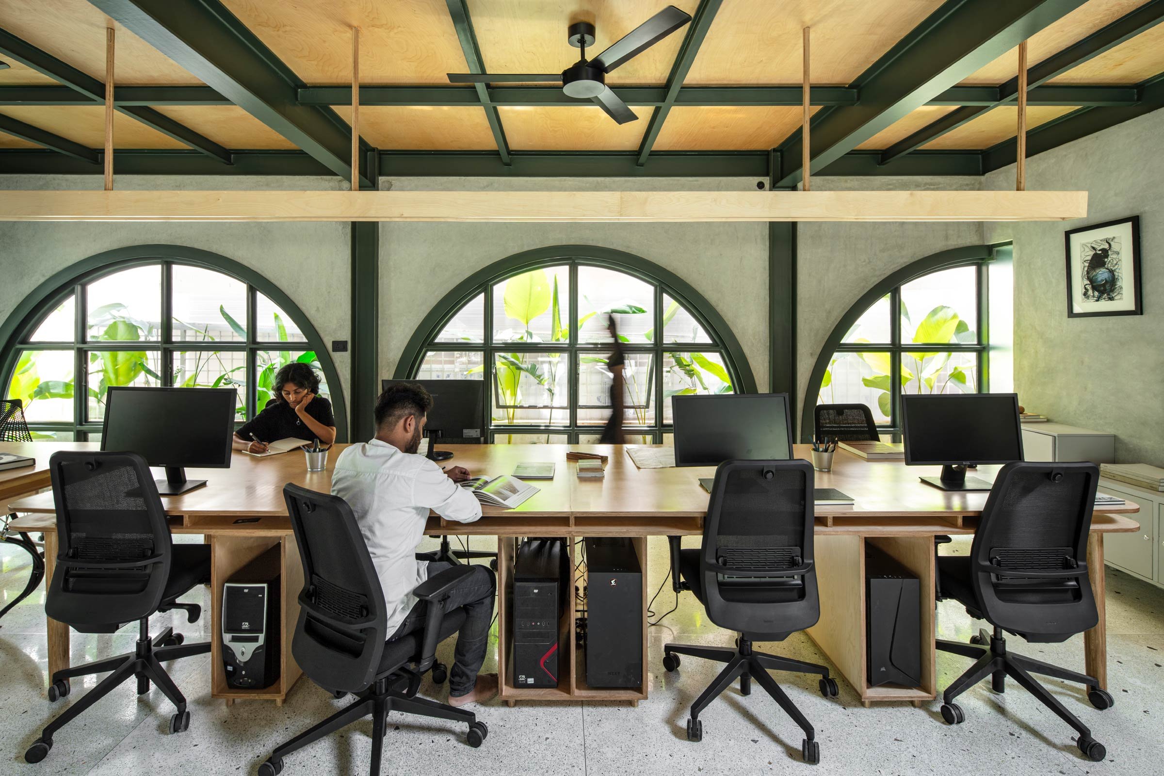
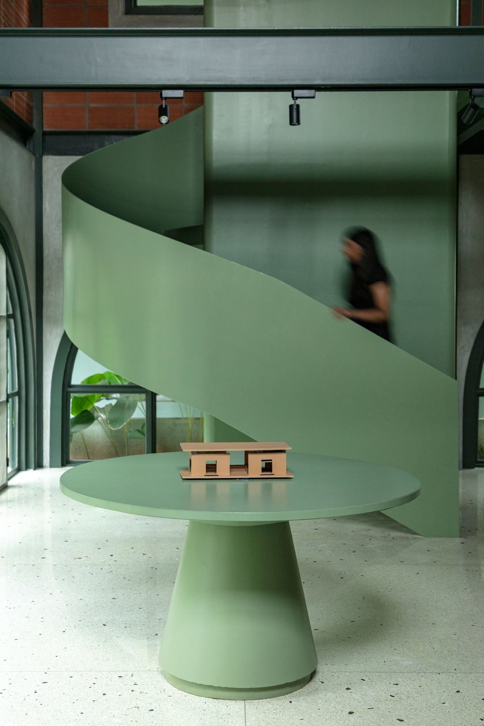
Anchored by a bold exposed framework that forms the structural skeleton of the space, the main studio features a series of semicircular arches and built-in metal sections. This single-storey facade is bifurcated horizontally by terracotta blocks on the upper half and cement arched panels on the lower, with metal sections reinforcing the juxtaposition of the two. The combination of these materials creates visual interest and porosity.
The terrazzo floor on the ground level was cast on-site using recycled broken chips. The furniture — including all the working desks, chairs and tables — was crafted onsite with birch ply perched on metal legs, echoing the studio’s minimalistic design sensibility.
Was sustainability a consideration? If so, how was that incorporated into the construction and design?
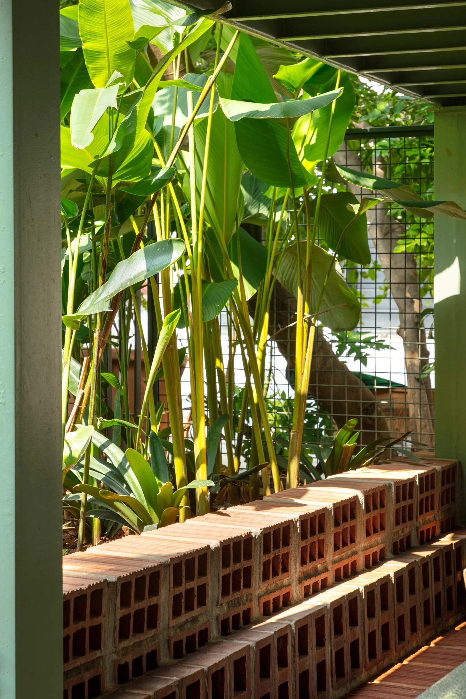
We crafted patterns and textures from hollow terracotta blocks and recycled materials from the site to create a sense of spatial curiosity. The space opens onto a landscaped front yard which acts as an inviting space for collaboration, gathering, informal events and social activities. We purposedly avoided any ornate finishes to highlight the original aspect of the materials we used — a sustainable approach that echoes Taliesyn's philosophy. We also incorporated a rainwater collection system, and the space’s three-layer flat roof houses solar panels that meet the electricity needs of the studio.
Images by Niveditha Gupta


