Indian restaurant Gaa Relocates to a Classic Thai House
Architectkidd channels the celebrated modern Indian restaurant Gaa’s nonconformist nature by accentuating the materiality and space of a classic Thai house in Bangkok’s Thong Lo area
Image by Aey Somsawat
Since its 2017 launch, Bangkok’s Gaa has become one of Asia’s most garlanded restaurants, and its Mumbai-born owner and chef Garima Arora — an alumnus of Copenhagen’s Noma and winner of Asia’s Best Female Chef 2019 — emerged as one of modern Indian cuisine’s most experimental talents. Her winning formula? Dishes evocative of the subcontinent but unconstrained by traditionalism, and all made with carefully sourced Thai produce. Whether it’s the signature cultured butter with jaggery and ginger powder, or the new street food-inspired tasting menu, her creations benefit as much from her critical distance and fresh eyes as her mastery of Indian cooking techniques.
Something of that nonconformity has informed Gaa’s relocation to a 60-year-old traditional Thai house on Sukhumvit Soi 53. Bangkok-based firm Architectkidd is behind the revamp, which was led by architect Luke Yeung. ‘We knew we didn’t just want to recreate an antique; we wanted to look at it with fresh eyes as well,’ Yeung says.
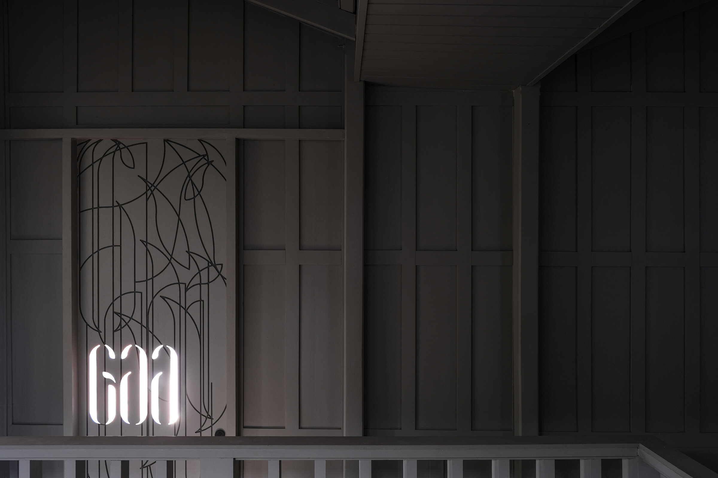
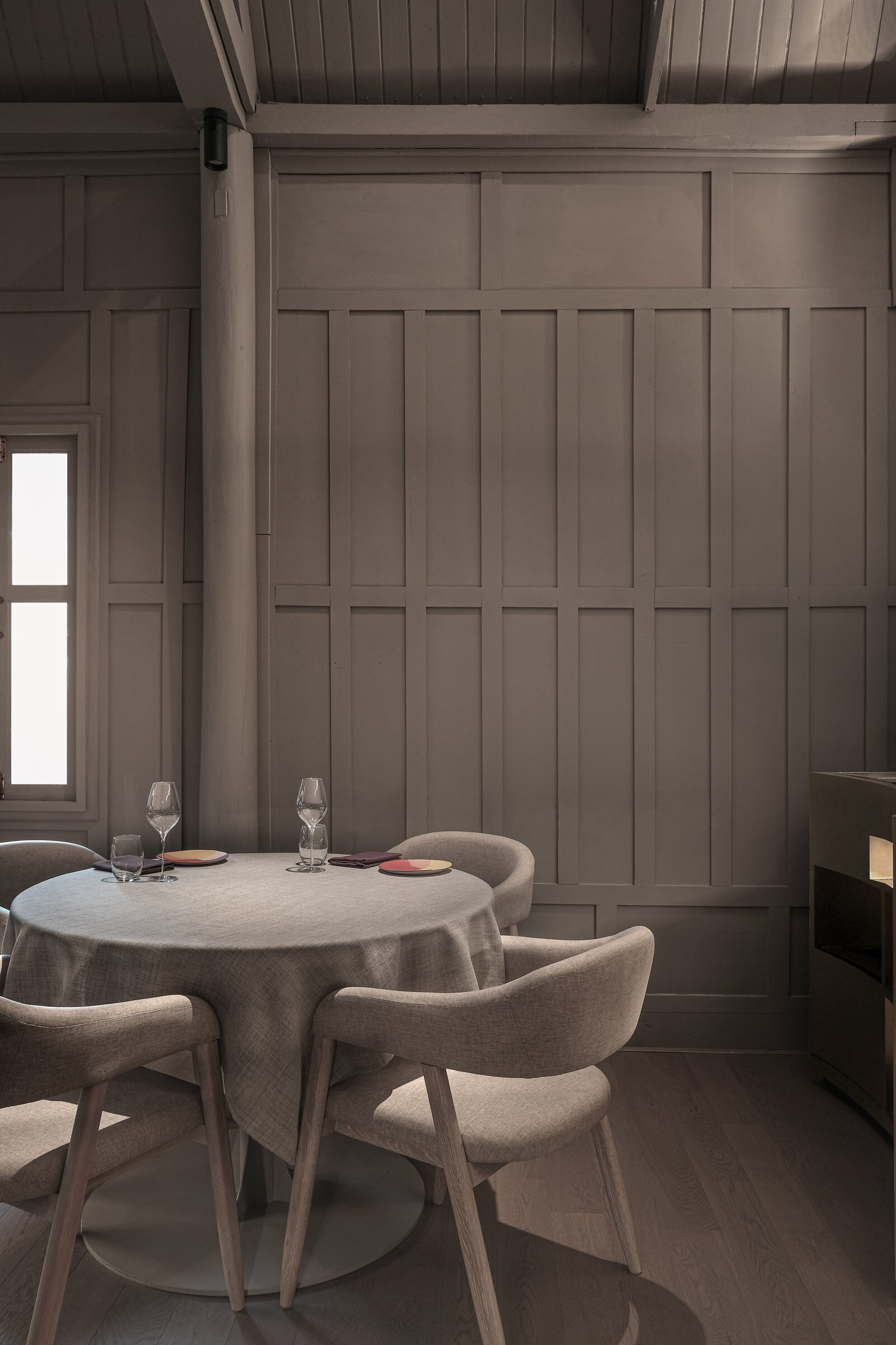
The exterior, with its steeply pitched roof, sinuous red-brown silhouette and teak pillars, is every inch the classic, modular baan ruen thai (wooden Thai house). But upon ascending the outdoor stairs and crossing the threshold, patrons are met by something that doesn’t quite fit the mould: a uniform taupe colour scheme that extends from the floor to the loose furnishings to the tropical hardwood panelling and beams. ‘There are a lot of textures, forms, shapes and surfaces in a Thai house,’ explains Yeung. ‘We wanted to accentuate them but in an unfamiliar way, by muting the colour.’
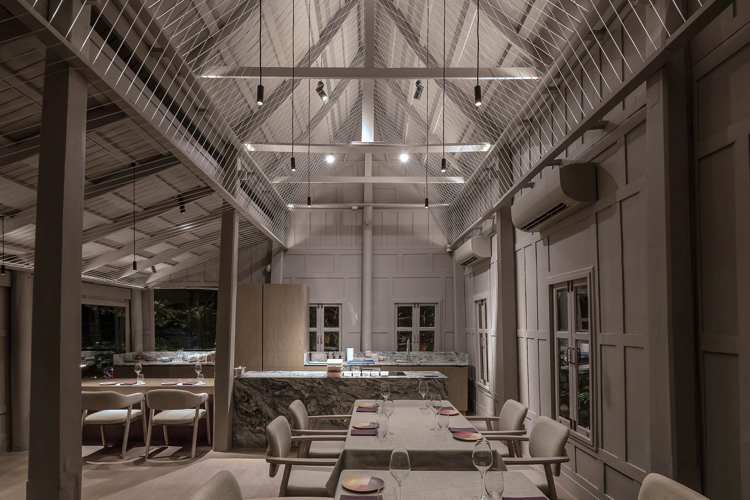
At each end of the dining room is a pillar decorated in lai kranok — a flame-shaped motif common to Thai religious art — in faded gold leaf. Between these sit matching chairs and dining tables by Bangkok-based Bowr and serving stations by local contractor WAWARA Design. But the signature element is overhead: a white string installation that flows through the tall, sharply curved rafters. This is inspired by sai sin, the white threads hung in Buddhist temples and houses, or worn by worshippers, as a symbol of purity and protection. ‘We wanted to draw people’s attention to the ceiling but not cover or decorate it. We came up with the idea of a lightweight, thin, porous thread, which has a presence but isn’t solid,’ Yeung says. Diffused sunlight accentuates this imposing yet inviting setting by day, while hanging pendants create drama at night.
On the ground floor, between the raised stilts of the house, is Arora’s new all-day eatery and bar. At HERE, she pairs a more casual menu with less controlled design. Replacing the upstairs restaurant’s elegantly choregraphed emphasis on light, shadow, materiality and space is a more playful mix of furnishings and a brass bar inspired by the Indian canteen. ‘There’s a duality between downstairs and upstairs,’ says Yeung, adding that, like Arora’s food, both spaces set out to defy expectations. As he says, ‘It’s great to shatter preconceived notions of design or food and add something new to the conversation.’
Text / Max Crosbie-Jones
Image by Luke Yeung
Image by Luke Yeung
Image by Luke Yeung
Image by Aey Somsawat
Image by Luke Yeung
Image by Luke Yeung
Image by Luke Yeung
Image by Luke Yeung
Image by Luke Yeung
Image by Luke Yeung
Image by Aey Somsawat
Image by Aey Somsawat
Image by Aey Somsawat
Image by Luke Yeung
Image by Aey Somsawat
Image by Aey Somsawat
Image by Aey Somsawat
Image by Luke Yeung
Image by Aey Somsawat
Image by Aey Somsawat
Image by Aey Somsawat
Image by Aey Somsawat
Image by Aey Somsawat


