Ho Lee Fook Gets a Cinematic New Look
Reimagined by local firm dix design+architecture, iconic Cantonese restaurant Ho Lee Fook returns with a captivating and playful look inspired by old Hong Kong films
Tucked away in a basement in Central, Hong Kong restaurant Ho Lee Fook has been an institution for years. Part of the Black Sheep Restaurants group — a hospitality team famous for its unique story-driven concepts — the establishment was recently redesigned by Sean Dix’s studio dix design+architecture. ‘The brief for the project was quite open, but it was clear that we all wanted to keep the playfulness of Ho Lee Fook’s original design,’ says Dix, who designed the original restaurant in 2014. ‘We updated and elevated the space to reflect the new, more authentic and refined cooking of chef ArChan Chan.’
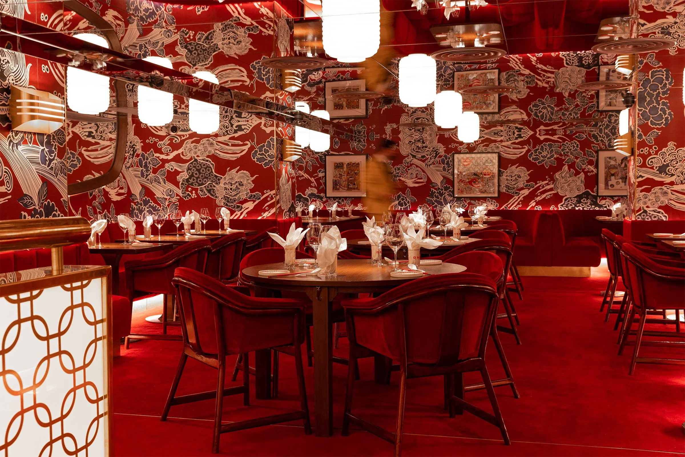
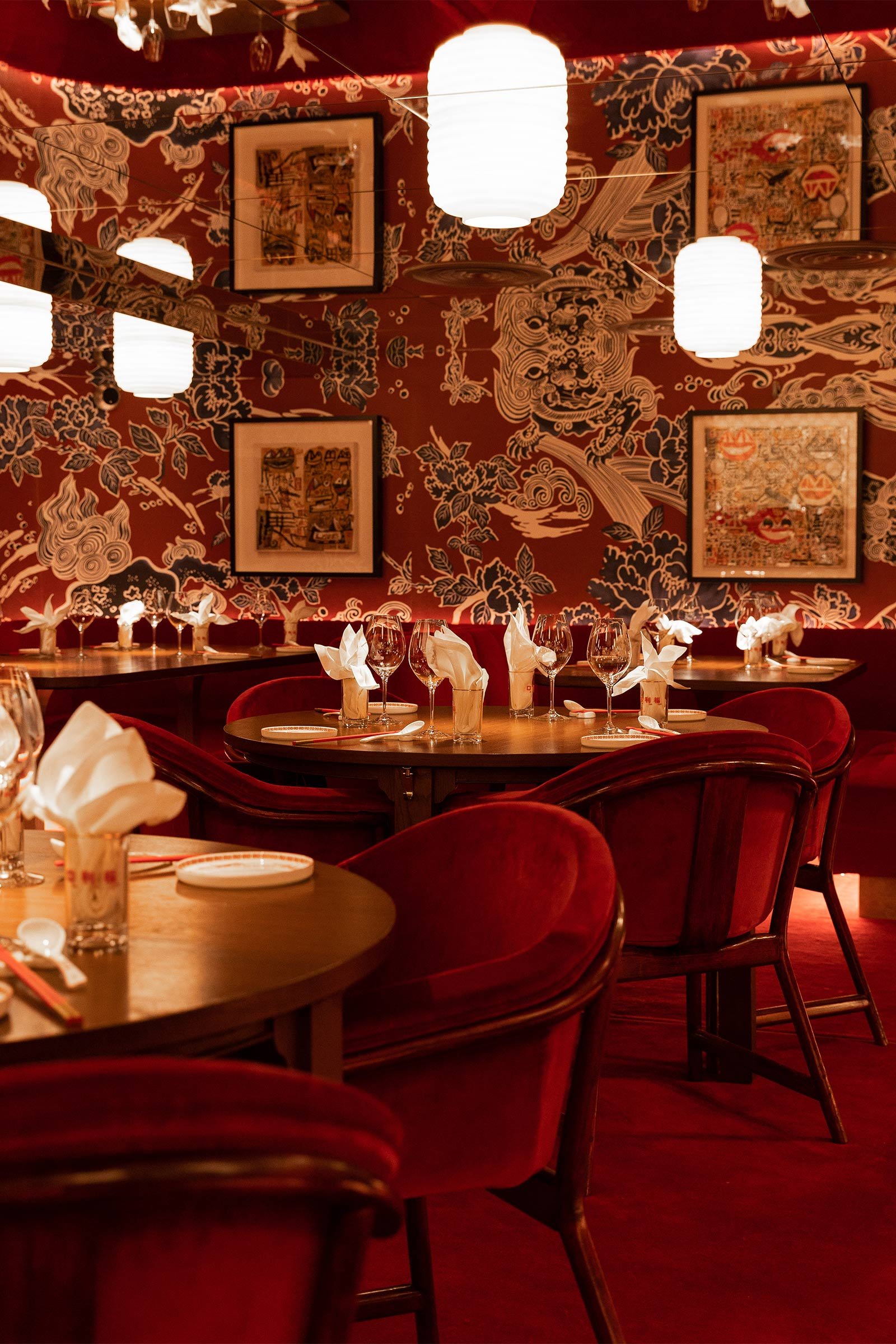
Walking into Ho Lee Fook, guests are still greeted by a wall of hundreds of golden maneki-neko, or ‘beckoning cats’ in Japanese — the kitsch waving cats commonly seen in Chinatowns and Asian stores around the world — a playful detail that sets the mood for the restaurant’s irreverent character. A gleaming brass staircase covered in blood-red carpeting leads down to the dining area on the basement level. Here, it’s the bold hues that first make an impression: a loud ensemble of patterned vintage wallpaper, plush red velvet chairs and banquettes and matching carpets. ‘We wanted to bring guests into an experience out of time, where quotidian Hong Kong is left behind,’ says Dix. ‘All the materials were chosen to create and reinforce the sense that you’re walking onto a Shaw Brothers film set, transporting you back to the glamour and elegance of smoky, post-war Hong Kong.’
In one corner, a hand-sculpted and polished golden onyx cocktail bar adds to the cinematic opulence. On the walls and the ceiling, mirrors bring layers of dimension while also creating the illusion of a higher ceiling. ‘One big challenge was to create a sense of height where there wasn’t any,’ says Dix. ‘To achieve that, we installed a mirrored ceiling and designed custom, handmade opaline glass luminaires that are cut in half and are reflected in the ceiling, creating the effect of a higher ceiling and appearing like lanterns that float above the tables.’
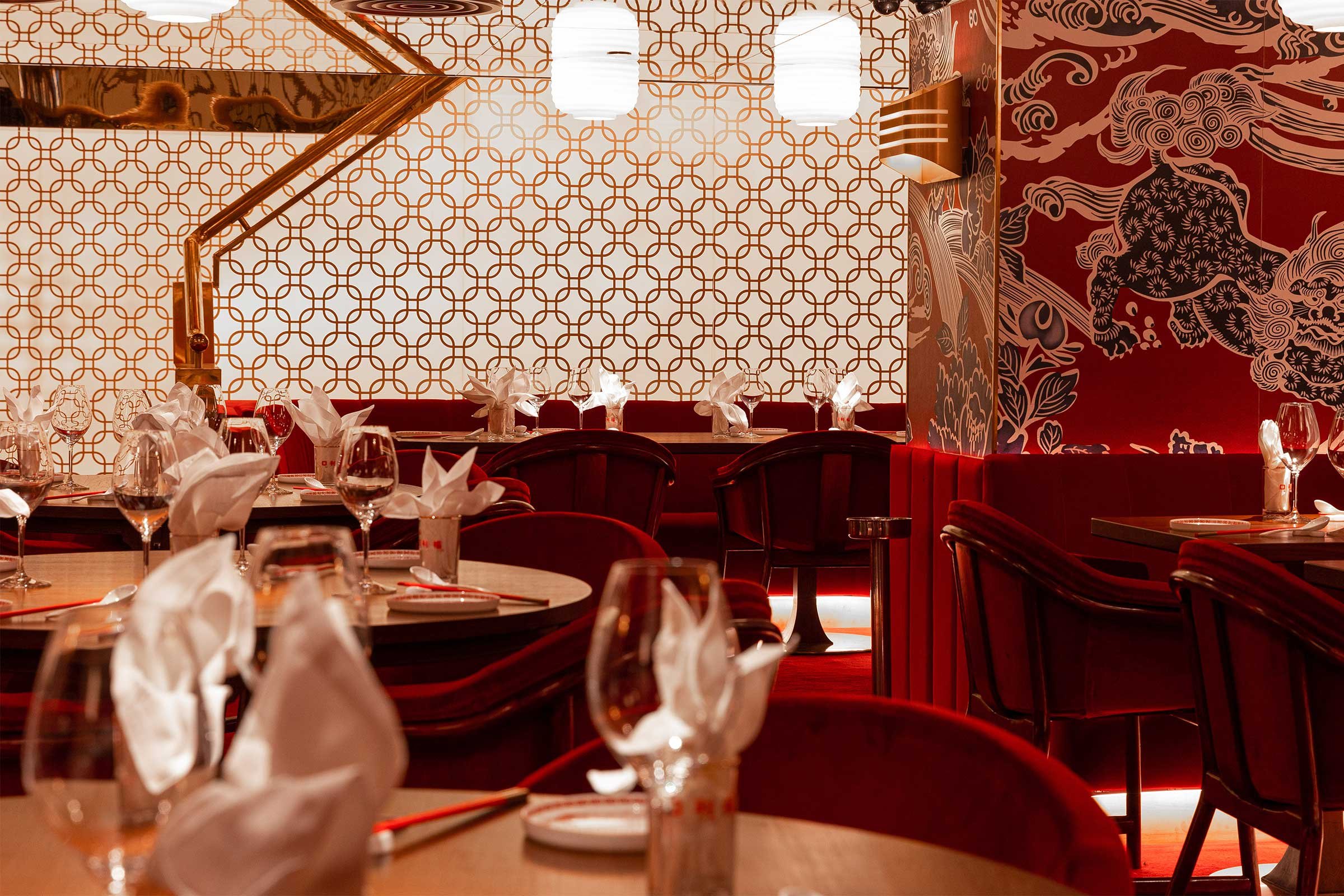
The side of the staircase was designed as a giant lightbox adorned with Chinese-inspired motifs, forming a captivating backdrop and bringing additional light into the enclosed space. ‘We used many tricks to create dramatic lighting effects,’ Dix says. ‘One might almost expect to see actress Chan Po-chu making a dramatic entrance, sashaying down the stairs while gangsters sit hunched at the cocktail bar side-eyeing everyone coming into the joint.’
While the bespoke hardwood chairs, tables and bar stools were designed to subtly evoke Chinese traditional furniture with a contemporary look, other elements were purposefully imagined as exaggerated references to Chinese culture. There’s the oversized cheongsam-inspired patterns on the wallpaper, the mah-jong tiles that cover the restaurant’s facade and the giant brass fortune cookie sitting at the entrance (with a smaller version forming the door handle). ‘The huge fortune cookie is big enough that you can actually sit on it,’ says Dix. ‘It’s playful and ironic, and I think brings some smiles.’
And the magic doesn’t stop there — a brilliant playlist of the best funk and disco hits from the eighties plays in the background, while impeccably executed classic Hong Kong and Cantonese dishes are served by festive waiters. If Ho Lee Fook’s new design is, as Dix describes it, ‘a respectful love letter to Hong Kong’, we call it a dazzling homage to the eighties and to Hong Kong cinema.
Text / Nina Milhaud
Images / Black Sheep Restaurants


