
A Home’s True Colours
Wrapped in bold hues and elegant textures, this eclectic Hong Kong apartment was designed by local design studio Lim + Lu. Co-founders Elaine Lu and Vincent Lim tell us more

Design Anthology: How did you first meet the client?
Elaine Lu & Vincent Lim: We were introduced to the clients by a mutual friend. We met them for the first time at their previous apartment, which was located right above the unit they hired us to design. They’d been living there for a few years, and had fallen love with the residential complex and the community. So, when the opportunity came to purchase an apartment in the building, they took it.
Can you tell us about them and their lifestyle?
The clients are a couple with a child. Since they both work, design meetings often happened at their home in the evening. They sometimes involved their child when making certain decisions, which shows that creating a safe and loving environment for every member of the family was crucial for them.
What was the brief to you for the project?
The clients were already very familiar with the apartment’s layout — they knew which room had the best morning light and which had the best sound insulation — so they already had a clear idea of how they wanted to organise the apartment. The only requirement they had was that the design should be fun for their child while staying sophisticated.
What’s the overall size of the space?
The apartment is 185 square metres and includes a good-sized balcony by Hong Kong standards.
What’s unique about the building and the location?
The six-tower residential complex was built in the mid-1960s and was designed to create a sense of community. The buildings are laid out in a circular pattern and face inwards onto a raised circular courtyard that welcomes joggers and children. The complex doesn’t have great city views, which might explain why it was designed with an inward focus. It’s also the reason why we created spaces that promote introspection.
How did you approach the project? What design references did you try to incorporate into the space?
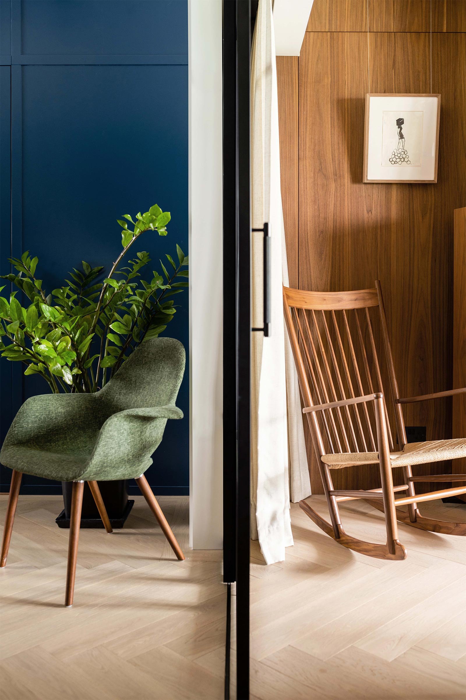
Having our first meeting at the clients’ previous residence gave us a lot of insight into their style. They’re not conservative when it comes to colours, so we used bold hues as the driving force for the project. We assigned different colours to each space depending on the activities it would be used for. For example, we paired spaces dedicated to relaxation with soothing colours, while more lively spaces like the dining room were designed using bolder tones.
We also incorporated vintage Hong Kong vignettes throughout the apartment, such as rattan in the living room and the tram-inspired red and green theme in the master bathroom. We wanted each space to have its own identity while complementing the rest of the apartment.
Please tell us a little about the material choices for the space.
The material palette consists of wood, rattan, stone, terrazzo, tiles and brass. In line with the clients’ request, we chose a palette that straddles the line between playful and mature.
The living room’s natural palette — mainly wood and rattan — creates a strong yet complementary contrast with the dining room’s striking Parisian blue. In the bedrooms, the muted palette creates an atmosphere of rest and serenity. The sage and warm maroon in the master bedroom contrast with the bathroom’s darker colours and brass fittings, which add an element of moody elegance.
Please tell us about some of the custom pieces for the space.
One of the clients’ requests was that the apartment should be practical and functional, so we incorporated a lot of built-in storage while making sure we kept the home’s design language consistent. One particular piece that should be highlighted is the master bedroom’s bespoke terrazzo-top island, which acts as both a study desk and a counter. We wanted the room to feel airy and open while creating separate changing and sleeping areas, so the island serves both as a divider and a functional centrepiece.
Do you have a favourite element or design detail in the interiors?
Our favourite element is the relationship between the master bedroom and its en-suite bathroom. The half-height glass corner between the bedroom and the bathroom creates a visual connection between the two spaces while providing some privacy. The maroon-themed sink and vanity counter area acts as a transitional space, making the en suite seem more spacious.
Images / Lit Ma


The Summer Edition
Our selection of the best design stories from Australia and New Zealand’s creative communities for the warmer months ahead
Kindly note that amounts shown are USD