A 1930s Building Becomes to Masha Ma’s SPMA
Chinese designer Masha Ma has opened her first store in the heart of Shanghai’s former French Concession. Designed by atelier tao+c, SPMA makes its home in a 1930s building transformed to reflect both the modern brand and the historic building. Lead designer Yaqing Zeng tells us more
Design Anthology: How did you first meet the client?
Yaqing Zeng: SPMA is a collaboration between renowned Chinese fashion designer Masha Ma and other designers. Masha studied at Central Saint Martins in London and worked at Alexander McQueen before establishing her own brand, MASHAMA, more than ten years ago. She saw our past projects and felt that our design approaches were compatible. We hit it off immediately and decided to work together on this project.
What was her brief to you for the project?
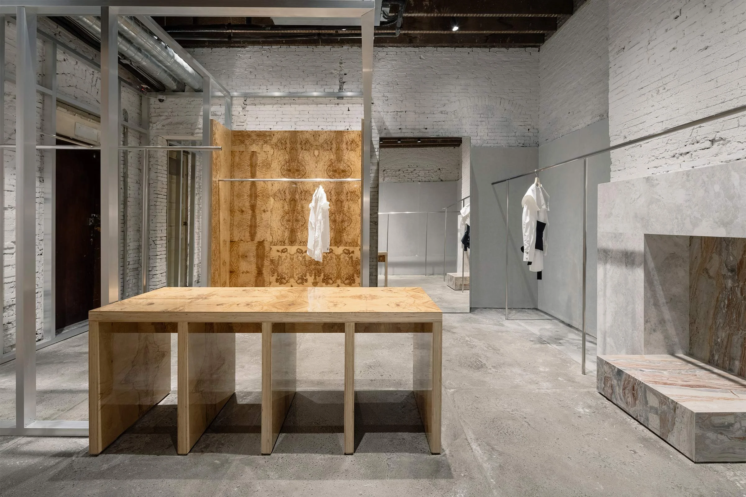
SPMA stands for ‘Self Pride, Massive Attack’. The brand’s image is classic yet avant-garde, and aims to represent female empowerment through fashion. The store curates a selection of women's clothing brands that are socially engaged and tell different stories through fashion, and the space therefore needed to be able to house and display these various brands. Masha also wanted the elements and materials used in the store to resonate with the clothing.
Where is the store and what makes the location unique?
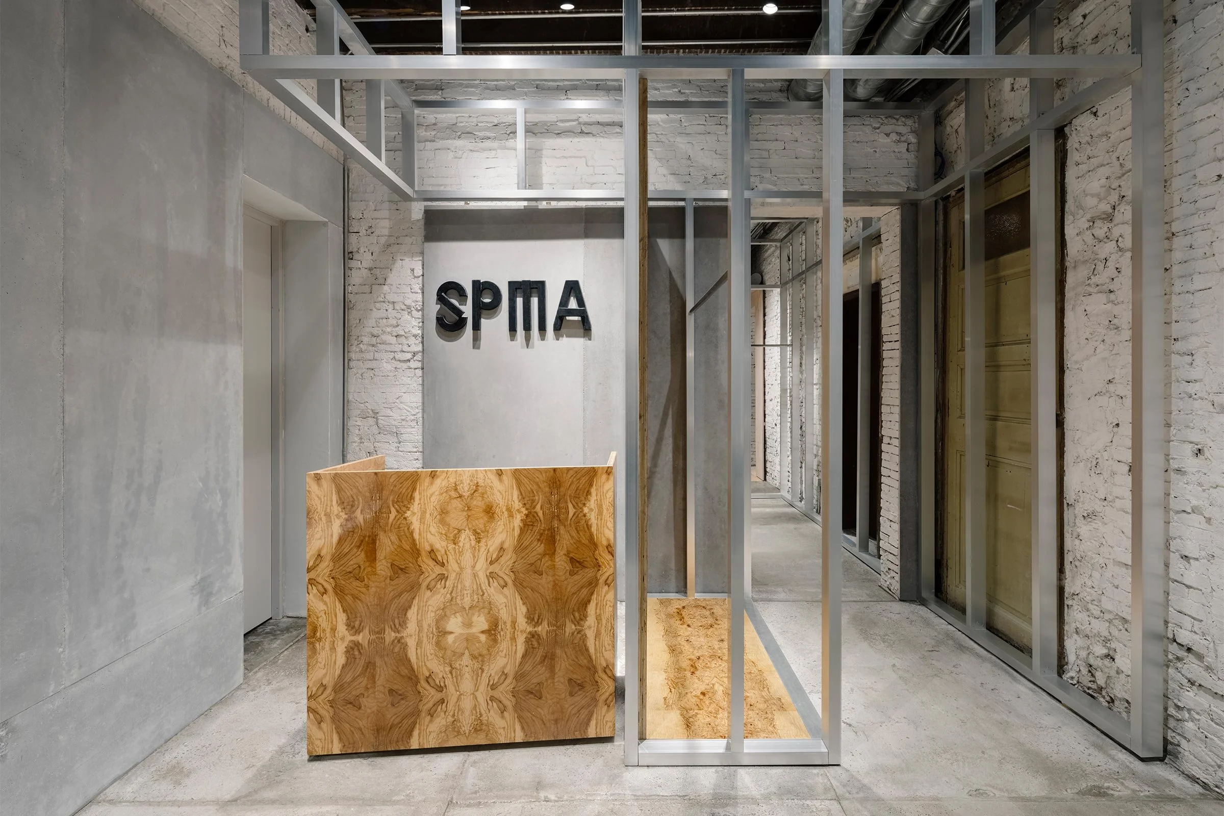
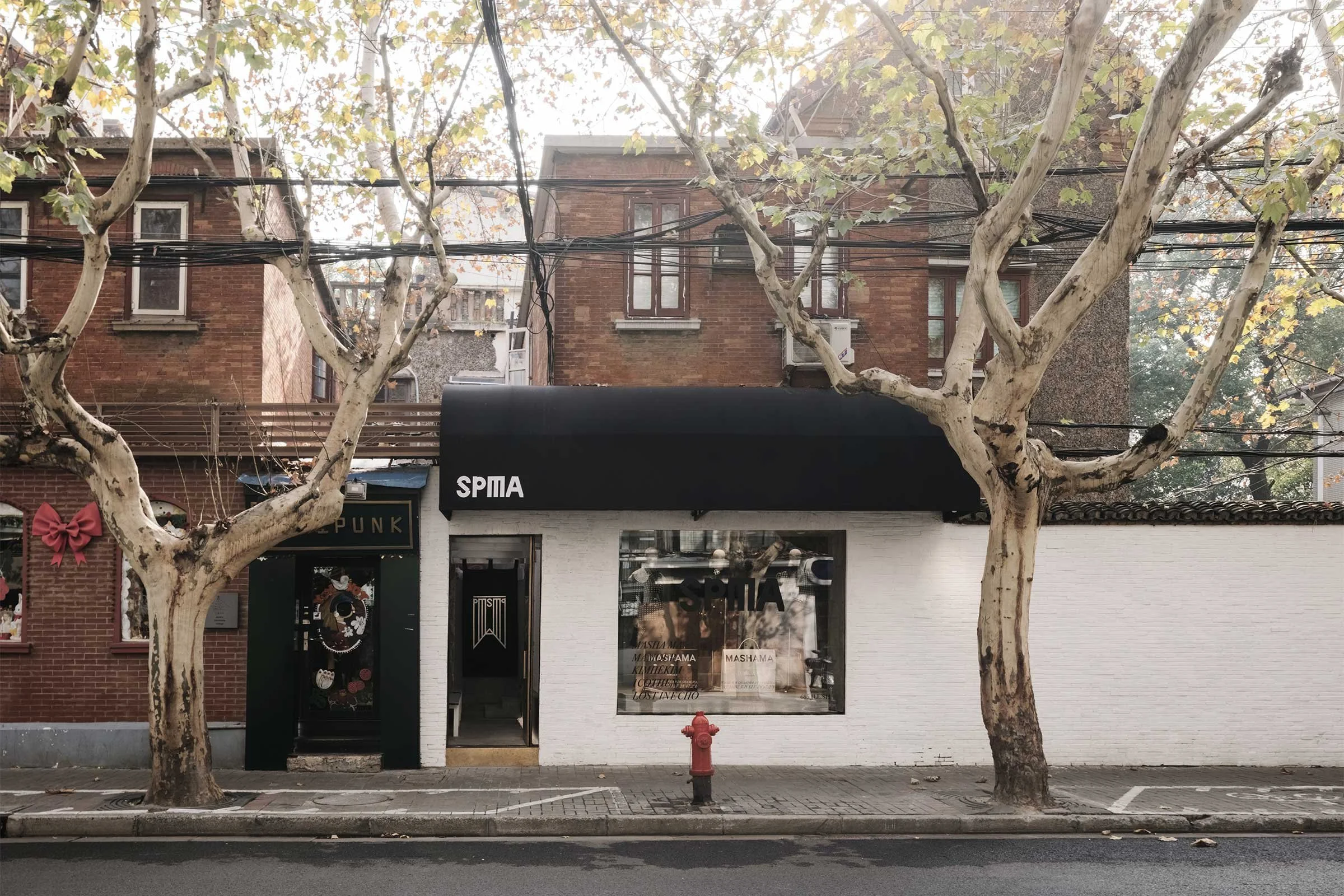
The 225-square-metre store is located on the ground floor of a 1930s building on Shanghai’s Julu Road, in the heart of the former French Concession. The area features many historical buildings and is one of the city’s most vibrant cultural areas.
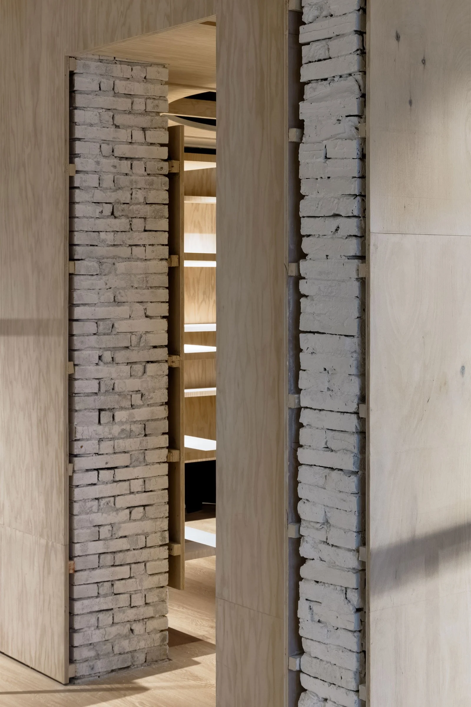
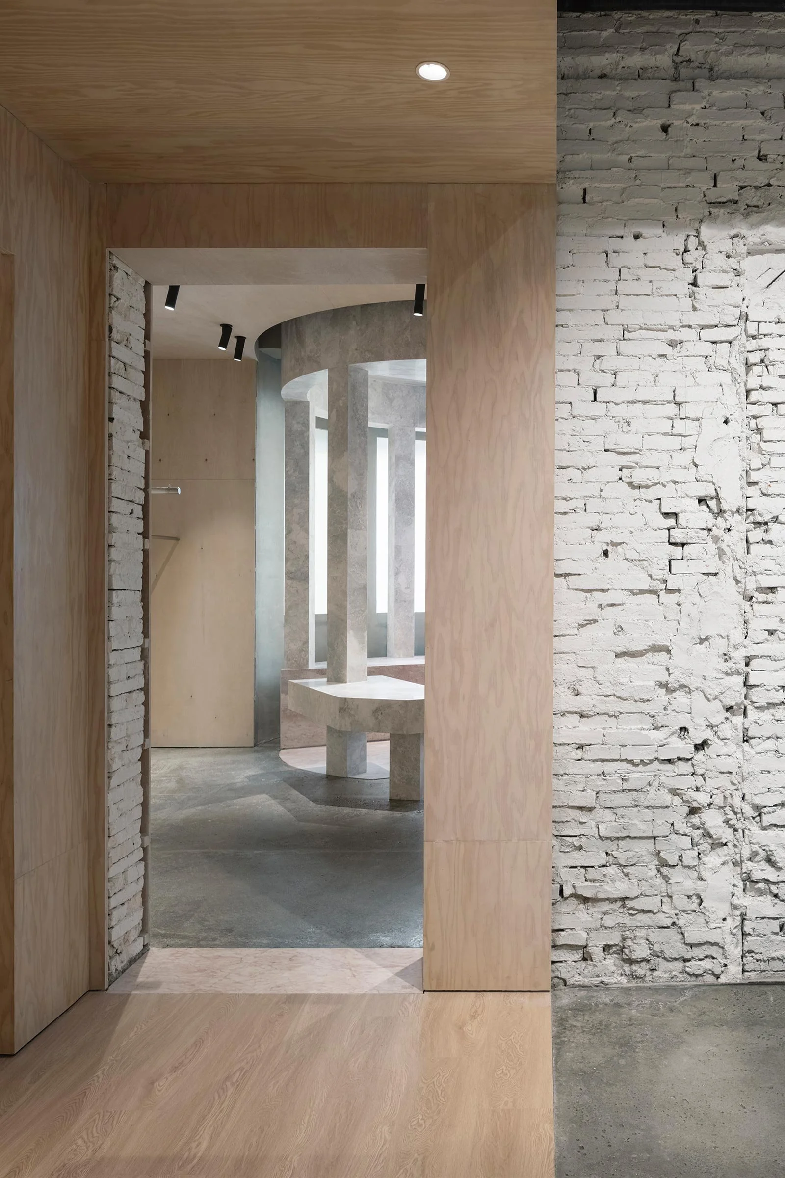
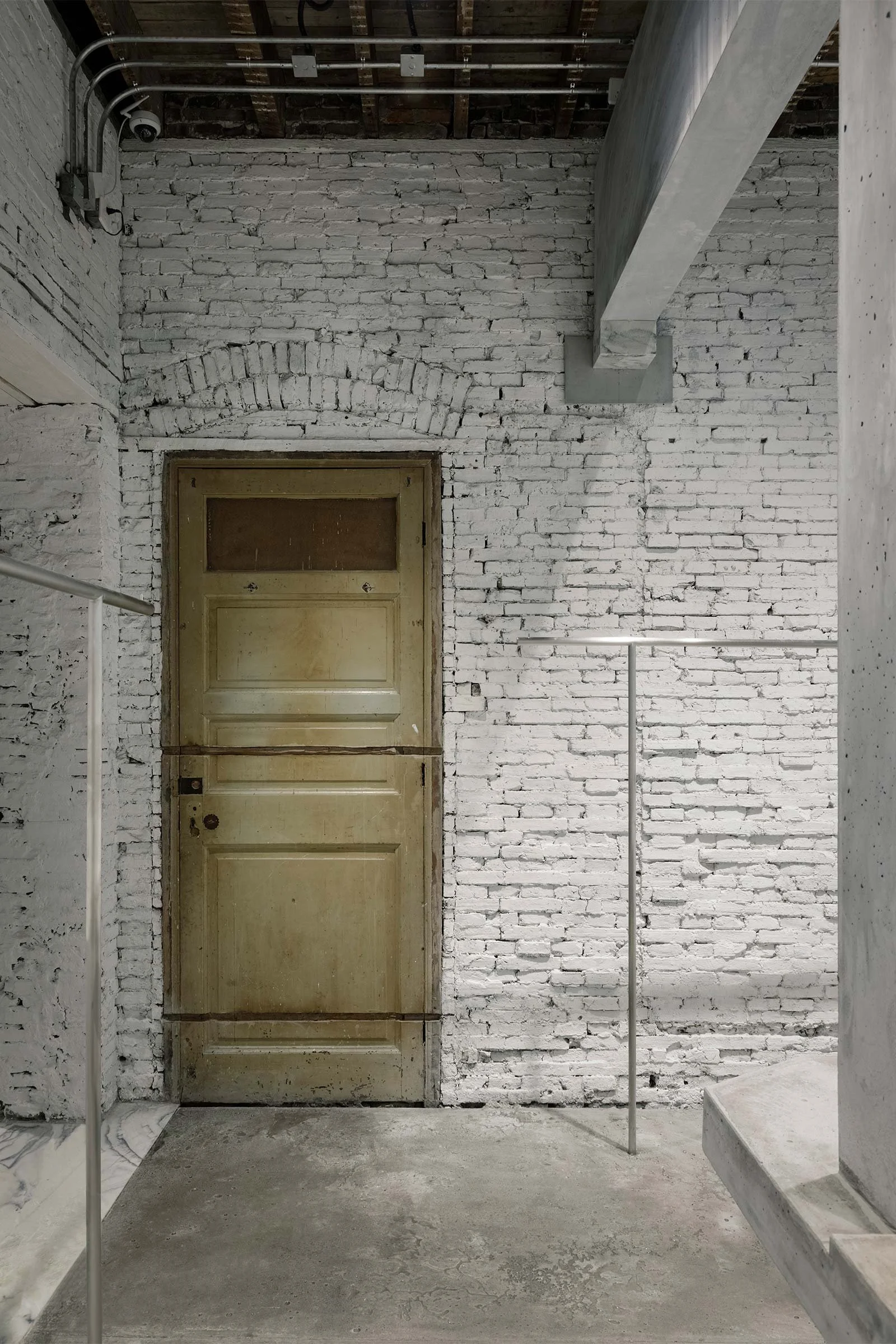
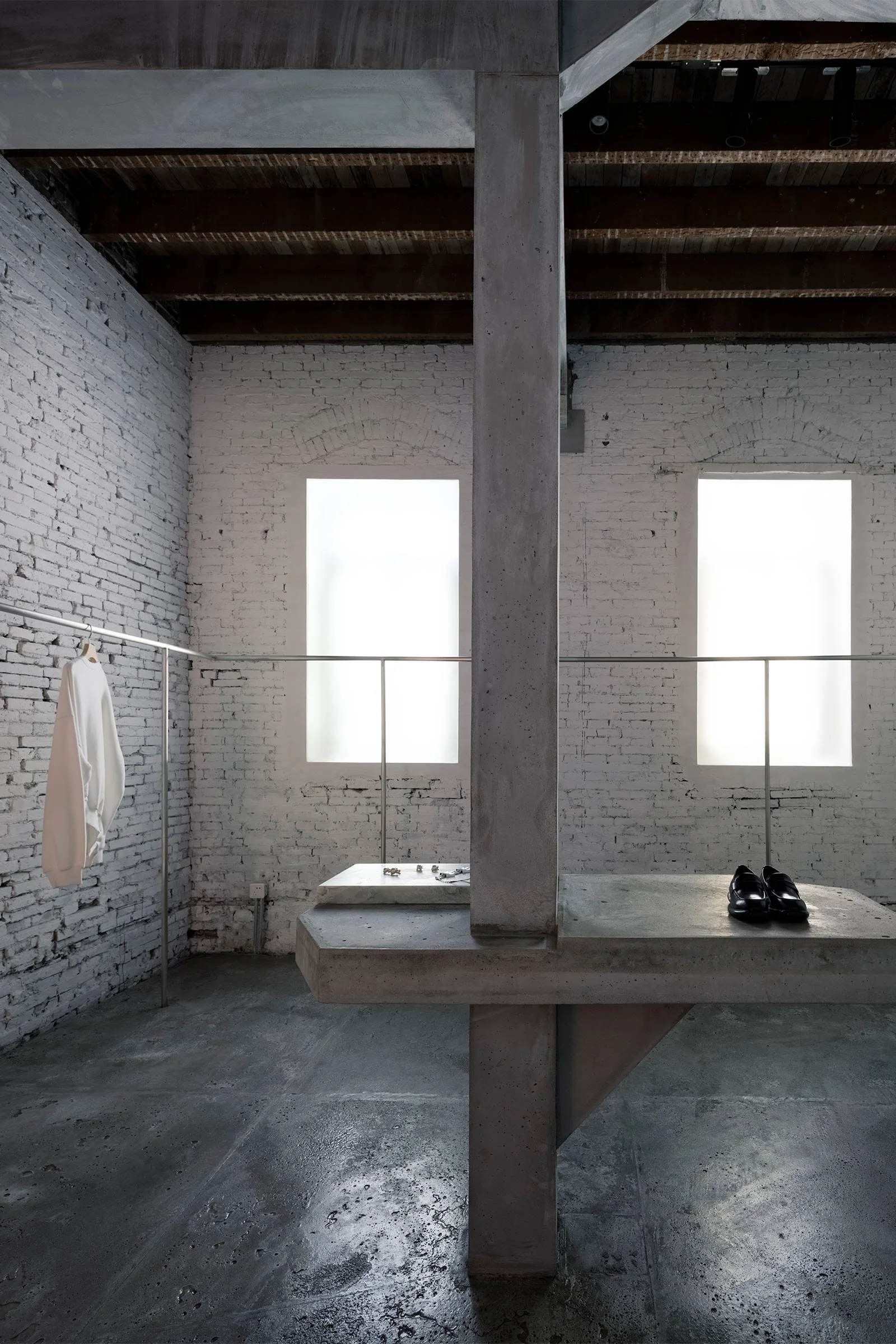
This particular brick structure was originally a residential building that has undergone several structural renovations.
How did you approach the project — what design references or narrative did you try to incorporate into the space?
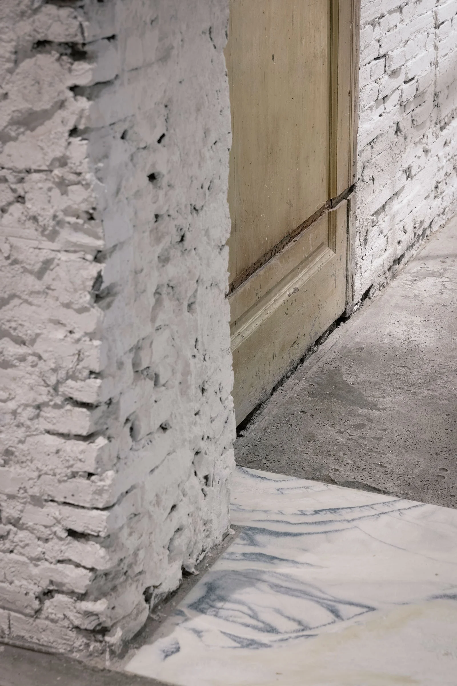
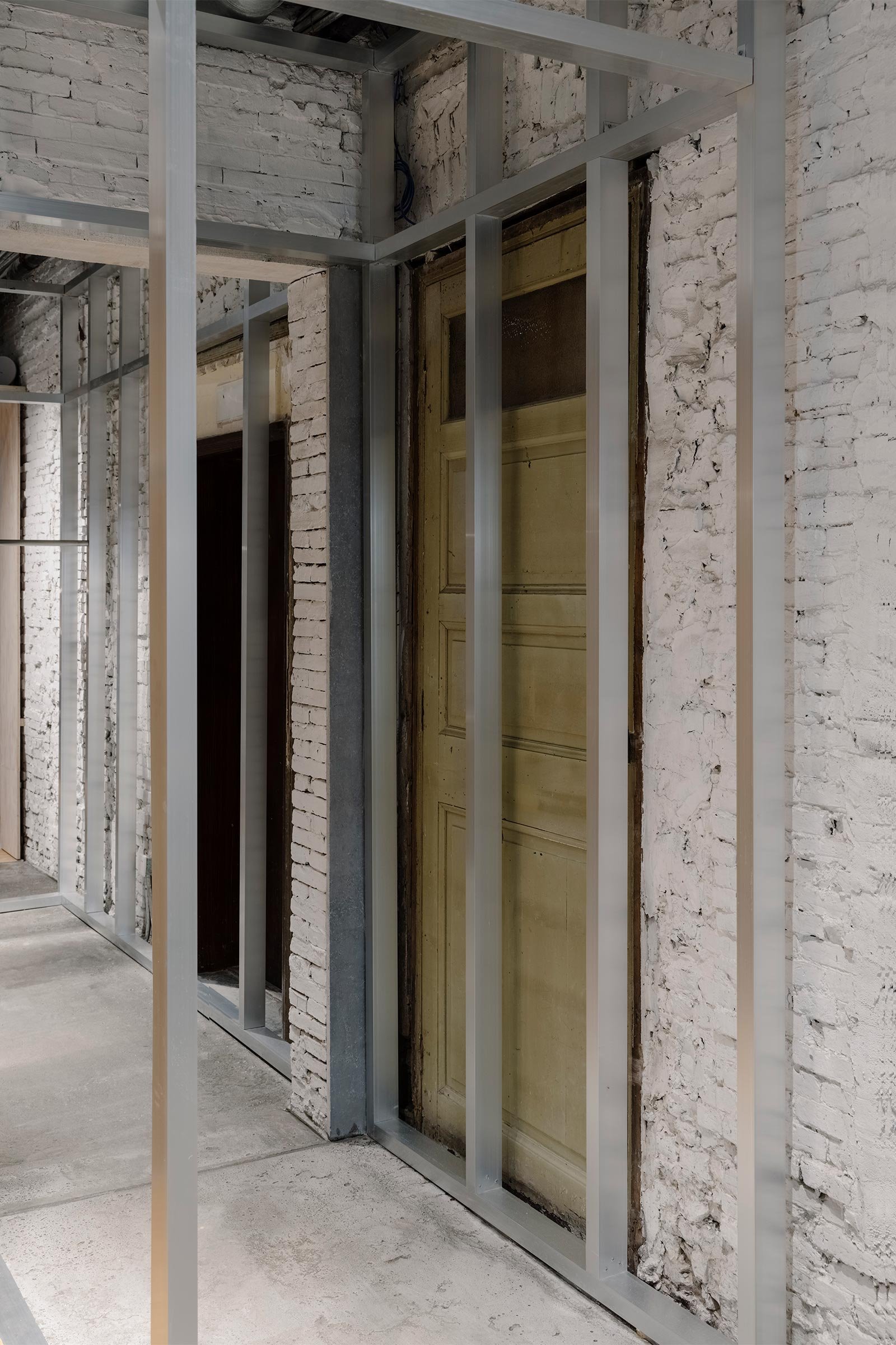
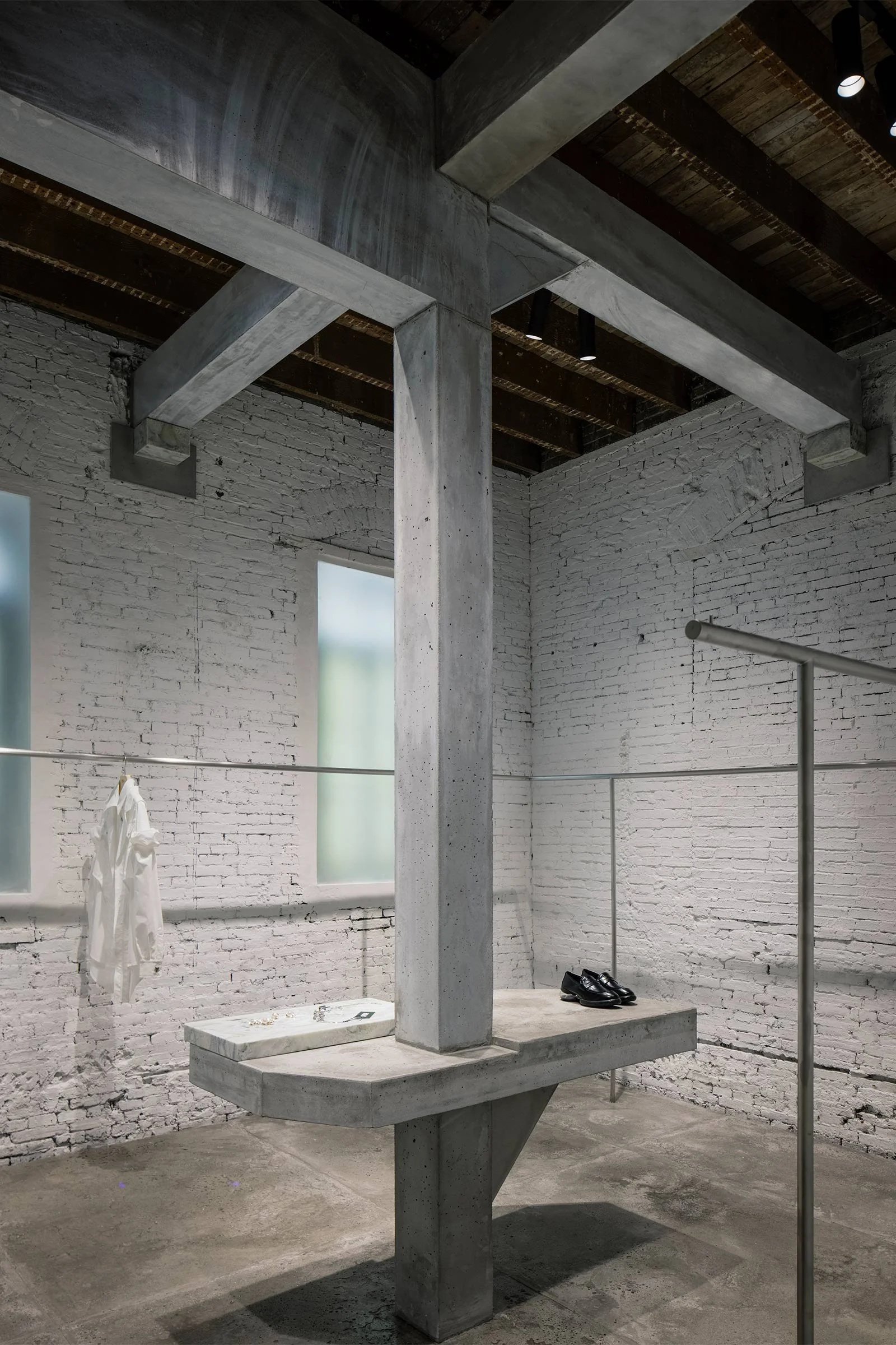
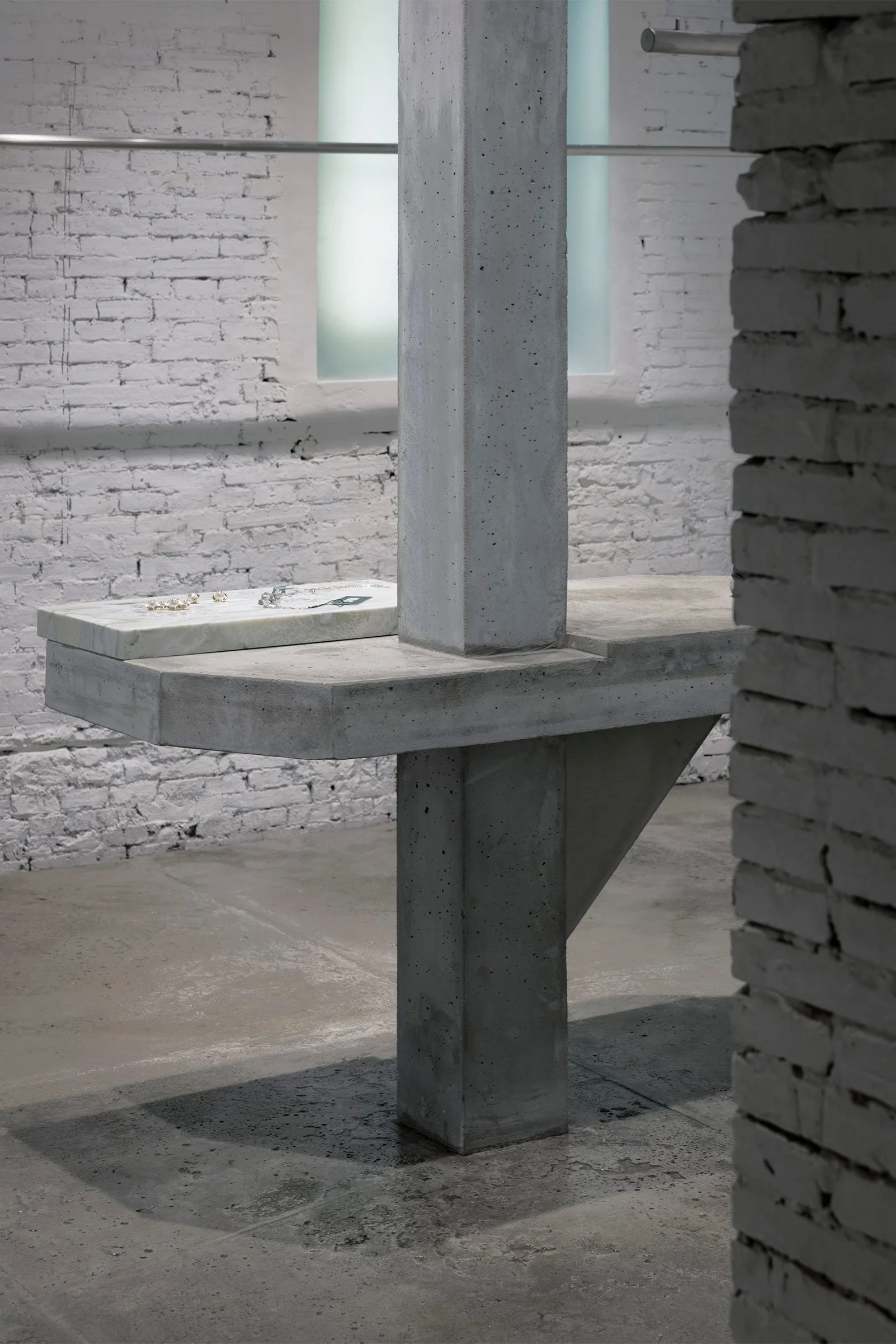
Our starting point was to renovate the building and turn it into a functional retail space, all the while taking into consideration its structural constraints. During the design process, we found that the layers left over from the building’s past renovations actually echoed the exposed stitching and lining visible on certain pieces of clothing. So we decided to expose these construction marks, hoping that people would notice the structure of the building just as much as the clothing.
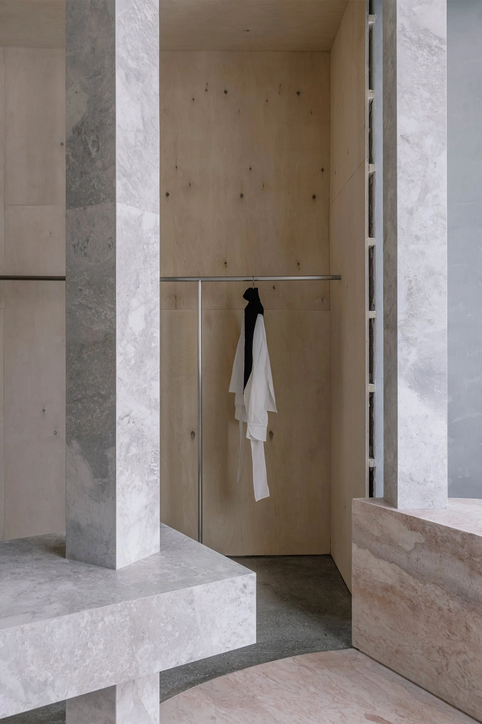
Please tell us a little about the material choices for the space.
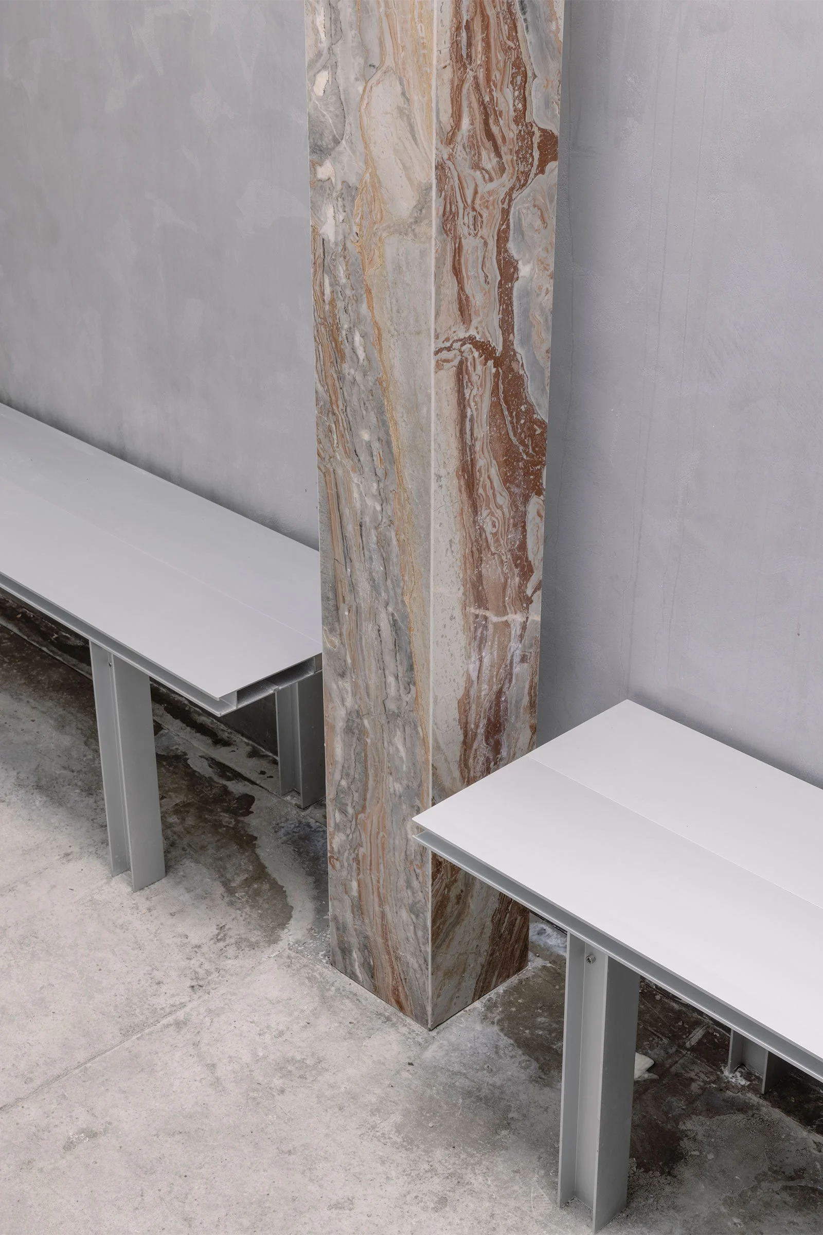
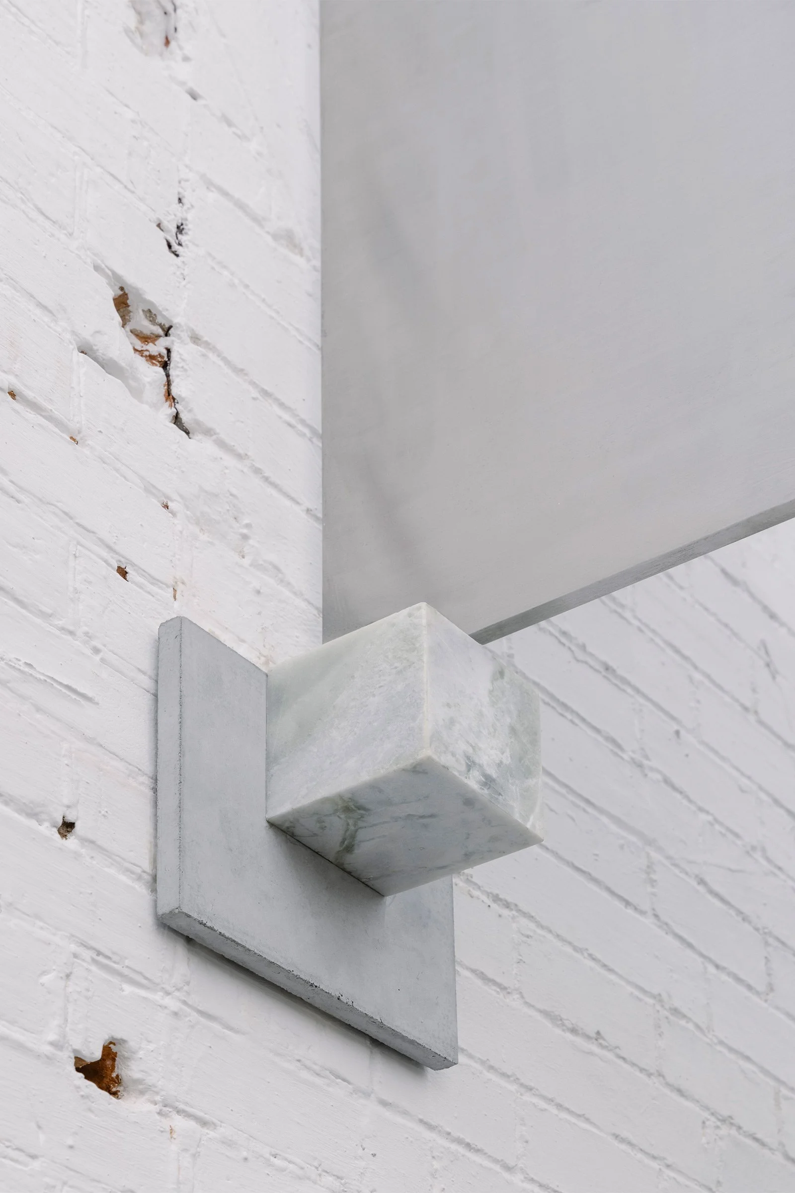
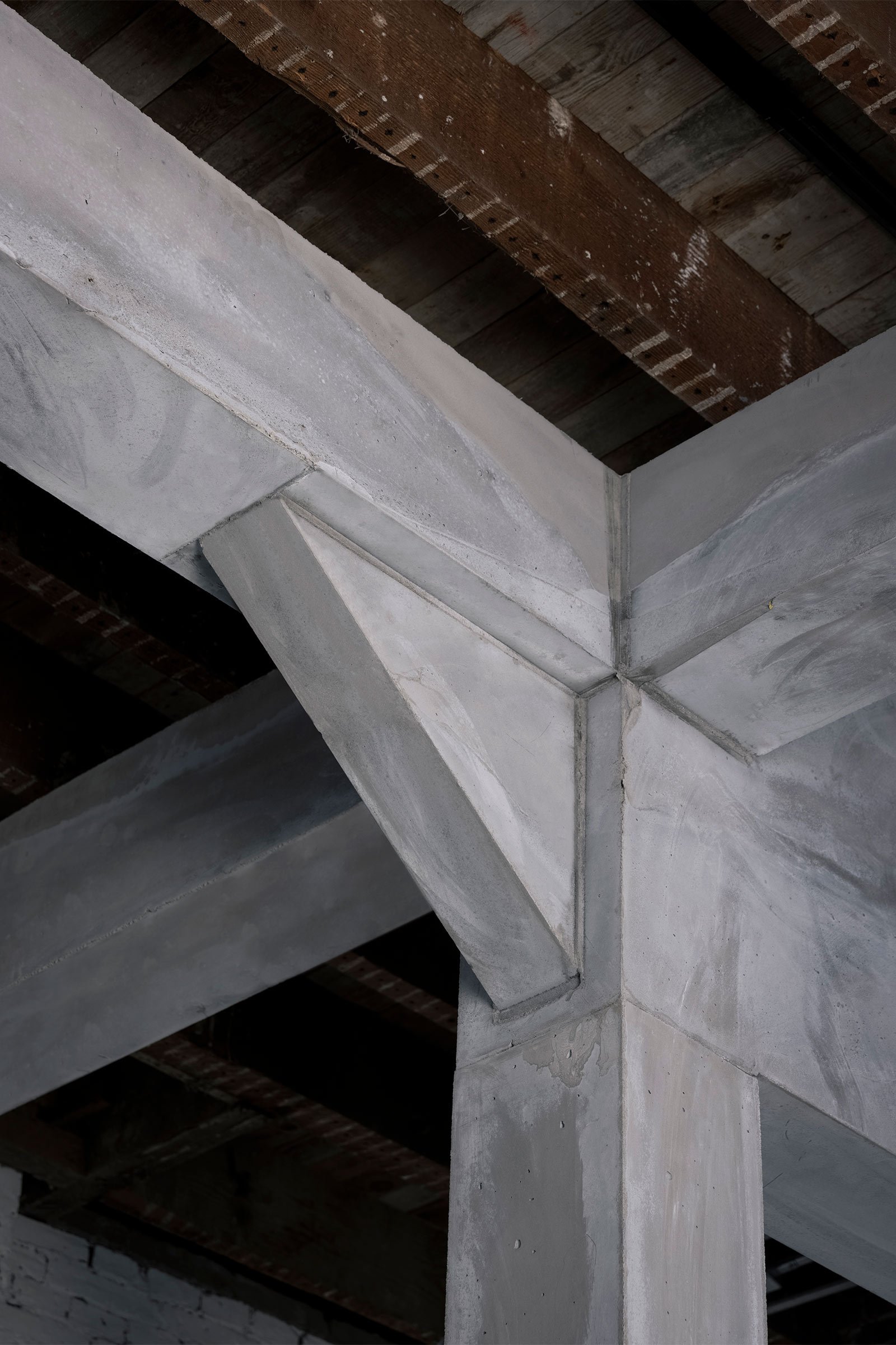
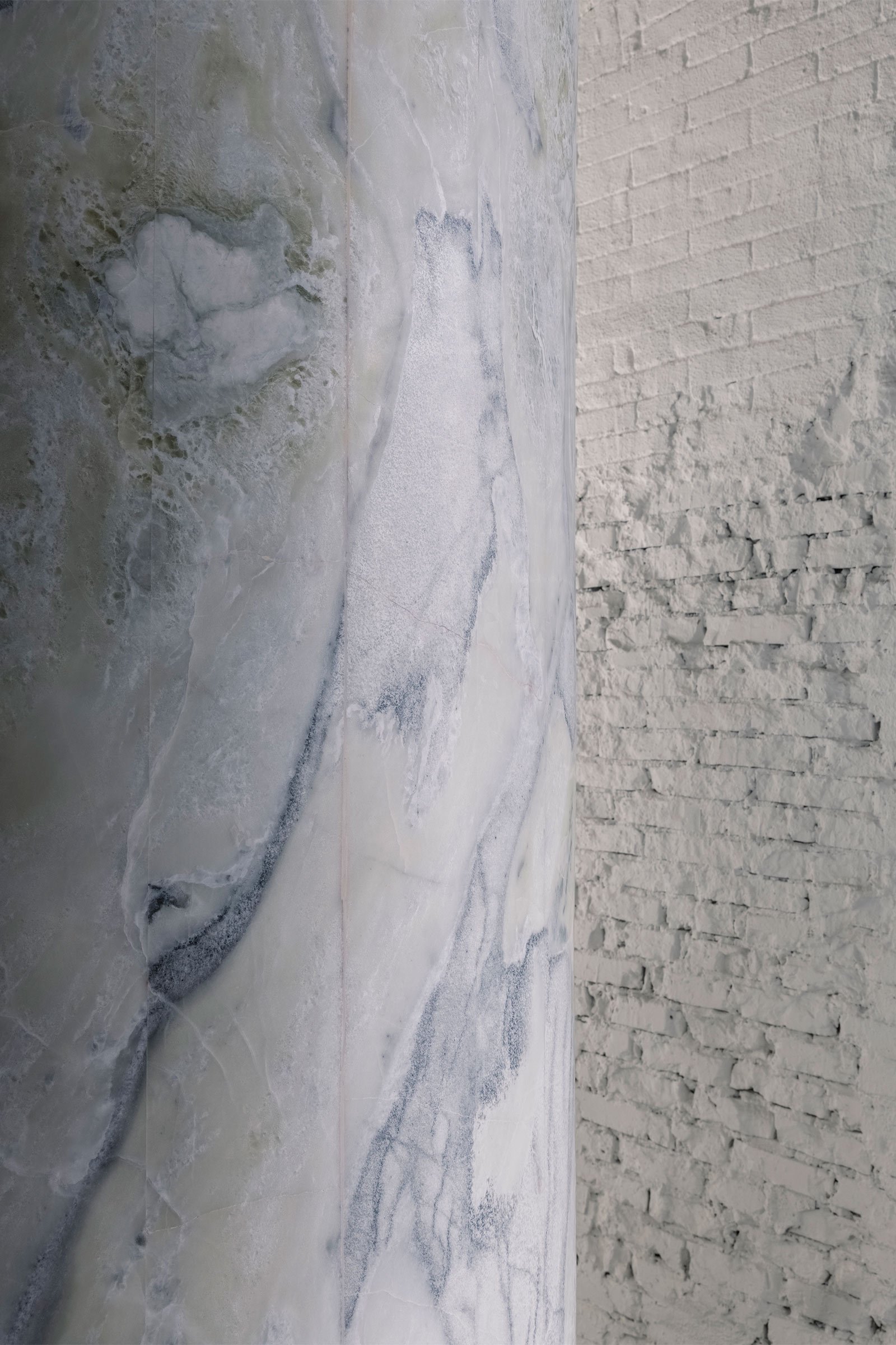
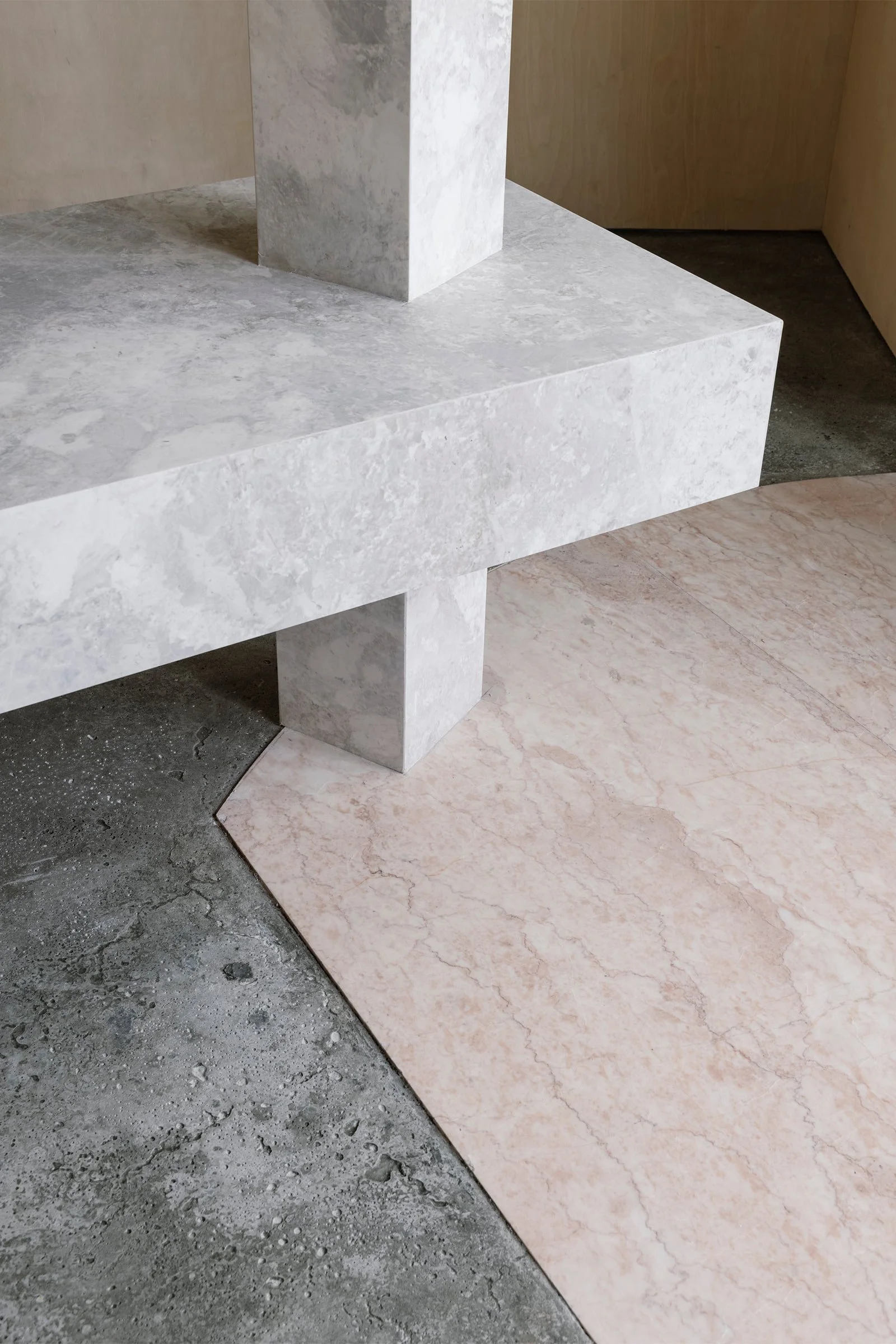
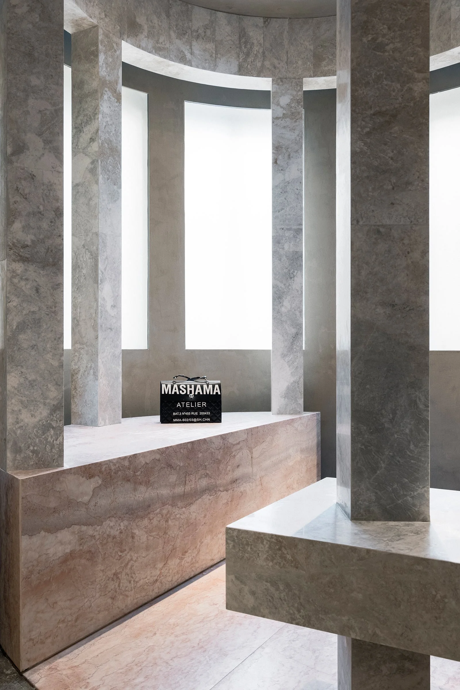
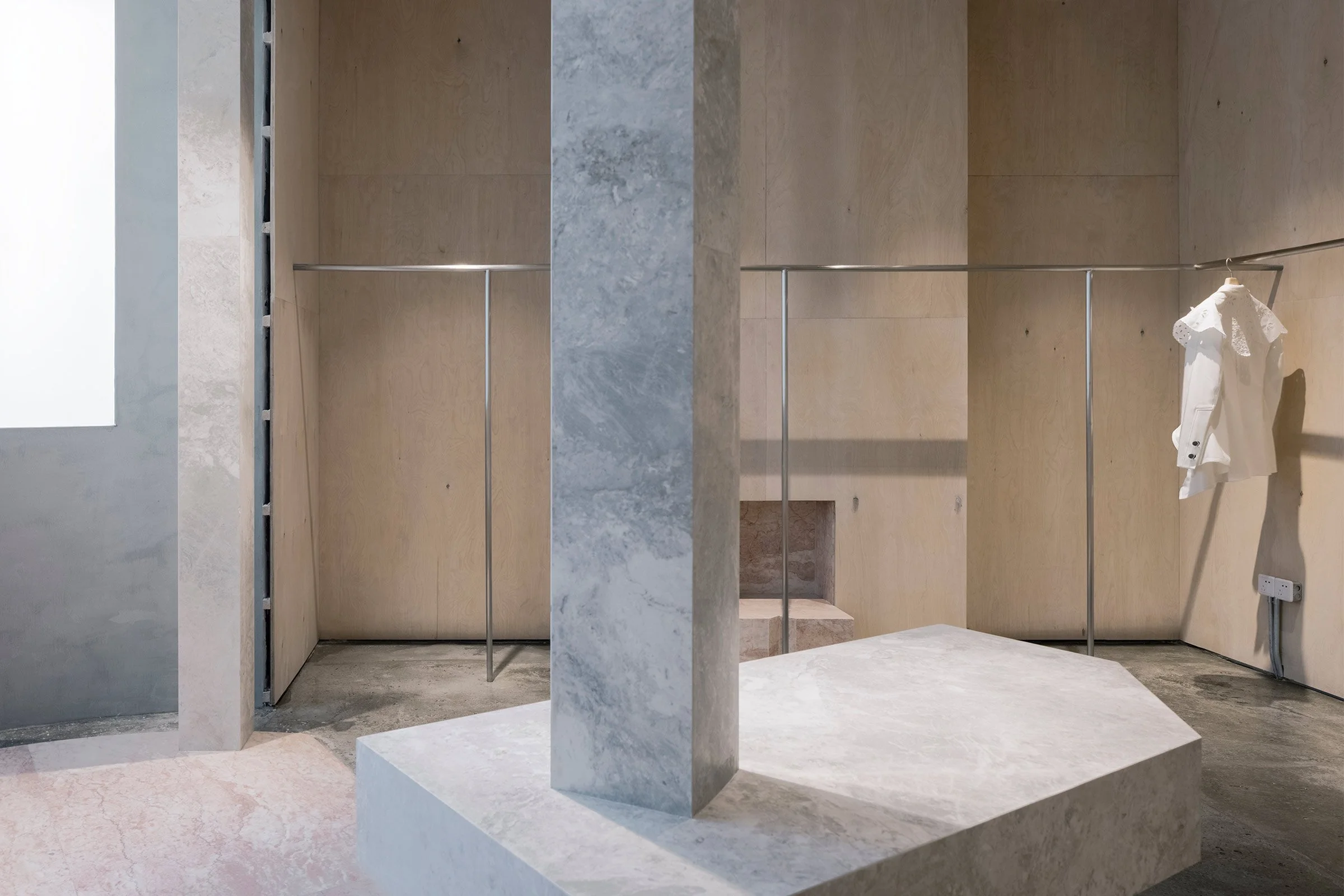
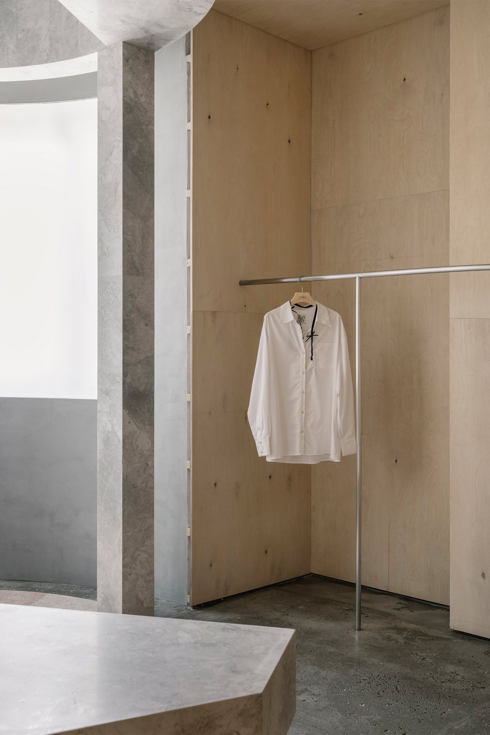
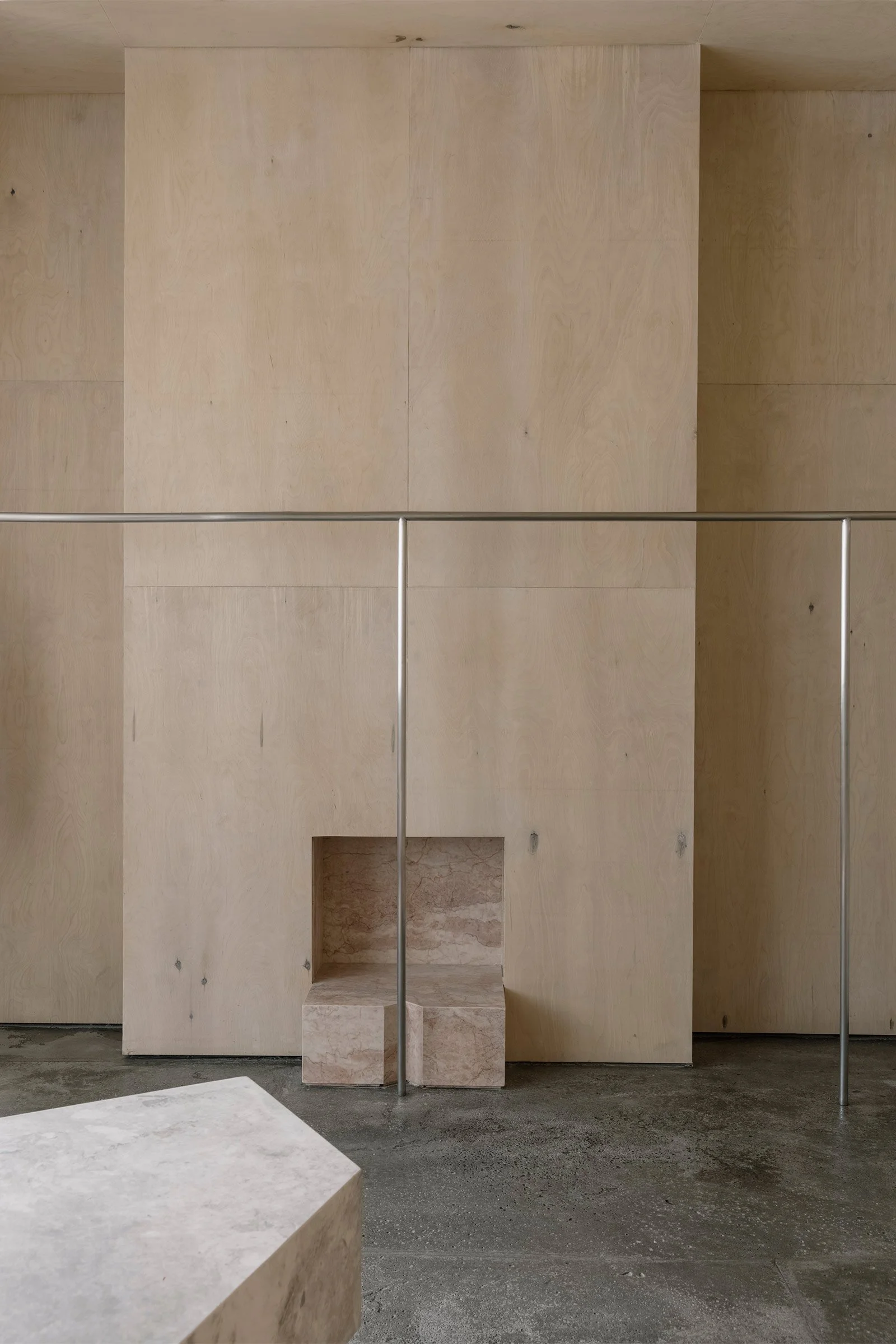
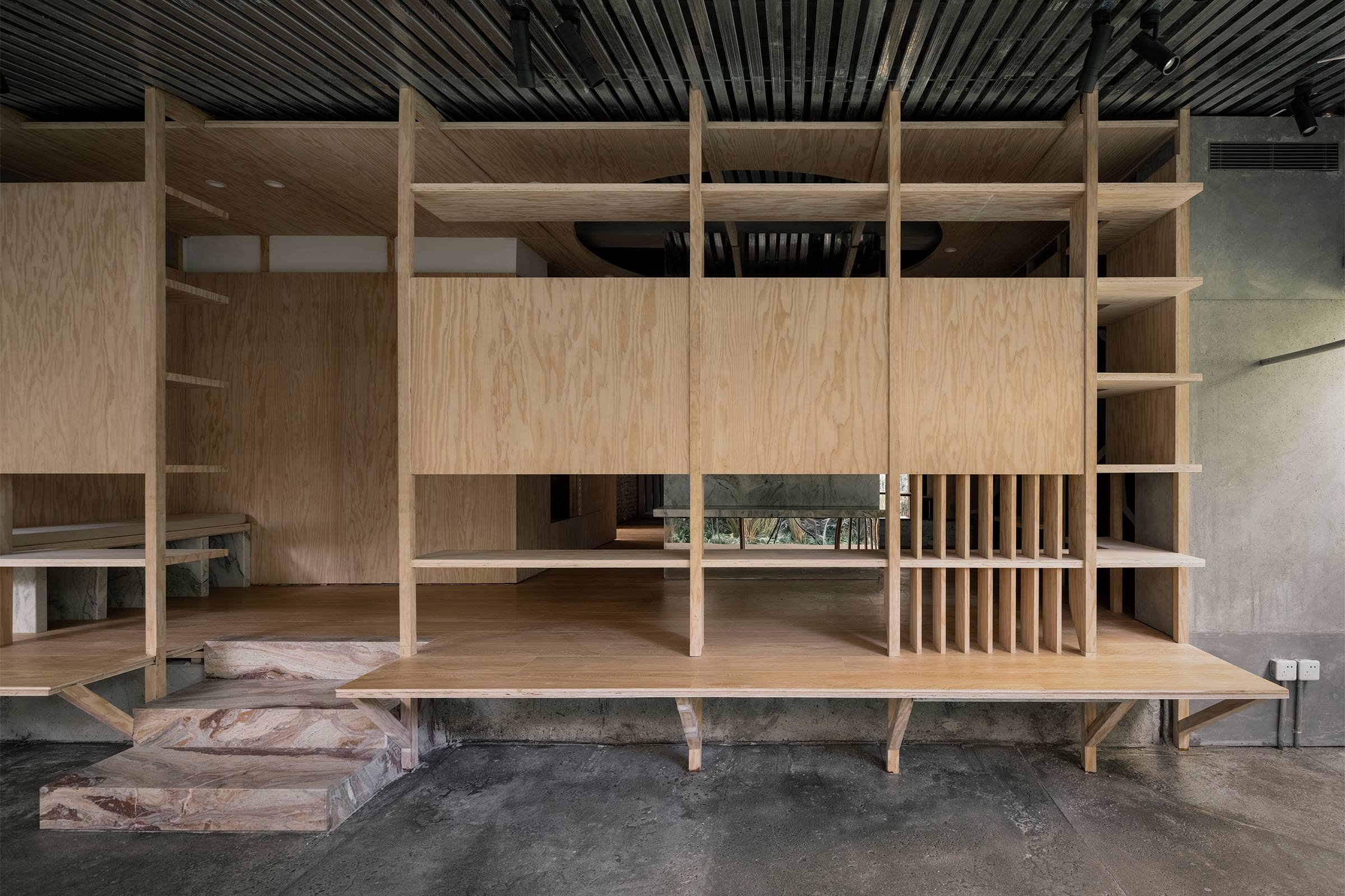
We used concrete, marble, aluminium and wood for the store’s display components, and retained some of the building’s original elements such as the existing wooden ceiling and the old doors. We also limewashed the original brick walls.
Do you have a favourite element or design detail in the architecture or interiors?
My favourite elements are the display volumes and components we added into the space. We designed special connecting joints to incorporate these components into the structure without them touching the existing walls, meaning that when they’re eventually removed the walls can be restored to their original condition.
What other features are you most excited about?
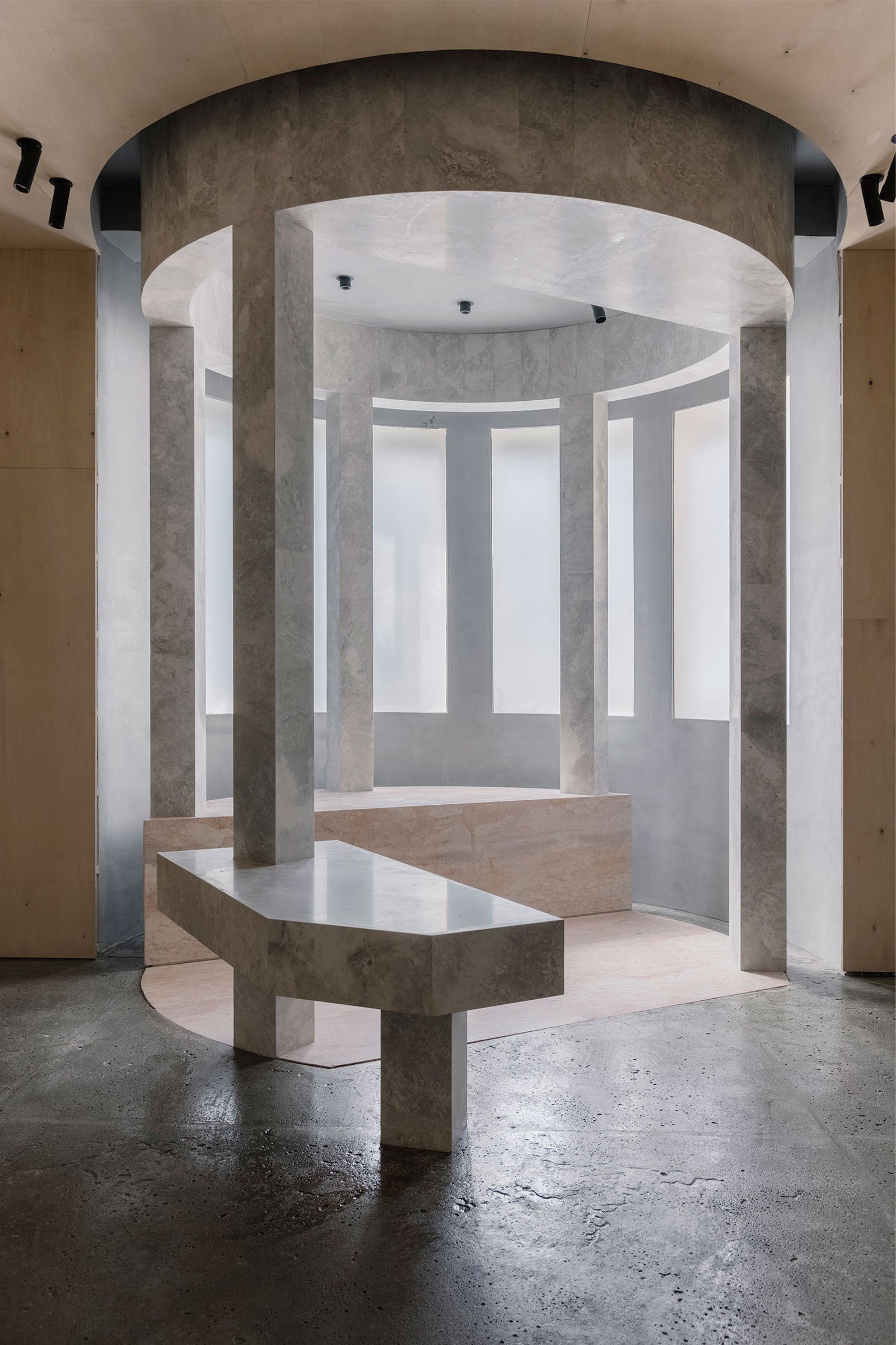
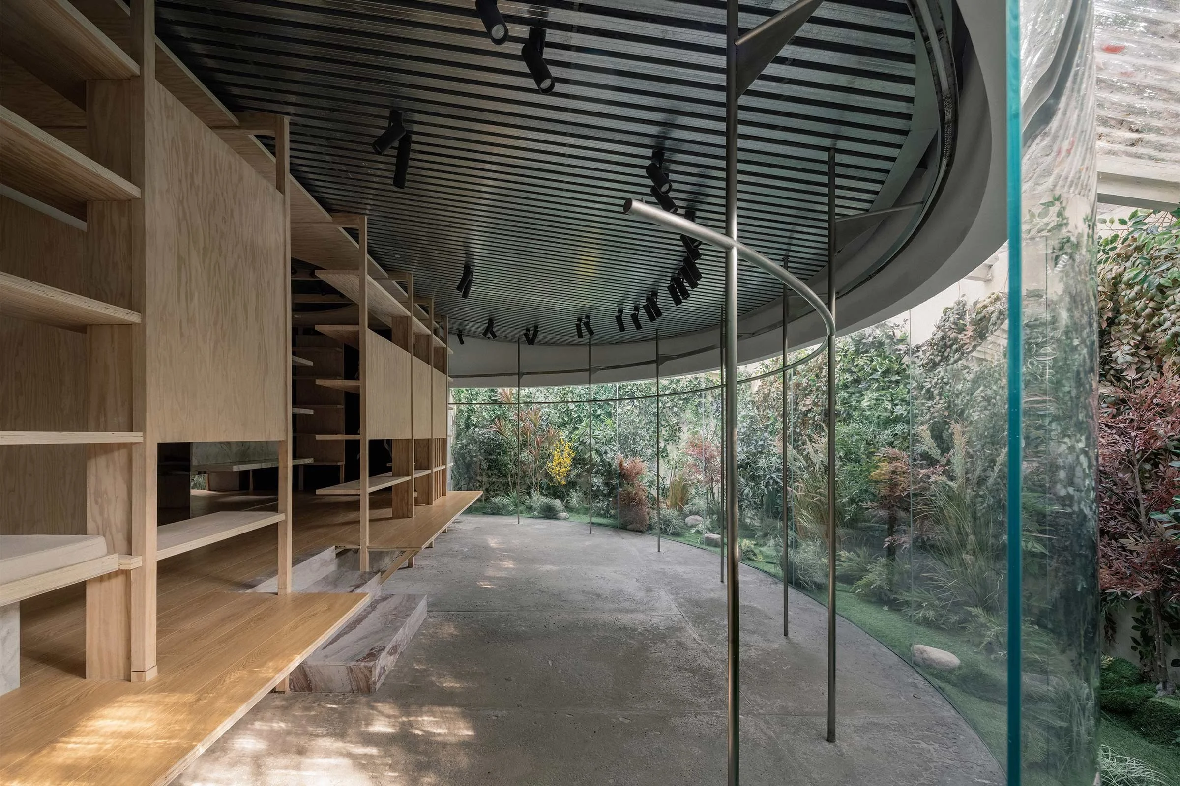
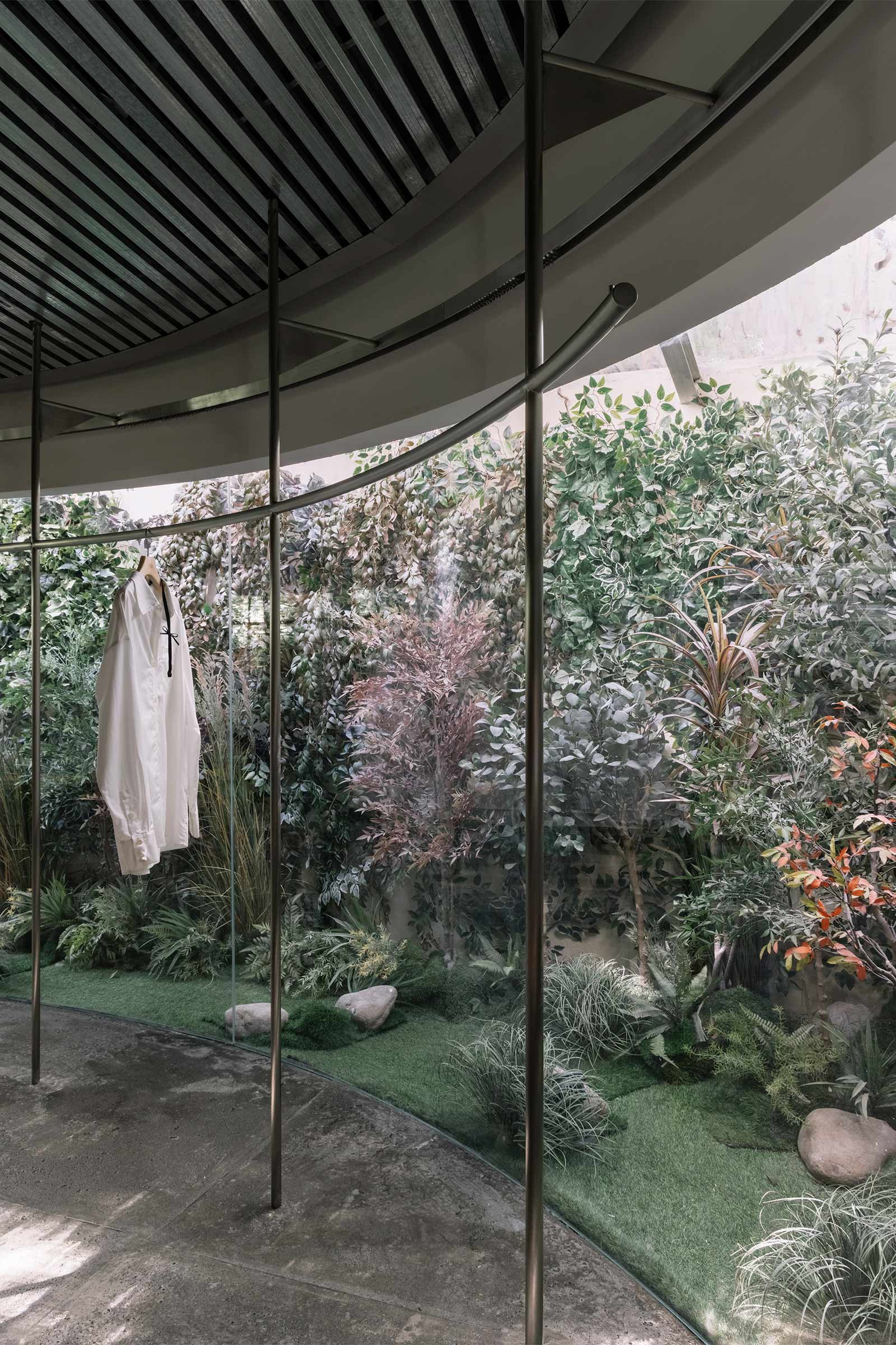
We really like the entrance space. We treated it as a tiny pavilion installed within the brick building and used stone pillars and concrete beams to support the stainless steel plate. This lightweight ceiling allows more light to enter the corridor, turning it into a bright and comfortable transition space.
Images / Wen Studio