A Colour-Coded Home
Singaporean interiors studio EightyTwo designed this family home by incorporating feng shui principles and using generous swathes of colour and texture to delineate spaces. We speak to interior designer Darren Neo to find out more about his approach
Design Anthology: How did you first meet the client?
Darren Neo: The client came to us via Instagram, having seen our posts.
Can you tell us about them and their lifestyle?
The clients are a couple with three children — two sons and a daughter. One of the clients works in the furniture industry and the other is a property agent. They really love their children, so part of the brief for their new home was that it should be inclusive and child friendly.
What was their brief to you for the project?
Interestingly, one of the aspects of the project was complementing the design with feng shui principles. The challenge was to create a design concept that embraced the ideology of feng shui but also resulted in a fun and energetic environment, which we achieved through the playful exploration of colours and textures.
What’s unique about the building and the location?
Located in one of Singapore’s housing estates, the apartment block is known for its spacious units — this one is about 110 square metres big. The estate itself is quiet and serene, located near an industrial area, but still accessible to the various hubs nearby.
How did you approach the project — what design references did you try to incorporate into the space?
The clients identified the kitchen as one of the focal areas, so we used the colour red to tie in with feng shui elements in order to represent fire.
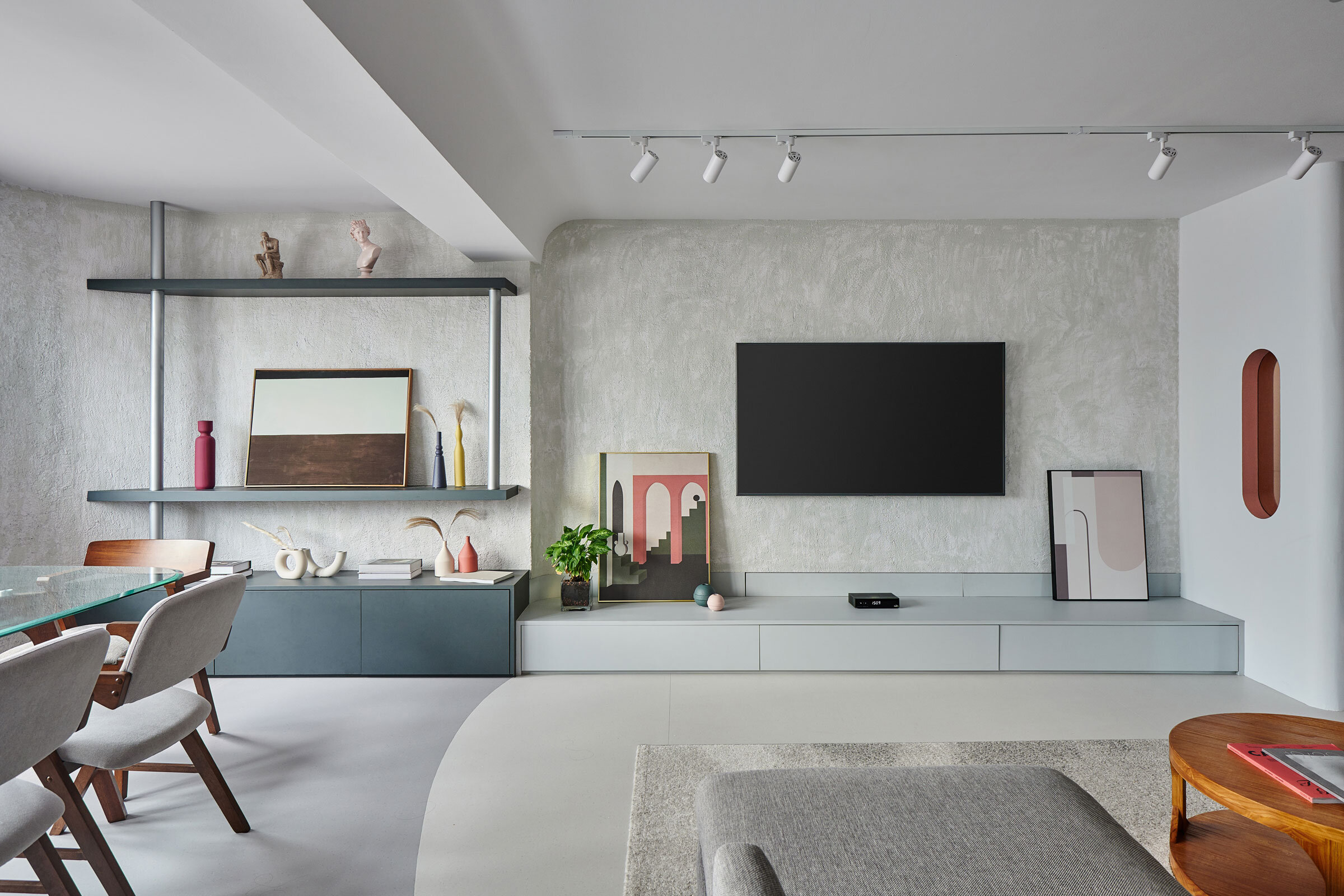
The Morandi colour palette was also an inspiration, and we played with shades for added contrast. I love the layout and spaciousness of the home, and we used lines and different colours and shades to demarcate the various spaces.
The home is really eclectic and explores textures and colour, creating an energetic atmosphere and reflecting the family members’ dynamic personalities.
Please tell us a little about the material choices for the space.
We took a hands-on approach to doing all of the textured walls in the house, using paint, plaster and gravel. We also used architectural materials such as tinted glass as a decorative element, also seen in the glass blocks in the master bedroom.
Which pieces are custom designed?
The vanity in the master bathroom is custom made. It features a paper pulp and resin countertop by Singapore-based KompacPlus, and it’s designed to fit a small space while achieving great functionality.
Do you have a favourite element or design detail in the interiors?
Yes — definitely the entrance wall. The beauty of this wall lies in the composition of colours and materials. It sets the overall tone and mood of the entire house, right on entry.
Images / Desmond Lim, Nieve Photography


