A Japan-Inspired Apartment in the Mountains
Tatami mats, shoji screens and dark timber characterise this Hong Kong home, designed as a serene space for slow living. Rebecca Chan of local studio Simplex Interiors tells us more about her approach to the client’s brief
Design Anthology: Can you tell us about the client and their lifestyle?
Rebecca Chan: The client is a tech entrepreneur and avid traveller who enjoys and appreciates a high-quality lifestyle. In his quest for work-life balance, he wants a home where he can practise the art of slow living.
We were really excited to be selected for this project, since we got to work with someone who really appreciates good design. The client is quite well-versed in contemporary and Japanese design and his aesthetic goals are aligned with ours; he was very involved in the process from the start.
What was his brief to you for the project?
The initial brief was to design a home in darker shades, using clean lines to create a modern minimalist interior — sophisticated and free from clutter — with a tatami room and a fireplace.
What’s unique about the building and the location?
Located on the peak of Kau To mountain on Hong Kong’s east side, the apartment is in a low-rise building with a view out to the sea on one side and the lush landscape on the other. It’s filled with natural light, giving it potential to become a genuinely tranquil space.
How did you approach the project — what design references did you try to incorporate into the space?
The apartment is about 150 square metres big and incudes four bedrooms with two en suites and a large balcony. Our answer to the client’s brief was to develop a seamless sense of the space that reflects his lifestyle. Not only did we try to incorporate many elements of Japanese design into the washitsu (tatami room) and evoke its calming feel throughout the entire space, we also drew inspiration from the essence of Japanese aesthetics, creating ‘views’ where different scenes and stages are carefully framed and composed.
To facilitate that seamless sense of space, we removed some of the walls and doors and moved the master bedroom from the front to the back of the home. The entrance now opens up to a large uncluttered main room, which is organised around a walnut dining table and a modular sofa.
The dark wood entry with shoji doors creates a connection between the main room and the washitsu. The simple and balanced yet refined style ensures the room is ‘visually quiet’.
Please tell us a little about the material choices for the space.
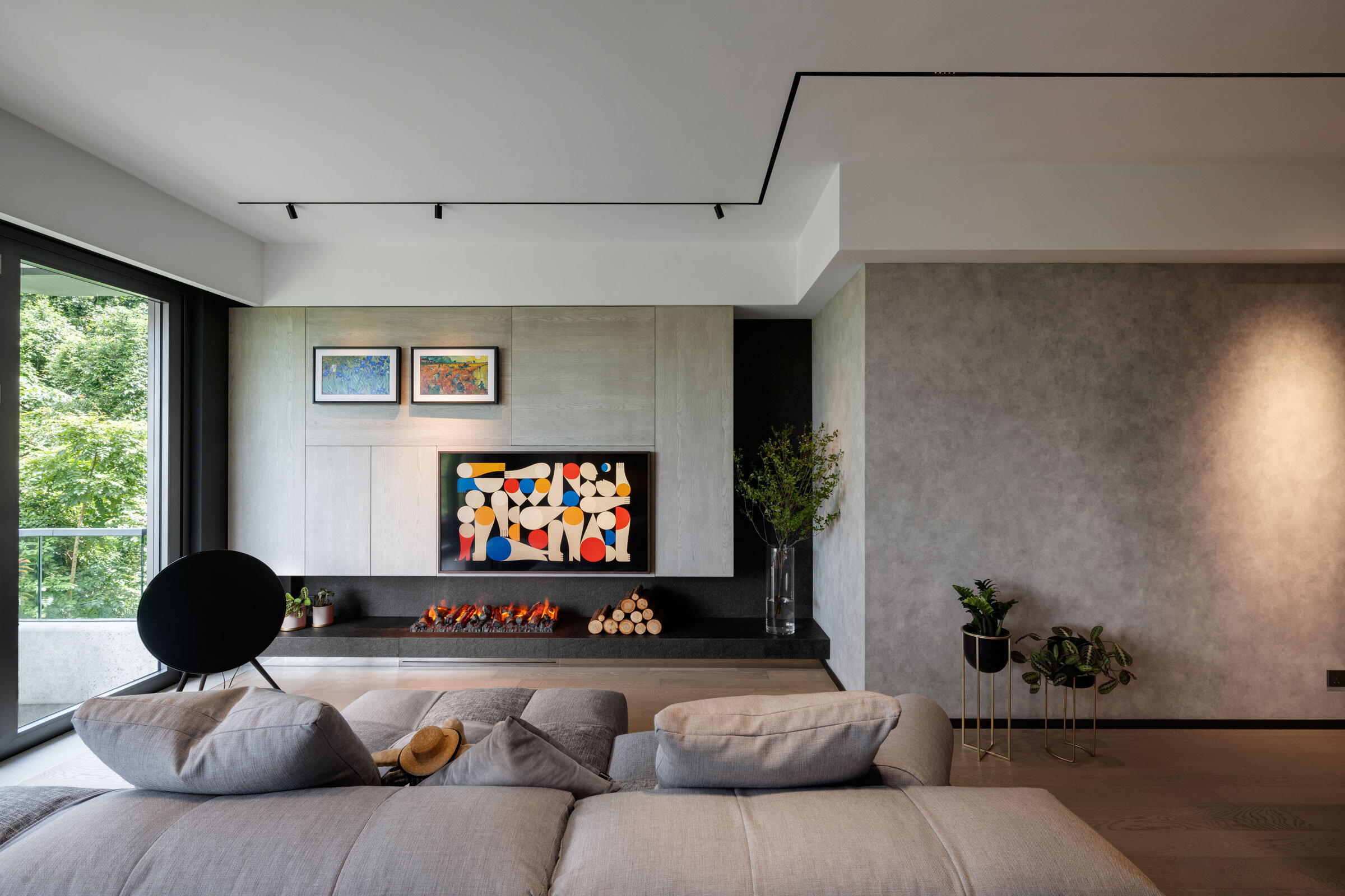
To achieve a calm, timeless atmosphere, we wanted to use a lot of natural materials and a simple yet strong colour palette. We used plenty of dark wood and shades of black, charcoal and muted greys with gold accents. The space is further enhanced by flamed black granite and cement walls. The tables are live edge wood slabs, ash for the desk and walnut for the dining table.
Please tell us about some of the custom pieces for the space.
In the washitsu, we used leftover wood from the desk to create hanging shelves, our take on a Japanese tokonoma (an uncluttered display space). The fireplace/gallery unit in the living room features a bespoke wood veneer that we achieved by painstakingly rearranging the grain and vein in a more random way — instead of the of original neat pattern — to make it look more subtle and natural.
Do you have a favourite element or design detail in the interiors?
The corridor — we transformed the original long corridor into a dark and moody passage, which together with the understated lighting helps change the mood in the space and calm the mind.
Images / Steven Ko


