An Old Jakarta House Becomes a Smart and Functional Home
In West Jakarta, local architecture and interior design practice Noema breathed new life into an old property, creating a new layout that optimises flow, natural light and ventilation. Noema’s Raymond San and Laurensia Levina told us more about the project
Design Anthology: How did you first meet the client?
Raymond San: The clients initially came to us to design their house on a different site in 2019. When Covid-19 happened, they decided to buy this old property in a calmer, more comfortable neighbourhood and renovate it.
Can you tell us about them and their lifestyle?
Laurensia Levina: The clients are a couple in their sixties who live a very active and healthy lifestyle. They’re passionate about music, so they love to relax in their living room and listen to music in their downtime.
What was the brief to you for the project?
Raymond San: The brief was to improve and maximise natural light and air circulation in the house while maintaining its old structure to minimise the construction budget. The couple previously lived in a dense and loud neighbourhood, so they longed for a house that had a sense of calm and that could accommodate gatherings with their family and friends. They also requested a space for their audio system in the main living area.
How did you approach the project — what design references did you try to incorporate into the space?
Laurensia Levina: The 350-square-metre house was built in the 2000s. The rooms were cramped and the inefficient layout didn’t suit the client, so our challenge was to create a new practical layout without interfering with the house’s old structure.
We reconfigured the first level to create a spacious living and dining room and moved the guest bedroom behind the long TV cabinet. On the second level, we filled a previously awkward void with a new space where the clients can practice activities such as yoga, tai chi, dance and table tennis. We also enlarged the formerly tiny bathrooms.
Please tell us a little about the material choices for the space.
Raymond San: We selected neutral material palettes for both the architecture and interiors to create a homey and toned-down space. Durability was also a consideration, as the clients requested a low-maintenance space. For example, in the master bedroom, we incorporated brise soleil made of synthetic rattan and powder-coated metal for easy maintenance.
Please tell us about some of the custom pieces for the space.
Laurensia Levina: The long TV cabinet doubles as a divider, a cabinet for the guest bedroom (which also hides the skylight and ventilation system) and storage space for the clients’ CD collection and audio products. The simple long dining table also acts as a pantry and provides easy access to food and beverages when hosting.
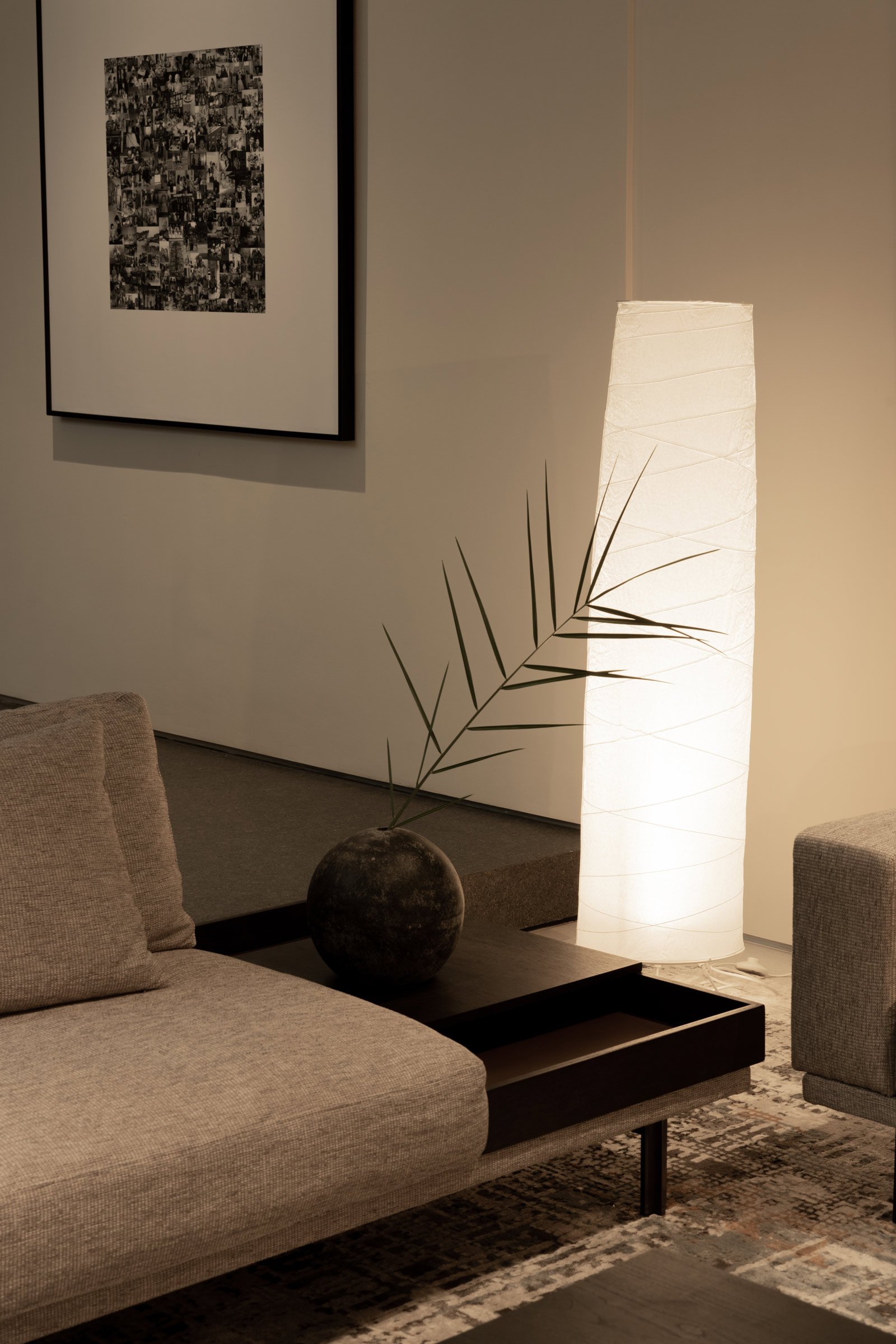
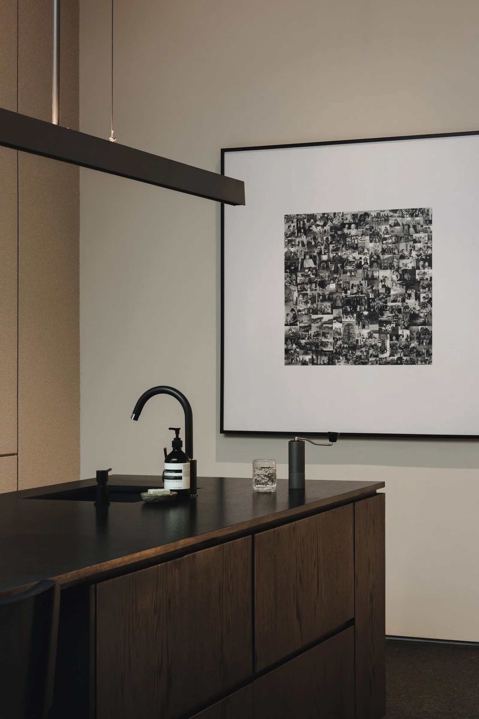
We also commissioned the living room paintings, which represent places where the clients have spent memorable times with their family. We wanted the home to reflect their personalities through these custom pieces.
Do you have a favourite element or design detail in the architecture or interiors?
Raymond San: We love how the natural light from the skylight hits the dining table — It brings soul into the home. The brise soleil in the master bedroom are also a favourite of ours. They effectively reduce direct heat from the western sun and create dramatic moving shadows.
Images by William Kung, copyright Noema


