A Room Dedicated to Reading
Designed by Atelier tao+c, this private reading room in Shanghai was imagined as a place for respite and tranquillity
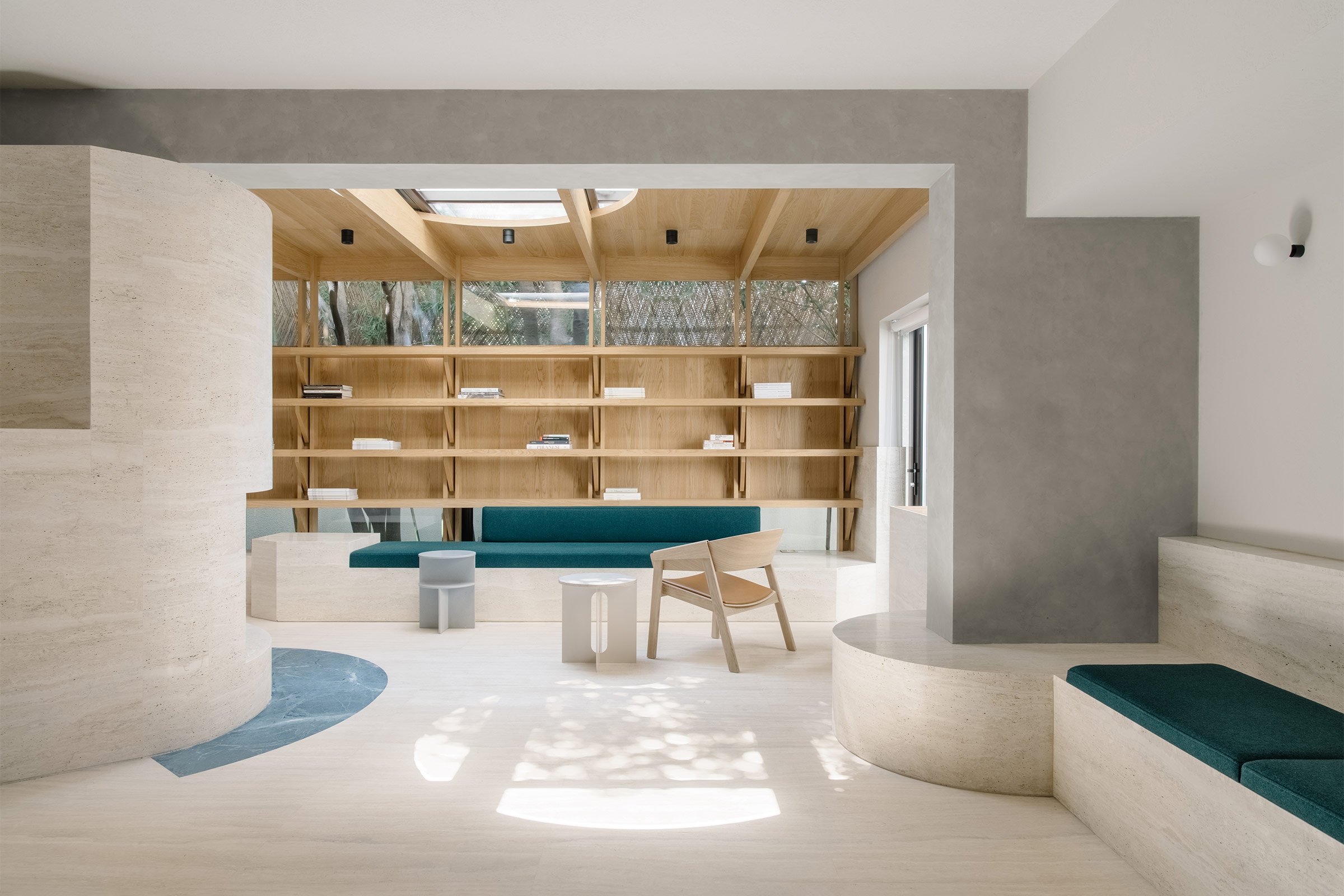
Set on the ground floor of a 1980s house in the heart of Shanghai, this private reading room by local firm Atelier tao+c was created as a shared space within an office. As studio co-founder Chunyan Cai explains, the intimate 80-square-metre room acts as ‘a third space between public and private, living and working’.
Cai and co-founder Tao Liu designed the client’s apartment six years ago, and part of the brief was to make space for his vast collection of books. ‘Since then, we’ve become friends, and he invited us to his new office and asked us what he could do with the vacant ground floor,’ Cai says ‘We came up with the idea of a shared reading room for the office and his friends.’
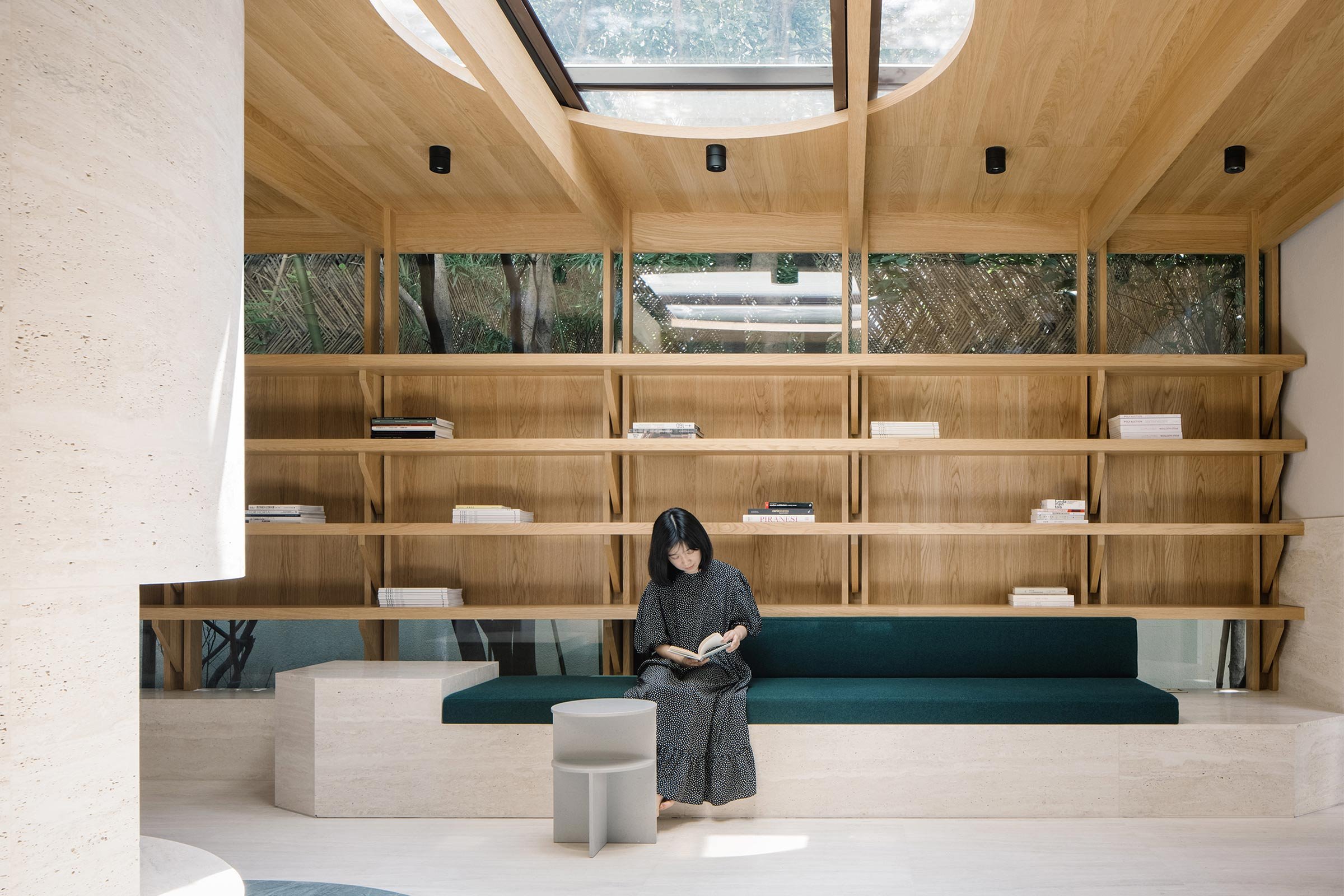
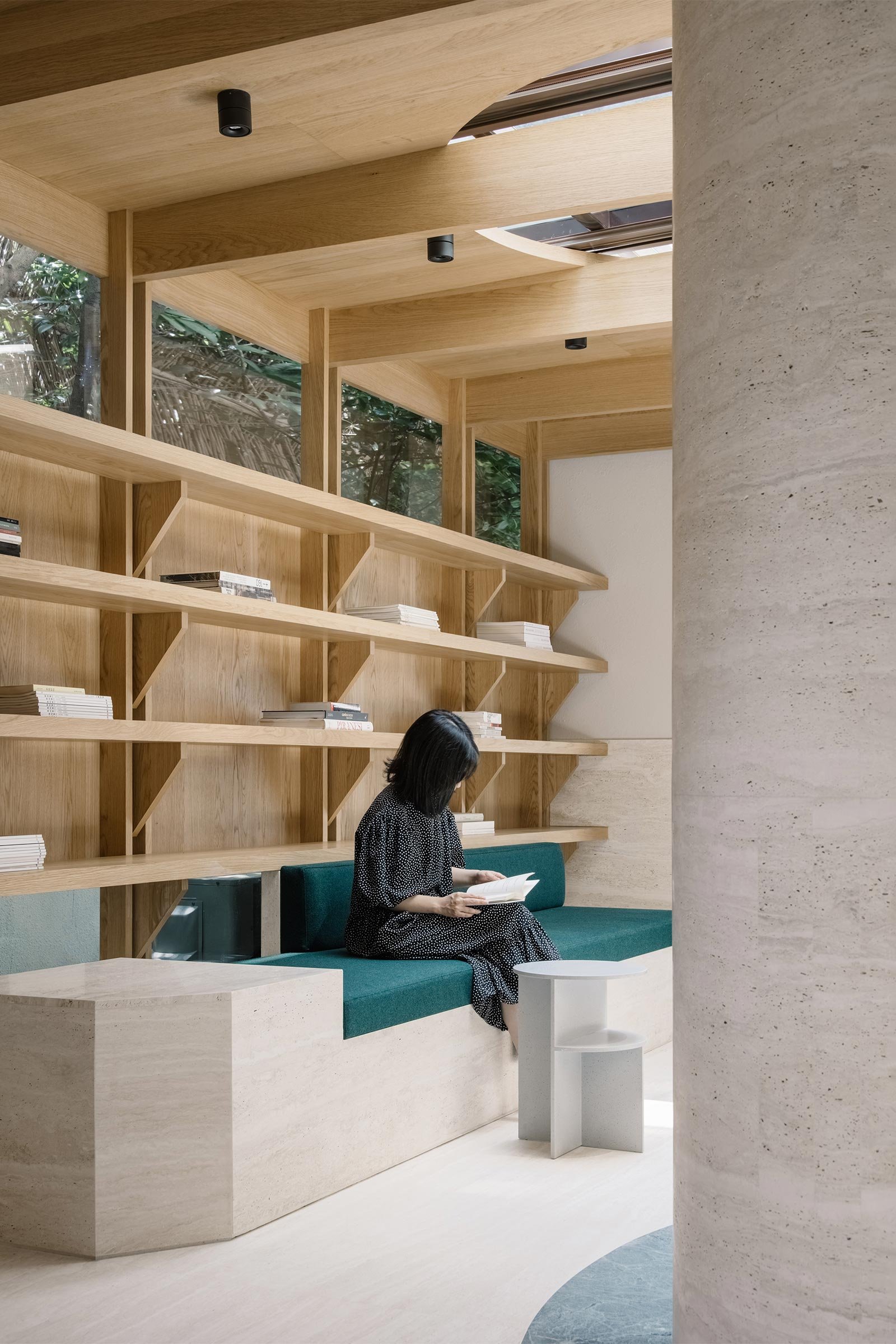
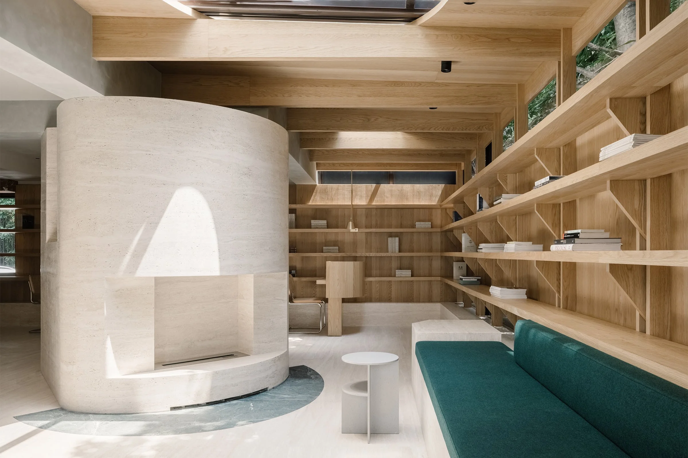
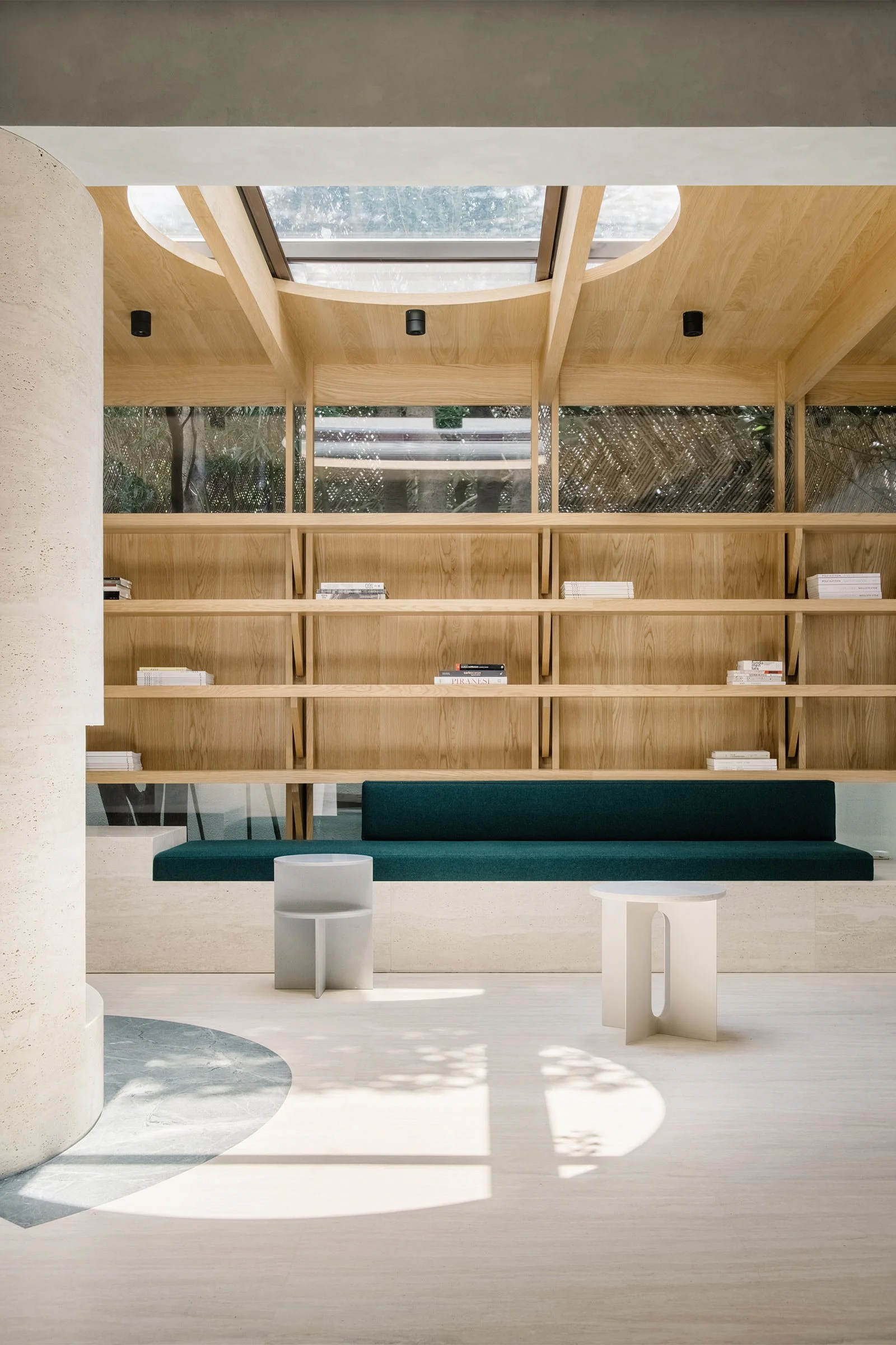
The site consisted of two existing rooms and a glasshouse, with the three units separated by immovable walls and connected through several openings. ‘At first we were frustrated as the site is quite small and has a very low ceiling,’ Cai says. ‘But we then thought about the idea of log cabins in the woods, which are also small and tend to have low roofs, but are still comfortable. So we decided to design an internal cabin under the shell of the glasshouse, framing the view of the trees and filtering the sun through the skylights.’
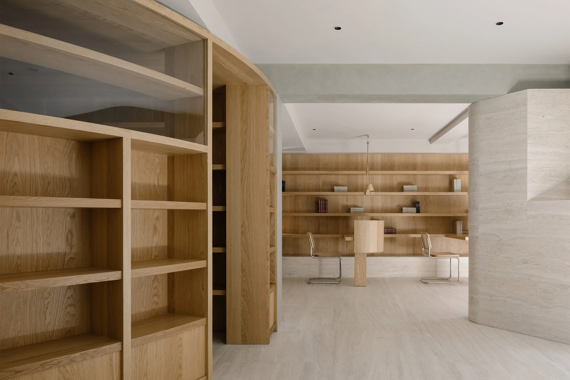
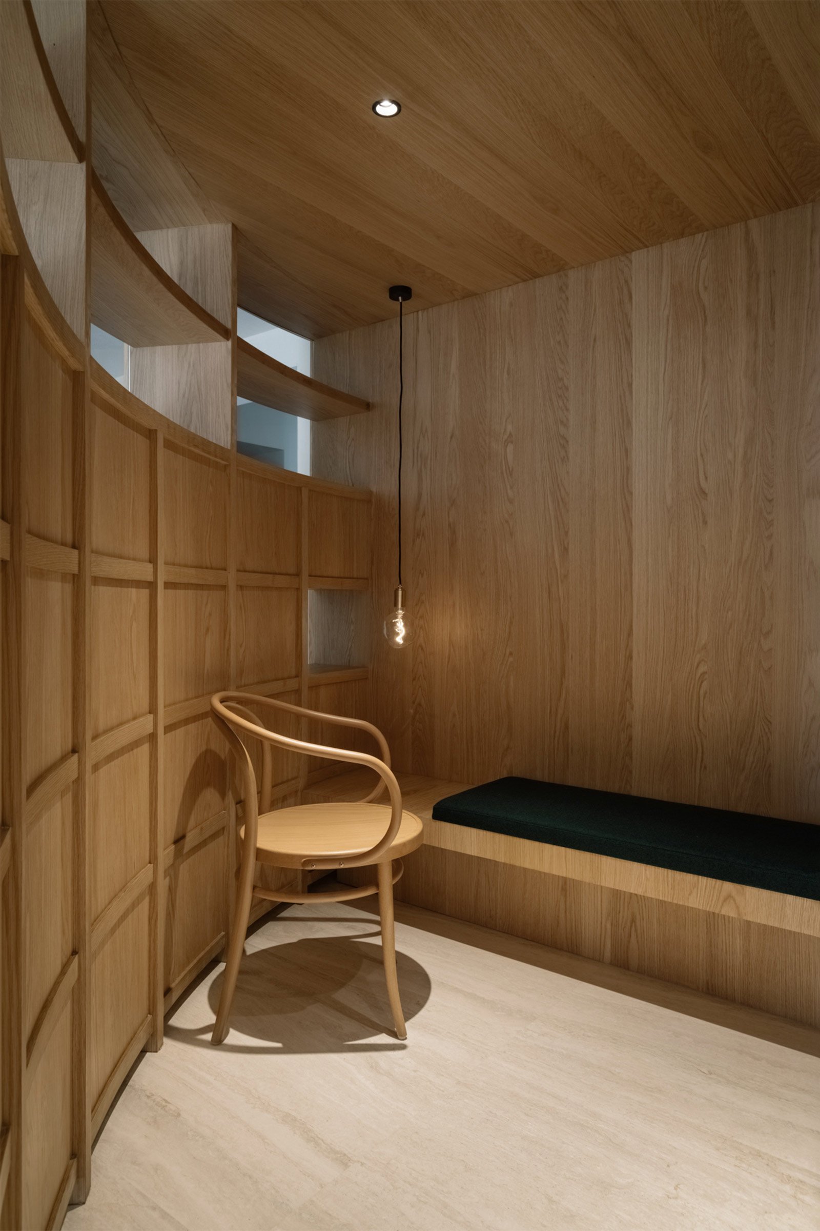
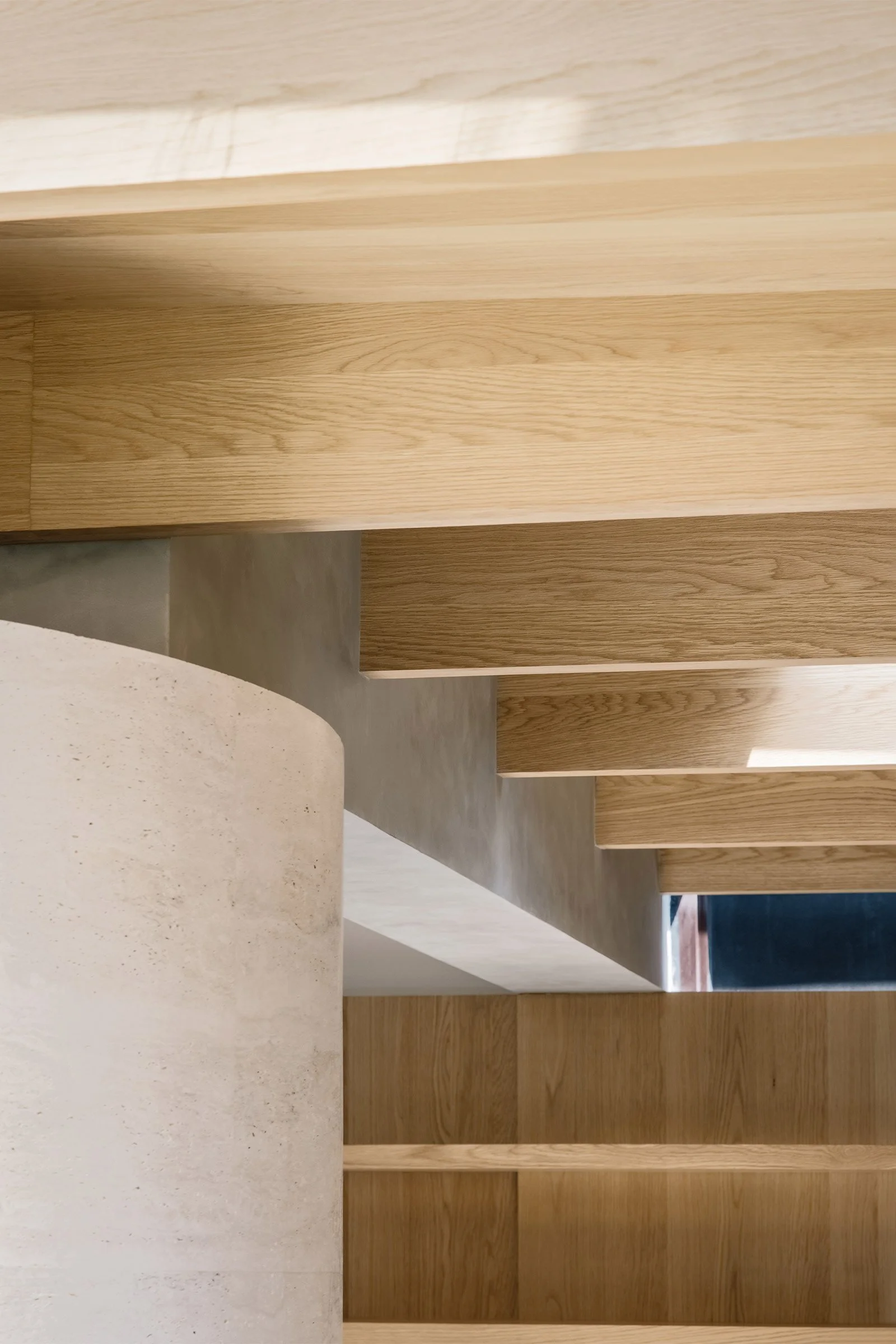
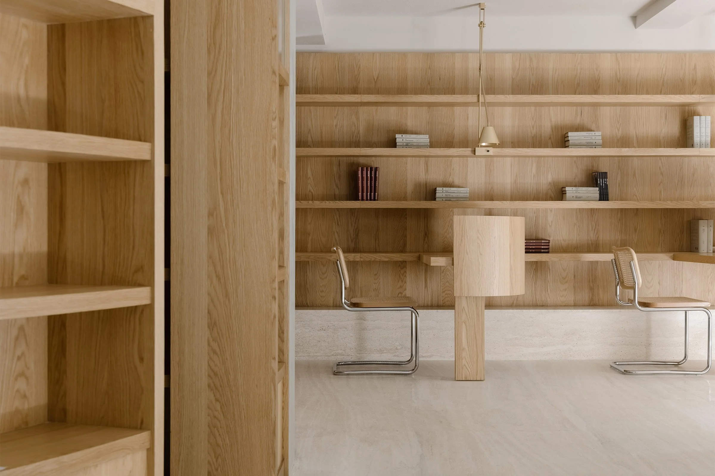
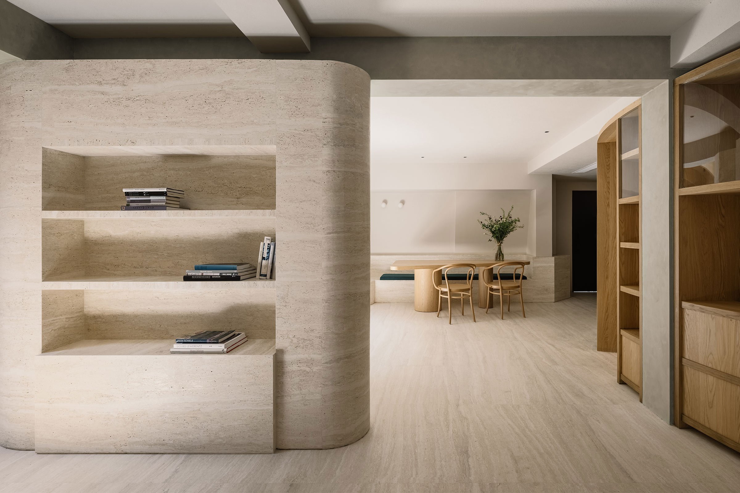
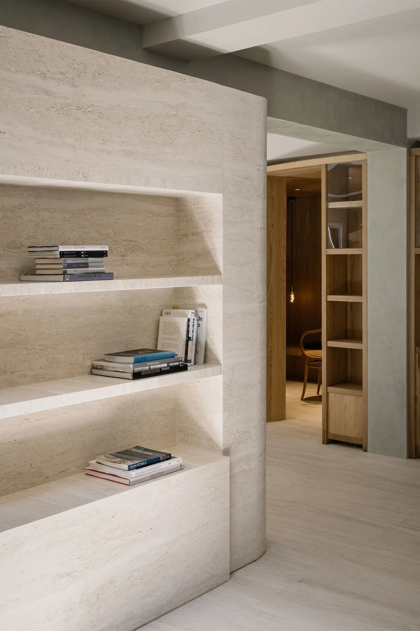
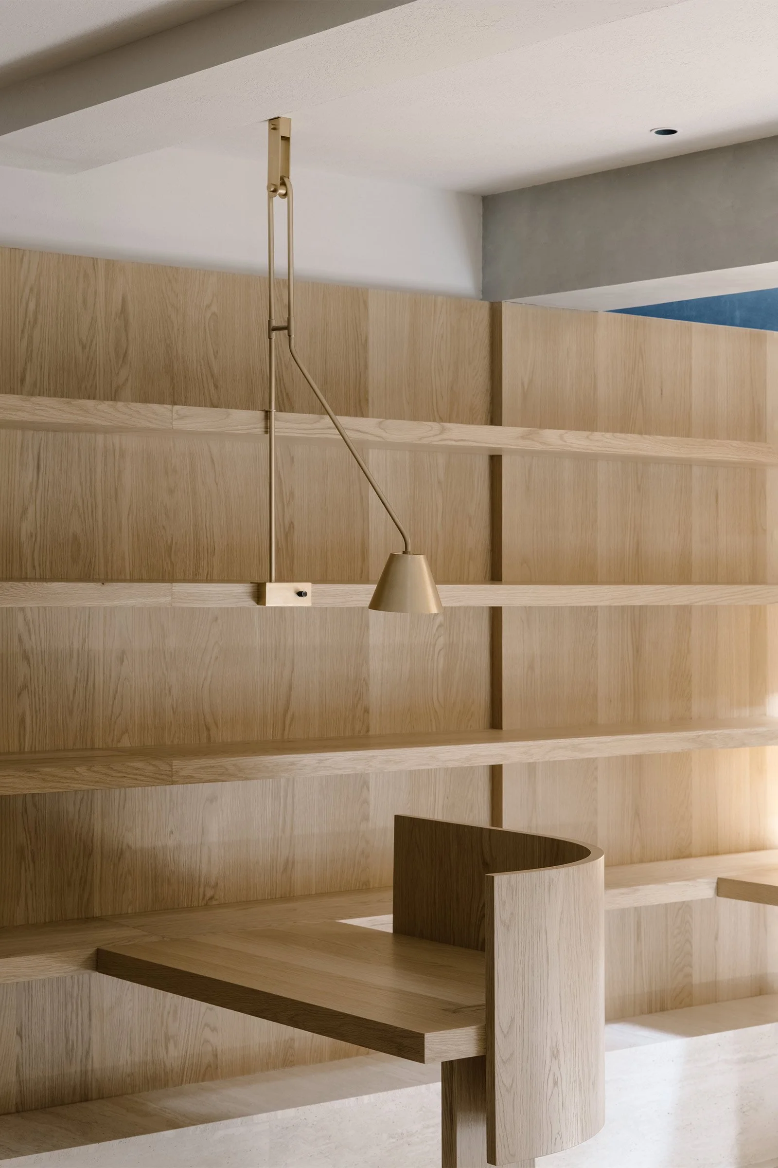
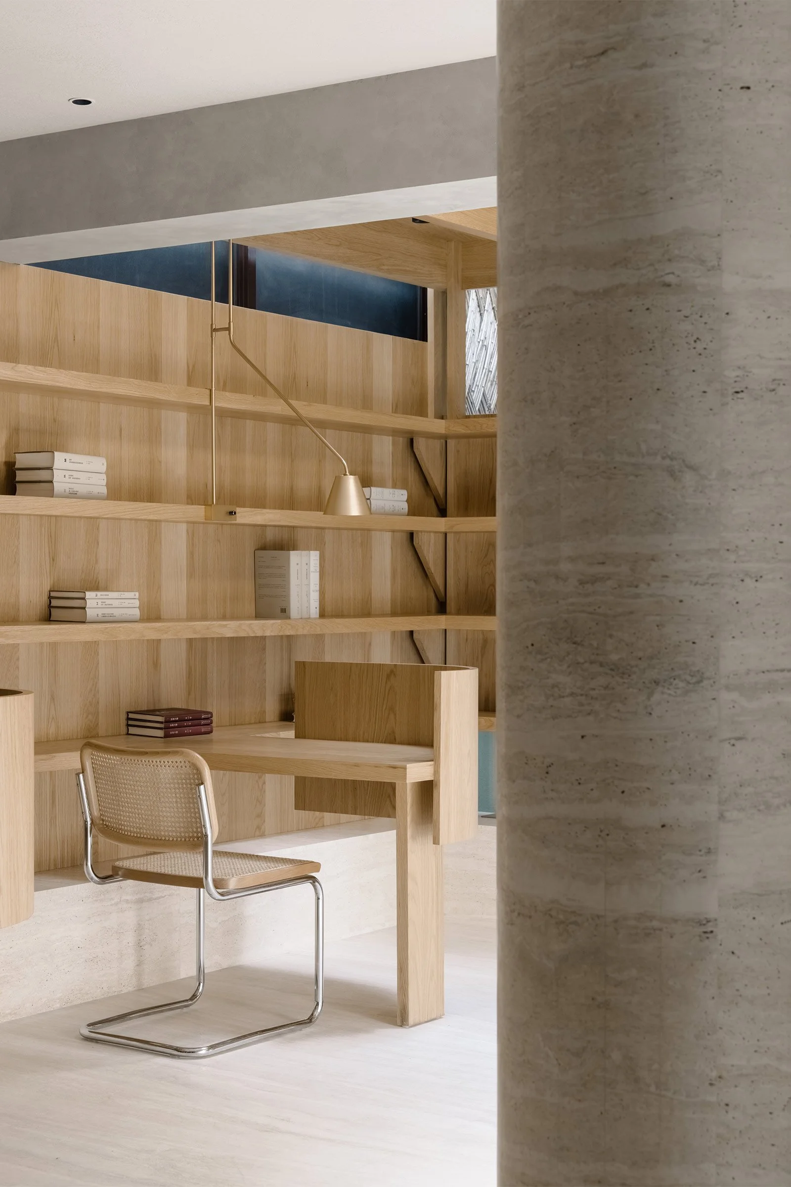
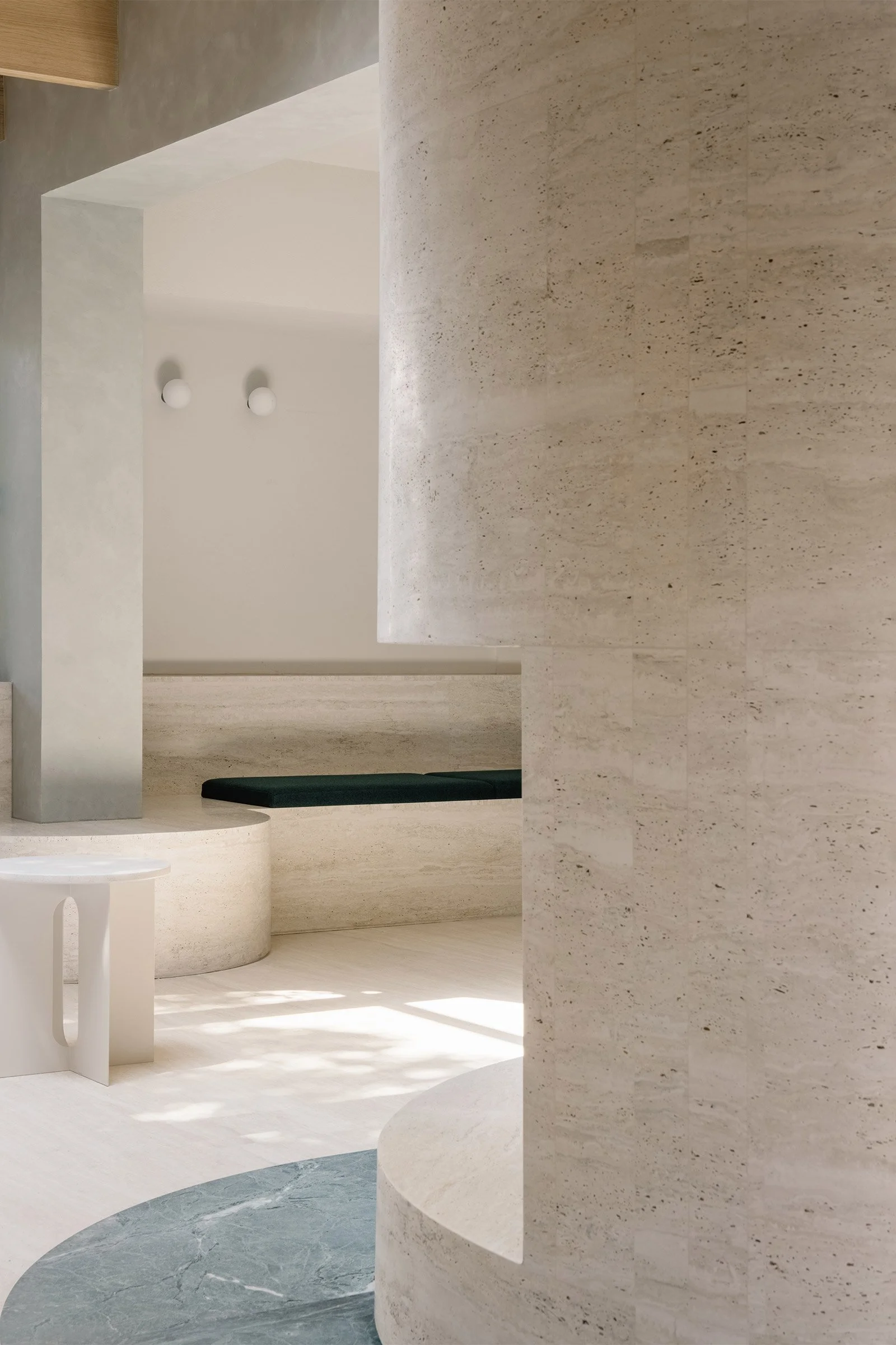
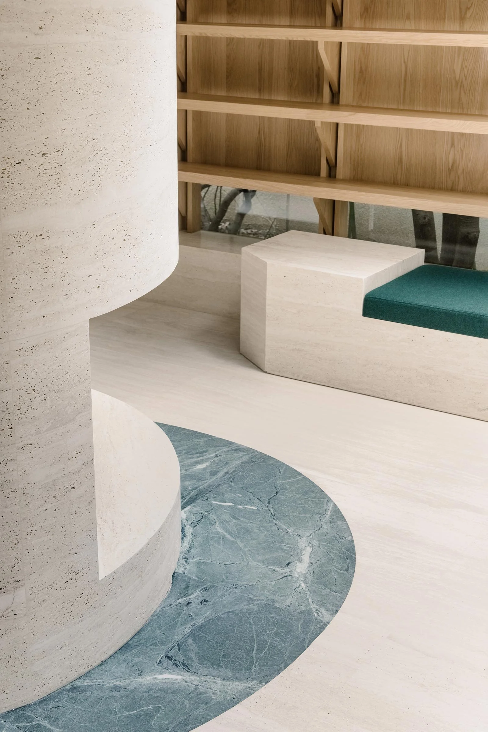
‘As it’s a shared reading room, we needed to create a relatively open and fluid space,’ says Cai. ‘Without changing the original structure of the building, we reorganised the circulation.’ A set of semi-circular bookshelves were incorporated to connect the two rooms into one, forming two small quiet reading corners. The remaining structural walls connecting to the glasshouse were wrapped in off-white travertine, creating an independent sculpture in the space. In the existing glasshouse, a timber structure was inserted with wooden beams and columns integrating with the bookshelves, and round and square skylights were cut out of the new timber ceiling to bring natural light into the centre of the room.
Four different seating areas were designed to cater to different activities — small study tables to sit and work at, a sofa for relaxing and conversation, a shared meeting table and a quiet reading booth. ‘We wanted to create a place of tranquillity where people can focus on the pages, so the materials we applied are quite simple and work together to create an austere atmosphere,’ Cai explains. ‘There’s nothing exaggerated or complicated that might distract people’s attention, except the sunshine and shadows that come through the skylight and the trees outside’.
Text / Nina Milhaud
Images / Wen Studio

