Mixing Work and Play
Designed by IXI Design, the new offices of a Shanghai-based gaming company make room for both productivity and relaxation. Here, founder Mac Huang and designer Evan Ding tell us more about the project and process
Design Anthology: Who is the client and what is this project about?
Mac Huang (MH): The client’s company is a young, creative gaming start-up. As the gaming industry took off during the pandemic, the company rapidly grew from just a few employees to hundreds of employees, so they needed to upgrade their offices. We discussed many of the issues that affect the employees’ mood and efficiency, such as temperature, odours and daylight disturbances.
What was the brief for the project?
Evan Ding (ED): The company’s games are based on experimental ideas, so our team designed an innovative and fun workplace environment to match that spirit. As the company’s employees spend long hours in the office, it’s often difficult for them to draw a clear line between their work and their personal lives. We wanted to design a space where they could both feel at home and focus on their work.
What was the inspiration behind the colour and material palette?
ED: We took inspiration from the game world developed by the start-up, while also being sensitive to how each space would influence employees' mood and productivity. For example, we designed the office’s canteen to make it feel more bright and welcoming, while the work space incorporates darker colours to reduce the impact of light. The engine room features titanium elements to reference the technological elements in the room.
Were there any particular challenges or constraints to do with renovating the existing space?
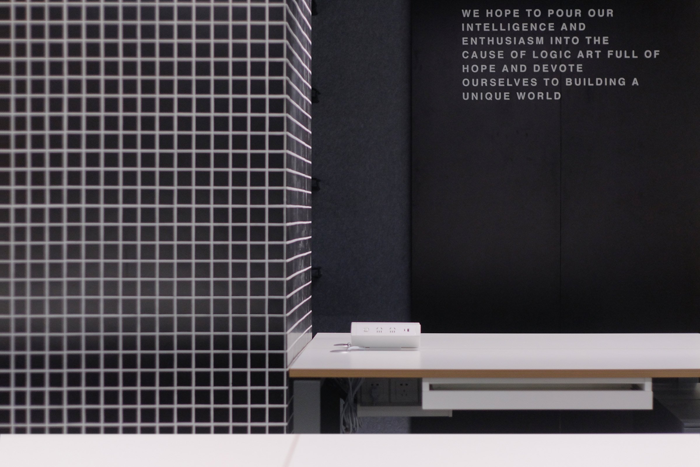
MH: The client wanted to block out natural light, as it can disturb the artists working on colour correction. So we installed blackout curtains in the office, but kept the French windows near the bar to still allow some natural light into the space. Another challenge was that a series of columns obstructed the space and hindered partitioning. By covering them with small tiles, we found a way to make them look smaller and less imposing.
Can you tell us about the materiality and design detailing?
ED: The main materials we used for the space include terrazzo, metal, aluminium board, wood veneer and sound-absorbing cotton.
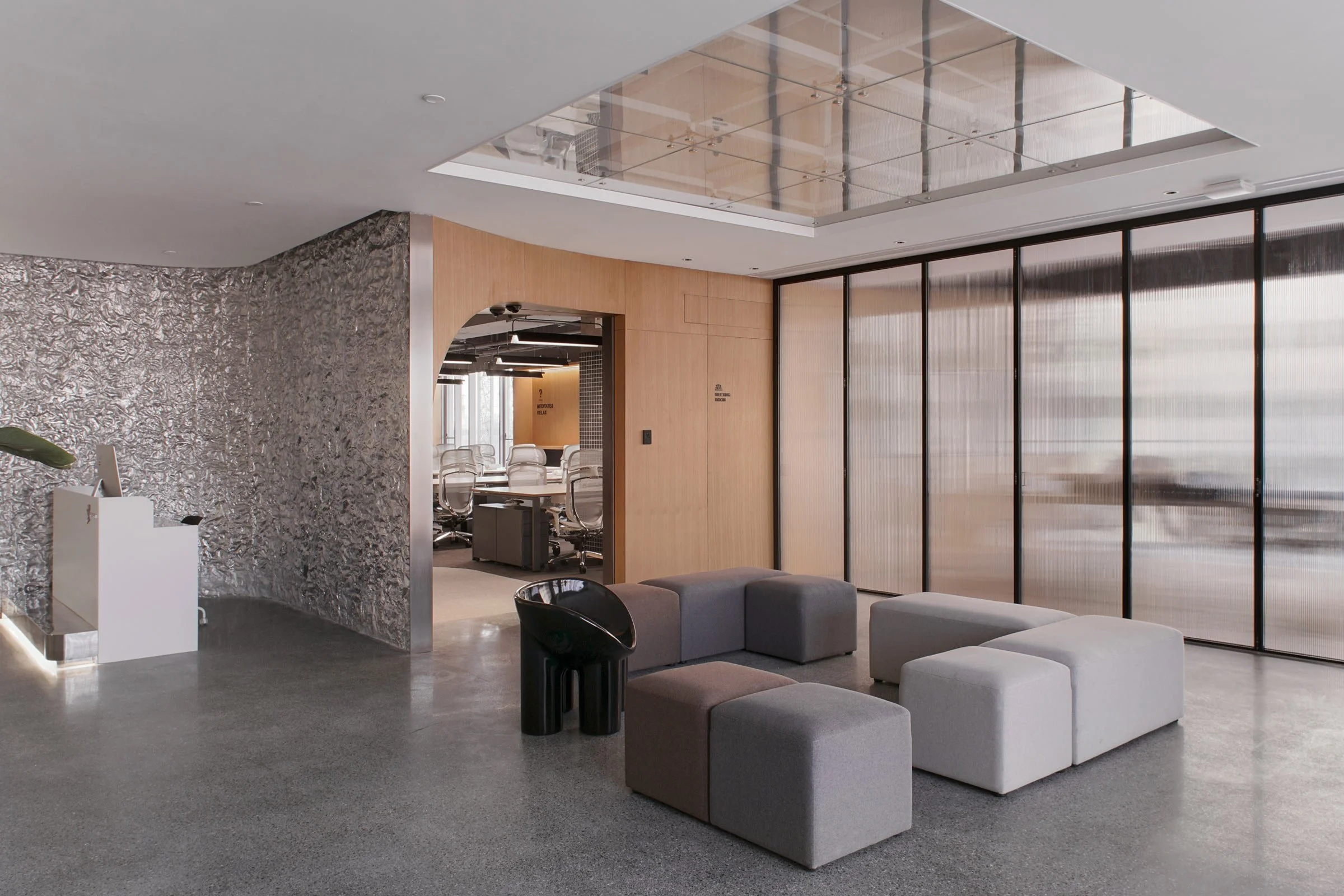
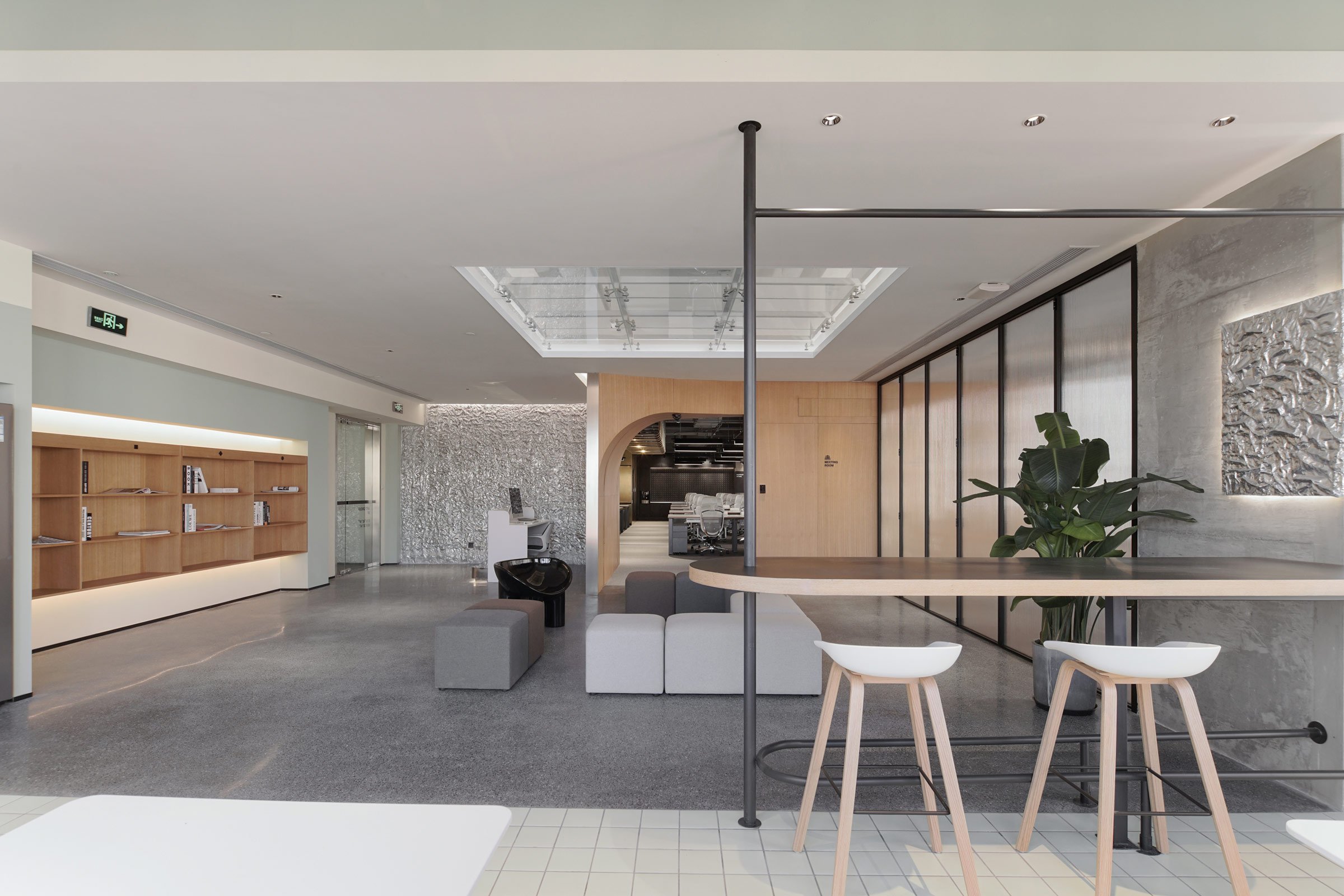
To bring a sense of leisure into the office, we included a gym ladder and a meditation bar, which allow employees to live, work and play in the same space. In the communal area, we designed a cosy lounge with a glass ceiling, which makes the space feel more open and adds some dimension.
The meeting room can be transformed to suit multiple needs. When the glass doors are closed, it becomes a soundproof, private space for formal meetings, but when the doors are open, the room extends the shared area and becomes a space where employees can play games or even celebrate birthdays.
The dining area, which features a sage-green ceiling and soft beige walls, is designed to be more like a relaxing cafe.
Was sustainability a consideration, and if so how was that incorporated into the construction and design?
MH: Sustainability is a value we attach great importance to. For this project, we chose recyclable materials such as aluminium sheets, woven carpet, sound-absorbing cotton and technological veneer.
Images / Yuuuun Studio


