A Tranquil Cafe in Downtown Bangkok
KIF cafe brings a green aesthetic and laid-back philosophy to the heart of Ekkamai. STUDIO 1:10 co-founders Joko Tandijono & Paula Barrionuevo tell us more
Design Anthology: How did you first meet the client?
Tandijono & Barrionuevo: We met this client some years back, and we’ve worked together on some projects in Cambodia and Hong Kong. We were excited when he contacted us to work on KIF in central Bangkok.
What was the brief?
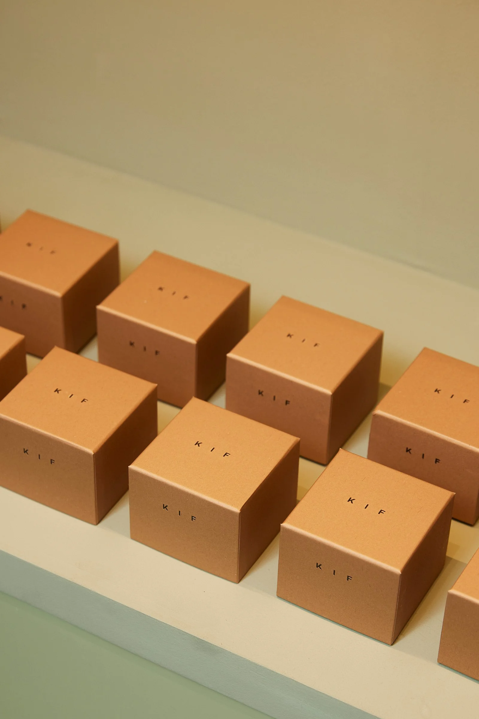
In response to the rising numbers of digital content creators in Bangkok and the neighbourhood, we were asked to deliver a cosy and design-focused contemporary space that could become a favourite neighbourhood spot for the intended audience. It’s 170 square metres including a 50-square-metre terrace, the client envisioned a warm and welcoming space; they emphasised the word ‘green’, where you can feel tranquillity and nature in the middle of chaotic Bangkok. They also wished for the design to reflect on the modern and minimal branding of their coffee products.
What’s great about the neighbourhood and what makes the location unique?
KIF is in Ekkamai, which is in Sukhumvit. The area is known for its unique characteristics, which make it stand out among the many neighbourhoods in the city. It’s home to a tight-knit community comprised of Thais and expatriates, contributing to a unique cultural blend. It’s also renowned for its vibrant entertainment scene, and has a burgeoning creative and artistic community with many art galleries, studios and cultural spaces.
How did you approach the project? What design references and narrative did you try to incorporate into the space?
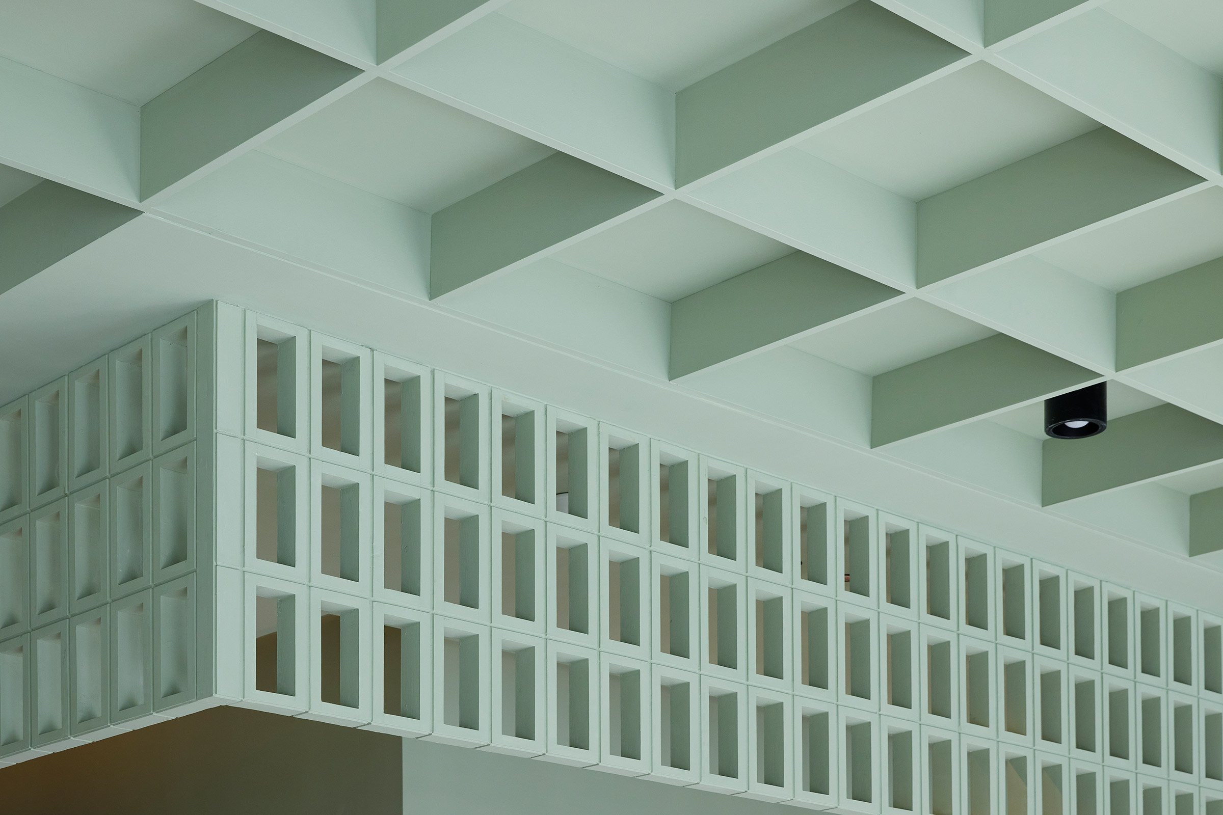
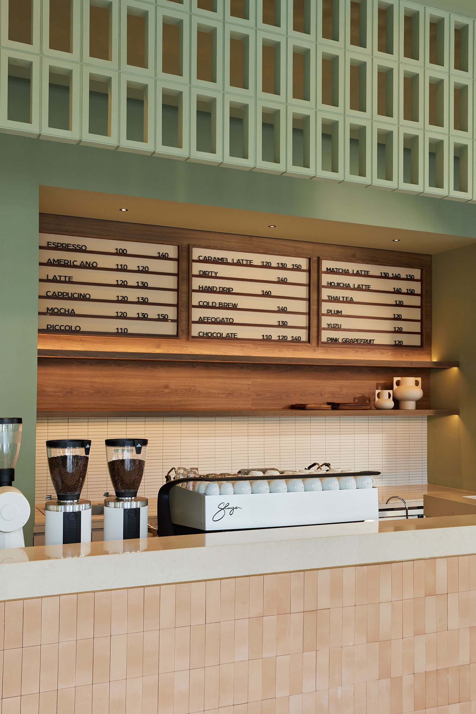
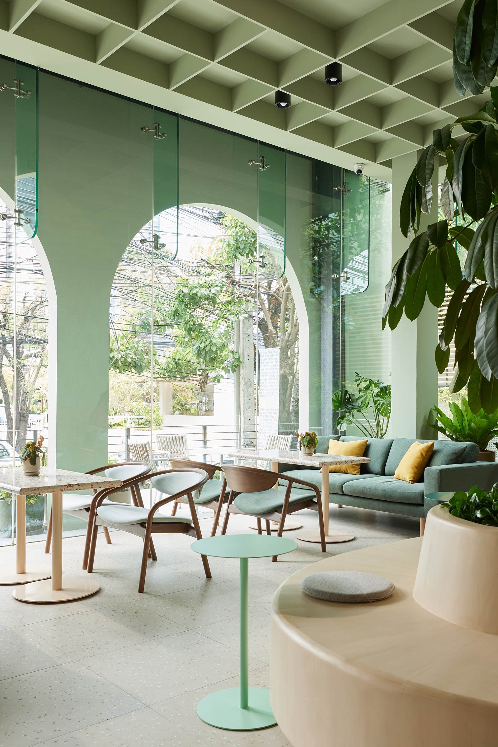
We interpreted the client’s brief of incorporating ‘green or nature’ in a number of ways. In a literal sense, we experimented with several green hues for the walls, joinery elements and ceiling before settling on a sage green. This specific hue brings you into nature, creating a relaxing and tranquil vibe. And complementing the sage green hues are what we call a ‘green symphony’ — that is, an abundance of flourishing greenery. The combination of various shades of green creates a harmonious symphony of colours and textures that creates an inviting and aesthetically pleasing space.
Tell us about the material choices.
Following our design narrative, the material choices embody serenity and tranquillity through the use of natural materials like local terracotta tiles, handmade ceramic glazed tiles and rammed earth material made from mineral clay.
Tell us about some of the custom pieces.
The feature planter bench with a 2.8-metre umbrella tree is the focal point. This design offers a comfortable seating area with integrated planter, making it a practical and visually appealing feature piece. It’s finished with natural lime-wash paint that doesn’t contain any synthetic fillers or additives. Unlike a traditional paint that leaves a plastic finish on the wood, lime-wash absorbs into the wood, leaving a natural contour.
Do you have a favourite element or design detail?
Our favourite element is seeing how all the greenery, locally sourced furniture and our proposed materials along with the hues and textures of green come so cohesively together.
What other features are you most excited about?
One main element that was a challenge for us in the beginning but a rewarding result in the end was to structurally insert a secondary facade into the existing one. The exterior facade is clad in handcrafted triangular glazed ceramic tiles in sage green, a three-dimensional element specifically chosen to give additional depth and further softened by the addition of elegant arches. From there, the theme of ‘green’ and using only natural materials and clean geometry continues into the main space of the cafe.


