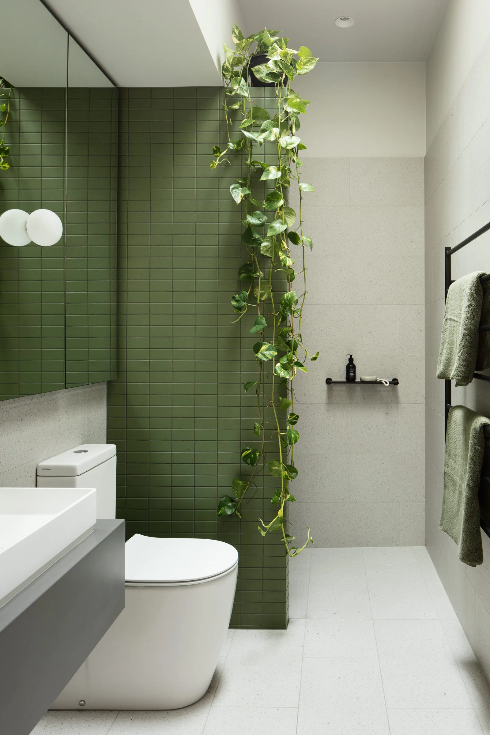
This 1940s Bungalow Gets an Intuitive Extension
Moloney Architects reprogrammed the layout and conceived a new extension for this 1940s bungalow in Ballarat, prioritising warmth, a contrast between light and dark, and a palette of textural materials. Here, firm director Michael Moloney shares more
Design Anthology: How did you first meet the client?
Michael Moloney: After a few phone calls and emails, the first time we met the couple in person was at their house, which isn’t far from our studio in Ballarat. They had followed our work for a while and invited us to take a look at the house and see what we thought of it. The clients are both design nerds, so we hit it off immediately.
Can you tell us about them and their lifestyle?
They’re both creative professionals — one is an art teacher and the other a graphic designer. They share a passion for art and design, and it comes through in their home, from the art on the walls to the furniture and books. They have two children and extended family in the area, and they’re genuinely warm and inviting people. Coming from design backgrounds, they really understand the value of investing in the architectural process.
What was their brief to you for the project?
They were keen to renovate their existing home, but weren’t sure exactly where to begin. They first suggested a small-scale renovation of the existing layout, with the addition of a new master suite at the rear, but during our first meeting we realised that the existing layout wasn’t ideal for the way they wanted to live in the house. We suggested flipping the current program by turning the existing living space into the master suite and creating a new extension at the rear of the house to contain the living spaces, allowing them to engage directly with the private backyard.
What’s unique about the building and the location?
The house is a 1940s rendered brick bungalow in Black Hill, a suburb of Ballarat. The design is typical of the era, with an austere exterior and generous rooms connected via a central hallway. The interior is unified by the use of dark-stained timber skirting boards and architraves that run throughout the house, as well as the stained timber doors and wall panels in the hallway. These timber elements give the existing interior a sense of depth and richness that we wanted to work with in the new design.
How did you approach the project — what design references did you try to incorporate into the space?
We approached the design from the inside out, focusing on the day-to-day functions of each room. We were interested in expanding on the rich timber features of the existing house and turned to In Praise of Shadows, Jun'ichirō Tanizaki’s essay on aesthetics, to help guide our approach to light and materiality. Tanizaki’s work talks about an appreciation of the quality of shadow, the contrast of light and dark, and how low-sheen materials create subtlety in an interior environment.
Please tell us a little about the material choices for the space.
We limited the material palette to concrete, timber, cement sheet, bagged brick and painted steel. We prioritised textural, matt materials over anything too shiny. Overall, the palette feels calming and warm, and the various textures give the space a real sense of being handcrafted, which of course it was, by the exceptionally fastidious team at D & H Building.
Do you have a favourite element or design detail?
My favourite element is the double-height void above the kitchen, which brings in sunlight where it’s needed and creates a ledge for greenery to hang down into the space.
Images / Ben Hosking
Styling / Hilgar Design


