Around the Bonsai
Studio Eccentric designed this serene, layered family home in Seoul’s Cheongdam neighbourhood around a central bonsai tree. Here studio founder and creative director Seuk Hoon Kim tells us more about the project
Design Anthology: How did you first meet the client?
Seuk Hoon Kim: It all started with an email, when I received a message from the client asking us to design his new house in Seoul.
What was his brief to you for the project?
As the client spends most of his time abroad, the house was to be a getaway place for him and his family, where they could enjoy being with friends and family.
The brief had two requirements: one was that the home should be a place where the client’s family and friends could enjoy themselves and rest, and the other was to include a bonsai tree in the living room.
What’s unique about the building and the location?
The home is in the heart of Cheongdam, a fashionable area in Gangnam, Seoul. Although the area is very crowded, the house itself is very quiet and enjoys a sense of privacy.
How did you approach the project — what design references did you try to incorporate into the space?
The main idea was to draw on Asian influences to balance function, experience, colours and materials. One of the most important elements, the main bonsai tree, was placed in the living room as the core of the space and gives the house its name, Songwoohun, which translates to ‘house encountering a bonsai tree’.
Please tell us a little about the material choices for the space.
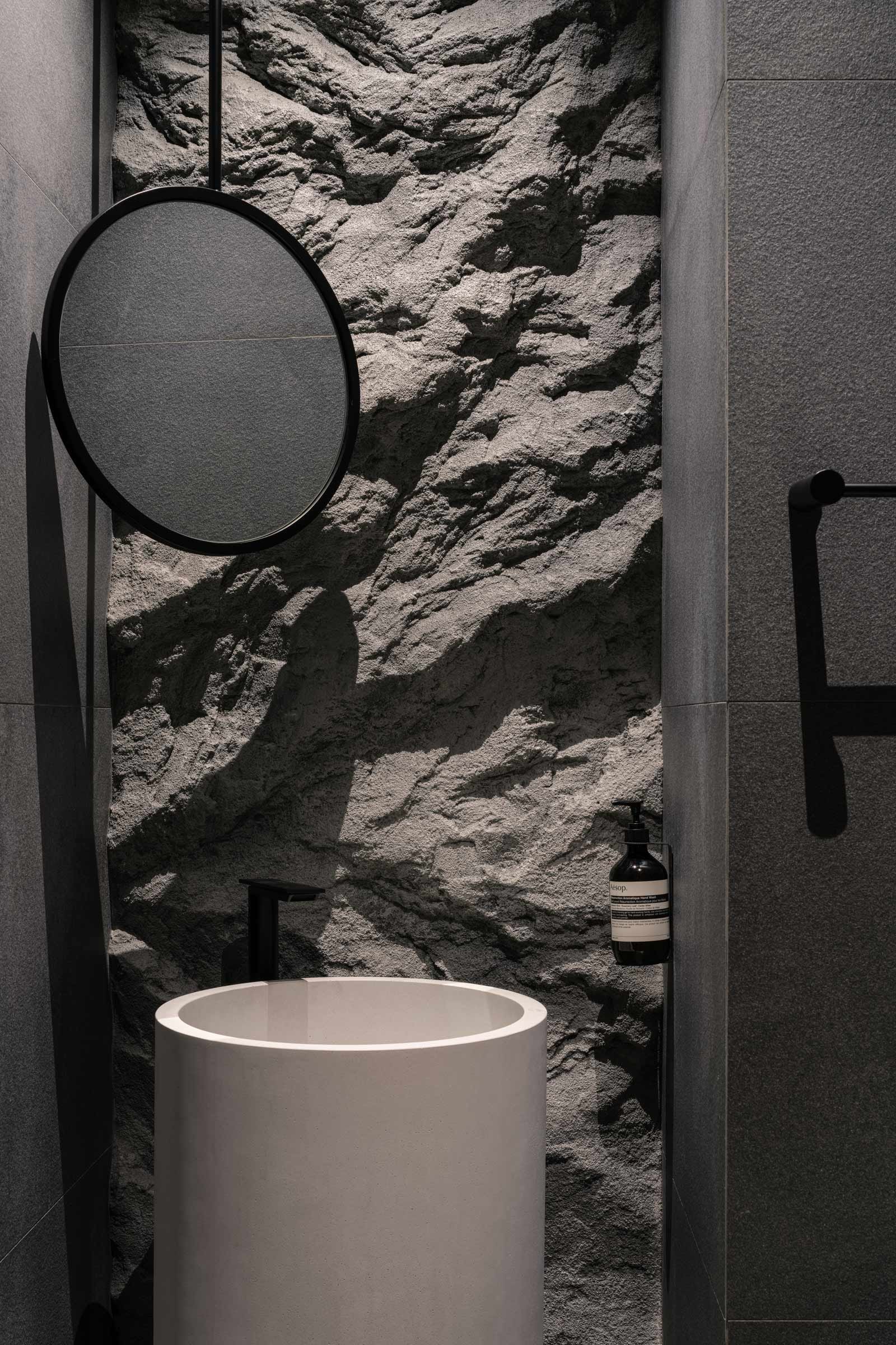
The materials are a mix of mud panels, wood flooring, concrete, rock-textured plaster and paint. All were carefully selected and articulated according to the positioning of the linear elements intersecting one another in the space. The distinct contrast between the brown and white material palettes creates a three-dimensional backdrop highlighting the main bonsai tree.
Which of the pieces are custom designed?
Most elements were custom made. The most impressive piece is the U-shaped dining table, which was inspired by the shape of a sushi counter. My team and I imagined it as a place where the client can enjoy meals with his family and friends, with him preparing and serving from the centre of the table, while his guests sit around the outer edge.
Do you have a favourite element or design detail in the architecture or interiors?
One of my favourite elements is the marble gate. We demolished the pre-existing wall between the dining and living rooms and replaced it with a rectangle-shaped marble gate, which serves both as a fireplace and as a portal allowing people to engage with one another from the dining area to the living room.
Images / Mingu Kang


