A Multigenerational Bungalow in Kuala Lumpur Finds Calm Through Contrast

Wuuu Studio kept this Damansara home’s old colonial shell and reworked it from within, opening up the cramped rooms and shaping a dining space around unexpected structural columns
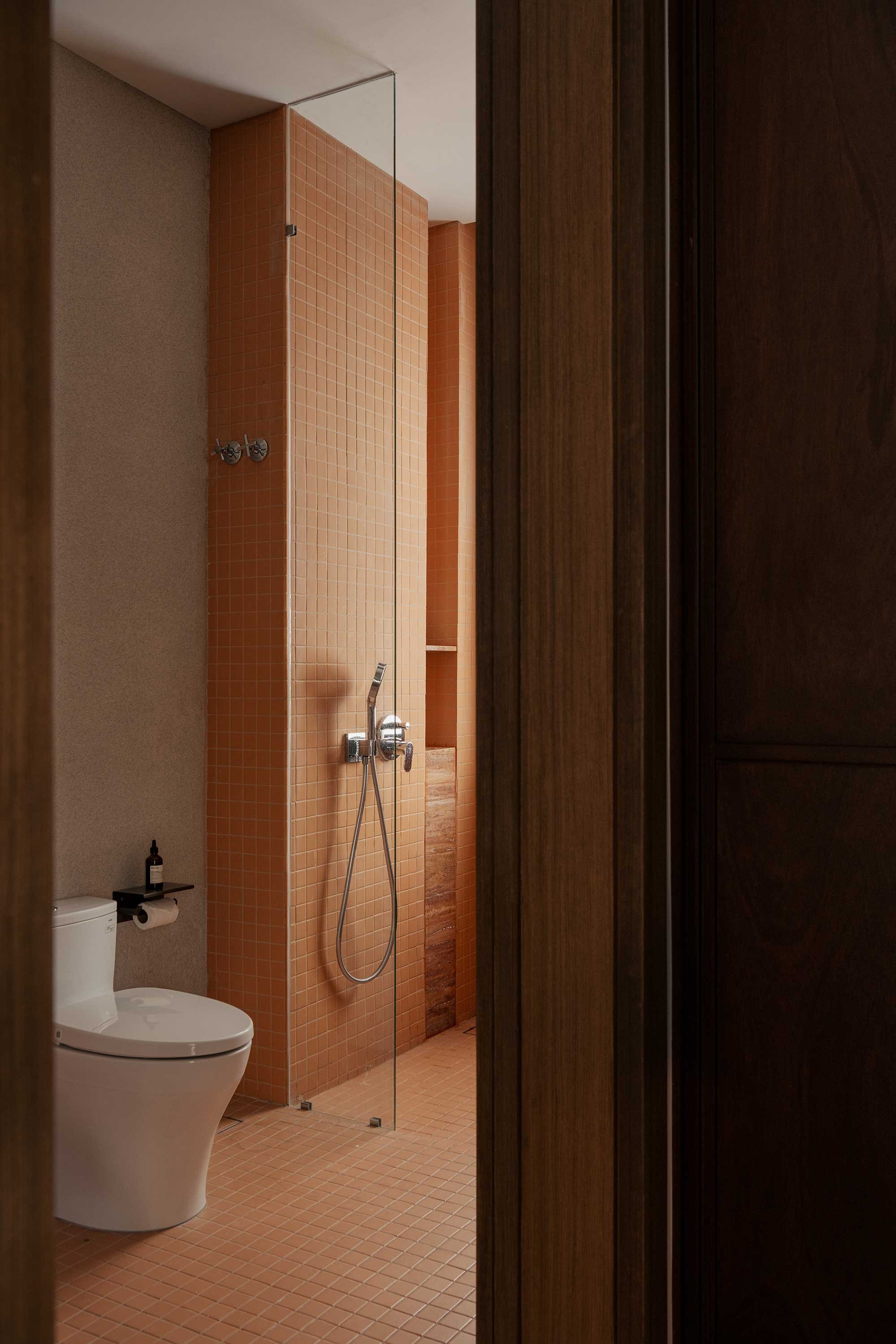
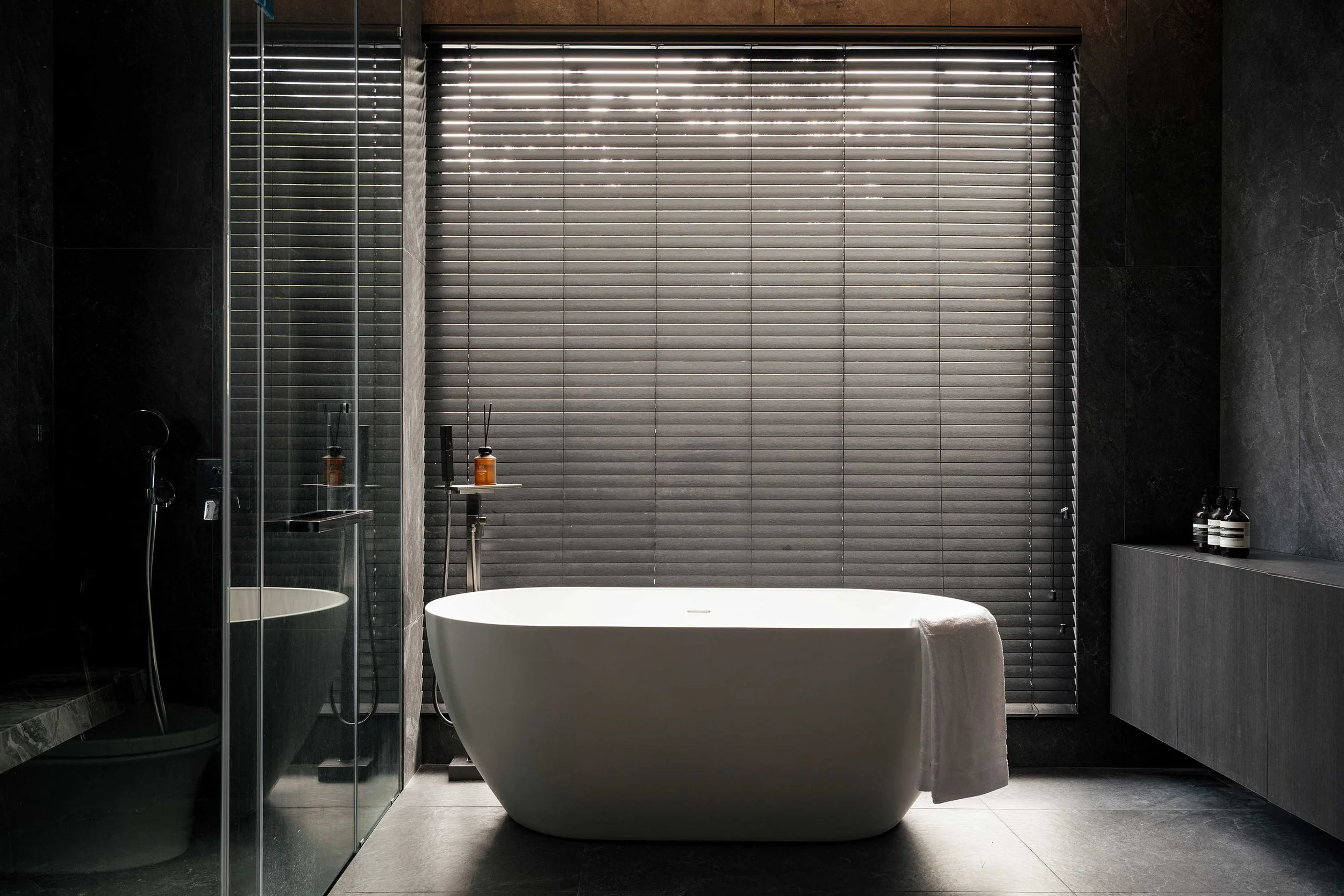
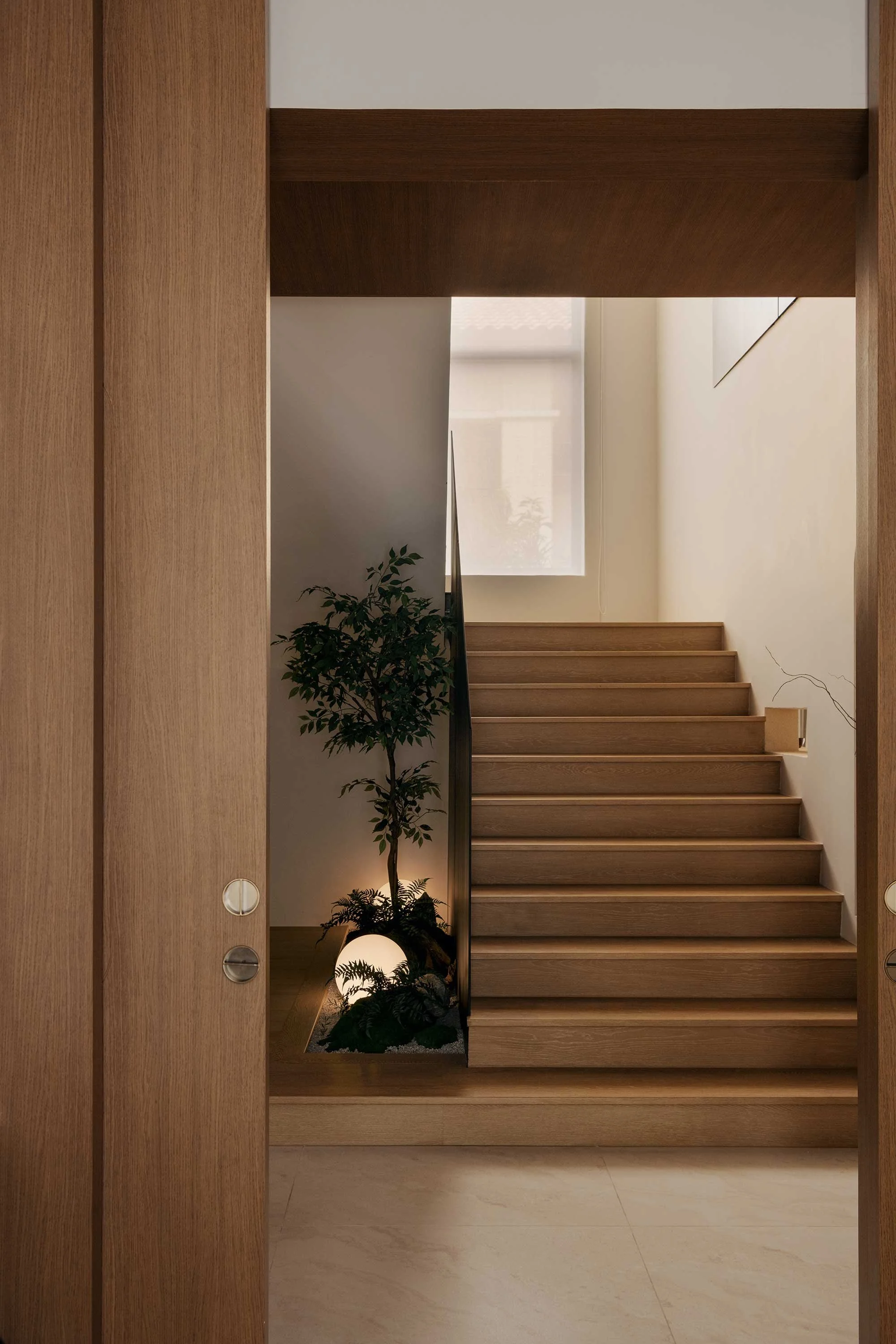
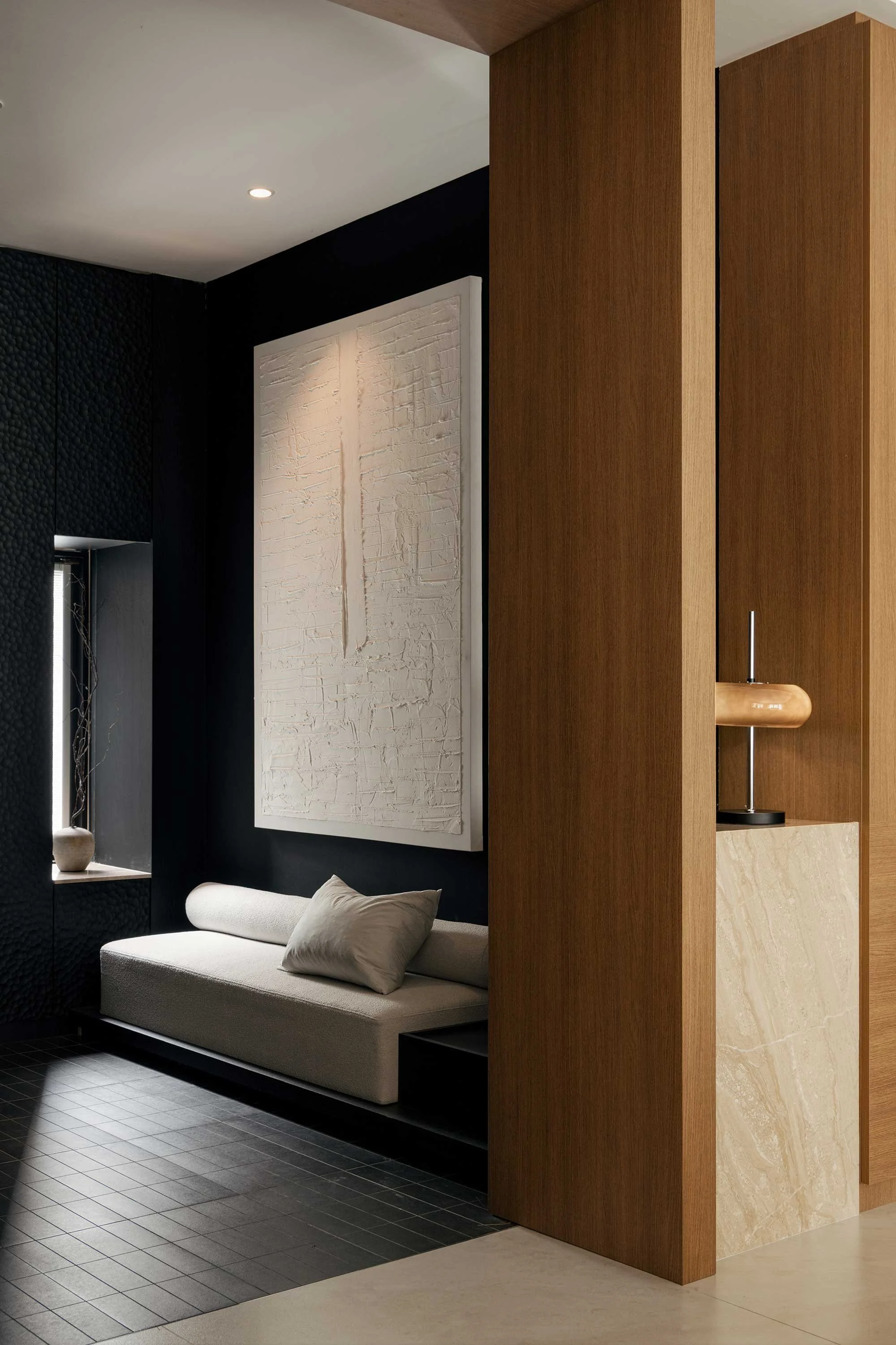
Entering this Damansara bungalow is a deliberately dark experience. Wuuu Studio lined the foyer in textured black, with a built-in bench in a niche beneath a large artwork and a single narrow window letting in one line of daylight. ‘The black colours can capture the very still moment of the space,’ says director Dom Tee. The floor tiles here are cut smaller than in the rest of the house, a detail Tee uses to underscore the Japanese sensibilities the owners had asked for. This style suited the studio, which tends to work in a less-is-more way. ‘We always practise a very minimal approach when it comes to designing a space,’ says Tee.
The house, about 370 square metres, is shared by two young couples along with their parents and siblings. They came to the studio with a clear idea of what they wanted: a calm, minimalist interior. ‘They just want calmness when they enter the space,’ says Tee.
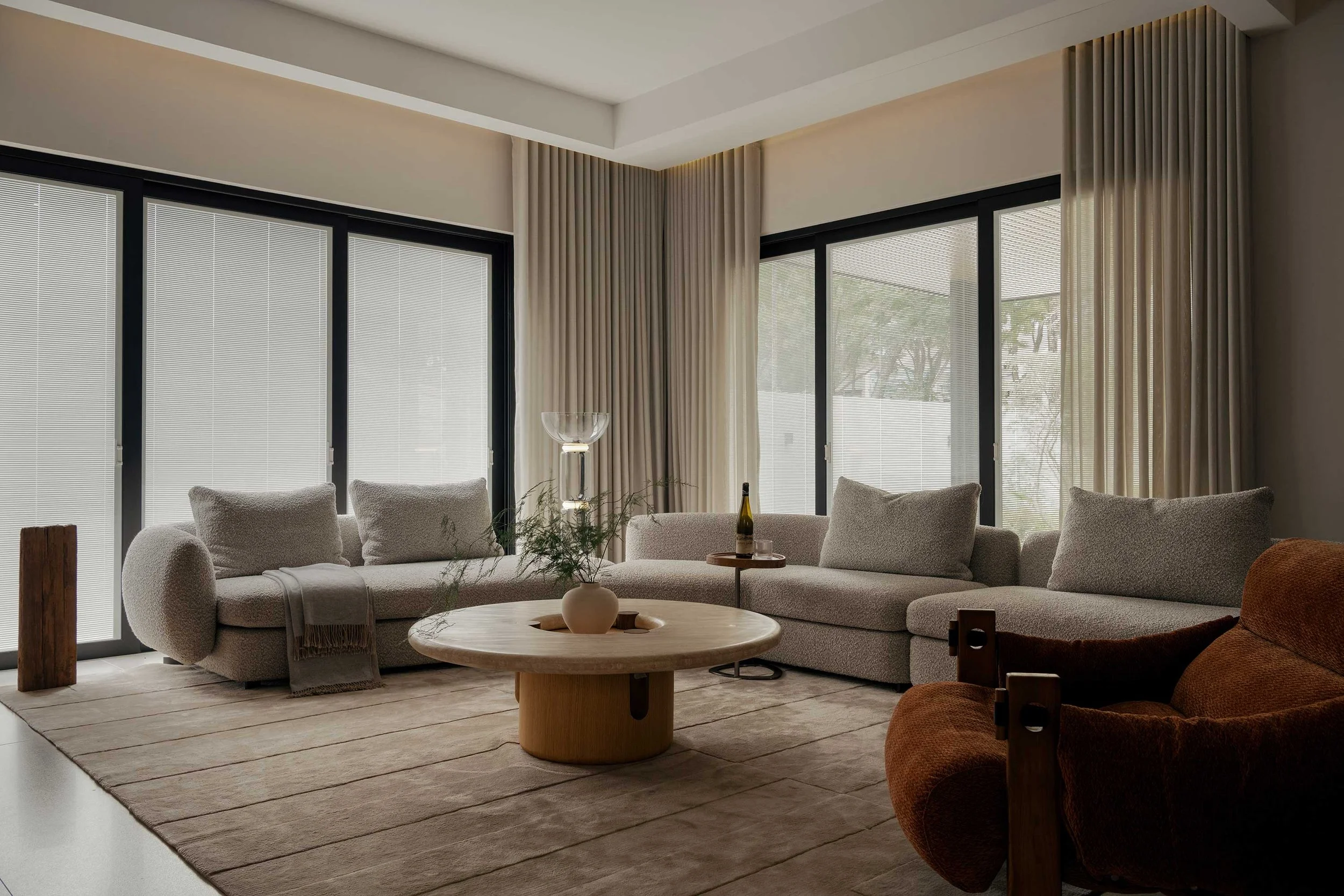
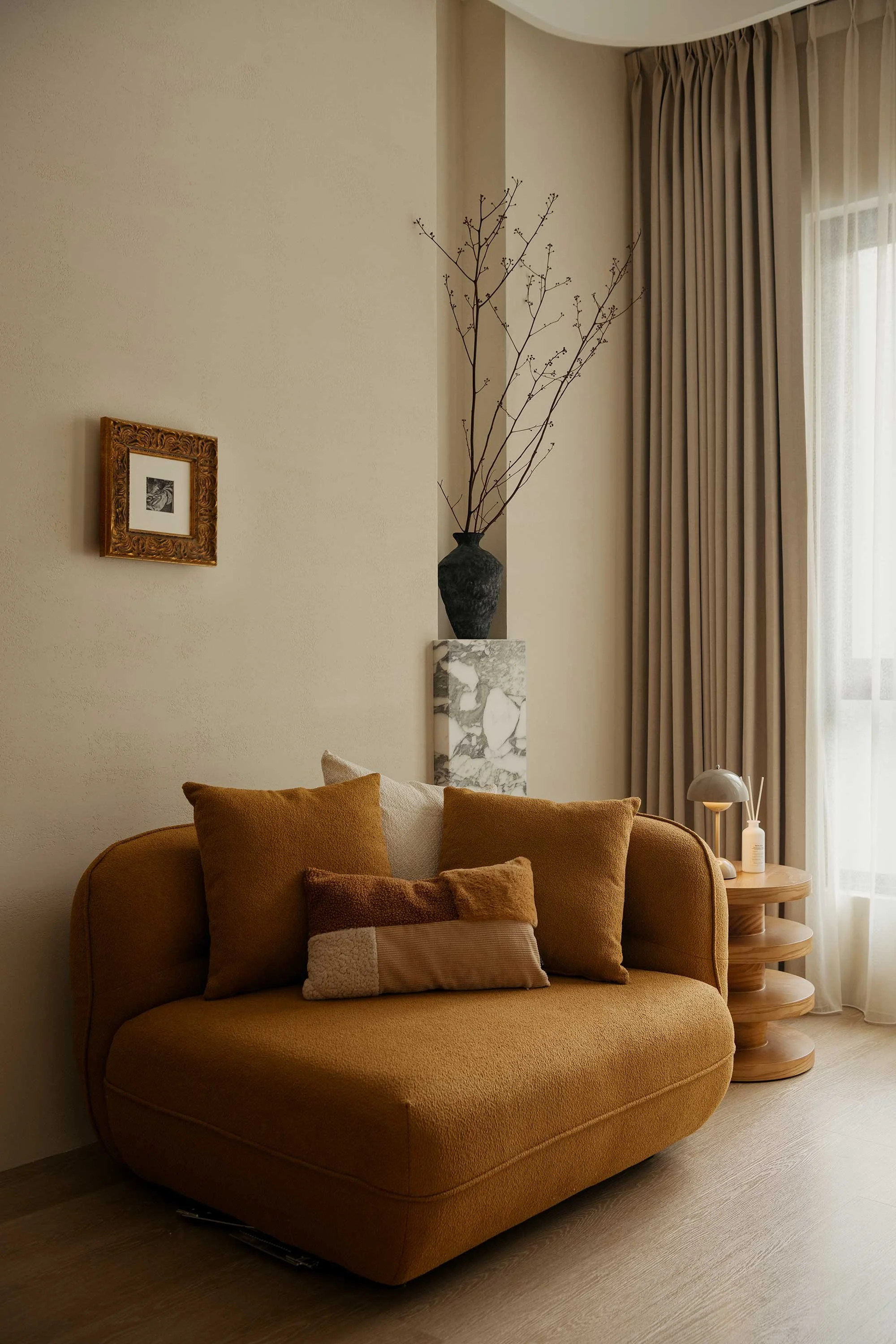
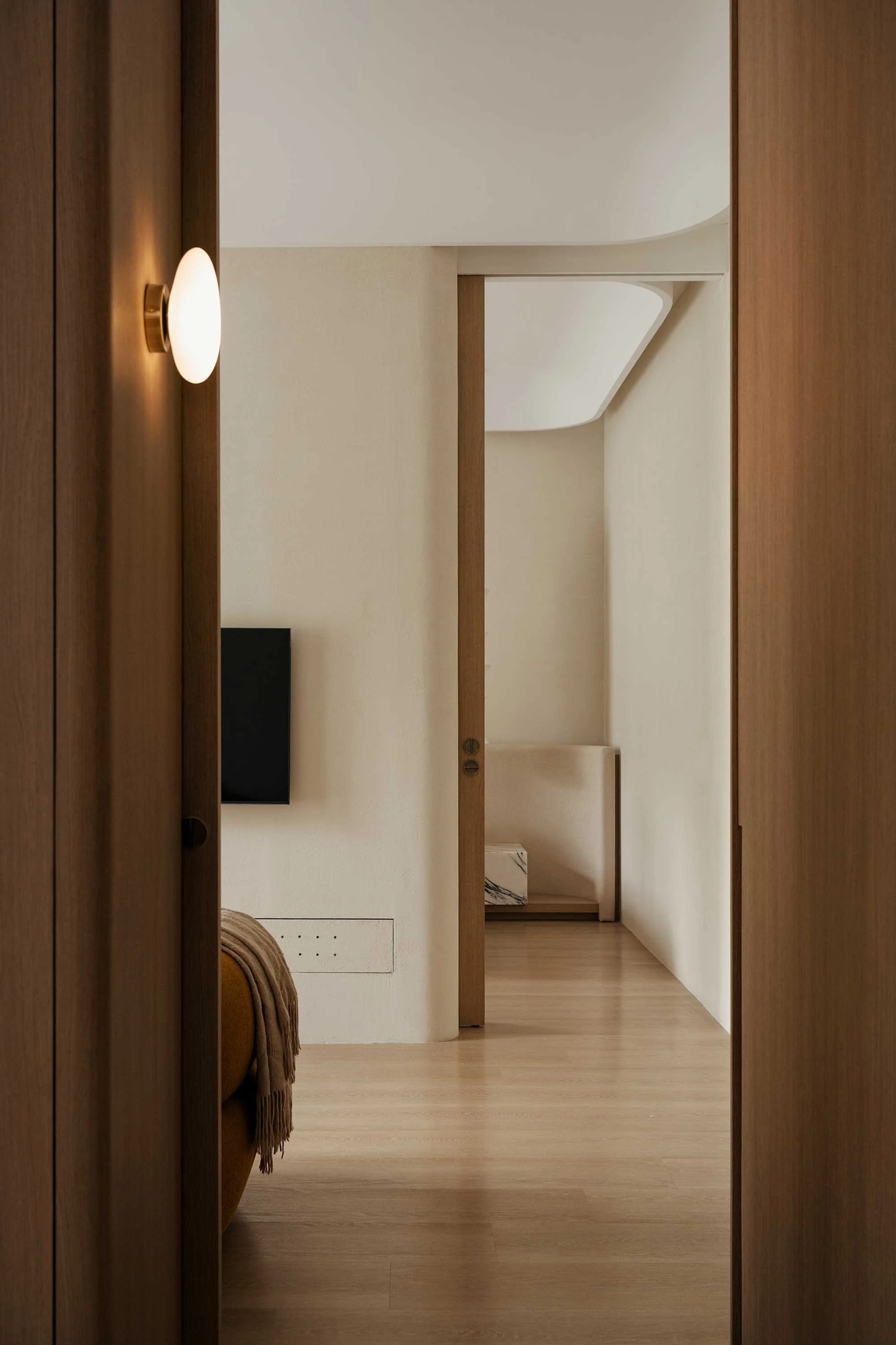
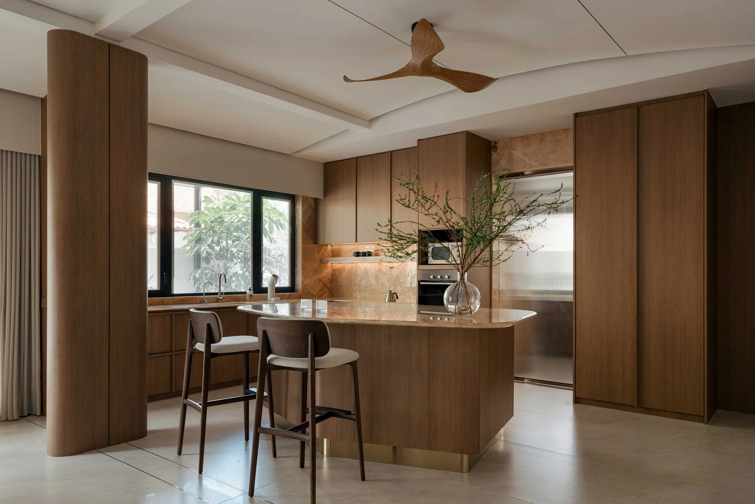
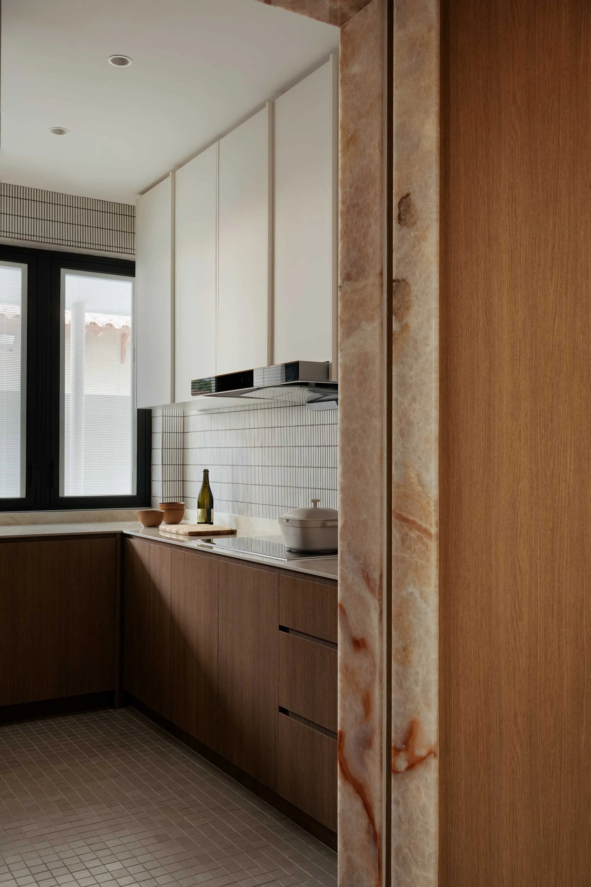
Tee chose not to touch the colonial-style façade, instead focusing on the interiors. Here, he removed most of the small, divided rooms common to houses of that era and used changes in level and ceiling, rather than walls, to separate one area from the next. The living room is pared back to a timber wall around the television and a stone console, with storage built into the joinery. A timber-lined corridor runs past the study and narrows into what Tee calls a tunnel before opening into the dining room and dry kitchen. That shift from tight to open is his favourite part of the house. ‘You move from a compressed tunnel to a larger space,’ he says, ‘from very angular forms into curvy, organic ones.’
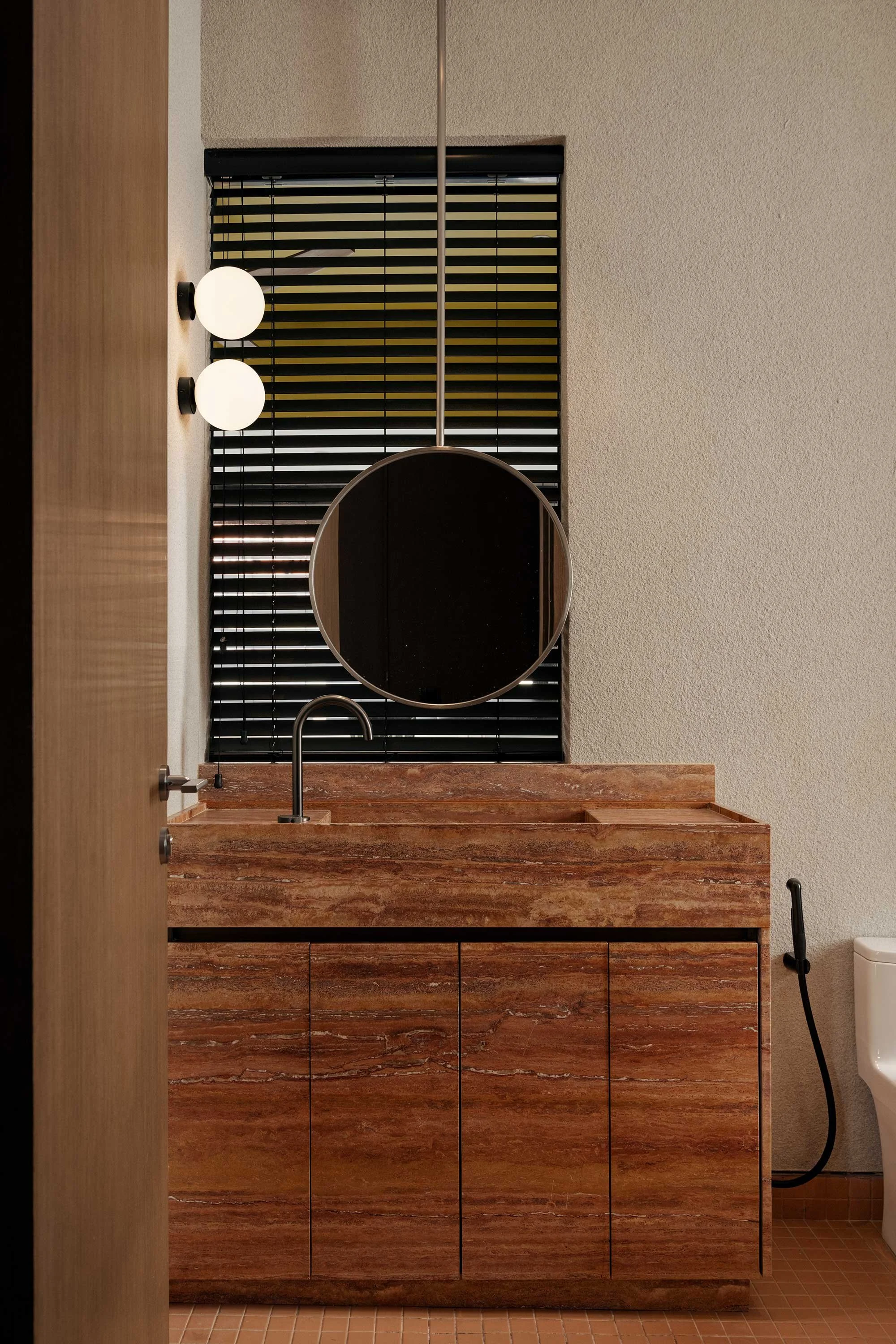
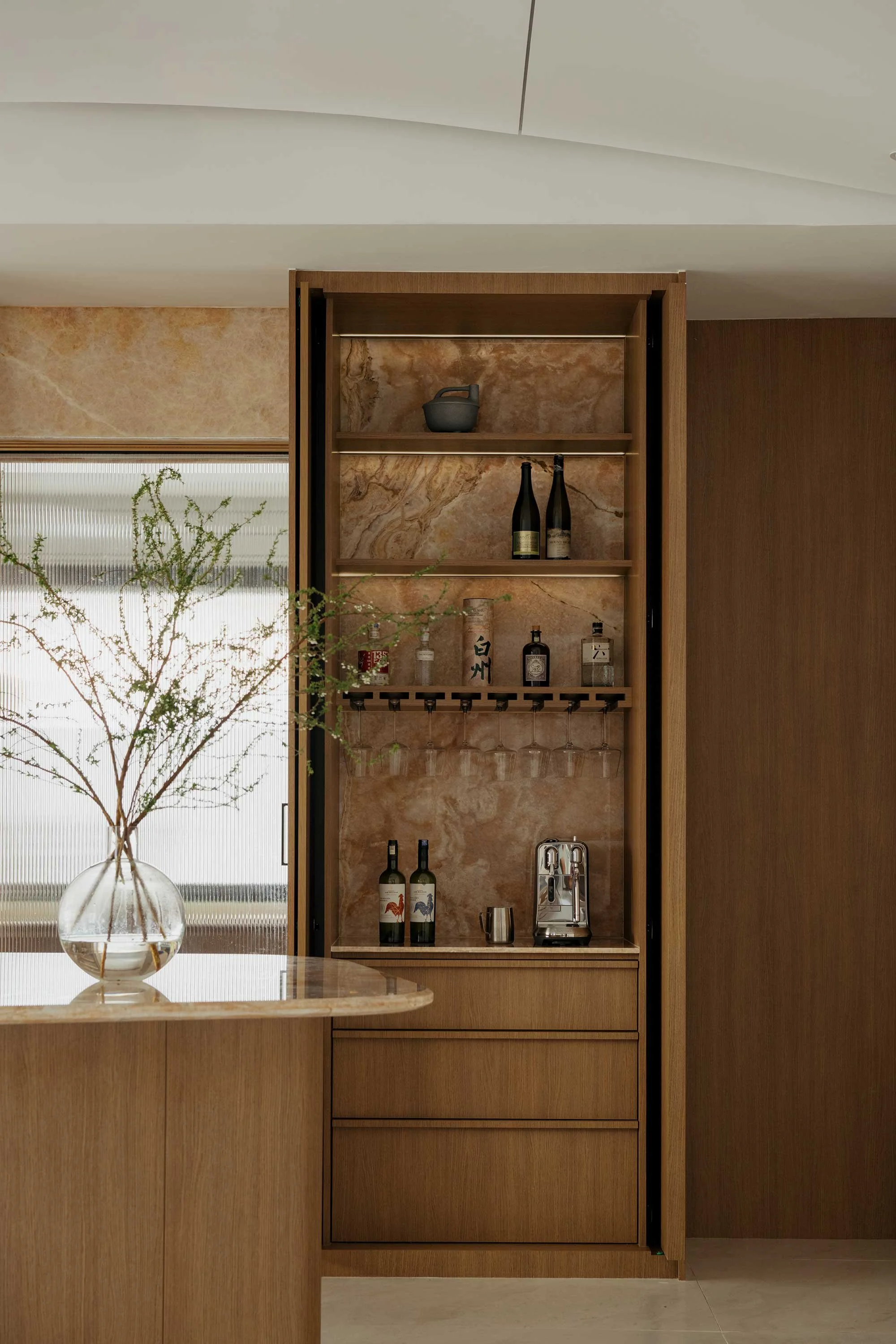
The curved ceiling over the dining room and dry kitchen wasn’t part of the original plan. When the team opened it up, they found structural columns and beams they hadn’t expected. Rather than box them in and lose height, Tee curved the ceiling into a soft half-dome that hides the beams, and left the central column exposed. Below the curve is an irregular island of pink onyx — one of a few pops of colour in a palette otherwise kept to timber, stone and beige. Most of the walls are finished in a rough render, which Tee wanted as a deliberate contrast to the smooth joinery.
Bedrooms vary by who uses them. The main bedroom follows the same language as the shared spaces, while another is mid-century — ‘a bit Bauhaus’, as Tee puts it. Almost all the furniture is bespoke, which was straightforward here because the clients own a furniture factory and built Tee’s designs themselves. ‘They know the materials,’ Tee says. It’s a rare collaboration with a striking result.
Text by Katherine Ring
Images by Weng Jen