A Sculptural Graphic Novel Library in Itaewon
Designed by OONN and U.LAB, new Seoul bookstore Graphic — dedicated to graphic novels, comic books and art and design books — takes its shape from the well-worn pages of an old book
In the last decade, the neighbourhood around Seoul’s Gyeongridan-gil in Itaewon has gone from a rundown hillside residential area to hipster enclave — until it was hollowed out by the recent years’ wave of gentrification. Enter Graphic, a bookstore dedicated to graphic novels that’s breathing new life into the area. There are hour-long queues to get in even on weekdays.
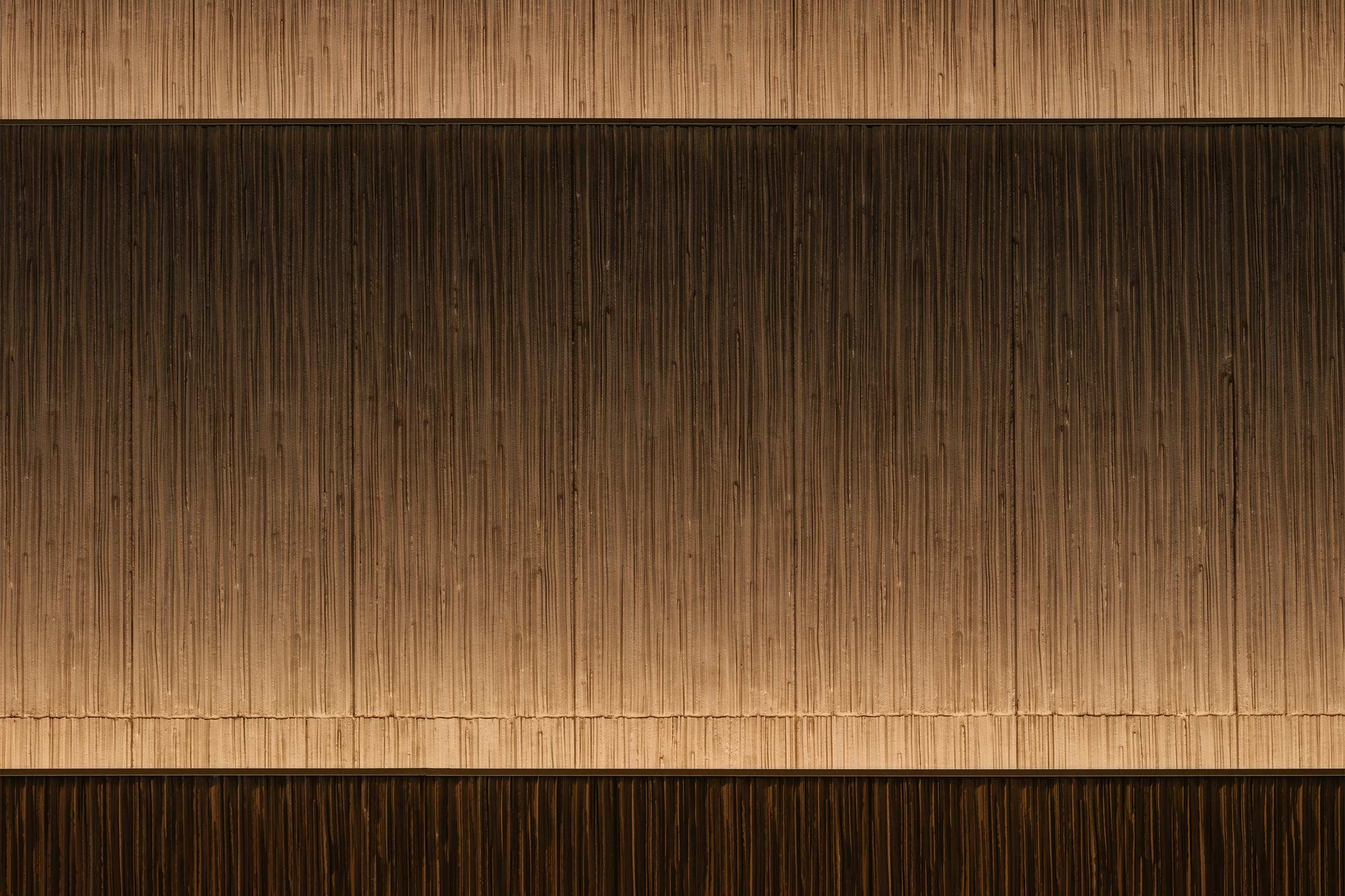
Designed by architecture firm OONN Metaworks and space and brand design studio U.LAB, both helmed by Kim Jong-u, the four-storey building has a striking cream-coloured exterior with no visible windows on the facade. Ensconced between low-rise brick-walled flats that have guarded the neighbourhood for decades, it stands out from the crowd.
The floors, each shaped like a quarter of a cylinder, are stacked on top of each other like a multilevel cake, growing narrower as they rise higher. The windows are on the ceiling, in the gaps that connect each floor.
‘It has its back turned towards Namsan. It doesn’t have a real view to speak of,’ says Kim, referring to the mountain that marks the geographical centre of the South Korean capital. Unlike the rest of the city that’s dominated by apartment blocks and tower residences, the areas at the foot of Namsan have been extremely slow to change due to height restrictions. Minibuses zip through single-lane alleyways that connect low-rise flats and shops, many of which were built before the turn of the millennium.
All of this makes the addition of Graphic to the neighbourhood even more striking. Kim says he was inspired by an old book that he inherited from his grandfather, its bound pages having grown uneven on the side over the years. This is what led to the building’s vertically lined exterior, which Kim says he collaborated with Chinese ceramic artist Wen Ping to achieve.
For the interior, Kim studied people’s reading positions, from lying down to sitting with hands cupping jaws, and designed seating areas to support those shapes. ‘I’ve always believed that form must conform to human behaviour. I don’t believe in making something only for the sake of beauty,’ he says.
Graphic is unusual for its rules. It is strictly an adult-only space, selling or lending graphic novels, comic books and art and design books like the ones published by TASCHEN. There’s also a bar that serves whisky, a shared love for the drink having connected the client and the architect in the first place. Kim came to be the designer behind Graphic after the owner of his regular watering hole recommended him for the project. The bar owner called him saying there was a prospective client who shared Kim’s tastes in music and whisky, a sign of kindred spirit. And when it comes to aural and gustatory pleasures, Kim has few matches — his unusual CV includes years as a professional drummer and a degree in French cuisine from the famed Le Cordon Bleu school.
Text / Jeyup S Kwaak
Images / Kang MinGu, courtesy of U.LAB


