A Hong Kong Haven
Tasked with redesigning this Hong Kong apartment, LAUD Limited reorientated spaces to maximise city views, while ensuring that the home is a comfortable yet chic weekend respite for the client. We spoke to studio founder Liz Lau to find out more about the project
How did you first meet the client?
Liz Lau: Paul and I have known each other for a long time, we’re good friends actually.
Can you tell us about him and his lifestyle?
We completed this project back in 2016, long before COVID. Paul’s family business required him to travel to China on a weekly basis. He sees Hong Kong as his hometown and — when things are normal — insists on coming back here every weekend to spend time with his friends and family. He told me that he would like the renovation to be cosy, since he’d spend most days and early evenings here. He enjoys cooking and hosting intimate dinners with close friends. He has always seen his time in Hong Kong as precious, and he was really involved in the design process to ensure that the apartment would be a place where he would enjoy spending time in, and somewhere he would very much look forward to returning to on weekends.
What was his brief to you for the project?
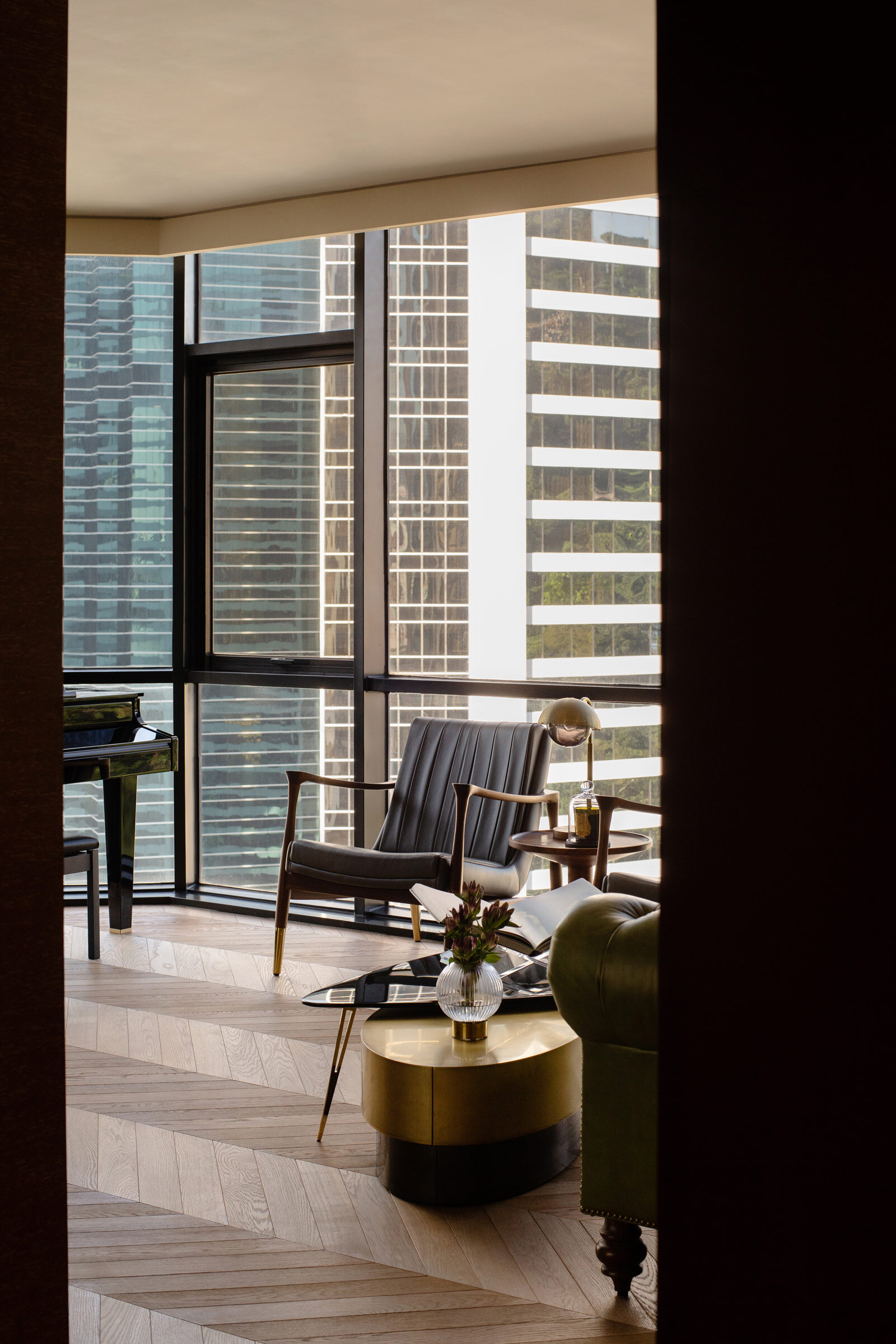
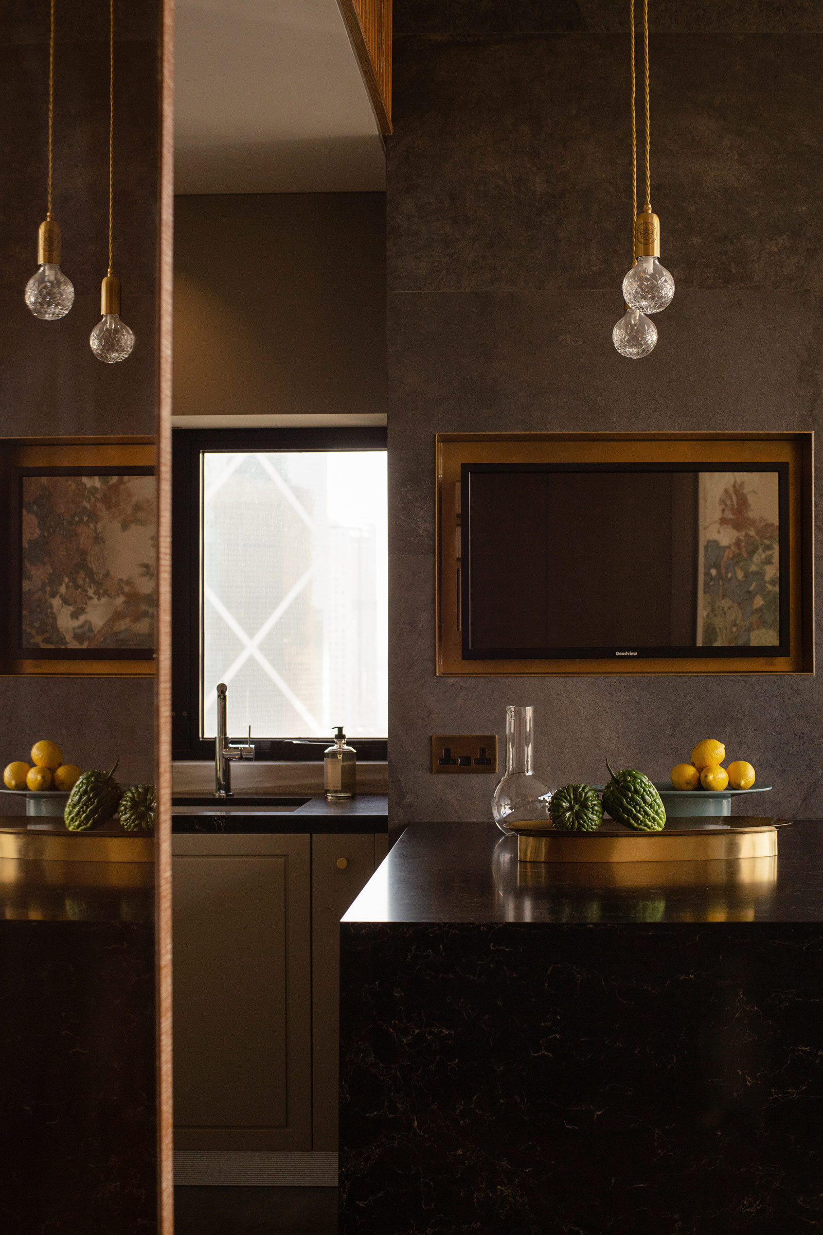
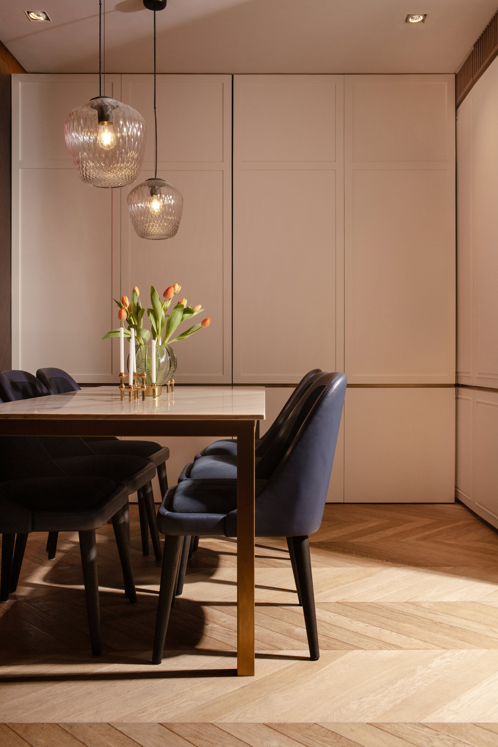
He wanted the home to be cosy and comfortable, but with a strong sense of style. He was more of a collaborator than a client and was involved in every detail and decision. The brief included redesigning the living and dining space to suit dinner parties, and since he loves the views out to Hong Kong Park and Admiralty, we decided to reorientate all the spaces, including turning his bedroom into what is now the living room. We designed an open kitchen next to the living room, which is the core of the apartment and merges with the dining space. For the rest of the apartment, the client wanted to create a big master suite completely private and separate from the living and dining area.
What’s unique about the building and the location?
The building is located in the centre of Hong Kong Island, in the Mid-Levels area above Hong Kong Park. The location really amplifies the duality of Hong Kong: beautiful greenery and natural landscapes on one hand, and a metropolitan skyline on the other. The 100-square-metre apartment is unique for its views of Hong Kong Park and Admiralty, but the building itself is also quite special because it’s one of the earlier residential buildings (from the 80s) in Hong Kong that is built with a curtain wall system. This means that the apartment features large windows that allow lots of natural light in.
How did you approach the project — what design references did you try to incorporate into the space?
This is one of our first projects where we used quite a bit of colour. We also wanted the project to feel more luxurious, especially in the living and dining area, so we used traditional elements like darker wood, brass trim and fishbone wooden flooring, as well as panel designs with a traditional motif intended to enhance the richness of the design. We added marble elements, including the kitchen countertop and the bespoke dining table, to anchor the spaces.
Please tell us about some of the custom pieces for the space.
Although we used numerous materials, we ensured the details of the fit are refined yet simple. We were also conscious that the fit out should be an elegant backdrop to the apartment, and the home became a lot stronger in style and character once we placed the furniture and artwork. I personally love the artwork on the living room wall, Jacky Tsai’s Save Empress Wu. The work is very textural and the vibrant, and its intricate colours work perfectly with the backdrop. I also love the new coffee tables from Baxter. As the living room is quite orthogonal and structured with the curtain wall facade, we decided to incorporate more organic furniture to create contrast.
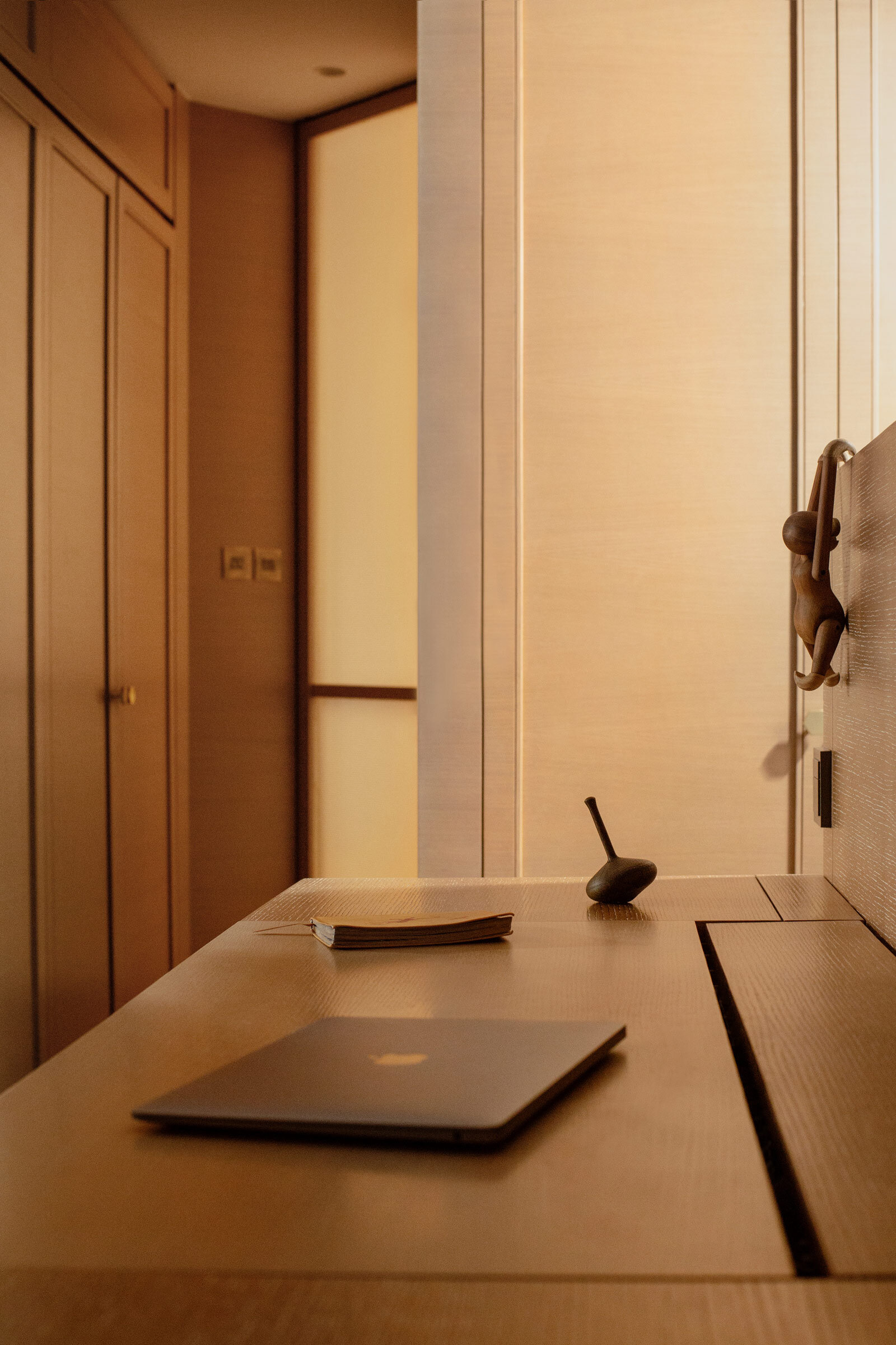
The custom-designed open bookshelf in the bedroom features partitions made from natural brass and light oak, and we left spaces open to personalise the display with objects and plants.
Do you have a favourite element or design detail in the architecture or interiors?
In general, I love how we worked together to reconfigure all the spaces to maximise the windows and natural light. It’s rare to have an opportunity to work on a residential project with such large windows. The spaces literally transform throughout the day, and I have to say this is my favourite element in the entire project. The natural light and the surrounding views were the inspiration for the entire design. I also love the dark wood in the living room. The richness of the material works really well with the large windows, the city backdrop and the furniture.
Images / Amanda Kho
Styling / At Liberty


