How One Tree Threads Through Every Part of The Standard Pattaya Na Jomtien
The Standard Pattaya Na Jomtien is the brand’s third Thai property, inspired by the sugar palm, sunset orange and sea breeze
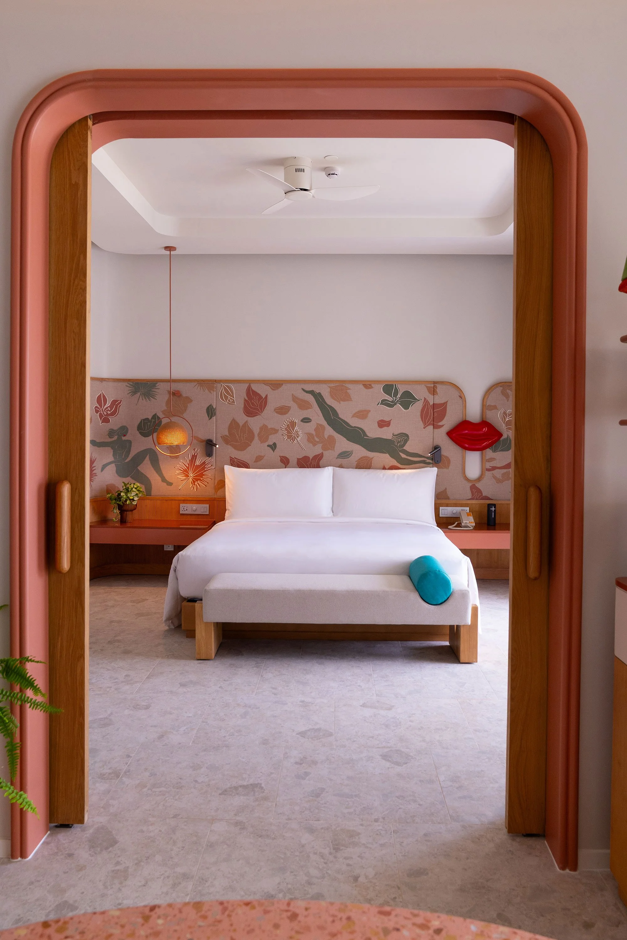
The sugar palm keeps surfacing at The Standard Pattaya Na Jomtien, which opened in the quiet enclave of Na Jomtien last October: replanted at the entrance, abstracted into the interior greens, drawn onto the guestroom walls. The resort was shaped by several hands — architecture by Onion, interiors by Din Studio and Studio Lupine, grounds by P Landscape, under Verena Haller and The Standard’s in-house team — but three of them reached for the same local references independently.
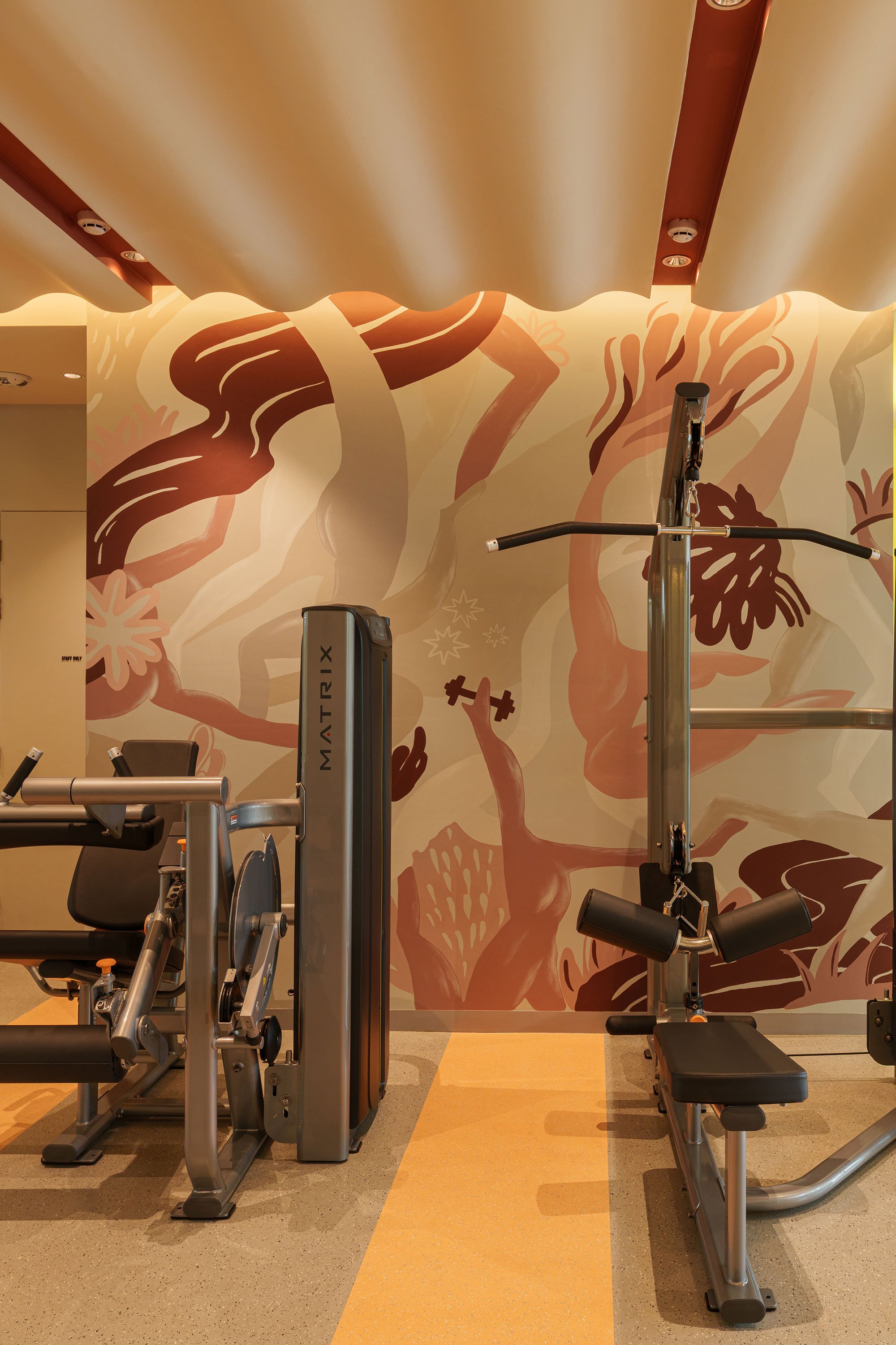
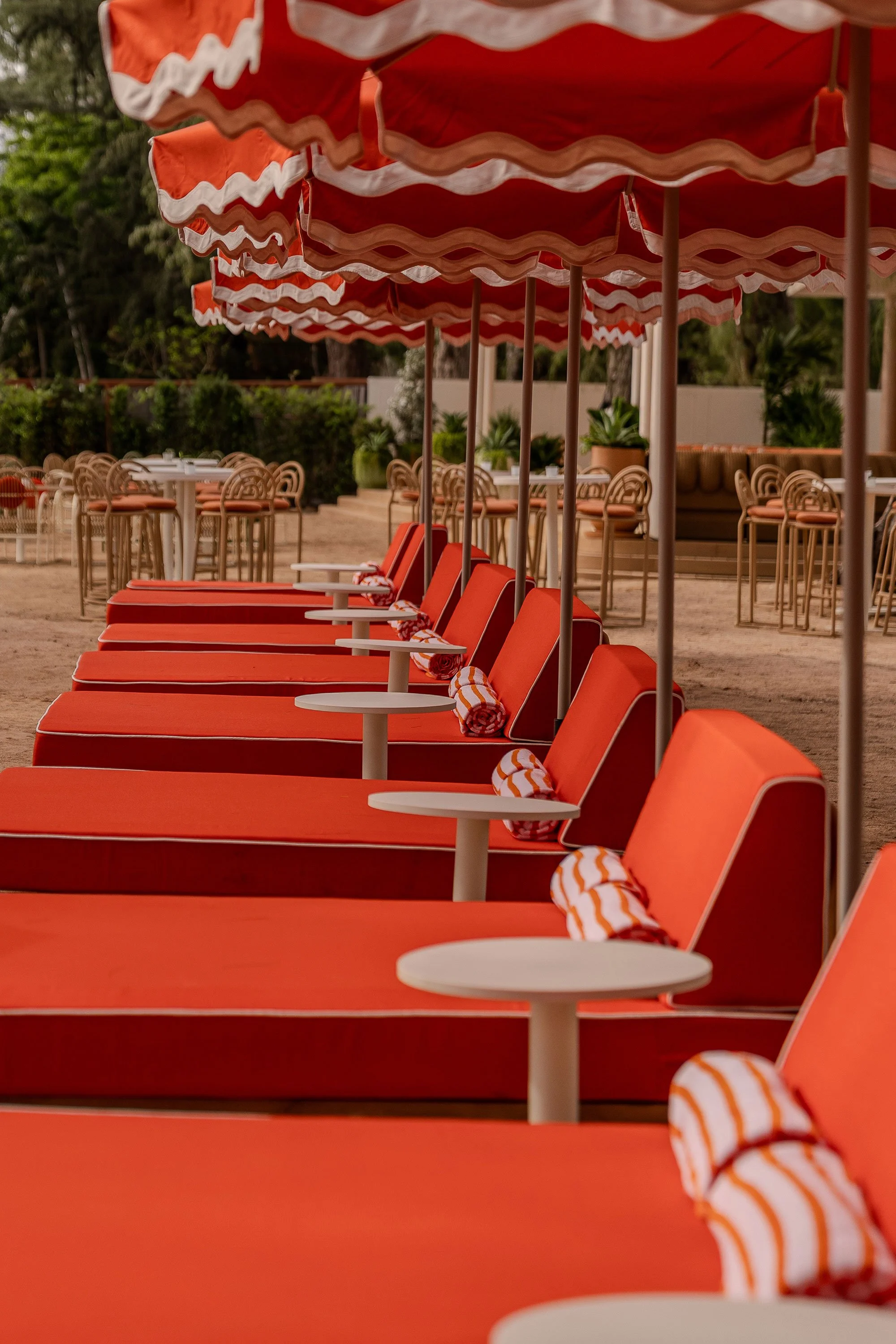
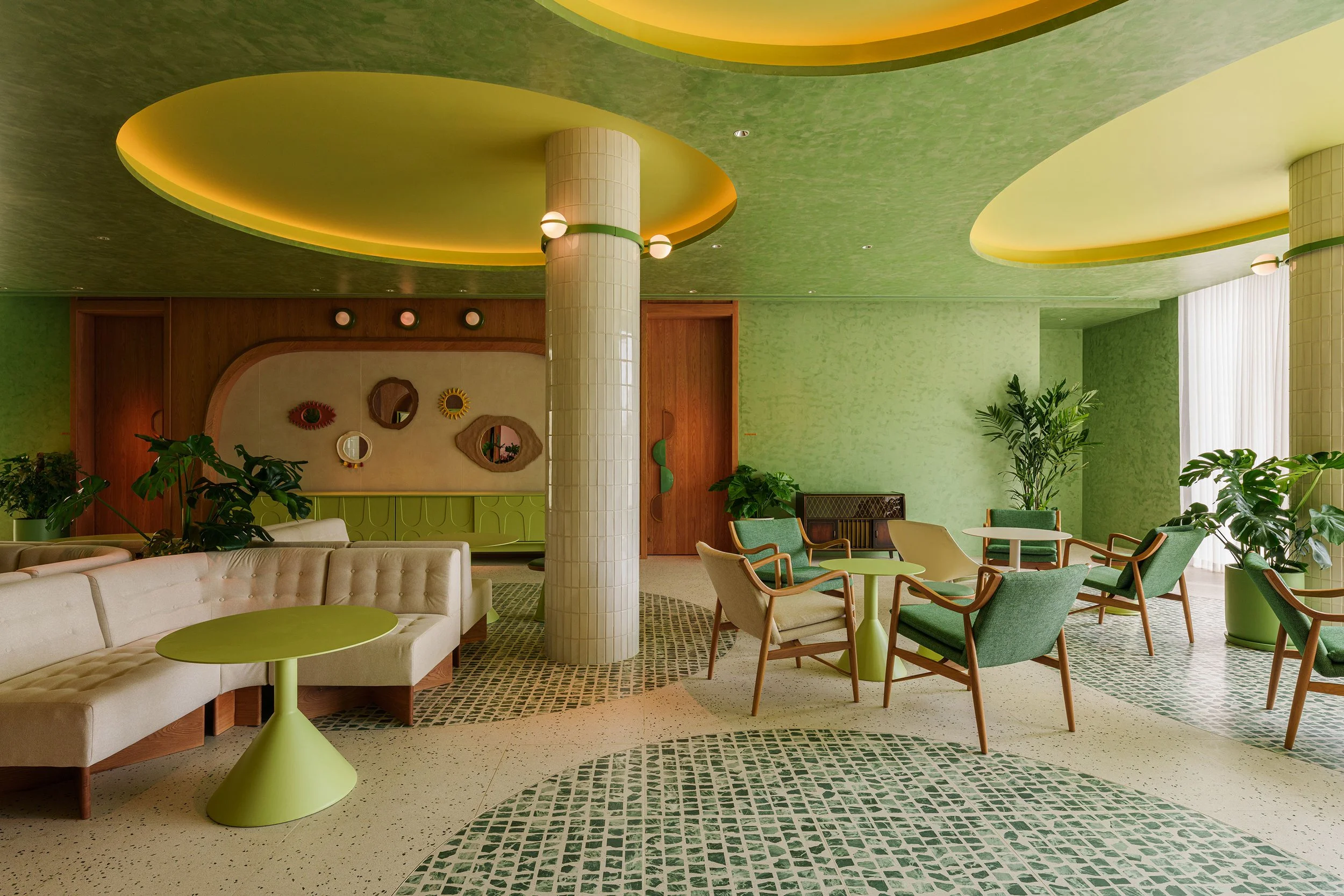
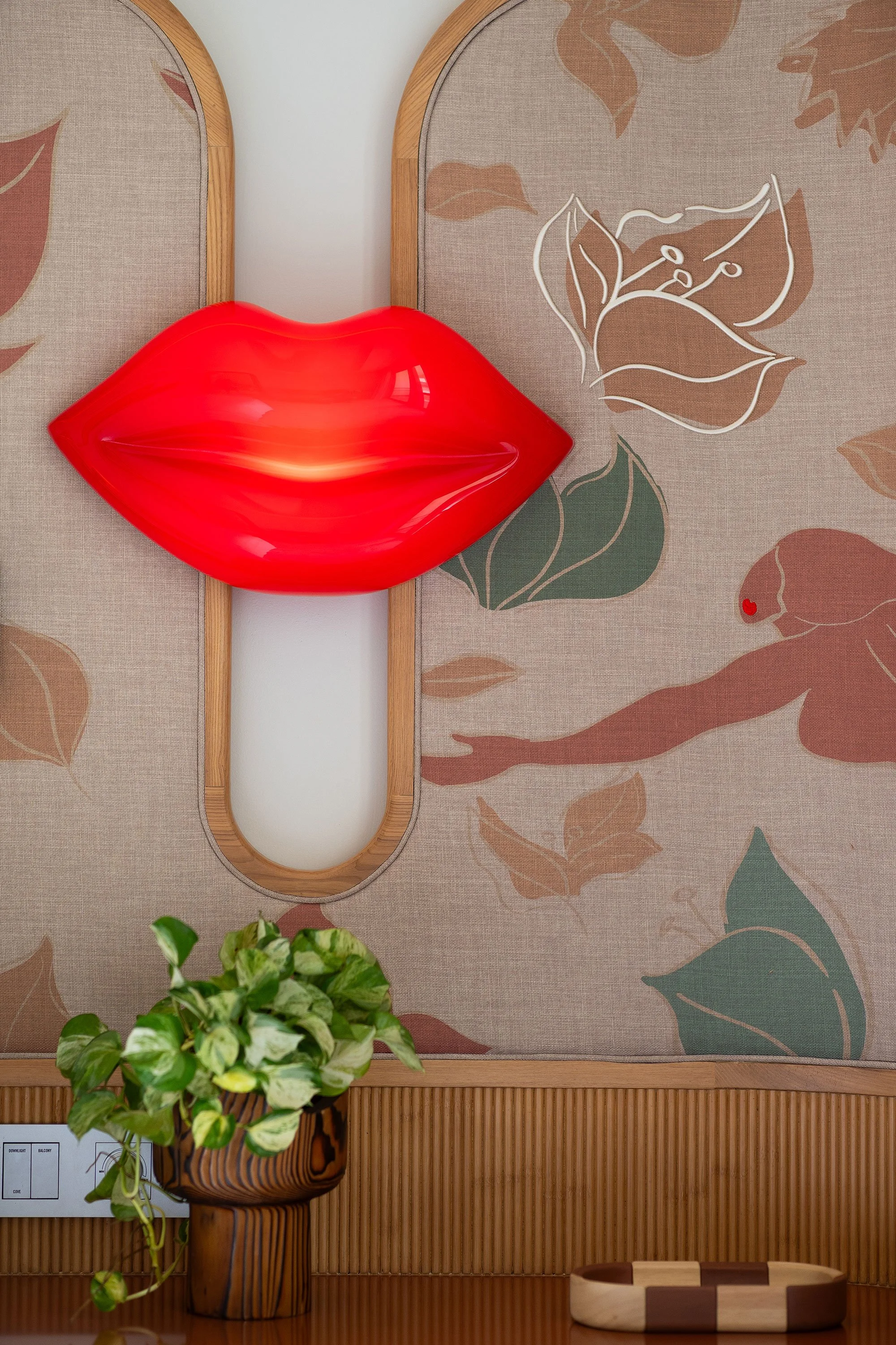
Din Studio traced the palette to Pattaya in the 1960s, when the town first took off as a seaside resort. The designers settled on three motifs — sun, wind and the sugar palm — and let them dictate decisions. The orange that runs through the hotel comes from the local sunsets, the greens from Dongtan Beach, whose name means a grove of sugar palms, and the curves from the sea breeze that gave Pattaya its name. None of it is treated as ornament. Illustration is not a separate discipline at Din, according to the designers, and the guestroom graphics bear this out: combing through photographs of Pattaya’s early holiday homes, they kept noticing how often bougainvillea appeared alongside the buildings, and reworked it into illustrations of men and women swimming among bougainvillea and palm leaves.

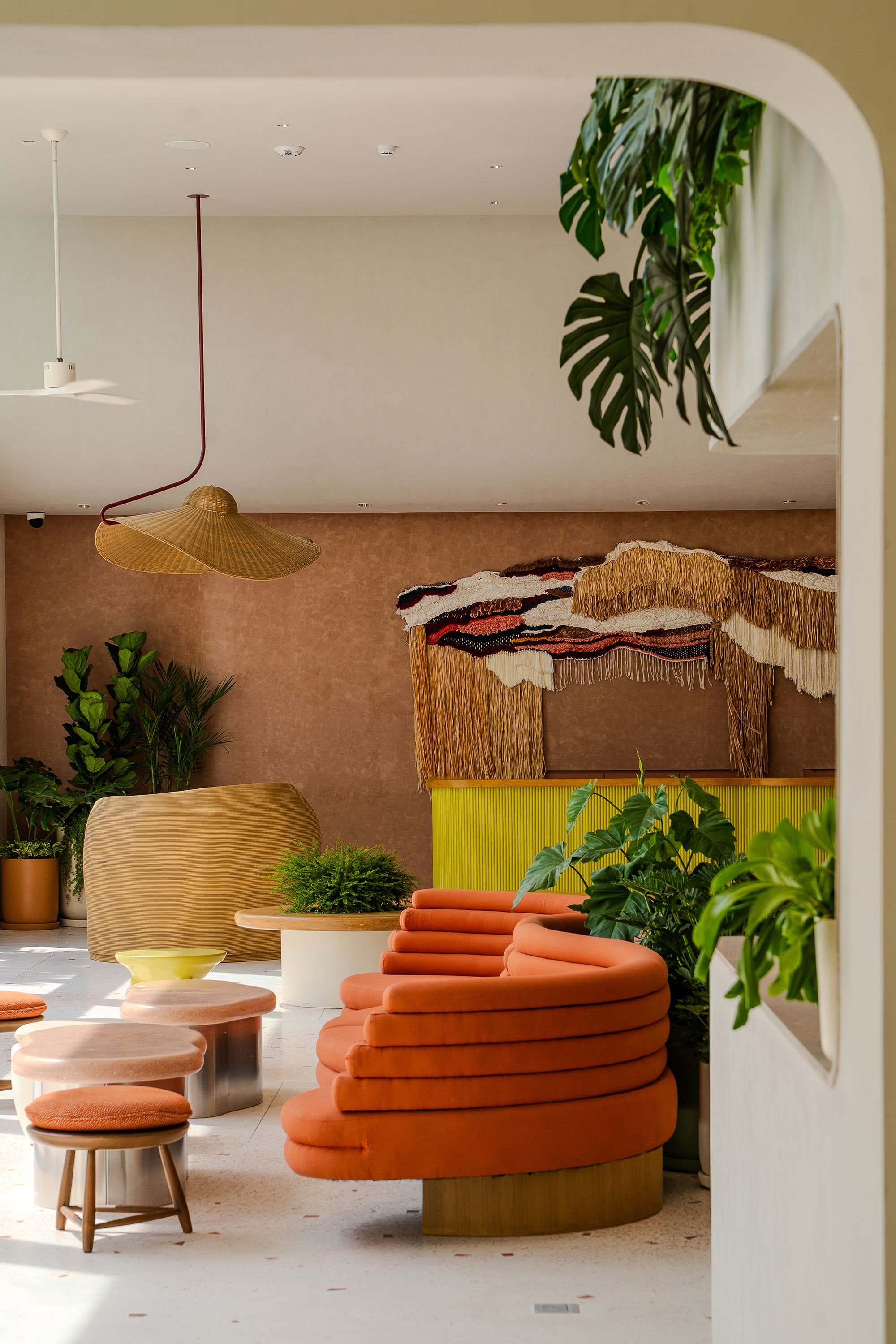
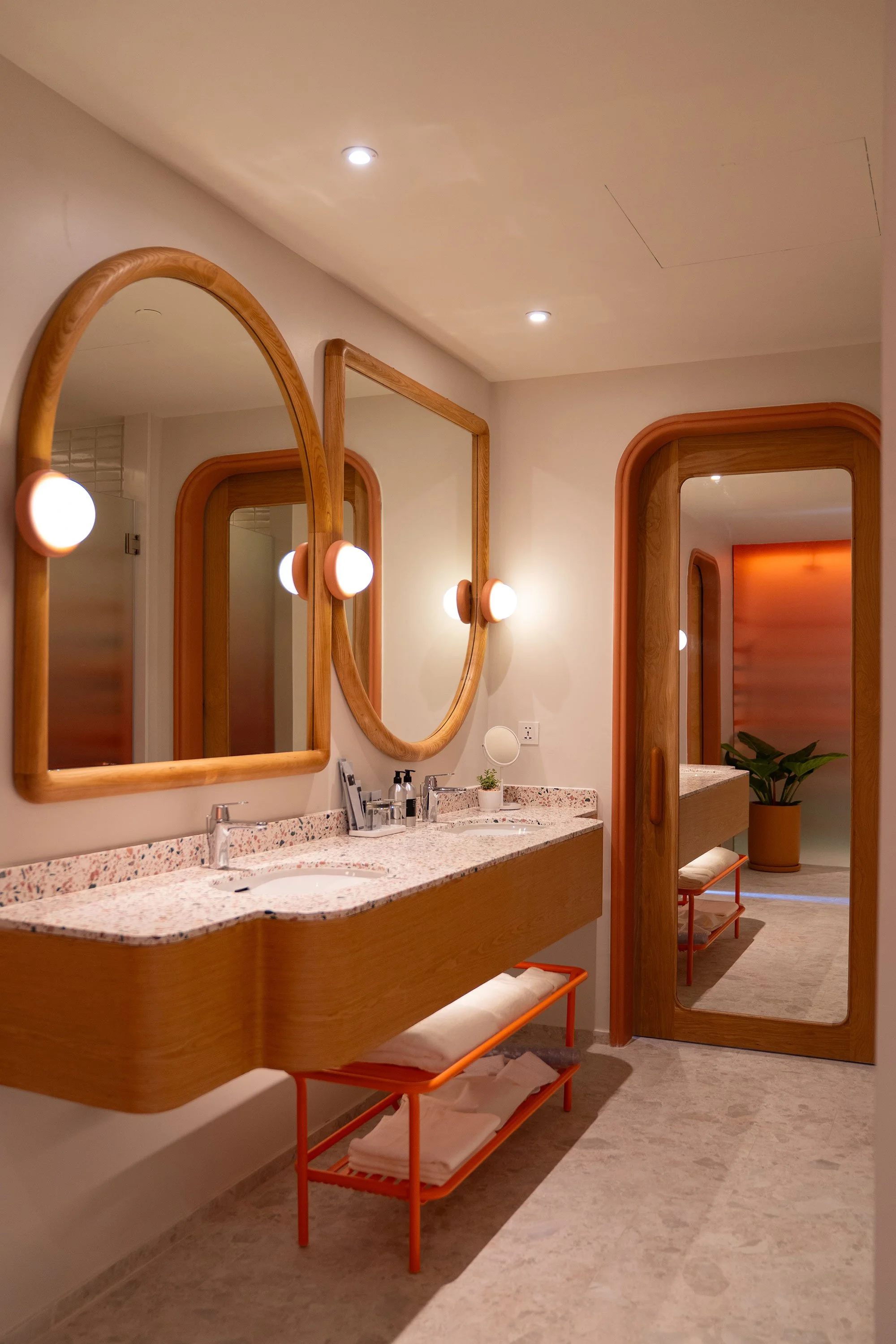
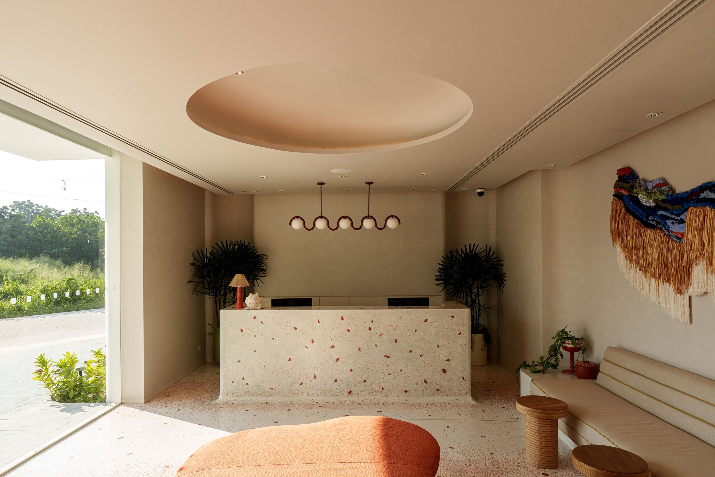
The point for Din was to keep The Standard’s well-known cheek from tipping into pastiche, based on the maxim that the difference between personality and theme lies in authenticity. It’s a line easier to assert than to deliver, though some of the quirkier furnishings suggest they mean it. The lobby holds a hibiscus-shaped lounge chair and a side table inspired by a pair of legs, set on a gradient terrazzo floor among a collection of bespoke pieces that borrow the optimism of mid-century resorts without quoting it directly.
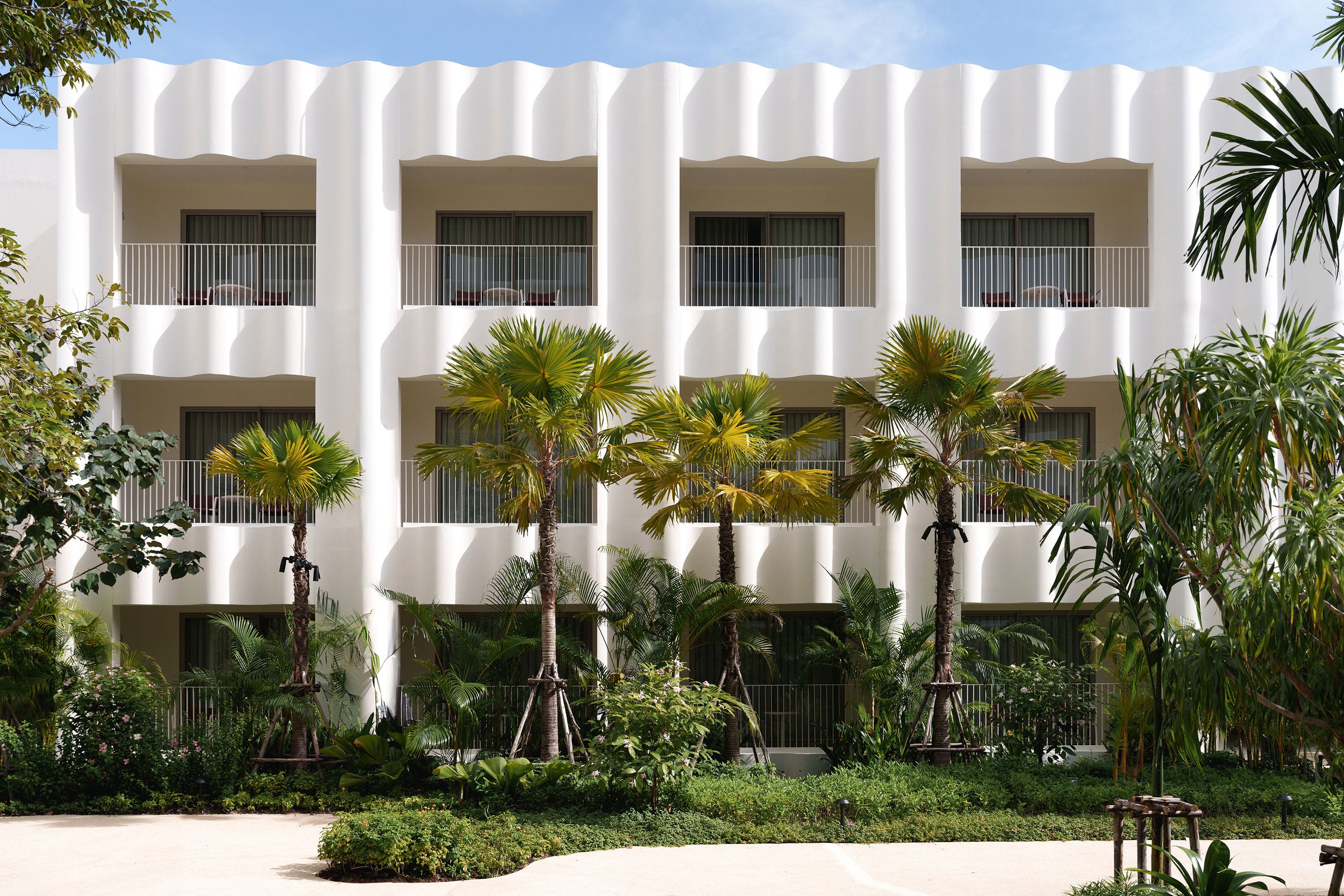
Onion makes the plainest case for the place over the brand. Co-founder Siriyot Chaiamnuay singles out one thing: ‘A key advantage of the Na Jomtien area is the absence of a beachfront road.’ This gives the resort a direct line to the sea and lets the building settle in among the existing casuarinas. A skylight shifts from clear to orange across the day, while the facade’s vertical, wave-like forms and a wave-shaped canopy on each floor turn the moving light into shadows that shift with it.
P Landscape took the coast as a premise. ‘Rather than treat the coastal environment as a constraint, we saw it as the starting inspiration,’ says project design director Chatchai Petcharad, who set orange-flowering plants in the courtyards to pick up the interior’s warm tones, chose vibrant, salt-tolerant species — cassia, clerodendrum, hibiscus, bougainvillea — for seasonal colour, and laid recycled terracotta around the pool. Four zones offer distinct characters while maintaining a fluid experience and not directing guests from arrival to the sea. The sequence, he says, is ‘less about choreography and more about creating conditions that allow guests to engage with the resort in their own way’, where pocket gardens and terraces left as destinations rather than waypoints.
What carries across all three is the same instinct — to tie the resort to this particular coast rather than to the brand’s idea of one. The plainest evidence is the sugar palm: handed down in no brief, yet in the ground at the entrance, in the interior greens and on the guestroom walls regardless.
Text by Katherine Ring
Images courtesy of The Standard